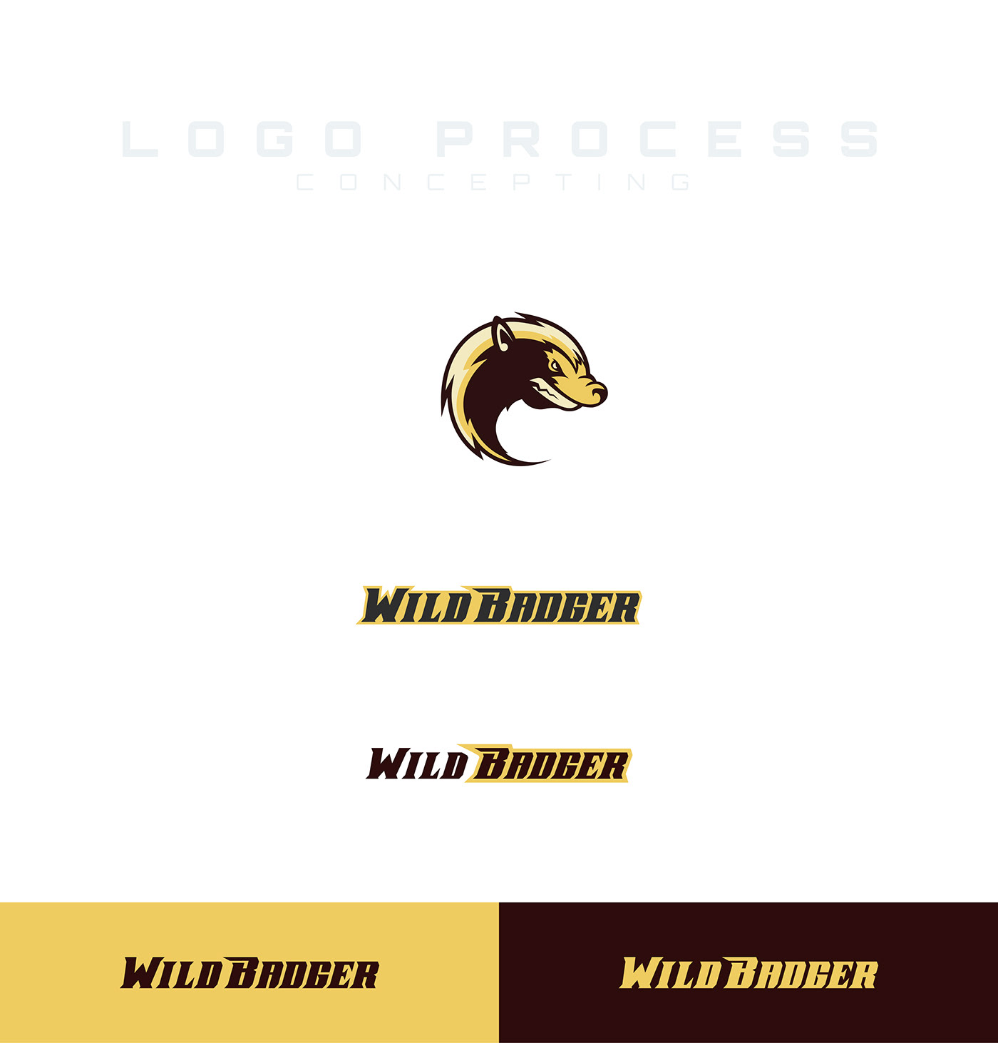
The first set of logo concepts was a more aggressive and unique direction. The thought process for these were to play off of the brands name, pulling a color pallet inspired by a honey badger.
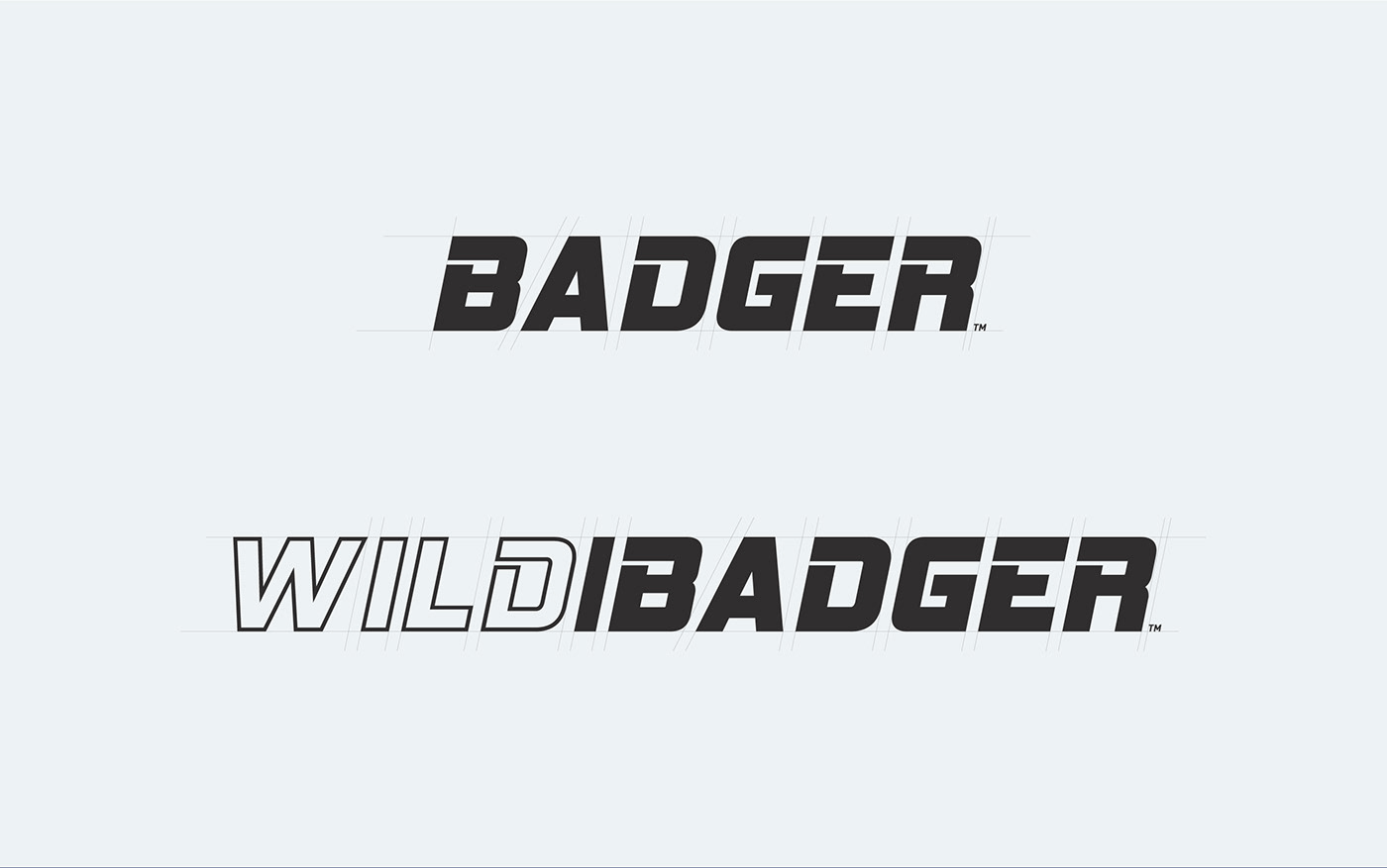
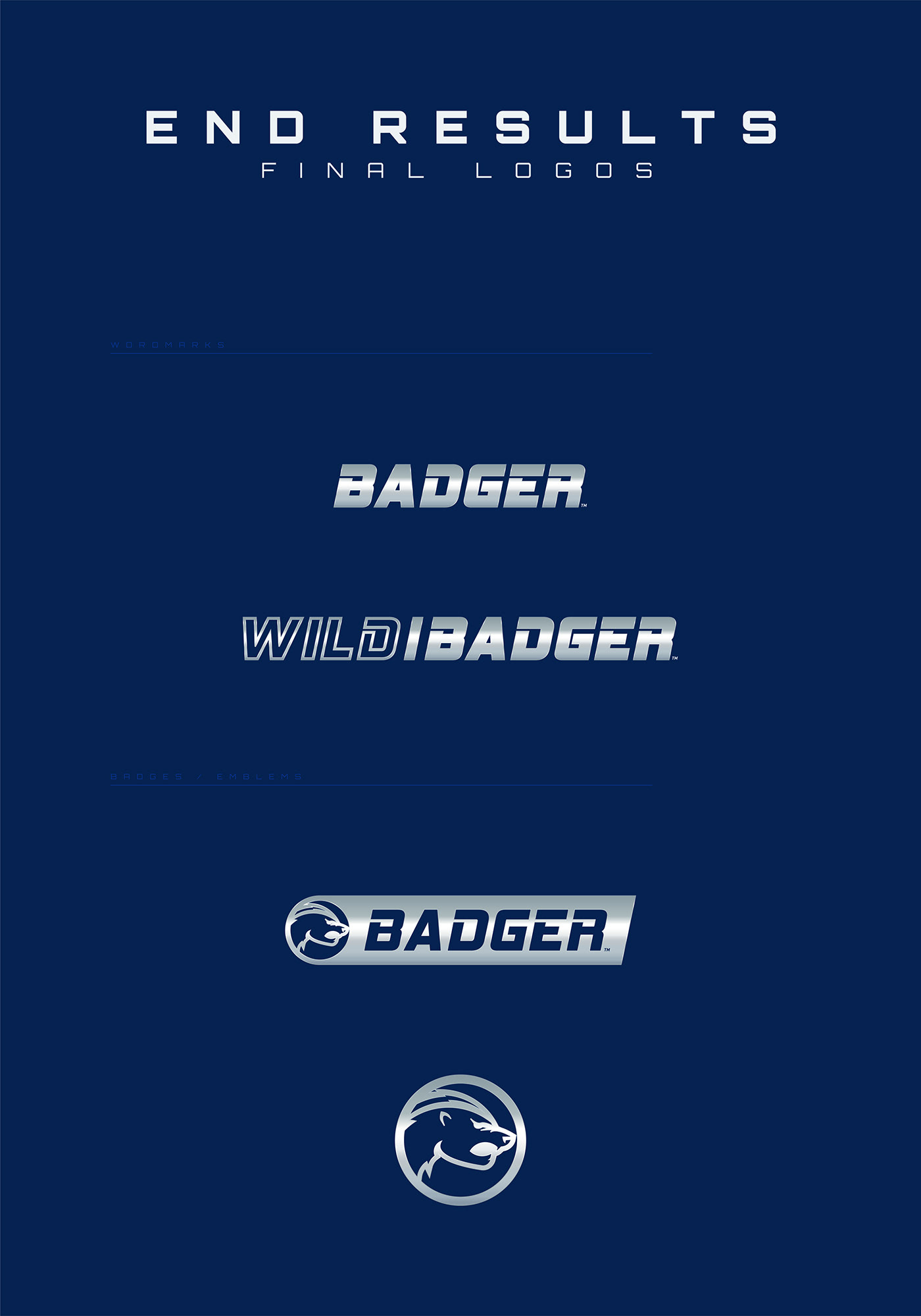
The second set of concepts was a cleaner less aggressive direction that was chosen to move forward with. We started with a really simple and clean concept and adjusted the typeface to be a bit more aggressive. We went through many color pallet options and ultimately decided on a dark navy blue to be the primary color.


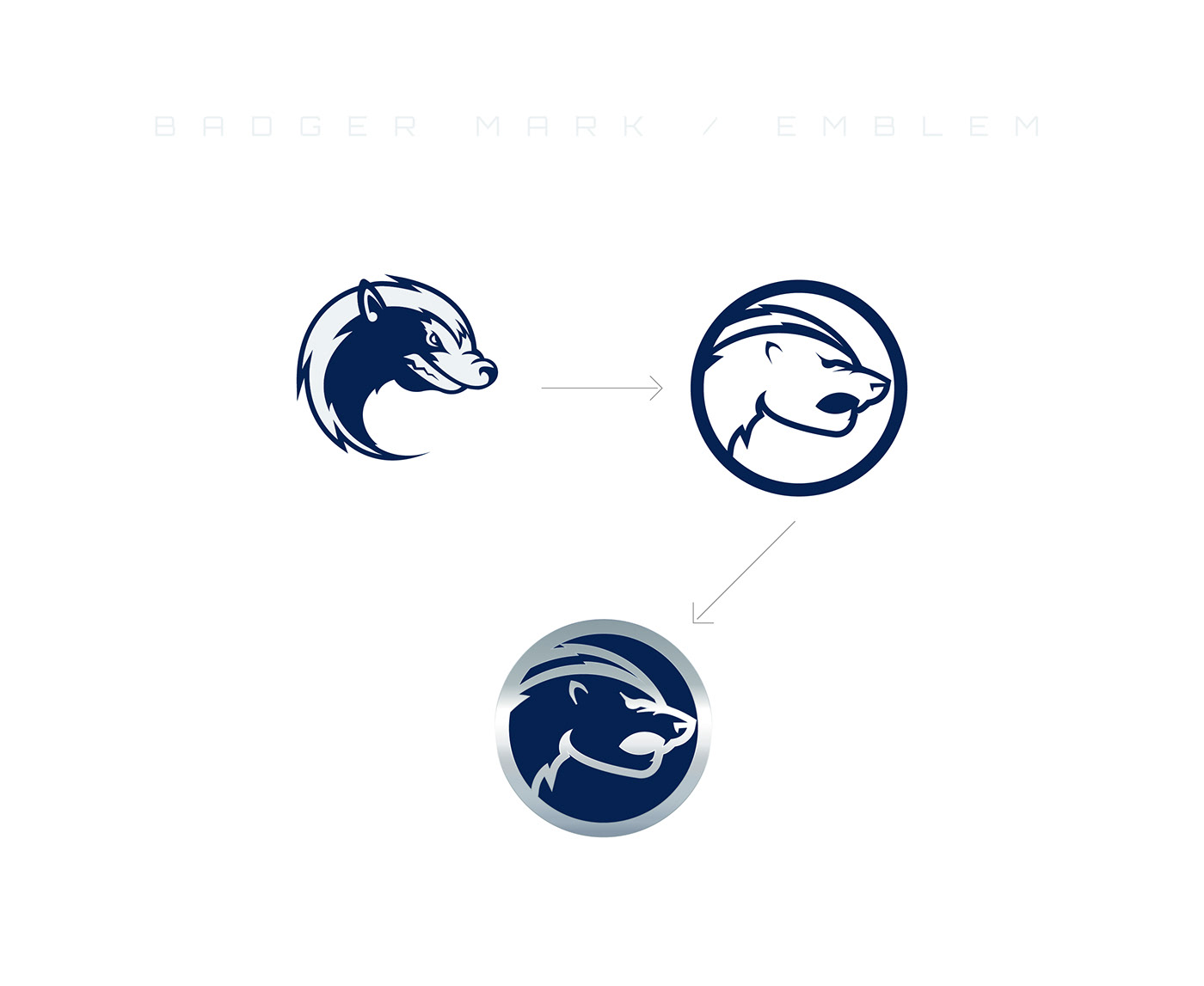
We took the Badger mark we designed for the 1st set of concepts and simplified it to work better as a product badge.