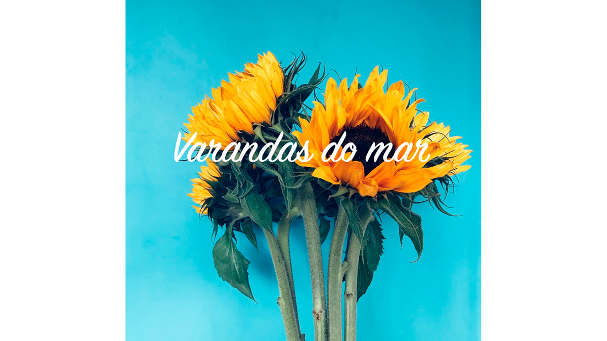
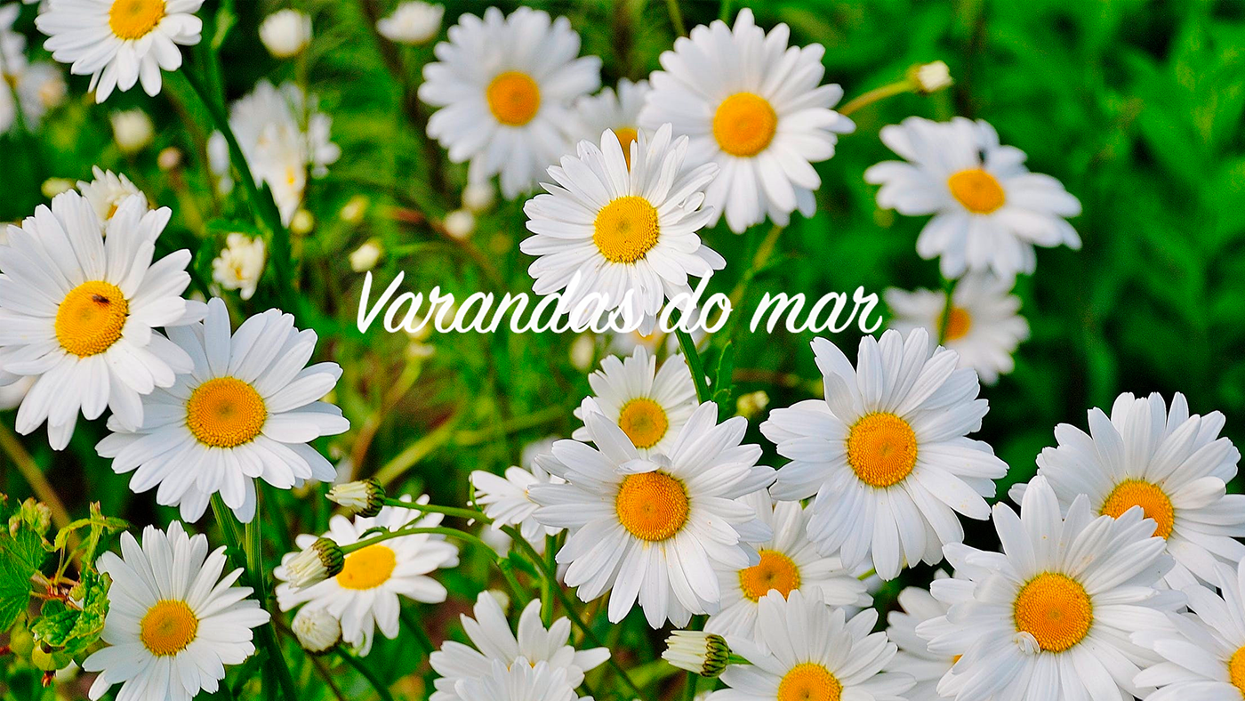
The brand:
With more than 20 years, the condominium Varandas do Mar, is located inside a condominium of apartments in Santa Caratina - Brazil.
Surrounded by a lot of green, a garden and the beach, this event space accommodates up to 400 guests.
But, why "Varandas do mar"? In Portuguese, "varanda" is a balcony and "mar" is the sea. So, in english the name is: Balconies of the Sea.
And the reason is: all the apartments are facing the sea. Awesome!
It is a charming space that captivates all who pass by.
The briefing:
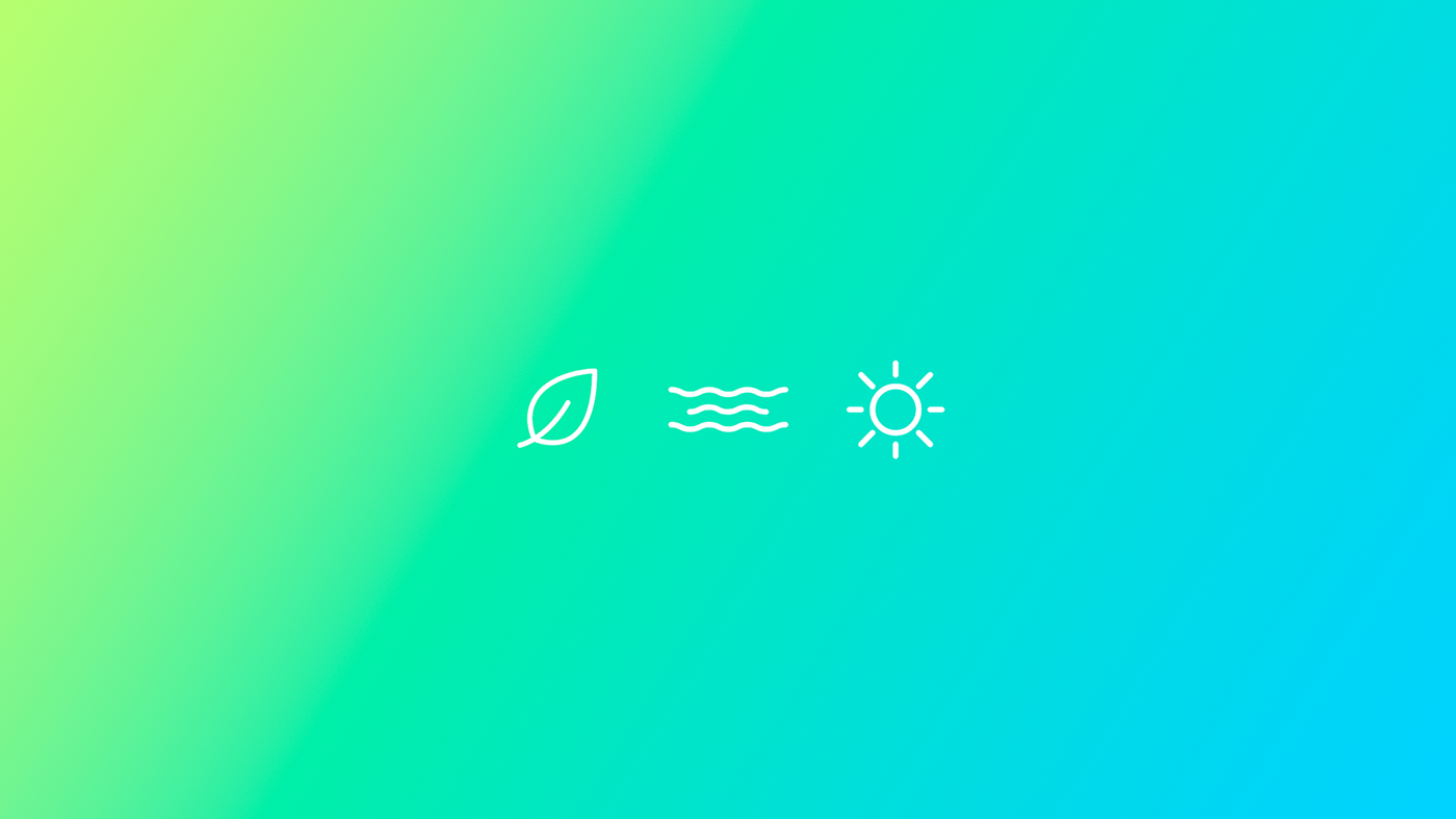
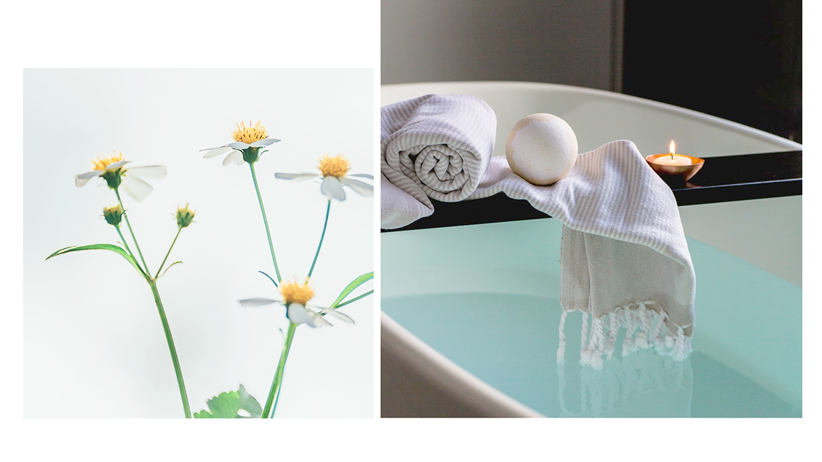
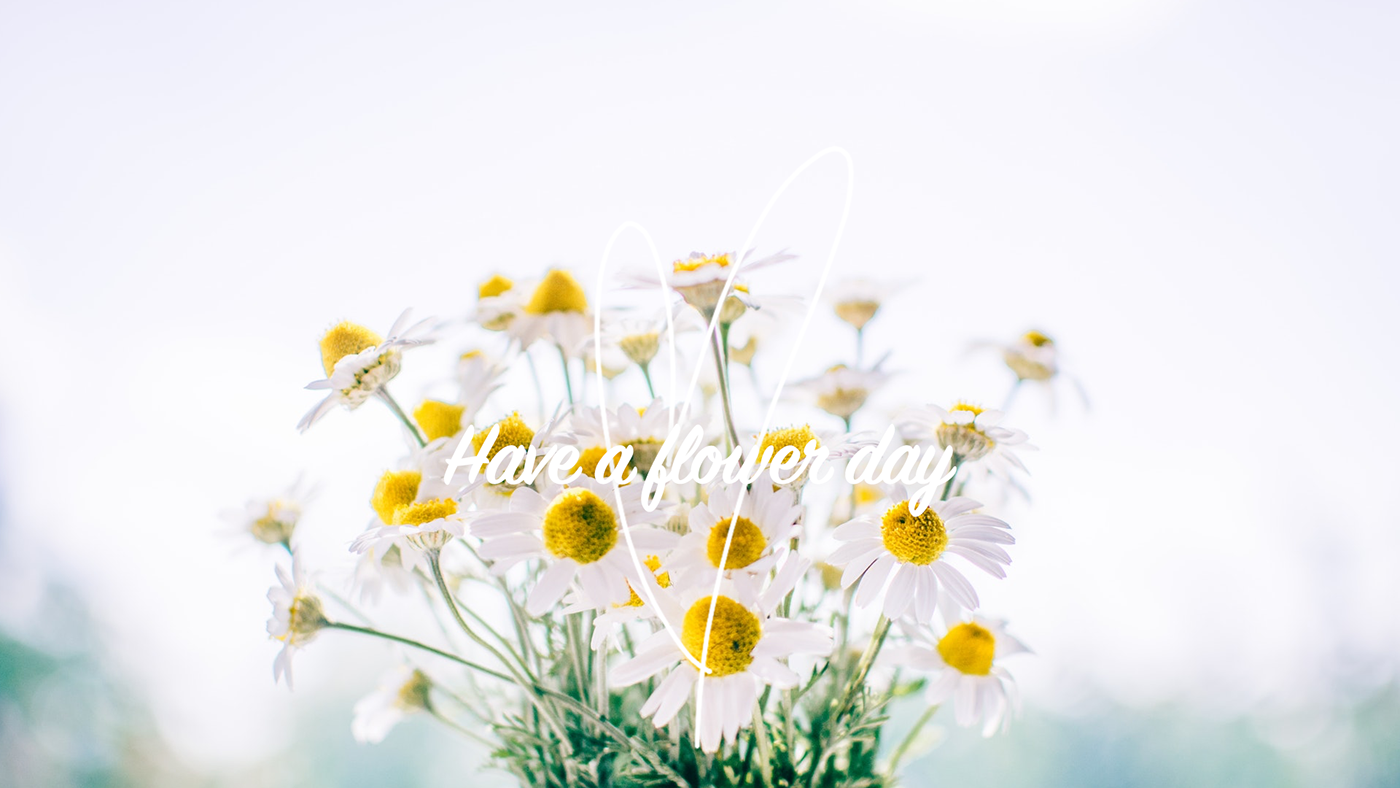
The briefing asked for a mark that expresses the main points of space. The sea, the garden, the sunset.
The brand also had to be clean, soft and calm. The color palette was selected and extracted from nature images.
Green was picked from the leaves. The yellow of the sun. The blue of the sea. Everything was thoughtfully designed to make the brand look unique.
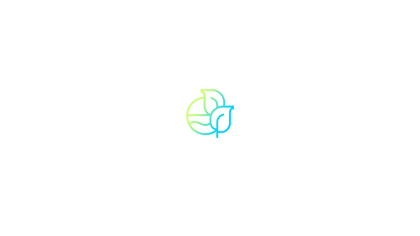
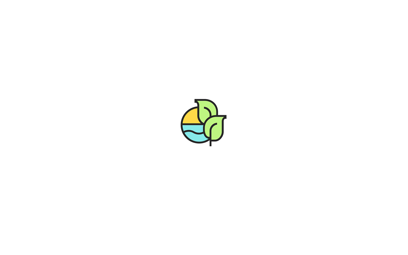
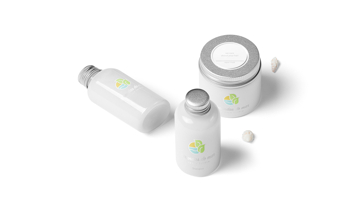
The logo is the representation of the front garden with the sea.
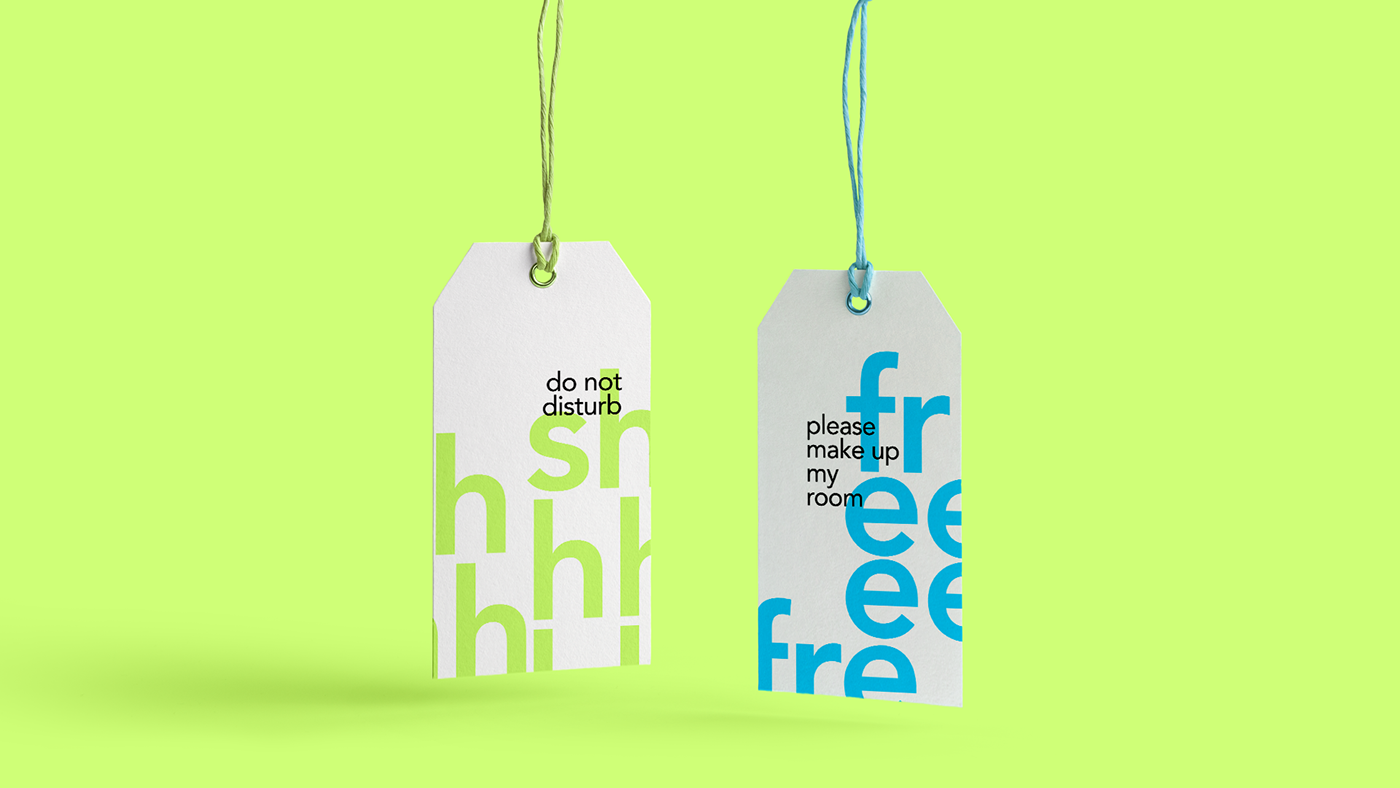
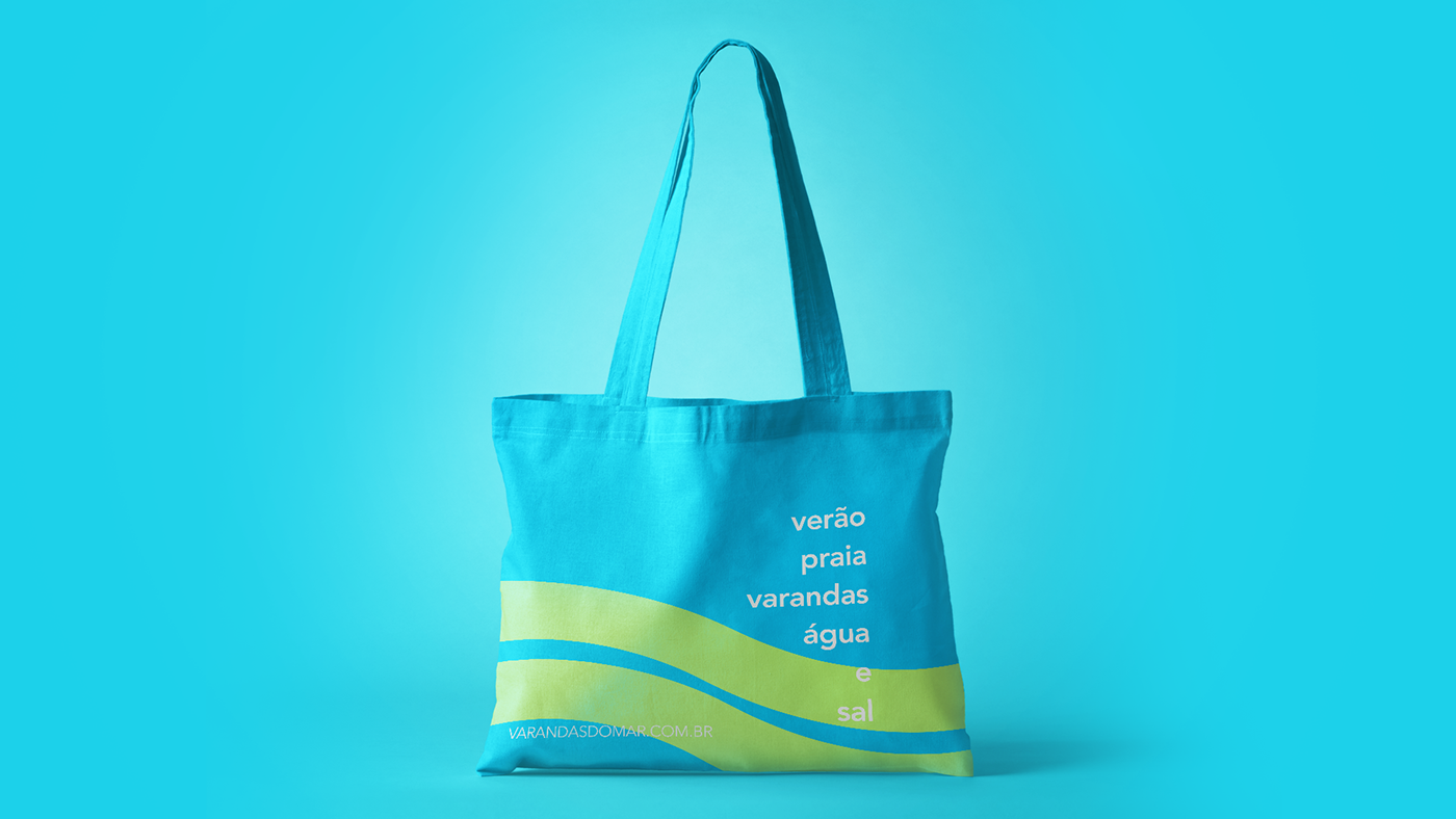
In addition to the logo and its stationery applications, I suggested applying the brand in different points and environments of the hotel.
Surrounded by a lot of green, a garden and the beach, this event space accommodates up to 400 guests.
But, why "Varandas do mar"? In Portuguese, "varanda" is a balcony and "mar" is the sea. So, in english the name is: Balconies of the Sea.
And the reason is: all the apartments are facing the sea. Awesome!
It is a charming space that captivates all who pass by.
The briefing:
The briefing asked for a mark that expresses the main points of space. The sea, the garden, the sunset.
The brand also had to be clean, soft and calm. The color palette was selected and extracted from nature images.
Green was picked from the leaves. The yellow of the sun. The blue of the sea. Everything was thoughtfully designed to make the brand look unique.
The logo is the representation of the front garden with the sea.
In addition to the logo and its stationery applications, I suggested applying the brand in different points and environments of the hotel.
It's a great project and we have a lot to build yet. These are some highlights and an overview.
Hope you like it.
Hope you like it.


_Thank you


