

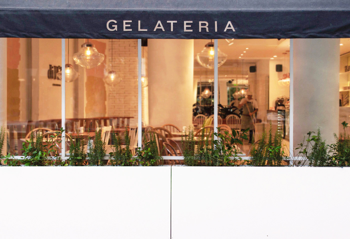
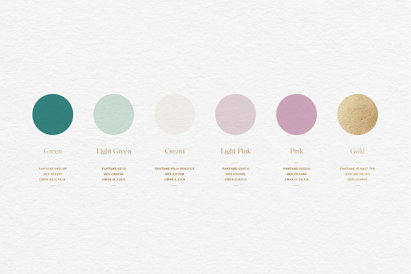
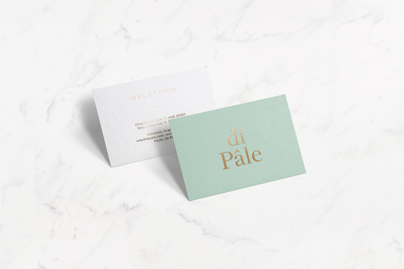
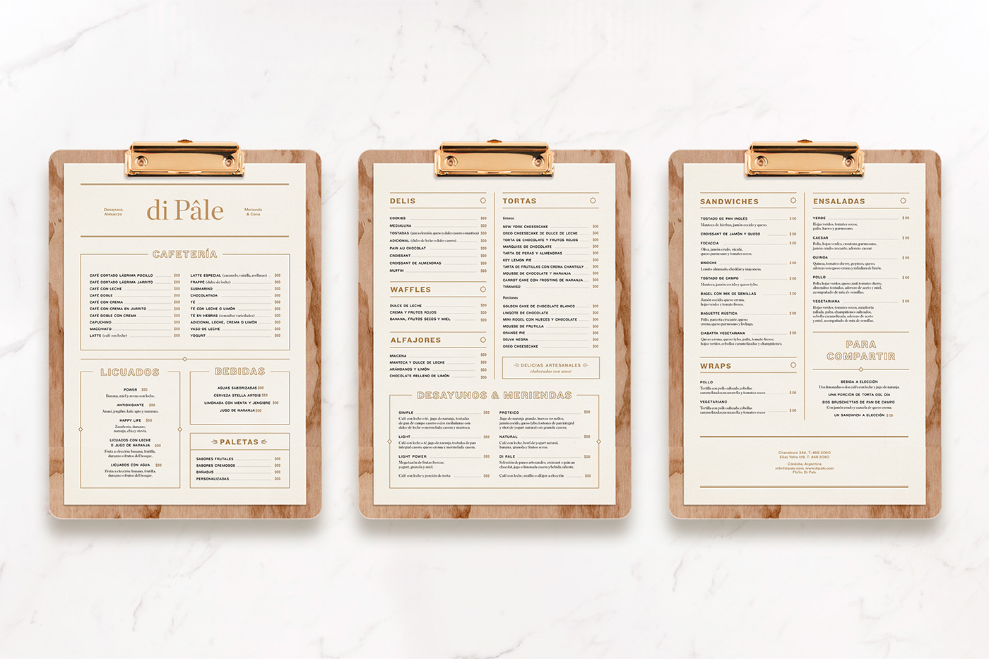


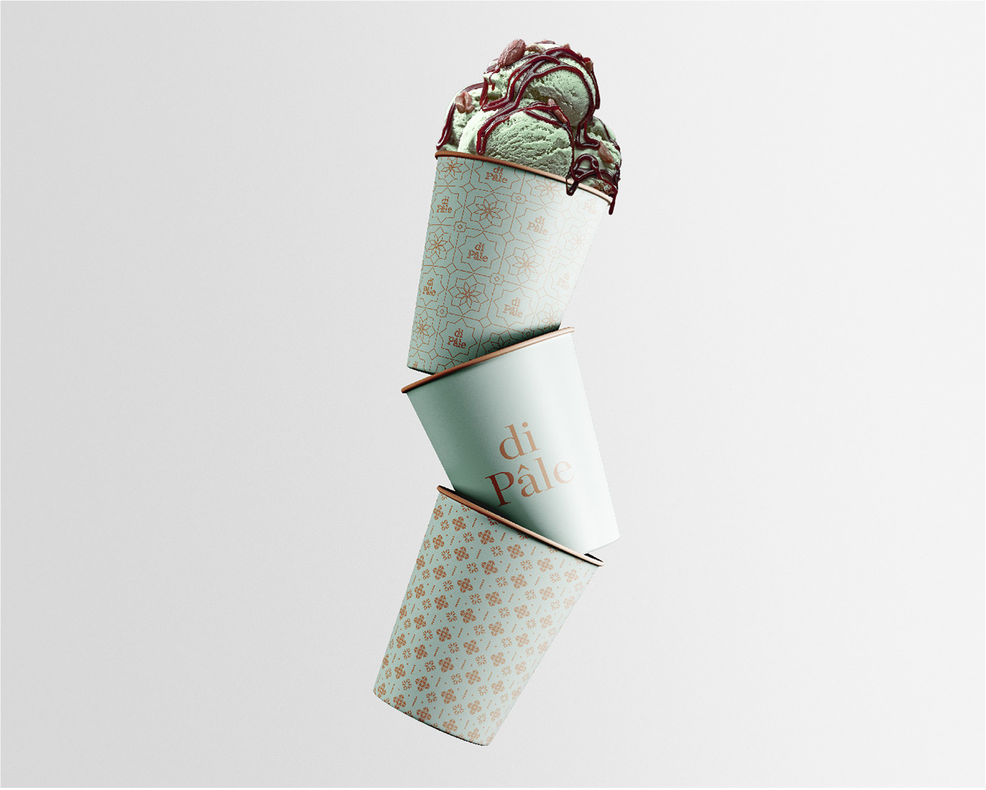
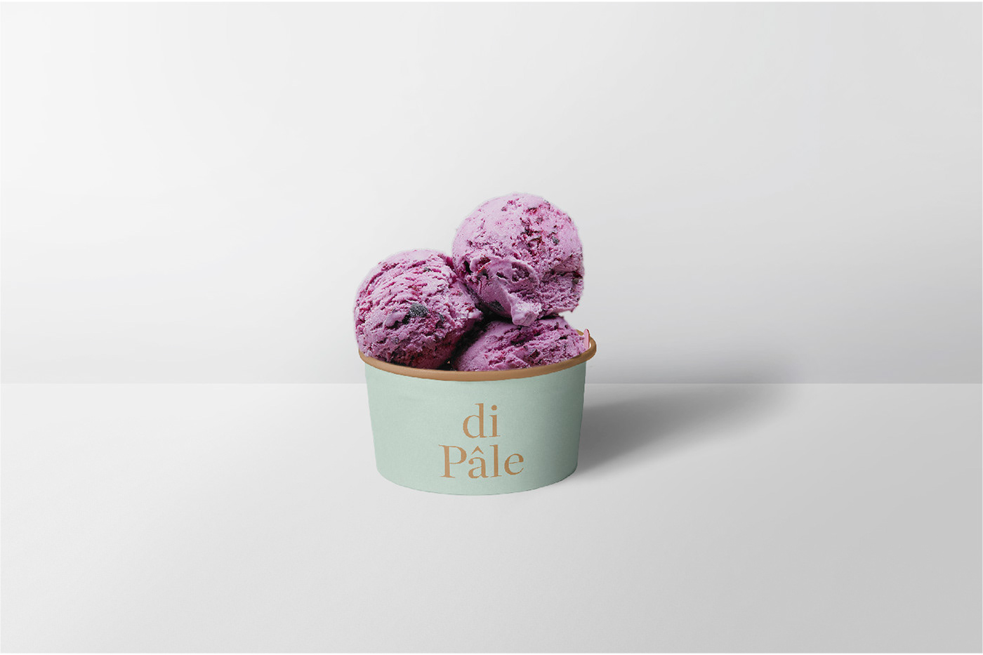
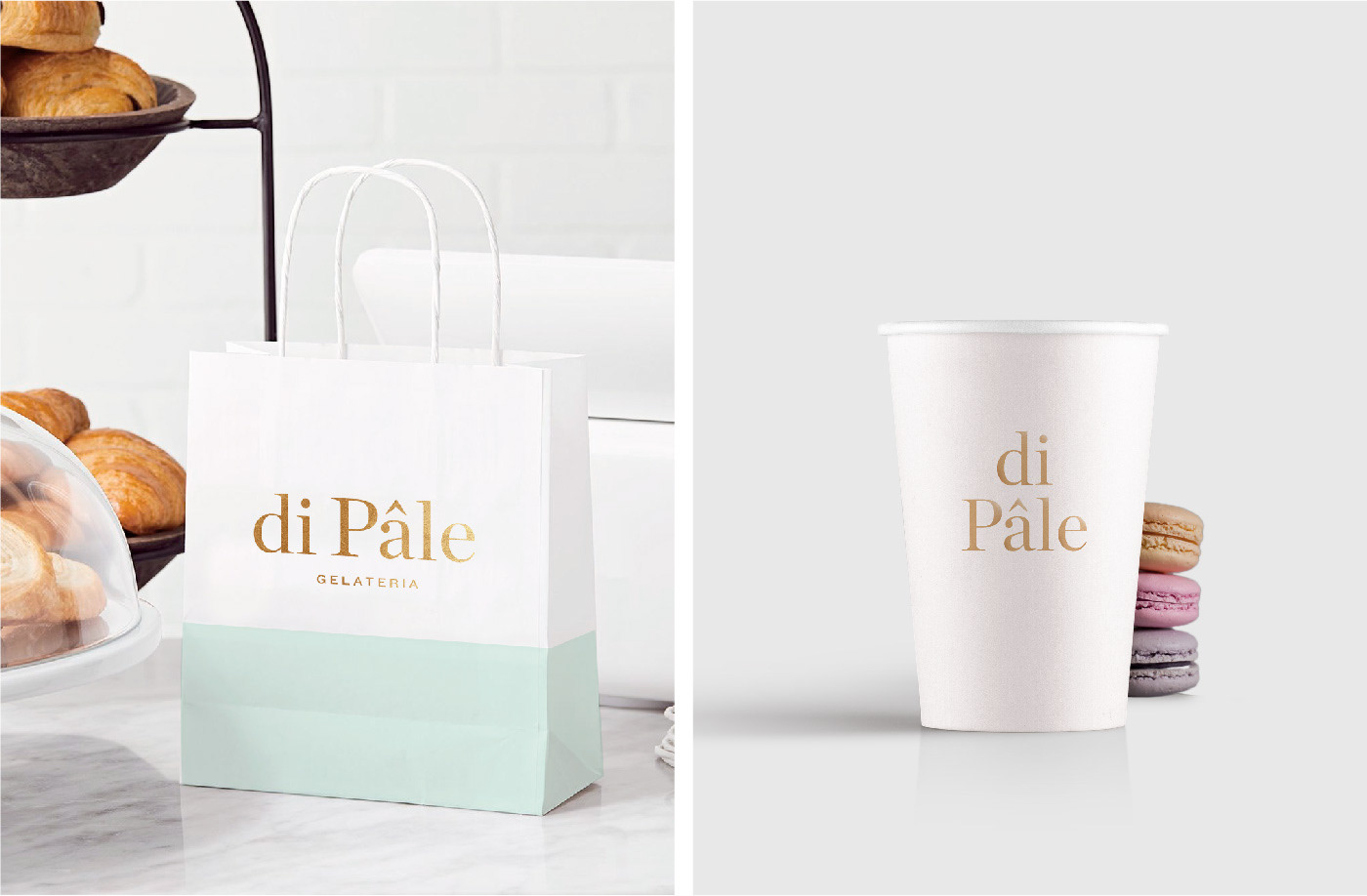
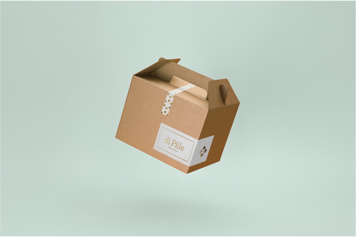
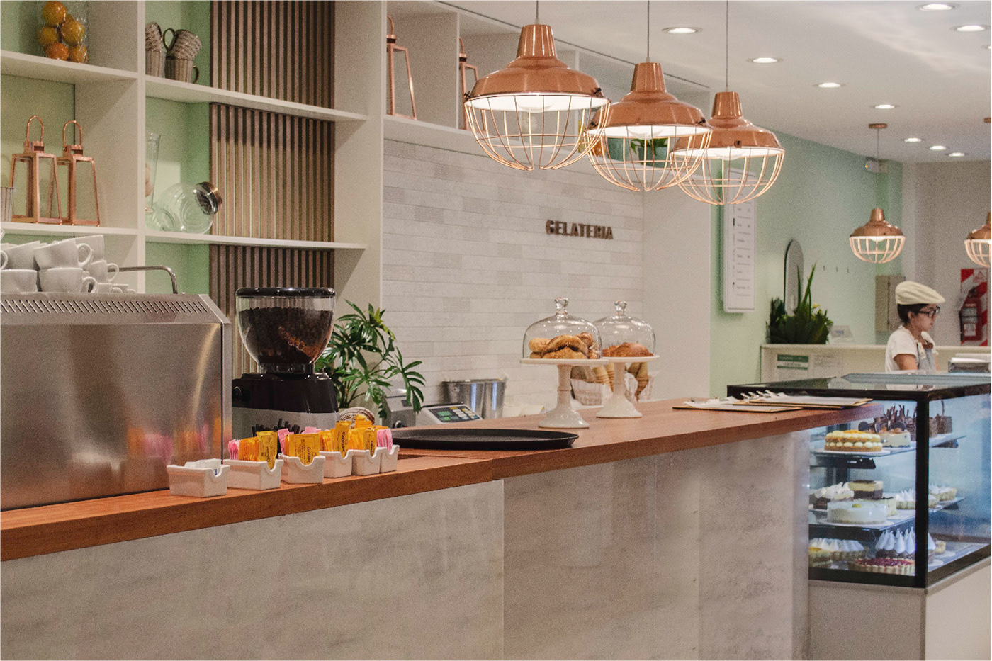
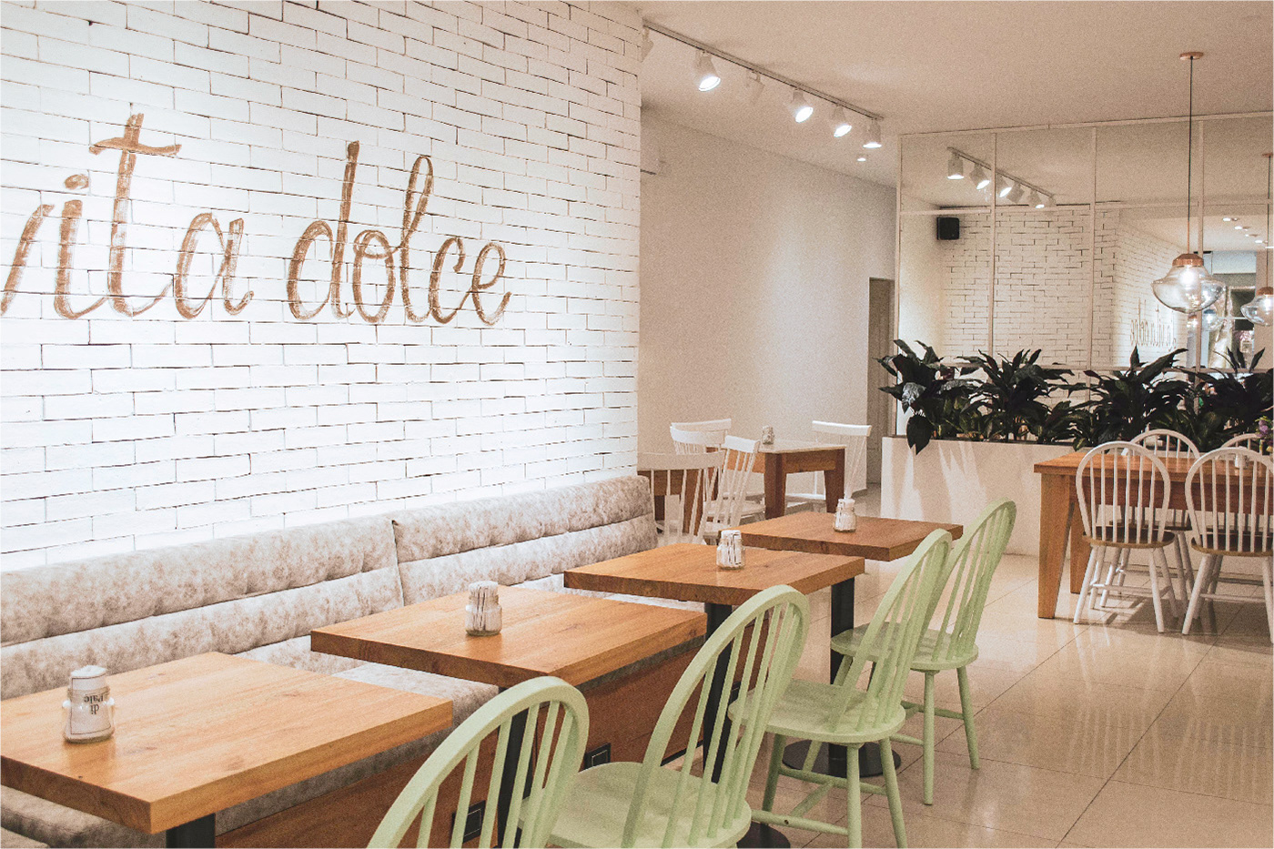
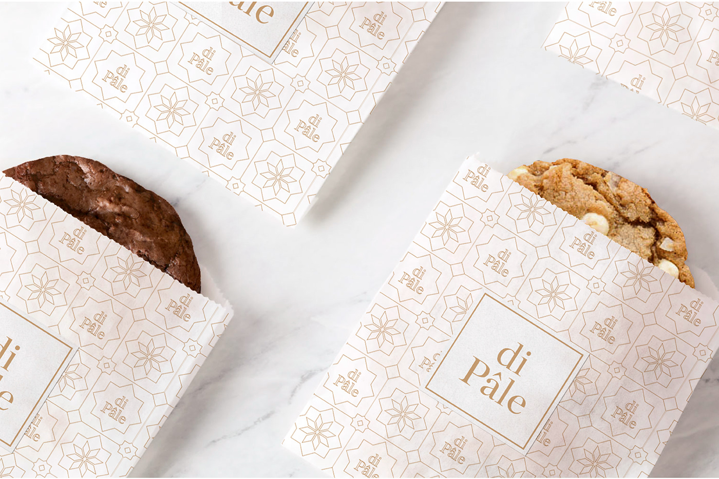
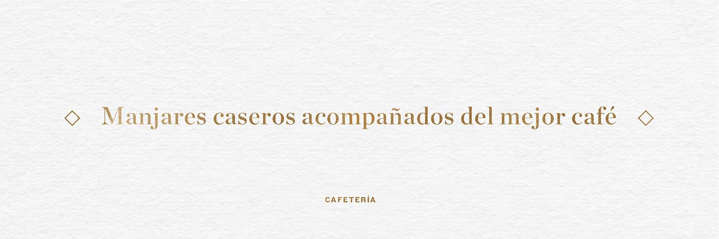
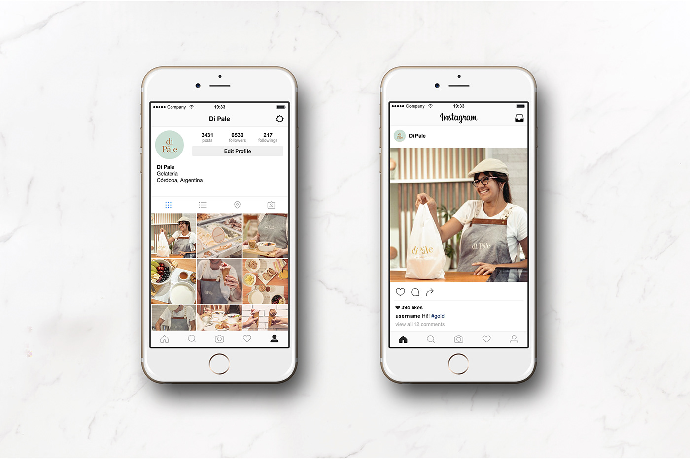

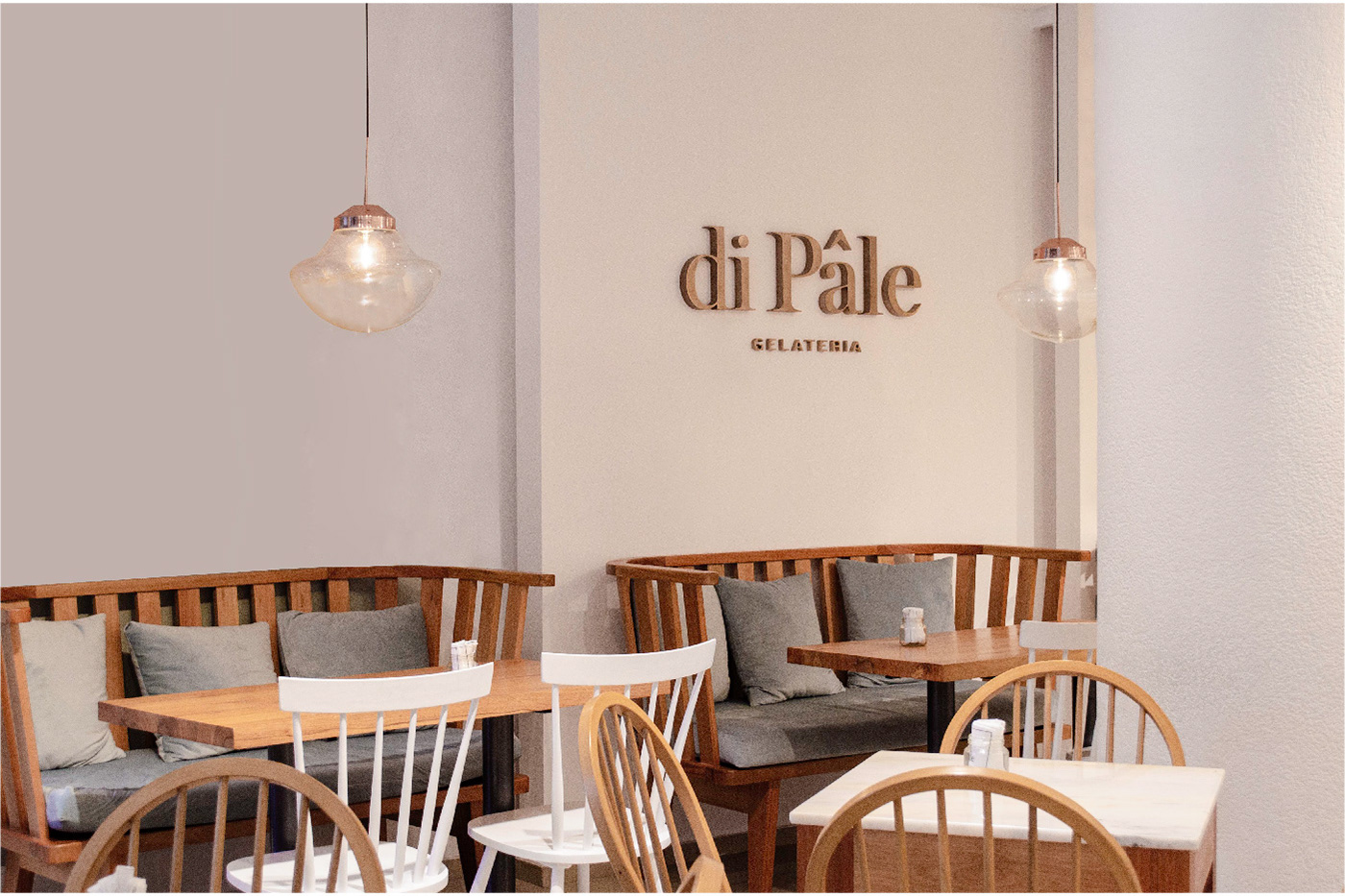
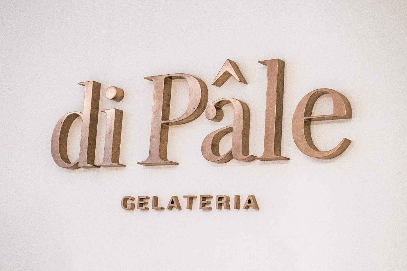
Based in Córdoba Capital, Di Pâle offers a different approach than the other ice cream stores in the area. It brings together the combination of two classics: the authentic italian gelaterie with the delicate french patisserie. The task we were assigned was clear: to create a fresh and delicate brand, that could go beyond the limits of a traditional creamery without losing the italian influence. With this premise, we did naming, brand image, architecture applications and printed stuff. We used pastel colours and a combination of classic typographies to create a warm and harmonic ambience. We proposed a simple yet friendly photographic mood to highlight homemade values.
__
Branding: Melisa Rivas & Manuela Ventura.
Architecture: Gruppo Arquitectos.
Mockups: Rocío Fernández Fuks.