
Trip.com provides one-stop travel booking services in 19 languages through its website and mobile app. We developed a new set of unique and easily identifiable brand guidelines to reflect our brand vision of becoming your “Non-stop travel Mate”. The updated identity has been designed to unify our brand image, convey the stories of our users, and most of all to embody the incredible experience of travel. Now sit back while we do what we do best, taking you on a journey!

Primary Logo / Alternate Logo / Launcher Icon
As part of the brand renewal, we decided to emphasize the domain name itself. By presenting the "Trip", the brand aims to become synonymous with travel itself. Much more importantly, the name itself becomes the brand's biggest asset.
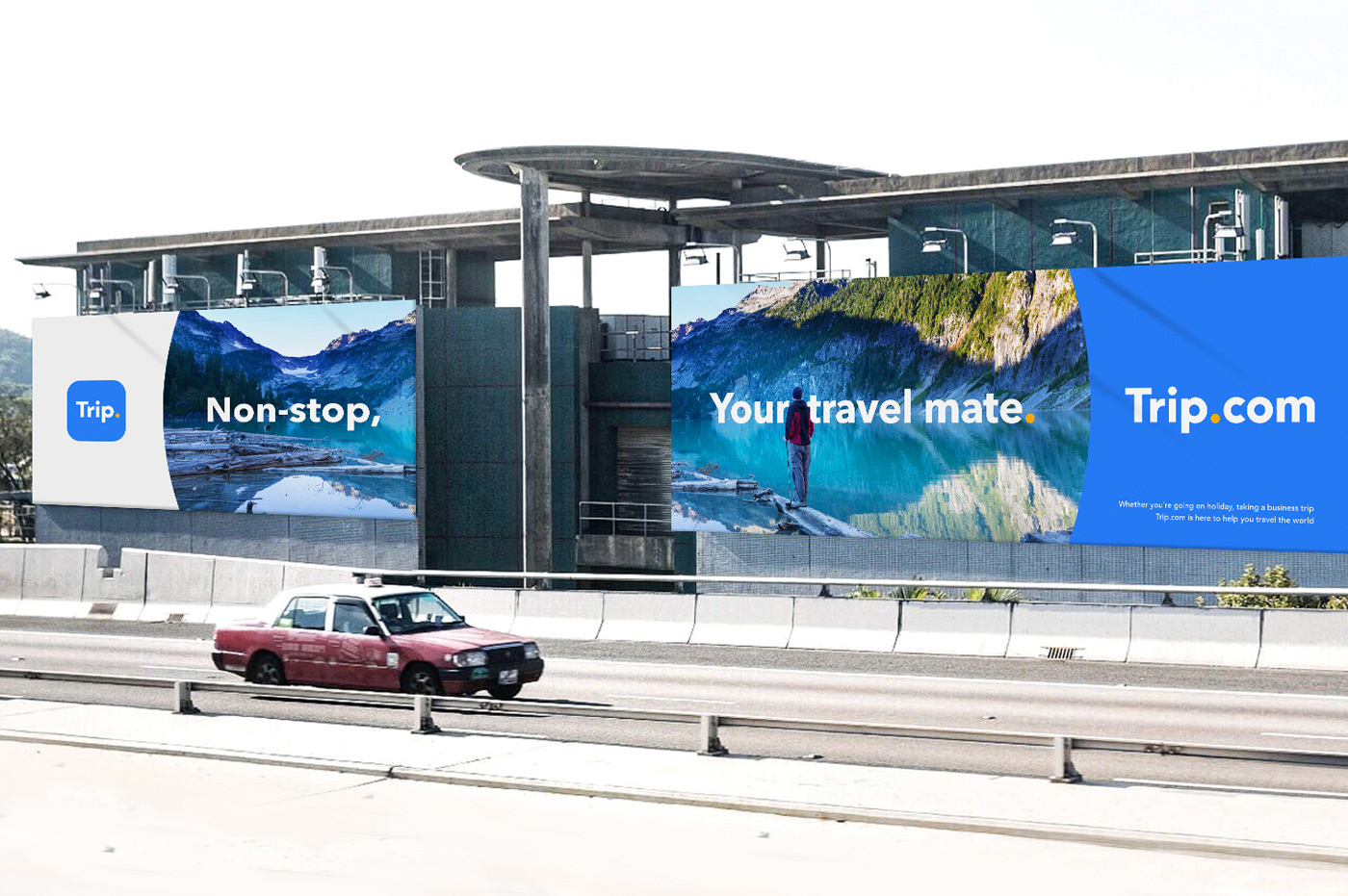
Non-stop, Your Travel Mate
Trip.com is a leading travel solution provider that considers a user's entire traveling experience. As a one stop shop platform, Trip.com is able to cater towards customer's travel needs. Trip.com aims to be present before, during and after a trip, anywhere in the world. Trip.com strives to be the first thing that comes to mind for all consumers no matter where they are or which situation they are in; whether you have missed your flight at the airport, are stuck in a city of fully-booked hotels, or need to book alternative transportation.

Omni Circle
The ‘Trip’ itself is the ultimate value and strength of the brand. It contains countless stories, values, memories and messages that the brand delivers to users. When followed by the "Omni Circle", the Trip.com brand name has its own uniqueness and value. Trip.com aims to provide all things relevant for a "Trip" to our users through different platforms.


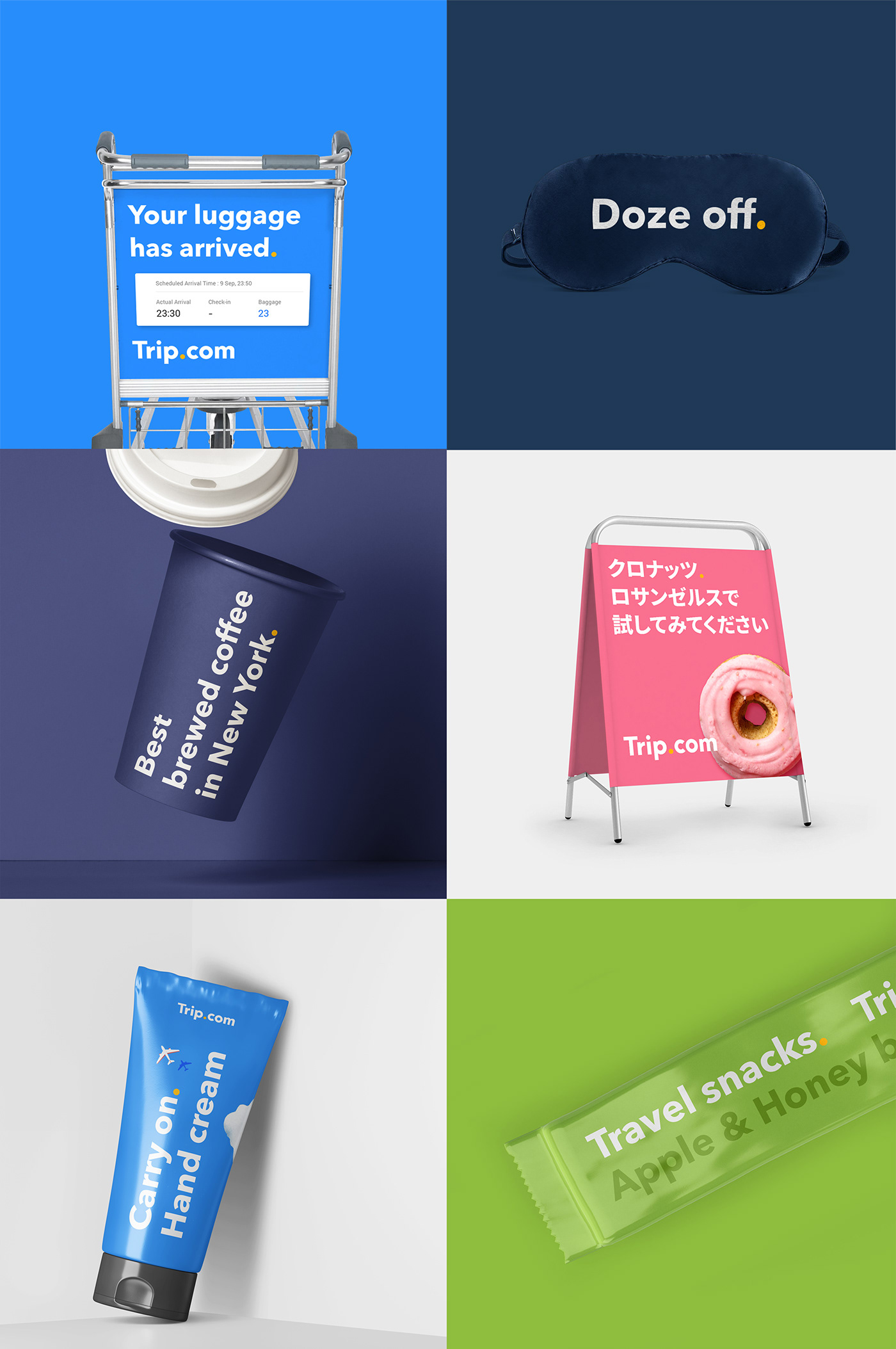
Brand Voice
Our brand language is crucial when communicating to our users. It has been transformed to be clear, simple and bold. The Omni Circle plays an essential role in delivering our unique brand voice.

Typography
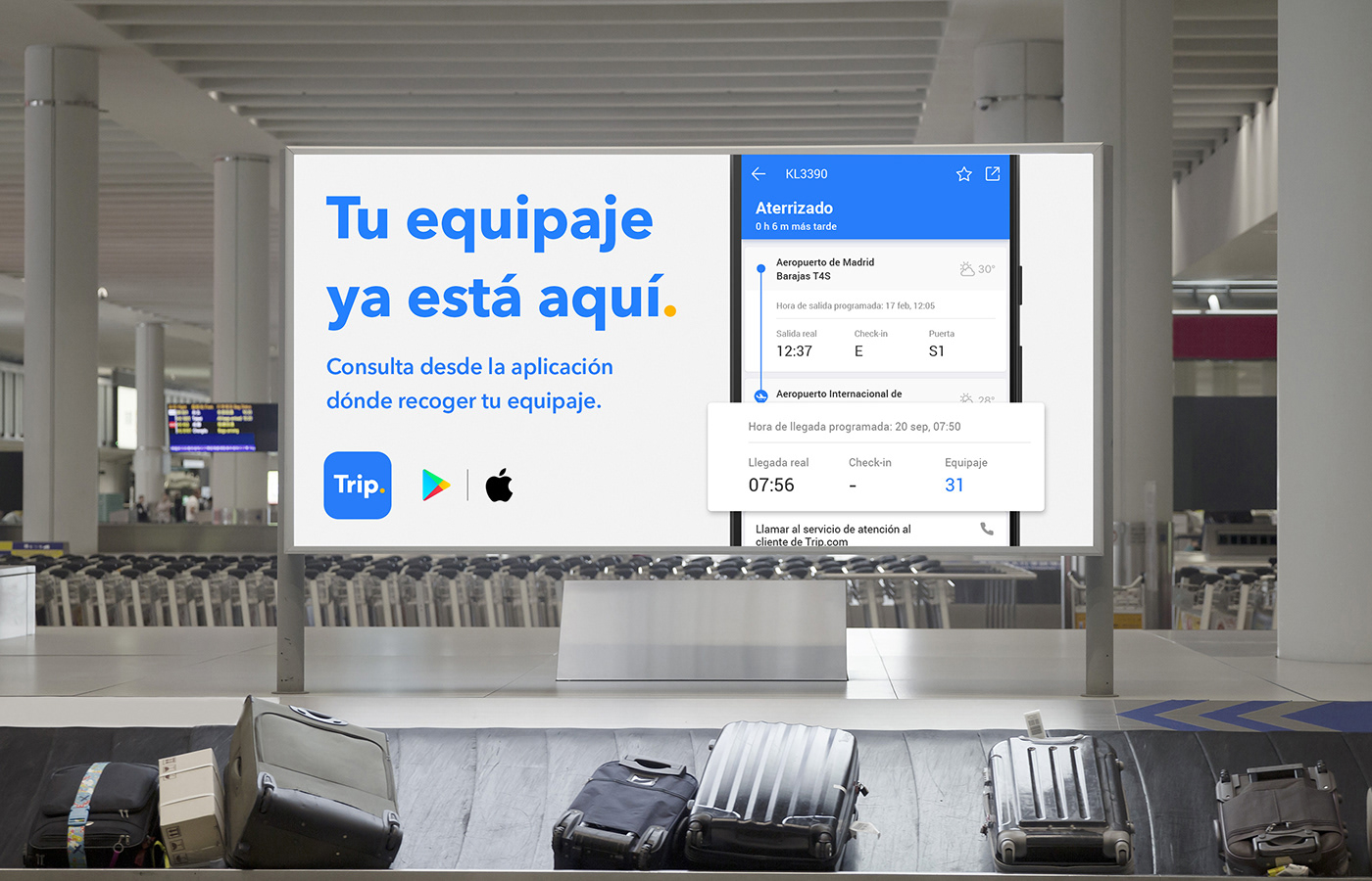
Trip.com supports 19 languages through its website and mobile app. It is important to present a unified look across all our materials, regardless of which language our users speak.


Composition

Brand guideline.
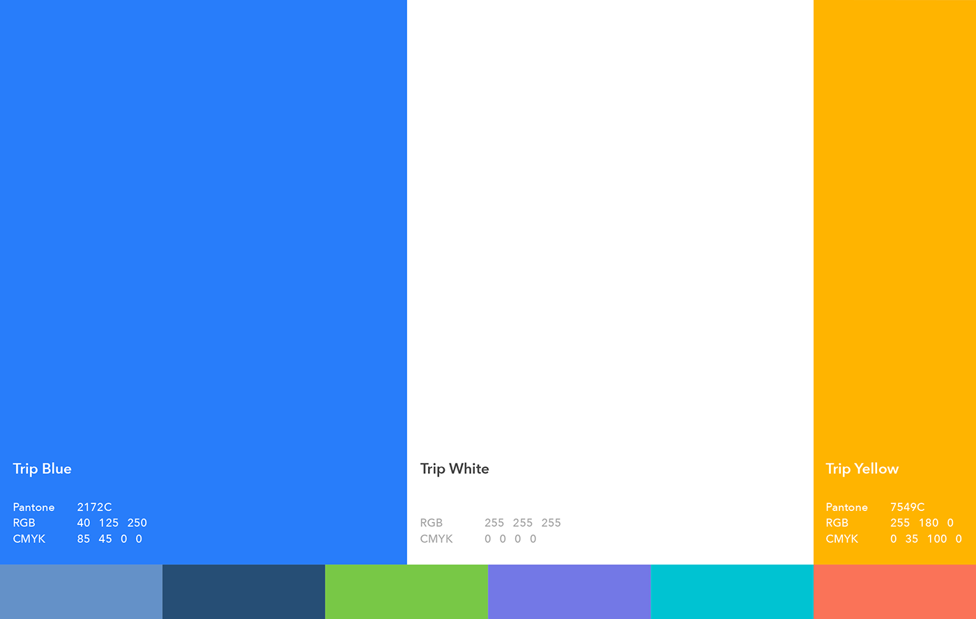
Color palette.
Sub Motif
The extension of the Omni Circle also becomes the sub motif. The Omni Circle is the window which reveals stories and content to users. It helps to broaden the visual expression of the brand, and works together with the main motif.
Iconography
Icon elements have been extracted from the logo and follow the newly developed guidelines.


Illustration
Trip.com’s illustrations represent users from all around the world who live in different countries/regions, speak different languages, are different races and nationalities, and most importantly are unique individuals. Through illustrations Trip.com can convey the wonderful stories of all people.


Motion
On any given trip, a traveler will encounter several departure boards and signs displaying their next destination, showing them what they want to know, and providing accurate information. This reflects how the Trip.com brand talks to people and delivers its messages.


Trip.com
Brand design Renewal
Designed by Trip.com BX design team
