

Brand Positioning & Naming
To present brands with different personalities, a select shop should be a platform which is neutral while keeping its identity. Just like a museum or gallery where thoughts are presented by curators. Therefore we positioned the brand “ the showcase of spirits” to highlight the fact that you do not only obtain quality items but also see through the ideas behind.
We also looked forward to the future of the chemical effects between the selections and the building. An item has its own space as a cube, and so does the space. As a result, we named the brand “Cubix,” a conclusion of the brand’s vision and position.

Logo design
There are three parts of Cubix’ logo:
1. Cube as a square
2. “C” as bike’s wheel
3. Square as showrooms
We extracted these elements to design an abstract logo, adding weight changes like calligraphy. An image of humanity, literature and simplicity.
There are three parts of Cubix’ logo:
1. Cube as a square
2. “C” as bike’s wheel
3. Square as showrooms
We extracted these elements to design an abstract logo, adding weight changes like calligraphy. An image of humanity, literature and simplicity.


Visual Design
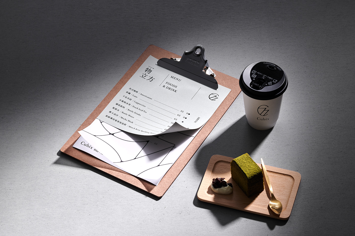
To avoid colliding with the selections, we want to kept the brand visual a lower tone so that it could serve as a platform. We used grey and metallic color as the main platte. The extensional design applied the line and C from the logo. This pattern can extends unlimitedly.
To avoid colliding with the selections, we want to kept the brand visual a lower tone so that it could serve as a platform. We used grey and metallic color as the main platte. The extensional design applied the line and C from the logo. This pattern can extends unlimitedly.


Workscope
Brand strategy development : Lynn
Branding design : Sean
Agency : think™必思維品牌顧問公司
Agency : think™必思維品牌顧問公司


