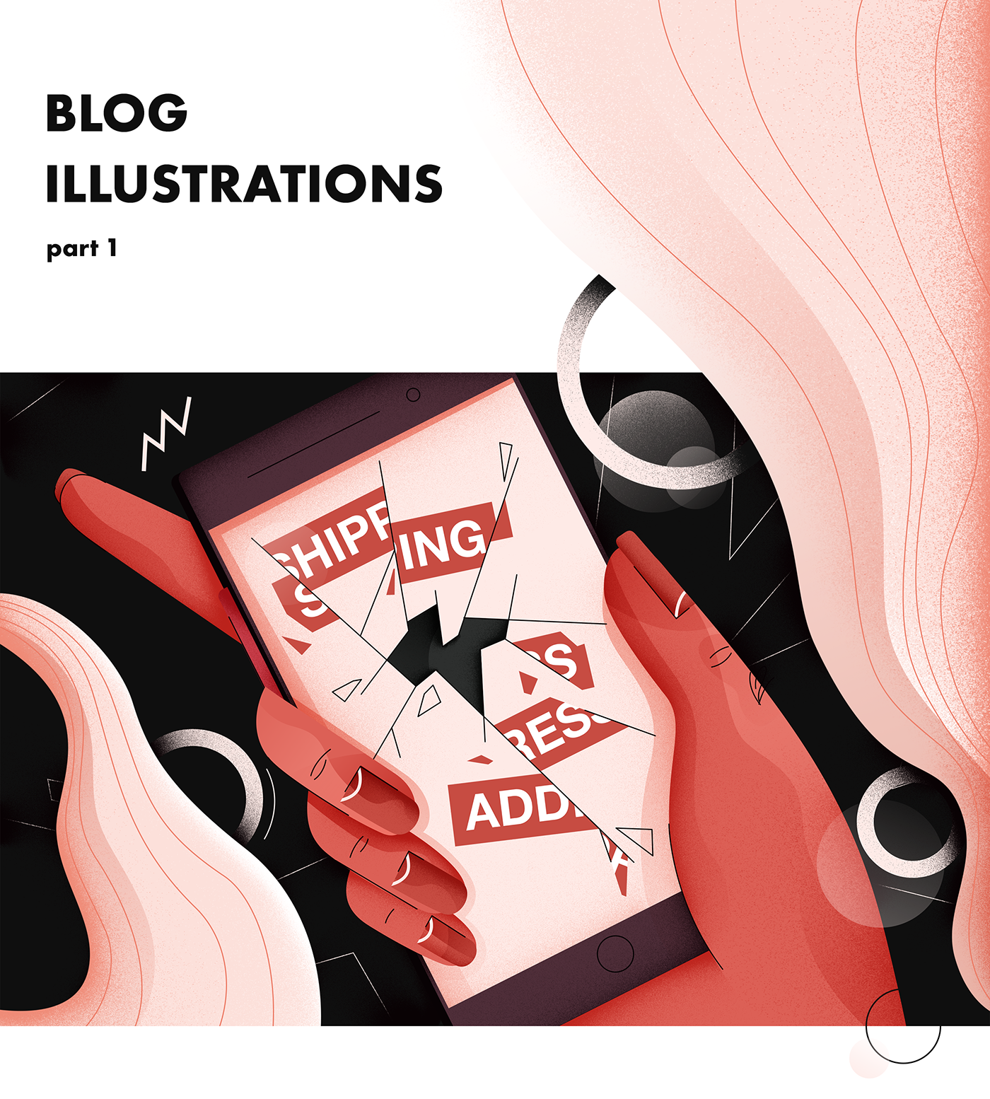

Badly written online shopping apps can drive mad everyone of us. Think of belated courier, damaged packages or lack of the information from the courier company. Illustration attached to the article was supposed to capture emotional state both literally and by interacting with viewer by agressive and disturbing color palette.
by Kondrat Kielar

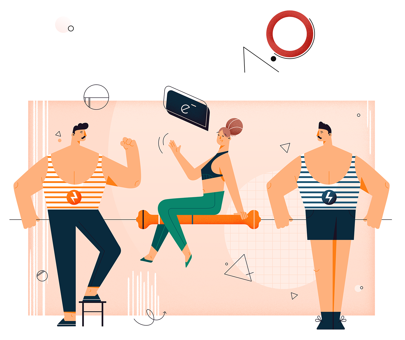
Do you remember illustrations of the physical processes in your school textbooks? They were always based on the ascetic and very abstract concepts. Such an approach allows to focus your attention on the core scientific ideas, but on the other hand, it can discourage you from further studies. In my work I reformulated the concept of physical illustration and applied more varied techniques based on the personifications of particular phenomena. In this article, the physics of resistor was discussed. One needs to apply a specific minimal voltage in the resistor for the transport of the electric charge. In my illustration two athletes symbolize the voltage which should lift up the "weight" of the electric charge represented by an acrobat.

Colour tests

by Kacper Sulisz

Your own business activity can create a real emotional attachment to the company or product. Especially in the startups young enterpreneurs can be emotionally bind with their, created from the scratch, company. This relation can be similar to one established with living being. Protectiveness is often presented in the illustrations by gestures of care and attention. In my work main character, who is a young enerpreneur, protects his small plant, which symbolizes a startup. Whole ilustration is filled with warm pink shades to keep viewer in homy and safe atmosphere.

by Peter Tuszyński

Having experience of working in different companies one can spot some patterns of behavior, which can be misinterpreted as useful. In fact they can often be a threat to the relations between employees. In my work I created a dissonance which is supposed to illustrate the difference between proper and undesirable behavior in the company. Composition of the illustration is made of two areas with different color accents. In addition, the area which corresponds to the bad employee behavior is filled with chaotic components in contrast to the "proper" side, which is specified by the harmonic composition.

Sketching and colour test

by Jakub Ziembiński

In the case of multilevel problems in IT, teamwork is fundamental for the efficient work. Even team with top programmers can fail without proper schemes of teamwork organisation. Scrum framework was a breakthrough in the area of team menagement and now it is one of the main tools of every software house. In my illustration I was trying to capture the main idea of the Scrum framework, which is based on dividing of complex problems into groups of smaller tasks.
Thank you for checking us out!
Looking for a design and development partner?
Contact us at growth@withintent.com
See more from us below:

