ASSEMBLISM
Assemblism is a small team of consultants based out of New York city. They specialize in recommending technology strategies for better customer experiences.
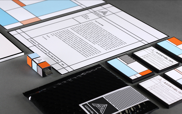
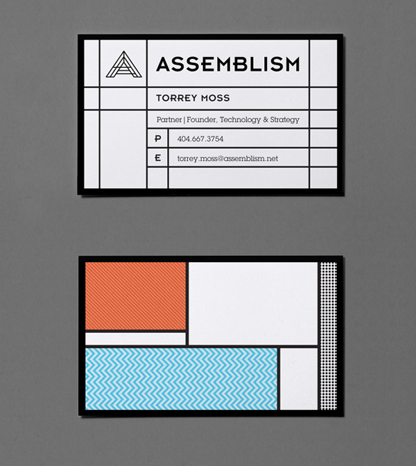
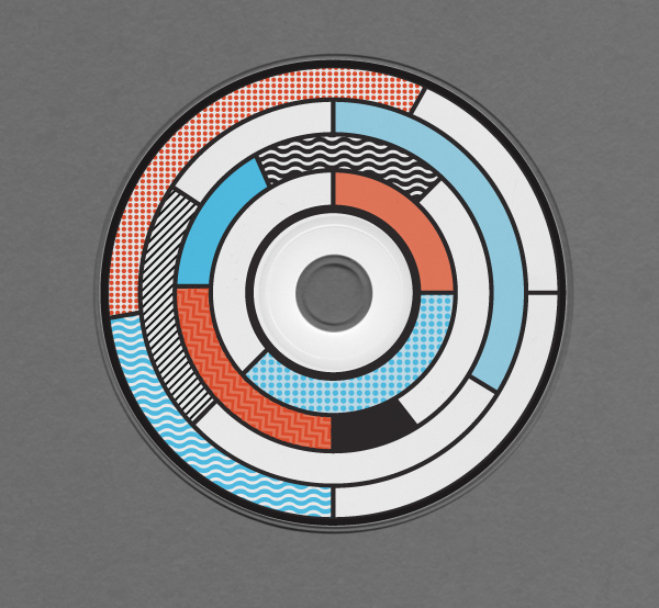
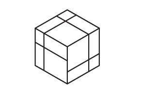
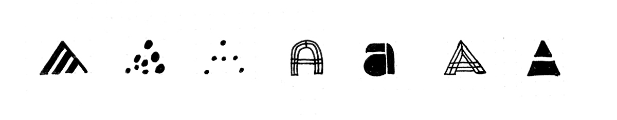
Assemblism needed an identity that stood out in a market flush with tech startups. The branding opts for simplicity and minimalism which is stark and unique when compared with the pastels, gradients, embellishments, and fake textures commonly found in the rest of the web-based and tech market. This simple approach is also a nice nod to what Assemblism does for their clients: build simple teams, strategies, and processes for better customer solutions. The logo is a simple capital A inspired by blueprints, housing frames, and maps. There is also an animated version of the logo that has the negative spaces of the "A" icon filling with different colors and patterns. This animation is a way to introduce a digital aspect to the identity, but also to represent the way that Assemblism is able to adapt and be flexible for their wide range of clients each with their own unique problems.
CLIENT: Assemblism
ART DIRECTION & DESIGN: Michael Molloy
2012
Assemblism is a small team of consultants based out of New York city. They specialize in recommending technology strategies for better customer experiences.
Assemblism needed an identity that stood out in a market flush with tech startups. The branding opts for simplicity and minimalism which is stark and unique when compared with the pastels, gradients, embellishments, and fake textures commonly found in the rest of the web-based and tech market. This simple approach is also a nice nod to what Assemblism does for their clients: build simple teams, strategies, and processes for better customer solutions. The logo is a simple capital A inspired by blueprints, housing frames, and maps. There is also an animated version of the logo that has the negative spaces of the "A" icon filling with different colors and patterns. This animation is a way to introduce a digital aspect to the identity, but also to represent the way that Assemblism is able to adapt and be flexible for their wide range of clients each with their own unique problems.
CLIENT: Assemblism
ART DIRECTION & DESIGN: Michael Molloy
2012

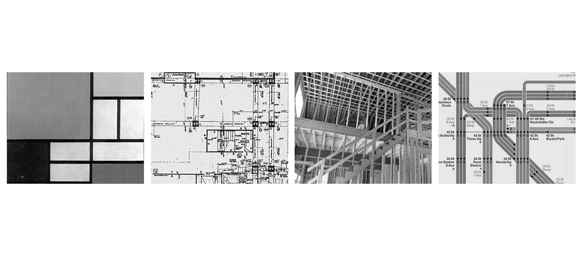
Logo inspiration & Sketches


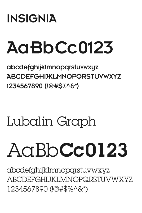
Corporate typefaces