


LPO arkitekter
Brand identity
LPO arkitekter, based in Oslo with offices in Lillehammer and Svalbard, has since the opening in 1983 been one of the leading architect firms in Norway.
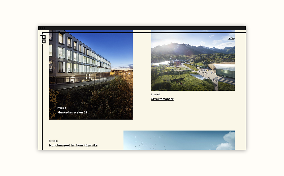
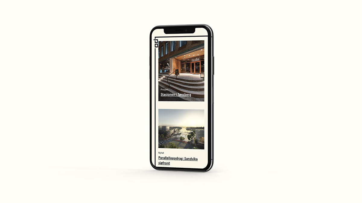
LPO wanted a new visual identity and web page that could reflect an office heading for the future. The company has grown considerably in recent years and needed better tools for optimised communication. LPO is characterised by their democratic structure. All employees are offered partnerships, which creates stronger ownership and high ambition in every project. The architects are the engine of LPO, and if we are to choose one term that describes the office it has to be energy.
With three offices and nearly 100 employees it was crucial to create an identity that unifies all parts of the office, and to develop a visual whole that says something about the LPO community culture, and a visual system that’s easy to use and apply.


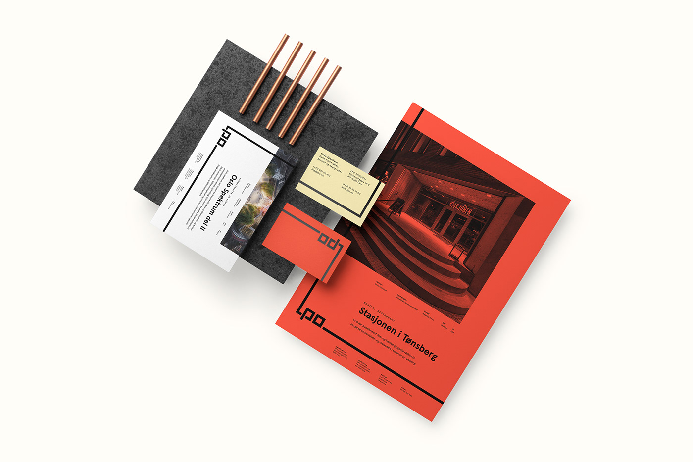
Tank started with a facelift of the old logo, harmonising the shapes and space. We exchanged the widely used corporate blue to an energetic orange that much better reflects the office's power and will. However, the most important part of the project was to introduce a dynamic frame that can represent the flexible and generous LPO community. The frame can be used in different thicknesses, dependent of the size of the logo, as a whole frame or as a bleeding line. The primary colour palette is strong and simple, black, orange and beige.


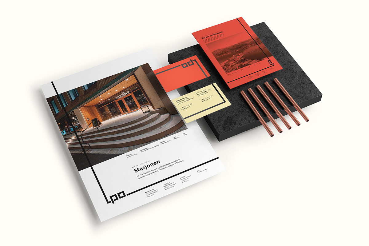


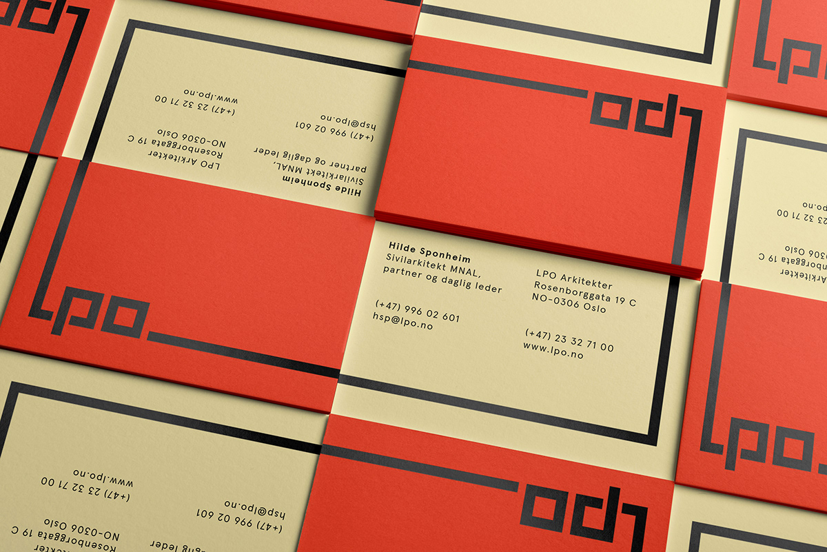


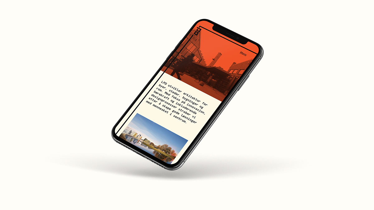


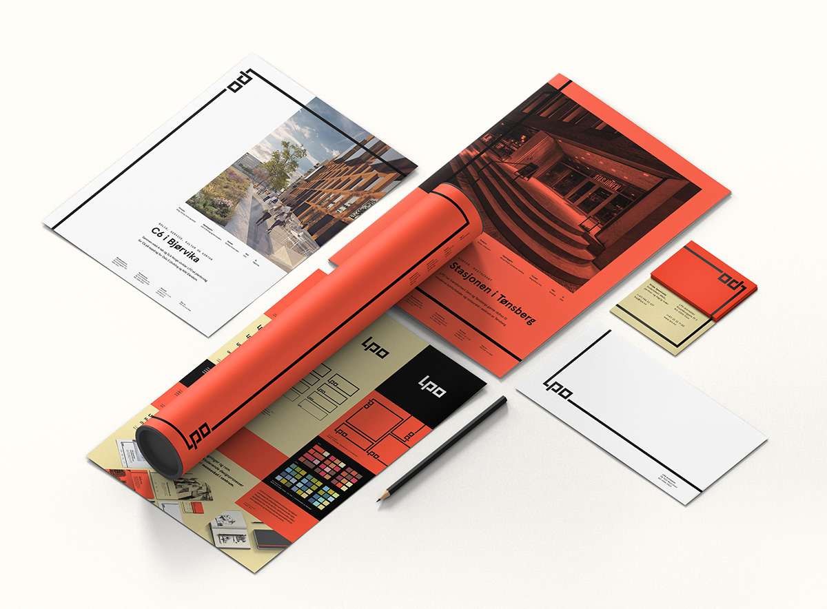
LPO now has a unifying visual identity that gives power and confidence to the office, a visual expression that facilitates great flexibility for both print and digital solutions.
Visit the website at www.lpo.no


