
C l i e n t:
HARDYZ, business IT solutions integrator. The brand positioning is as follows: perfecting oneself to perfect one’s clients.
O B J E C T I V E:
Developing a corporate brand style that reflects the dynamic nature of the team, the ideas and products that can adapt to fit any needs that small and medium-sized businesses may have.
S o l u t i o n:
The idea of transformation is integrated in the positioning. We got help from Autobots and Optimus Prime, their leader, and our reference was the transformation sequence showing a blue and red semi-truck transform into a robot. This was “Transformers”, one of the three final concepts which was chosen.

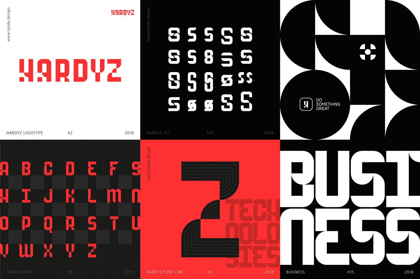


From the very start, we decided to create the main elements of the brand style with animation in mind.
For instance, we added shifting parts allowing it
to transform into its constituents and back into
a complete form again, or into other “emphasized”
words adding new meanings:
H A R D Y Z — T E A M — B U S I N E S S
To implement this seemingly simple idea, we had to develop a typeface from scratch, but now it gives us additional opportunities to use animation in all digital formats.


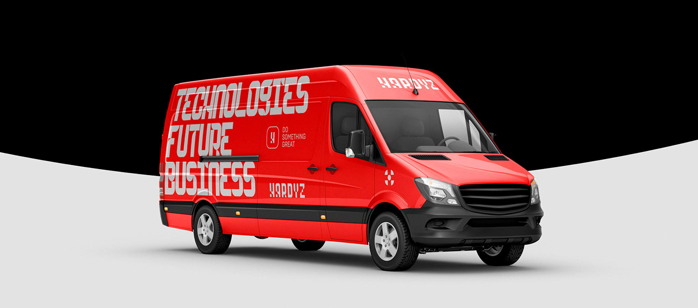
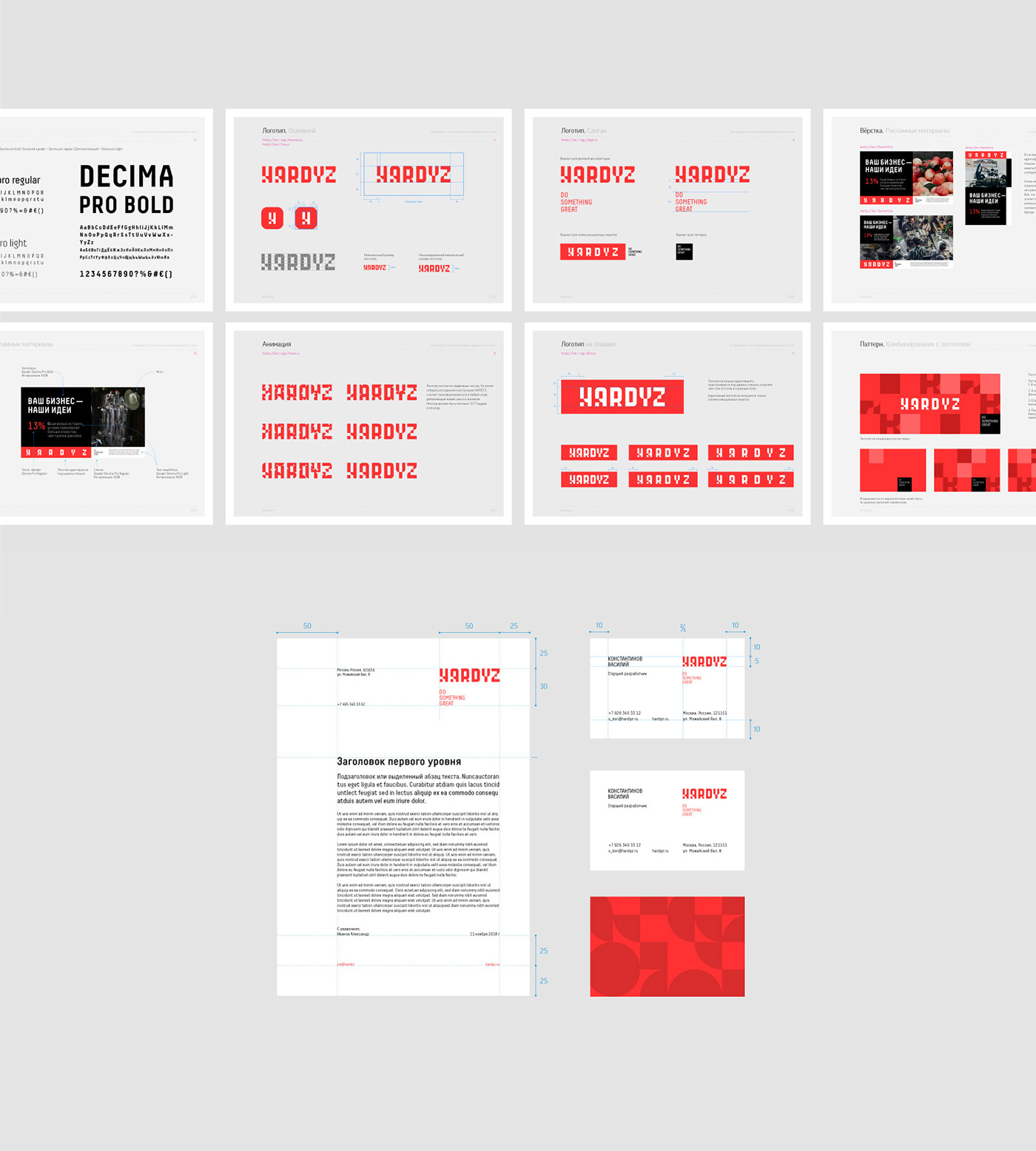
In layouts (Indoor, POSm, digital), we use the brand typeface
in the logotype and emphasized words, and the Decima pro typeface in message headers.
In essence, emphasized words work as a brand pattern or as additional graphics. They may be used in conjunction with other graphics to apply branding
to both large areas and small objects.


Team
Strategy: AlYona Shebarova
Animations: Alex Frukta
Animations: Alex Frukta
Art Director: Maxim Alimkin


