CHROMIC. Visual identity and graphic design for a Horizon 2020 European funded project
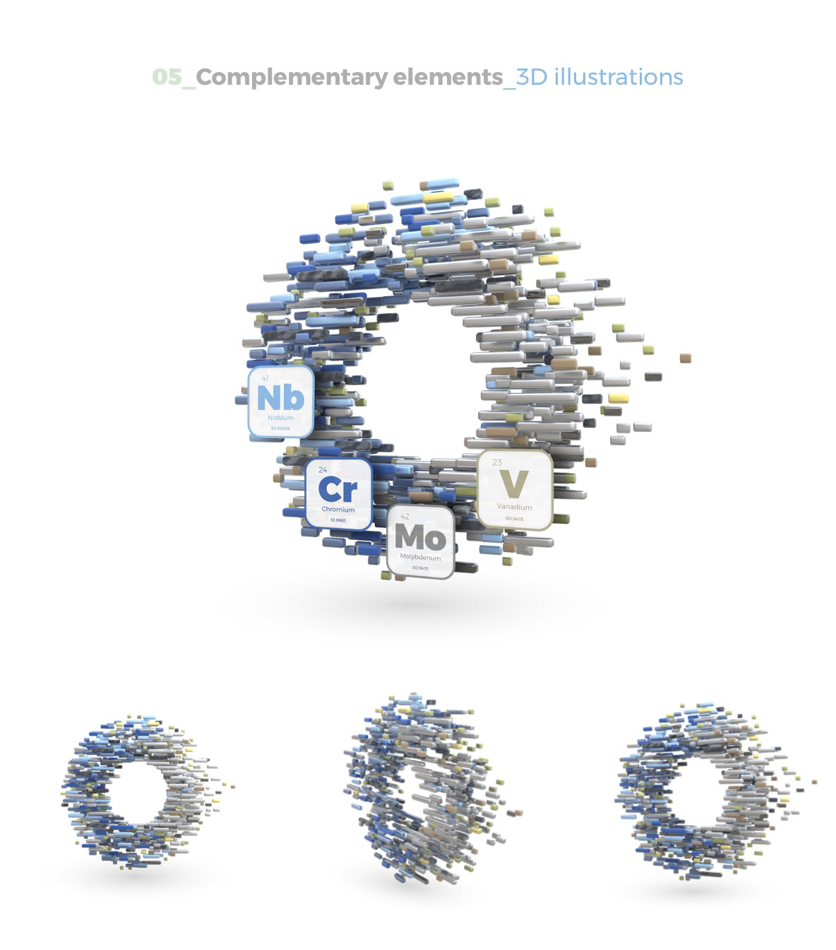
CHROMIC is a research and innovation action financed by the European Commission under the Horizon 2020 Programme. The CHROMIC project aims to develop new processes to recover chromium, vanadium, molybdenum and niobium from industrial waste, through smart combinations and new technological innovations. This will help reduce the CO2 emissions of metal production and reduce the environmental impact of its wastes. CHROMIC will contribute to sustainable materials management by recovering resources from waste and avoiding primary extraction.
The project involves 5 research centers, 5 industrial partners (4SMEs and 1 large company) and 1 university from 5 different European countries (Belgium, Germany, France, Slovakia and Italy).
The project involves 5 research centers, 5 industrial partners (4SMEs and 1 large company) and 1 university from 5 different European countries (Belgium, Germany, France, Slovakia and Italy).
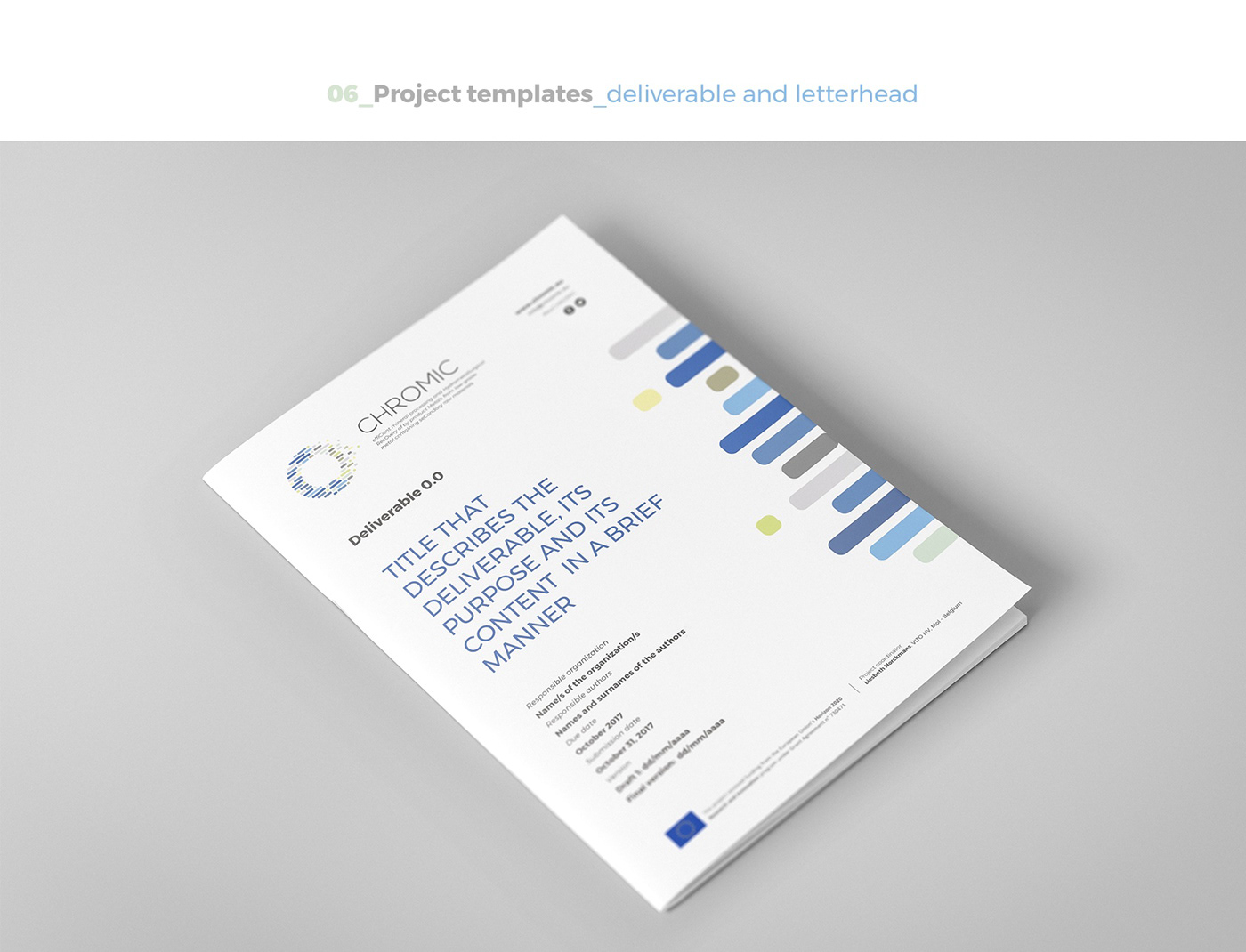
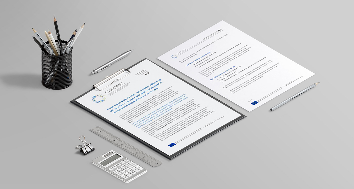
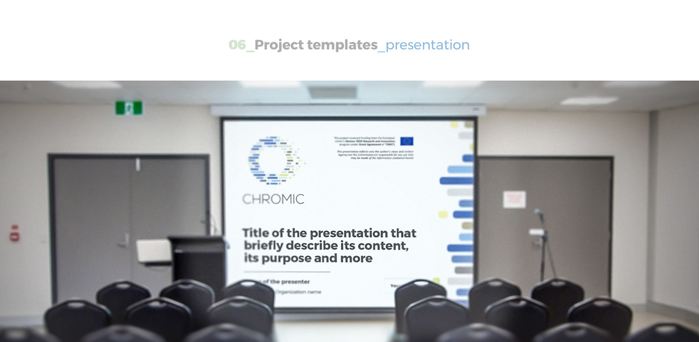
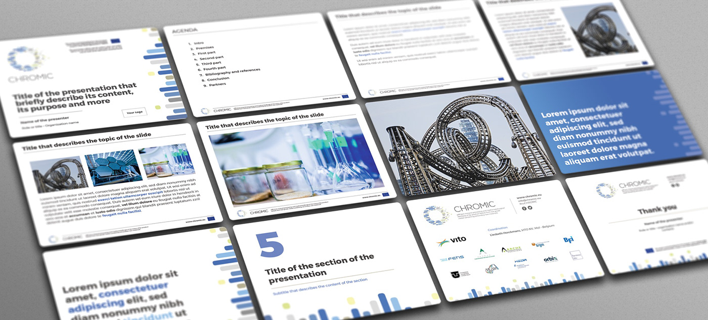
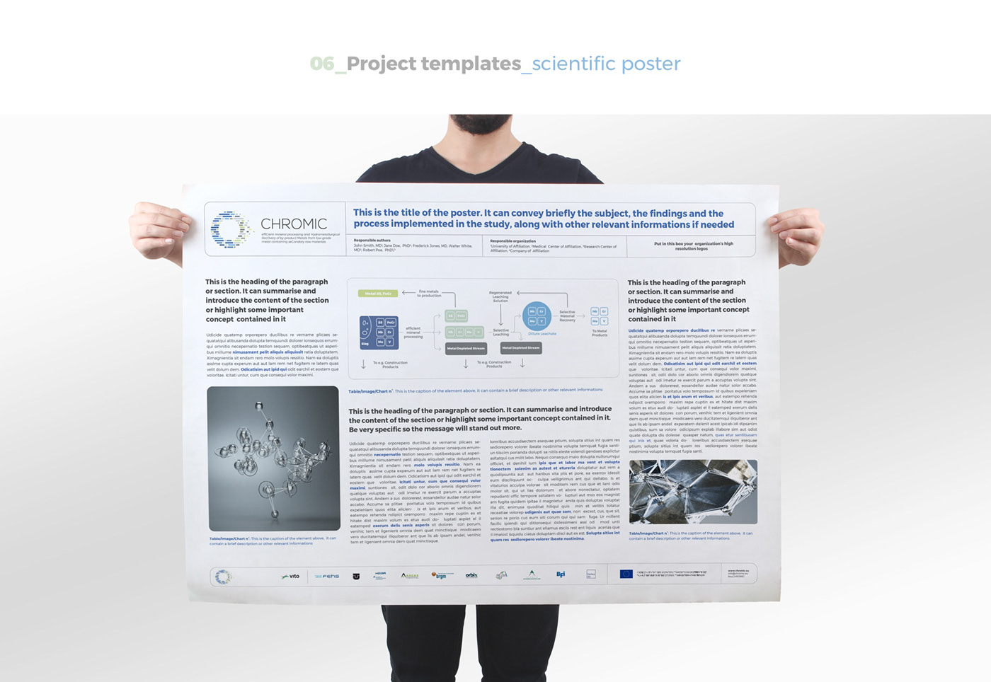
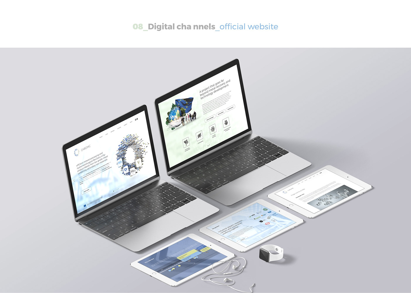
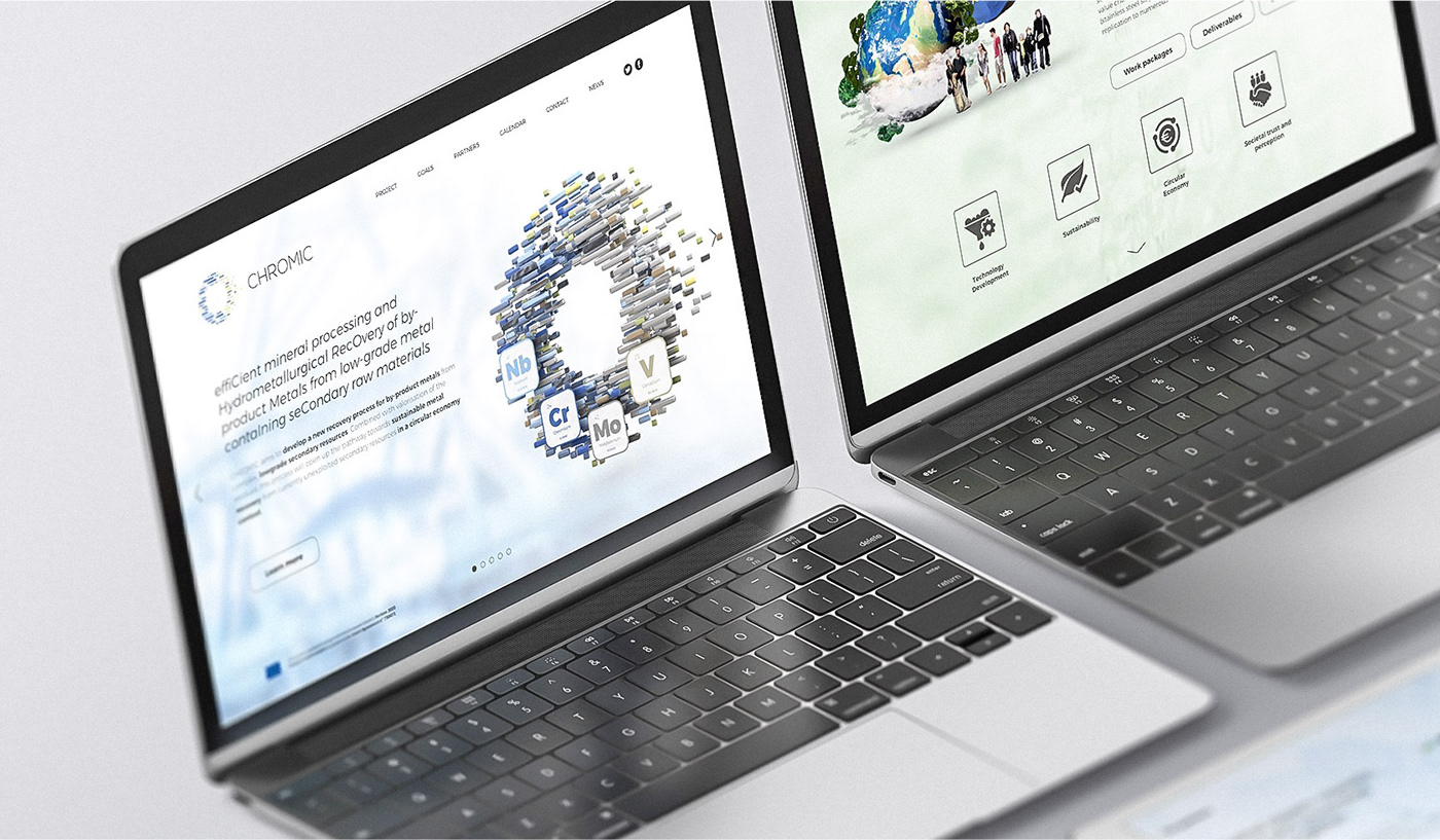
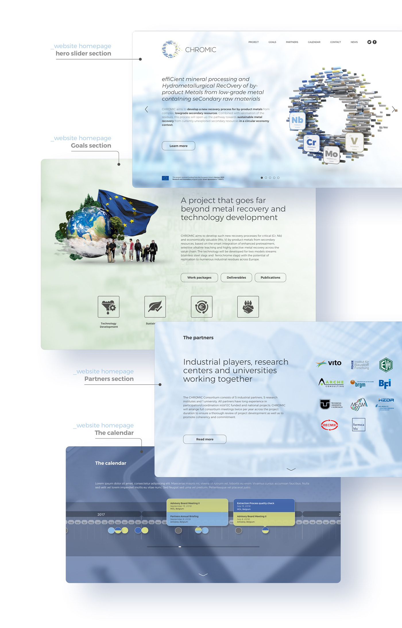
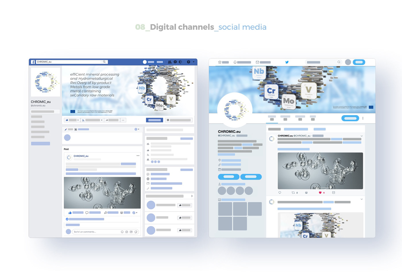
Formicablu is the partner in charge of the communication activities, and as for the SMART-map project, they asked me to design all the visual identity and the visual material for both printed and digital applications. To complement my design capabilities and add a new perspective in the process I partnered with Roberto Zizza, a graphic designer based in Milan, and worked in collaboration with in him on every phase of the project.
Our work started by analyzing the structure and the aim of Chromic. Metal recovery from industrial waste, is a very technical goal yet it fosters also very important, non-technical aspects like sustainability and societal trust. The main goal was therefore to develop a visual language able to be both elegant and technical but also very friendly and relatable.
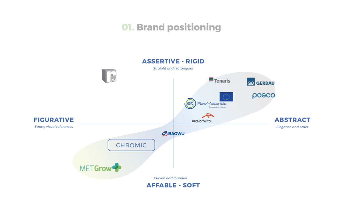
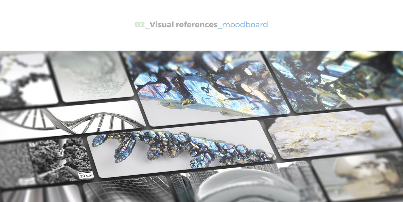
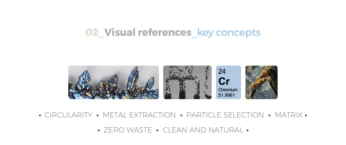

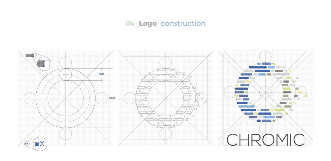
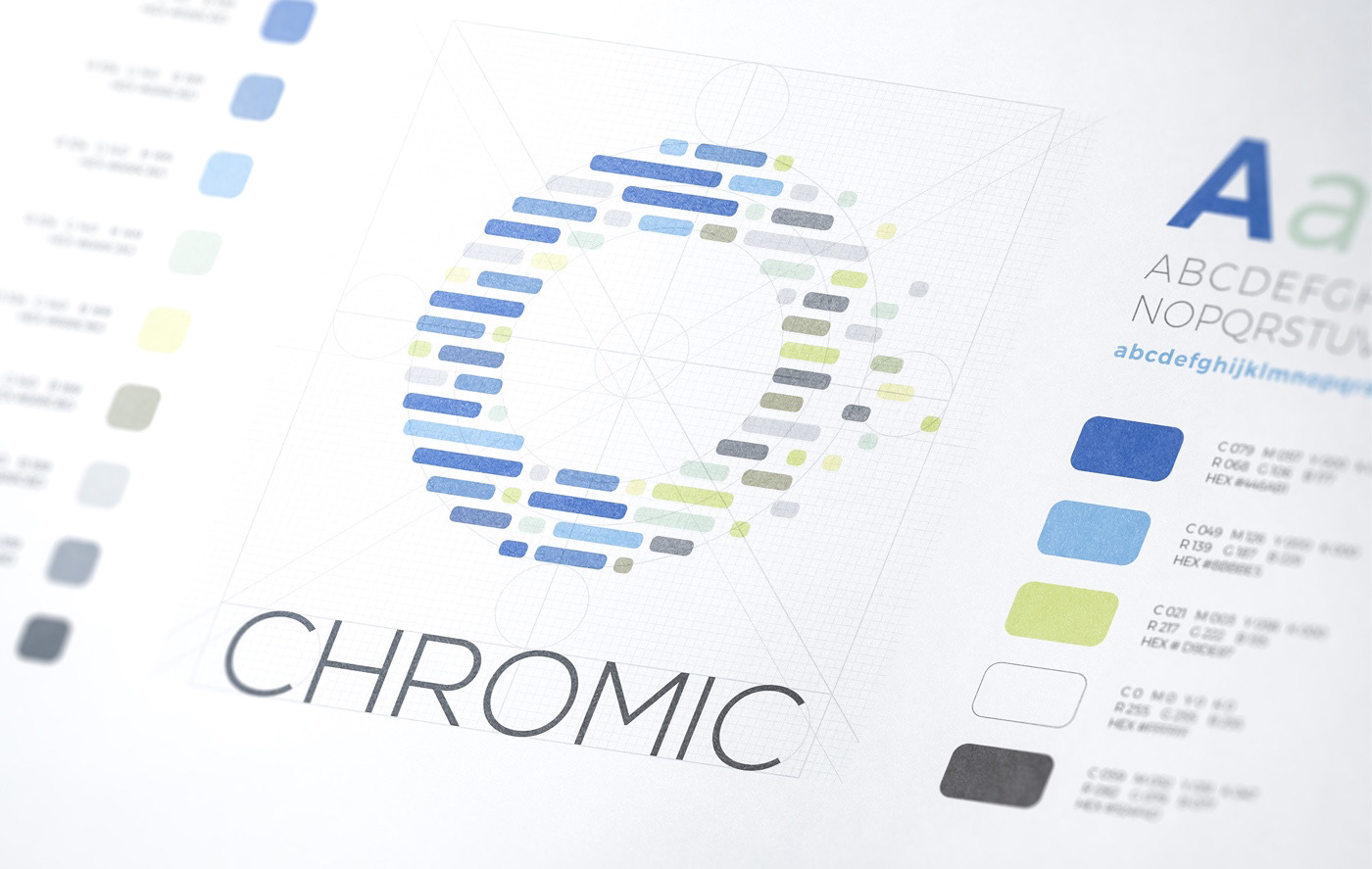
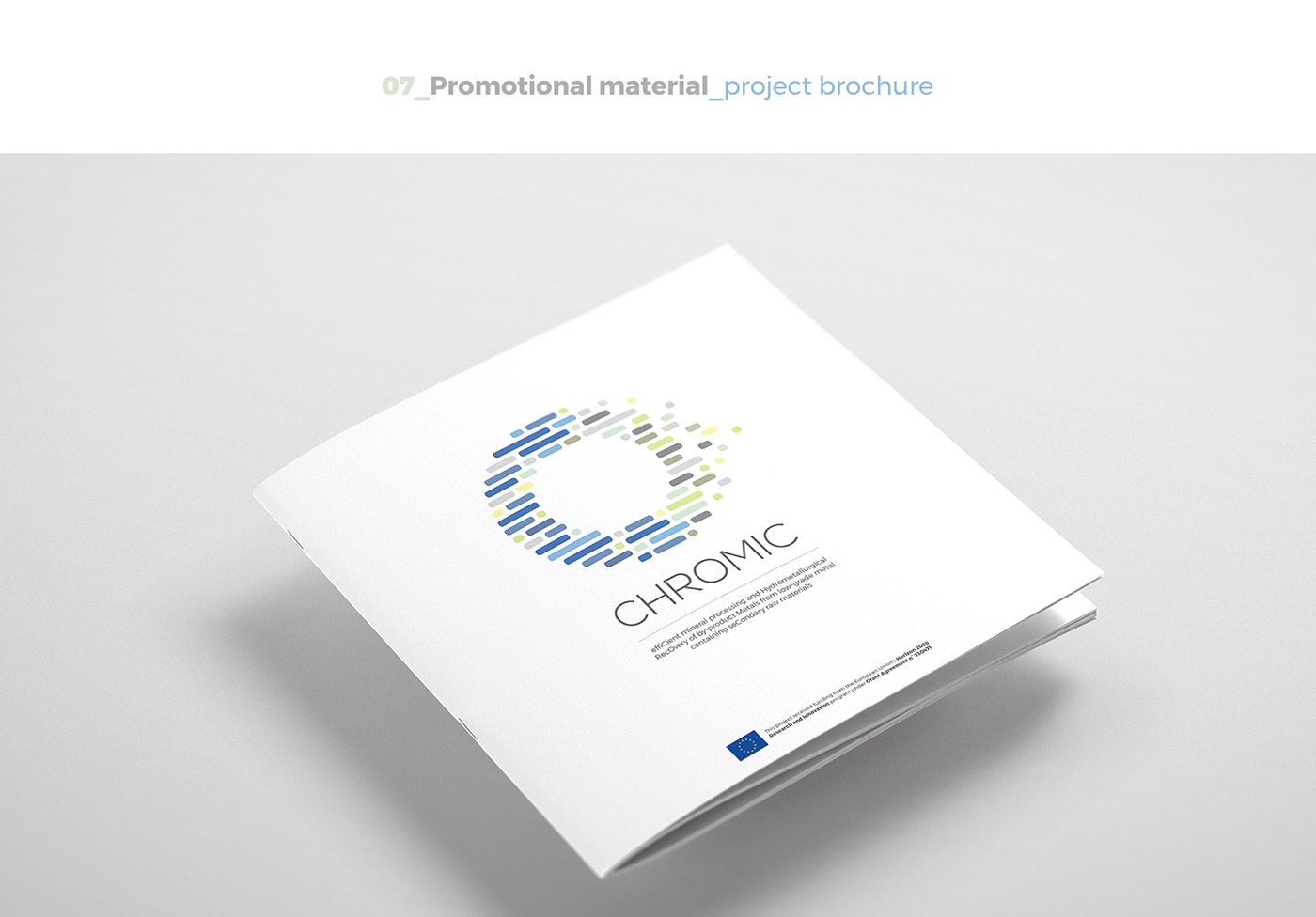
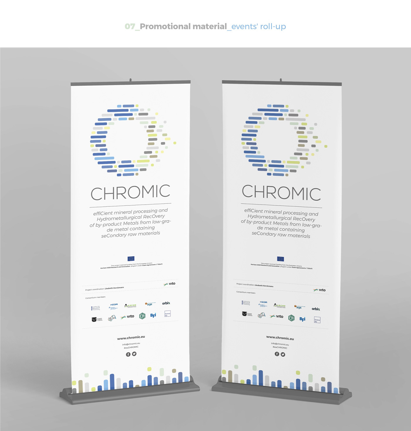
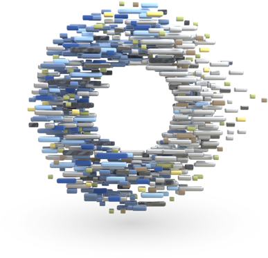
The CHROMIC logo depicts the highly technological and innovative roots of the project by illustrating a process of particle extraction and material separation. Furthermore, with a circular shape and a very characterized color palette, it also suggests more profound (and very fundamental) aspects of the project, such its circular and inclusive approach and its deep commitment to environmental sustainability. The logomark subtly forms a “C” shape with the blue segments in the left side of the circle in order to maximize even more the connection between the logo and the name of the project.




THANK YOU


