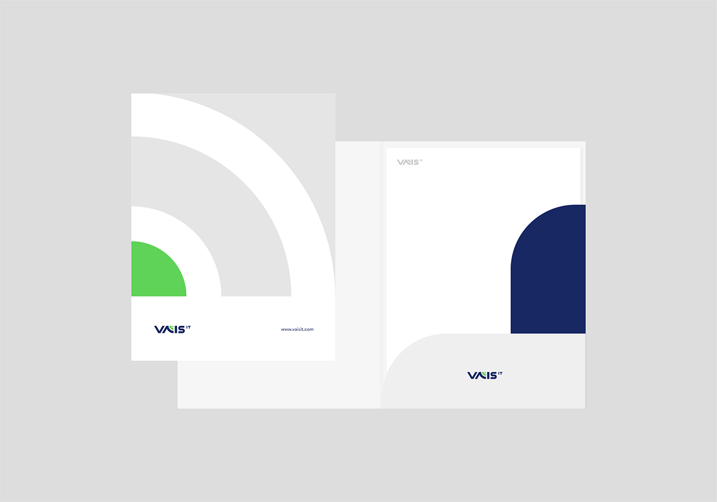
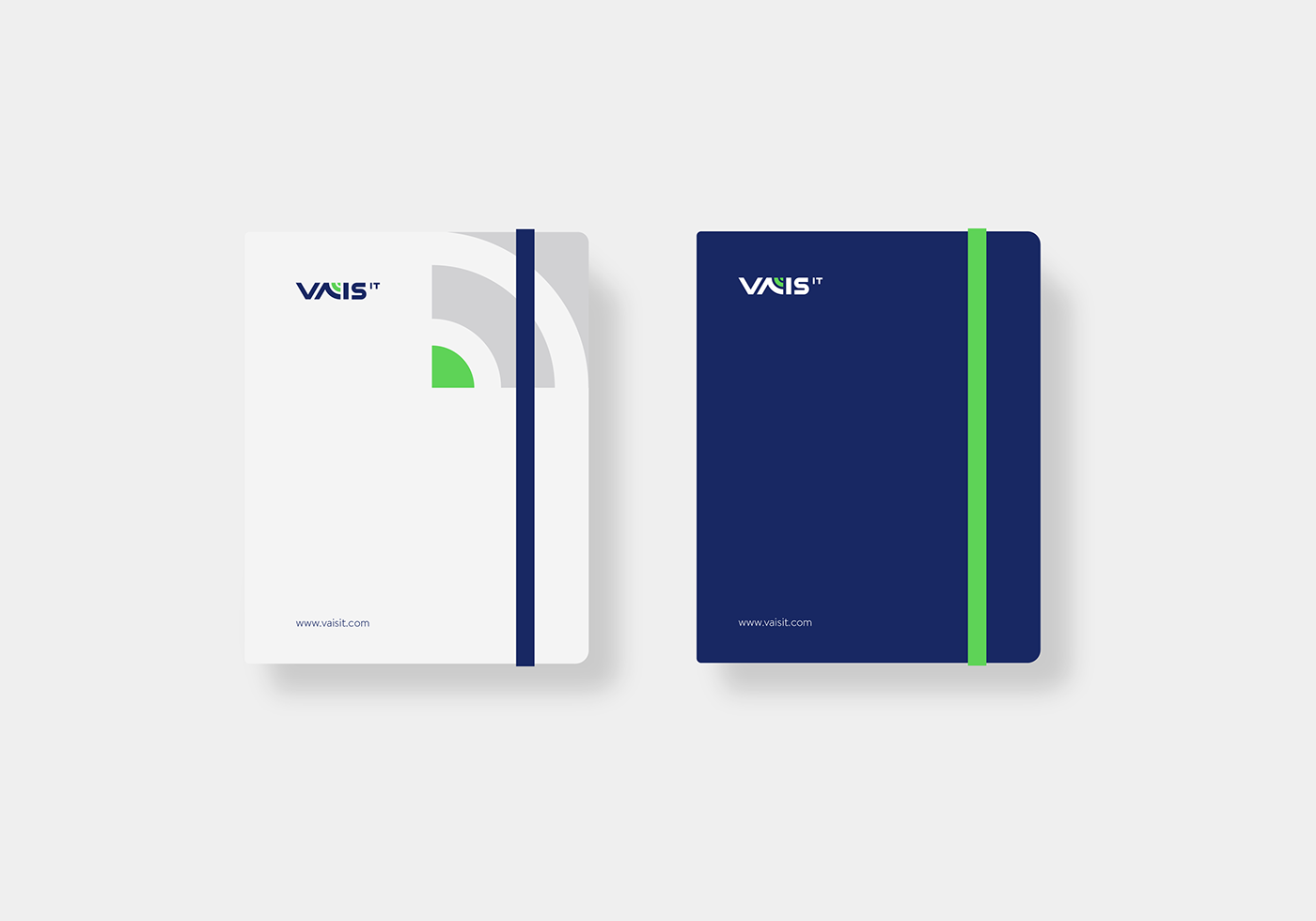
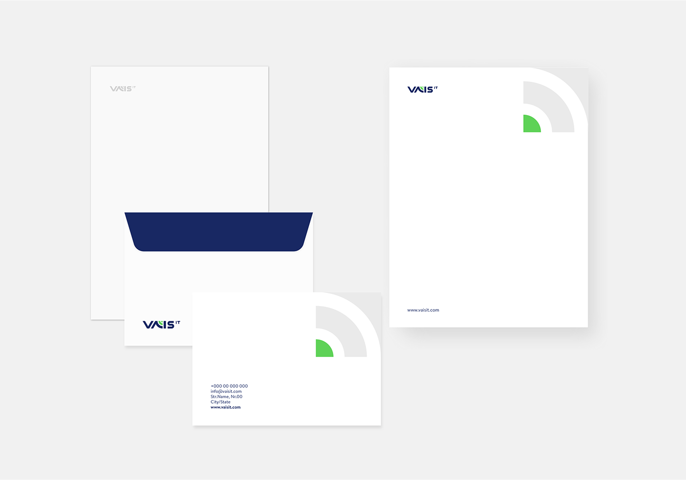
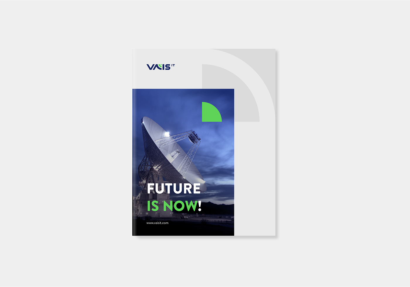
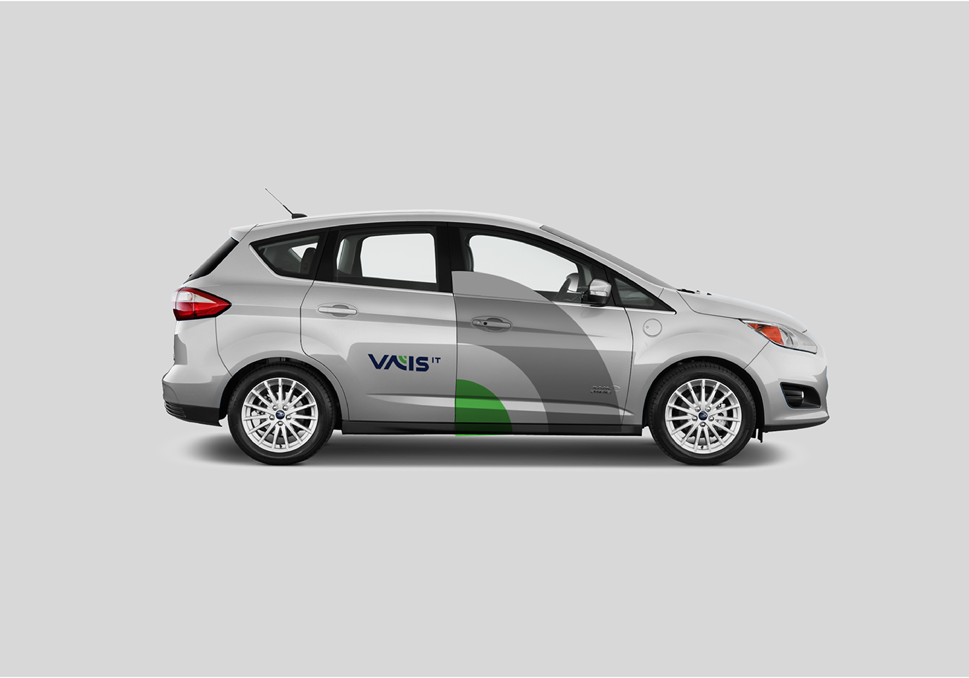
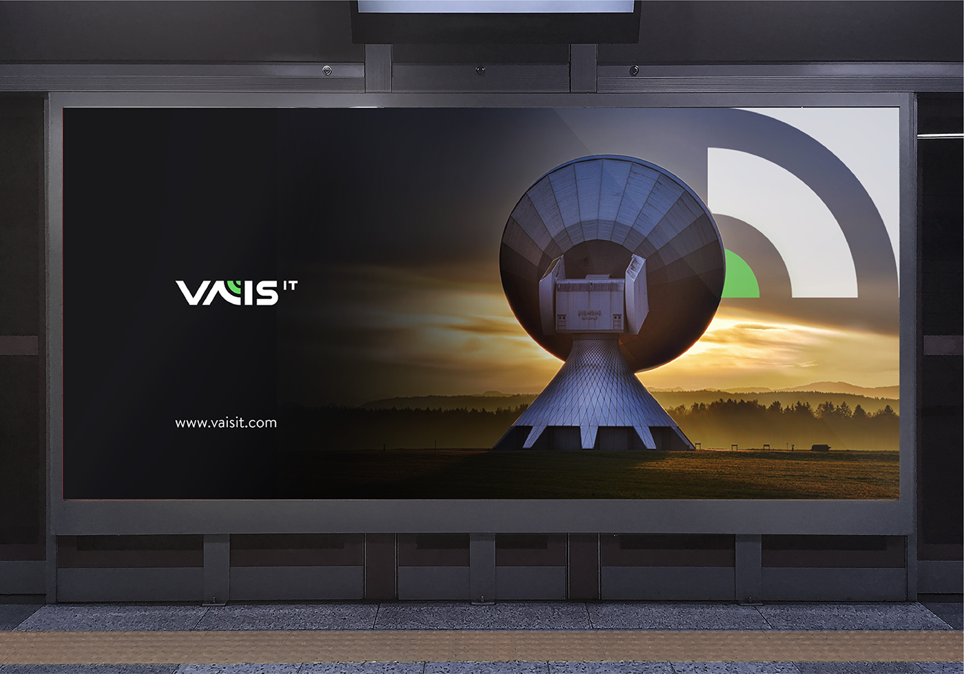
Visual Branding done for our client VAIS IT
Armend Berisha and team UNITED PIXELS design a new identity for VAIS IT based in Ireland.
The logo created below is made for a company named “VAIS IT” that with a highly qualified and experienced team in cutting-edge technology, helps Enterprises and Service Providers worldwide to gain full competitive edge by adopting infrastructure virtualization and intelligence solutions from top vendors.
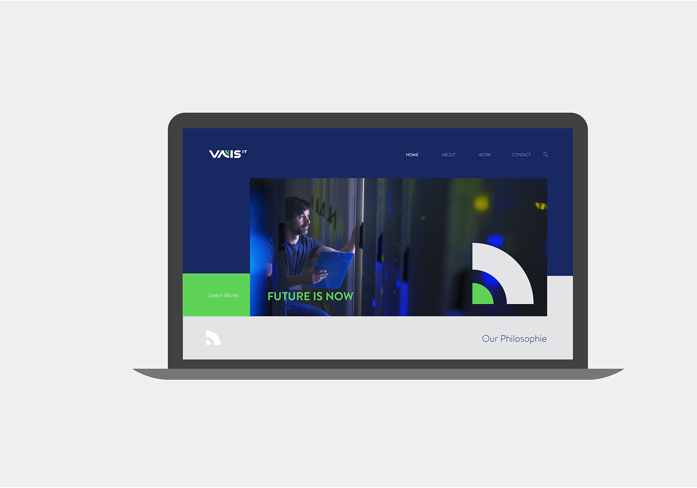
Collaborating with a company that is in competitive trade of technology, is always a challenge. By incorporating a simple graphic treatment we aimed to create a clear visualisation of their ideology.
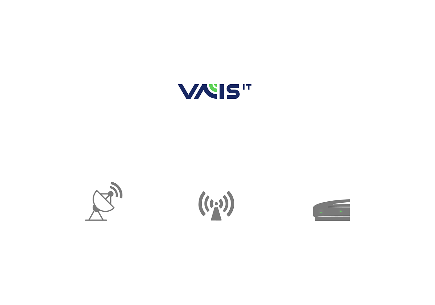
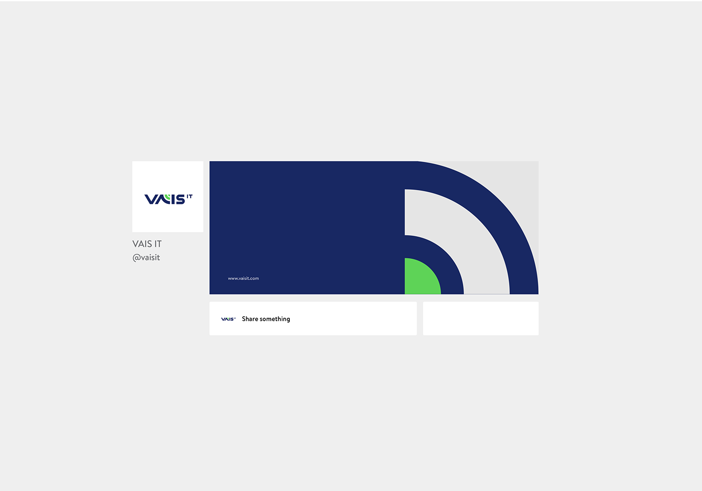
By merging a satellite dish, a signal symbol nonetheless green and navy blue color we made the word VAIS IT become a visual symbol of the company itself.
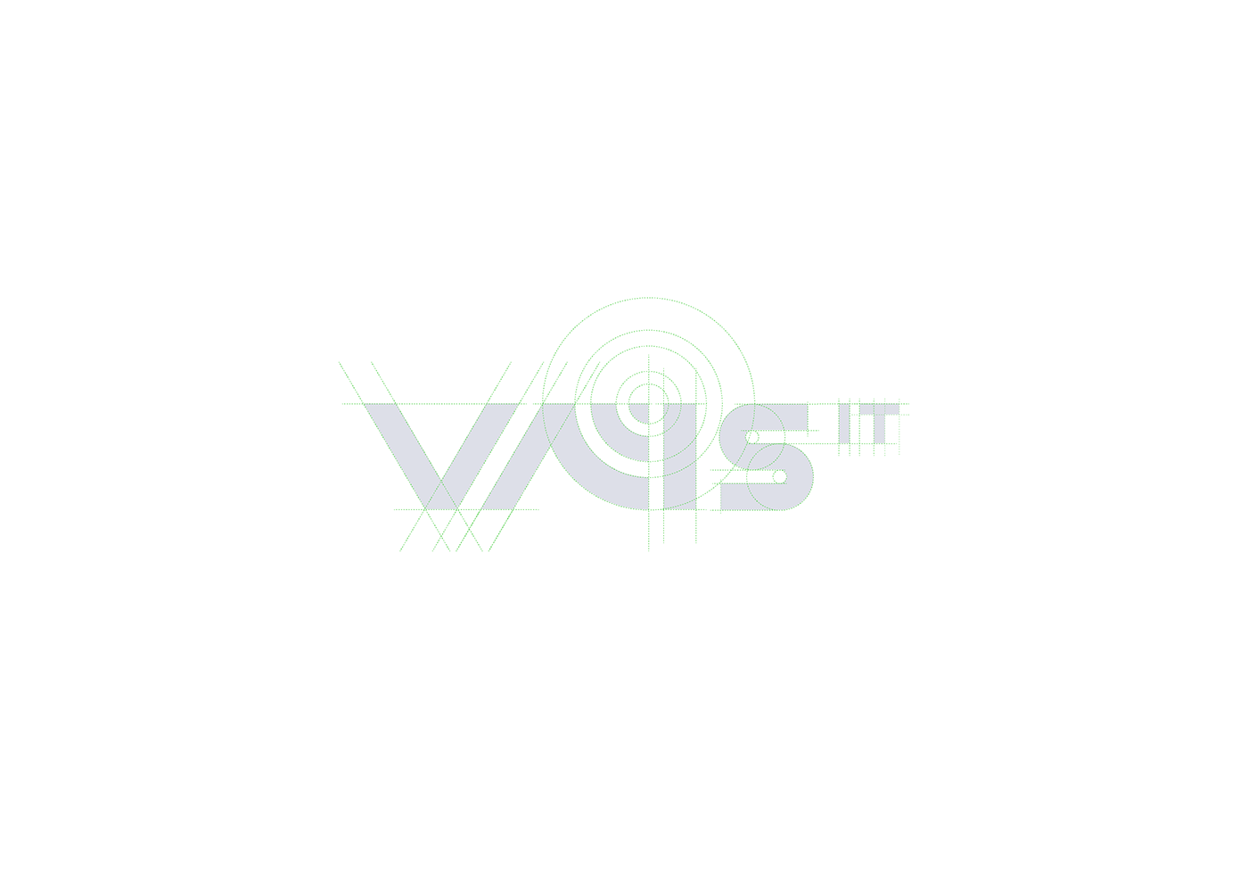
Utilizing a Satellite dish into the letter “A” of word VAIS IT represents Transmission of information respectively communication which can be defined as a direct translation of their philosophy.
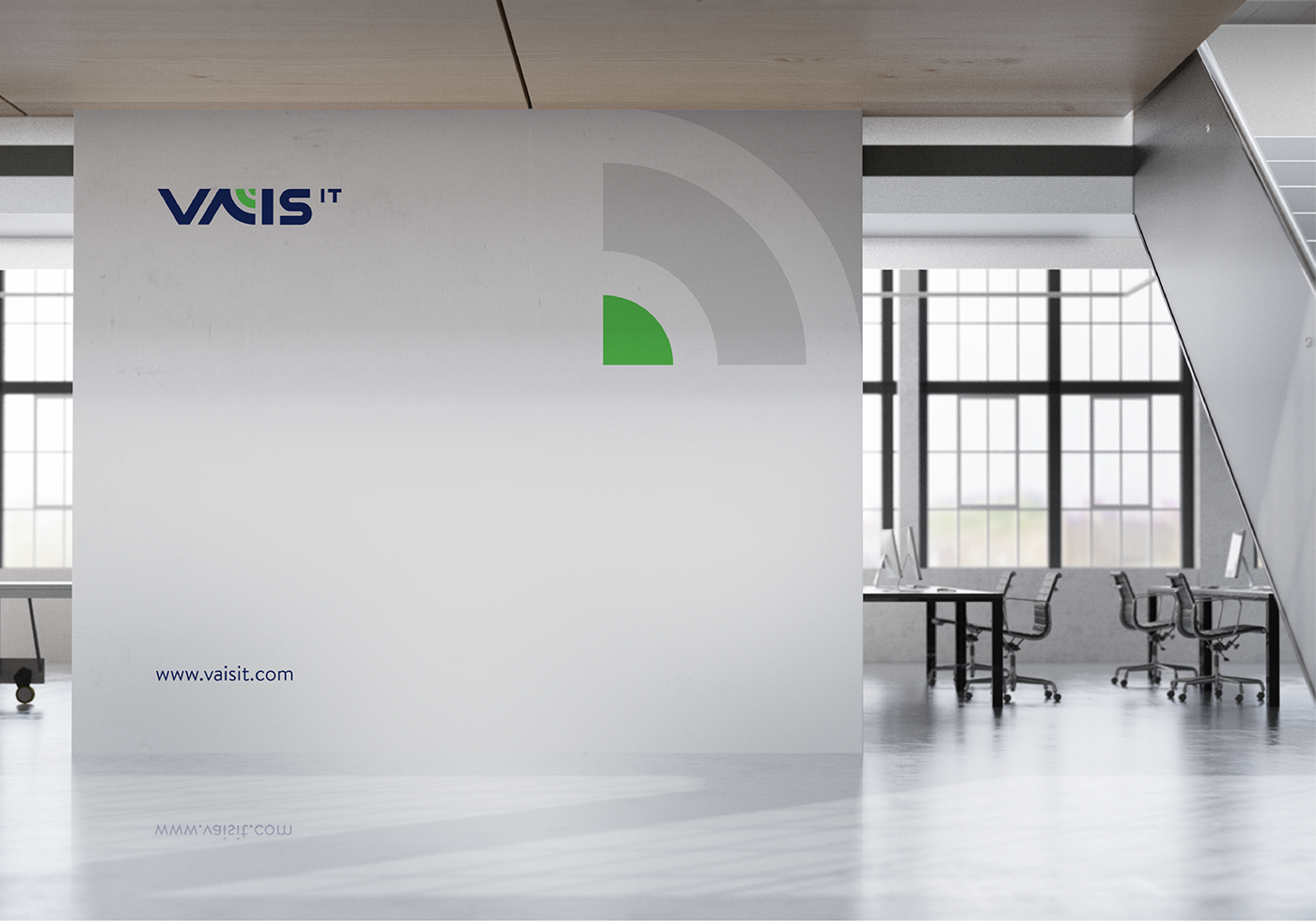
The second element that is represented in this Logo Signal Symbol speaks on behalf of connection. And nonetheless by combining the GREEN COLOR we transmitted positive bounce and fulfilled the entire puzzle in one piece letter “A” of the word VAIS.
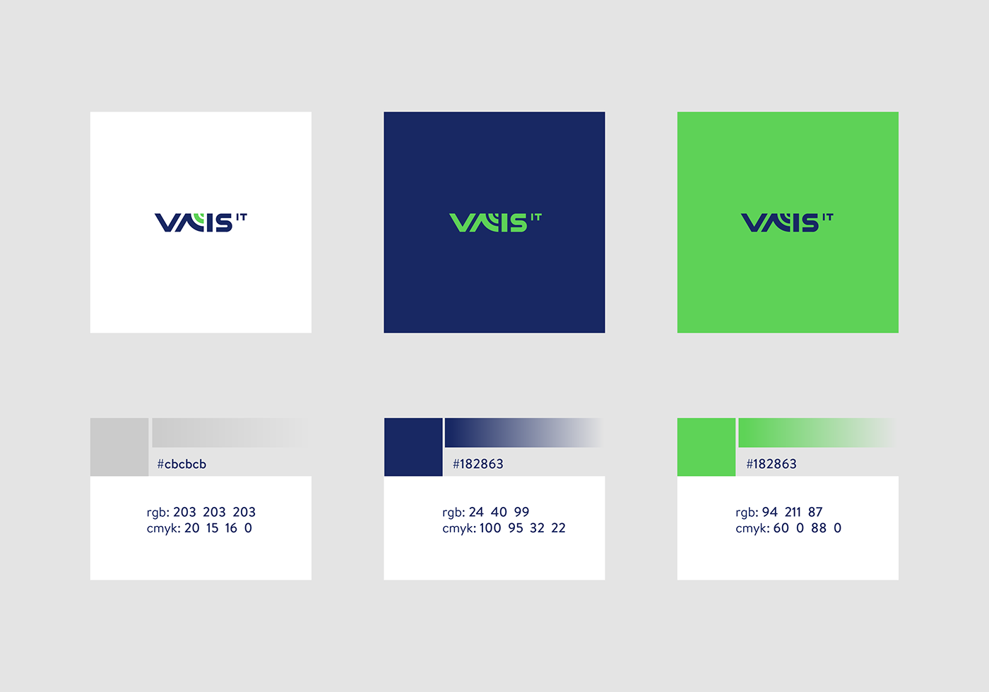
We combined Navy Blue Color to have contrast with green color at the same time to represent loyalty, confidence, stability and intelligence that display and complete the entire concept.
Hence, by combining all these elements in one single letter we have managed to visualize and embrace all the values that are part of VAIS IT company.
Collaborating with a company that is in competitive trade of technology, is always a challenge. By incorporating a simple graphic treatment we aimed to create a clear visualisation of their ideology.
By merging a satellite dish, a signal symbol nonetheless green and navy blue color we made the word VAIS IT become a visual symbol of the company itself.
Utilizing a Satellite dish into the letter “A” of word VAIS IT represents Transmission of information respectively communication which can be defined as a direct translation of their philosophy.
The second element that is represented in this Logo Signal Symbol speaks on behalf of connection. And nonetheless by combining the GREEN COLOR we transmitted positive bounce and fulfilled the entire puzzle in one piece letter “A” of the word VAIS.
We combined Navy Blue Color to have contrast with green color at the same time to represent loyalty, confidence, stability and intelligence that display and complete the entire concept.
Hence, by combining all these elements in one single letter we have managed to visualize and embrace all the values that are part of VAIS IT company.