Manchester Jazz Festival, Group work
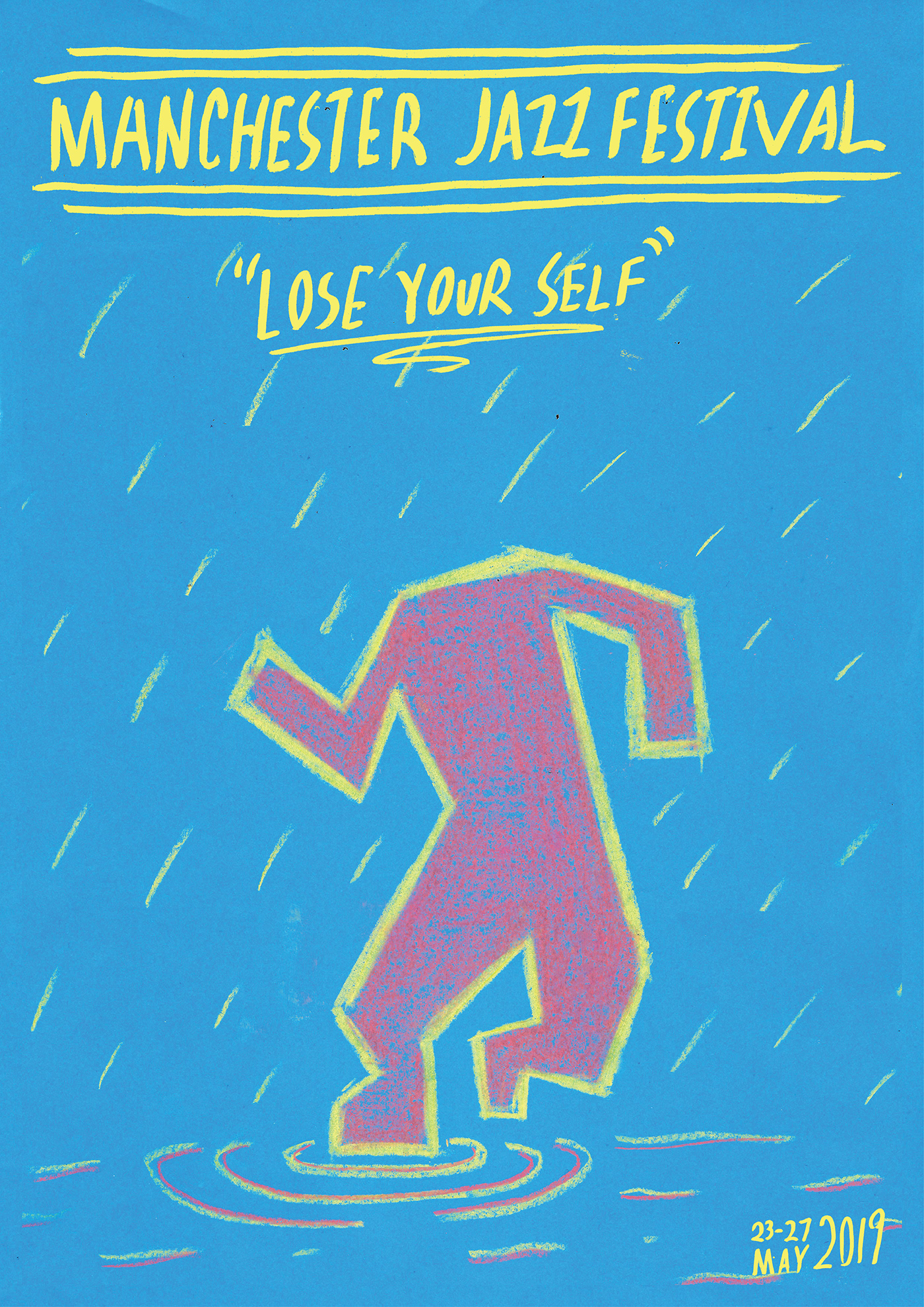
Here you can see the development and outcomes of a seven-day project. The strict time gave fascinating and unexpected answers to a brief that asked us to communicate what a jazz festival is all about. As a group of four, we thought it would be best to include people and the idea that they were dancing to the music. The logo developed firstly with a quick sketch of a pair of legs in the same shape as the letter 'M' for Manchester, into a more considered image for use on the posters and any remaining formats. Fortunately for me, everyone was interested in the hand-drawn look. Therefore we generated pages and pages of compositions for the client to look through. The logo tweaked by Alex O'Brien, an illustrator who gave the logo a real character.
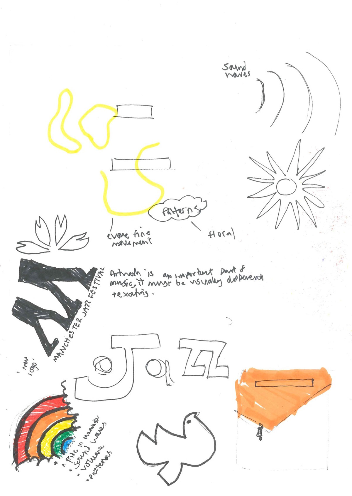

My initial logo (left) in need of (right) some adjustments to make it seem more fun and M shaped, cut out in card it was nice to bring it to life.

Lose your head was a title which was thought of because we hadn't considered the head just the legs and also because when you are listening to music you get lost in the sound.
Poster Concept


We were all inspired by Keith Haring whose work always was a go to for inspiration and to understand the motion we needed to show.

thanks for listening.


