

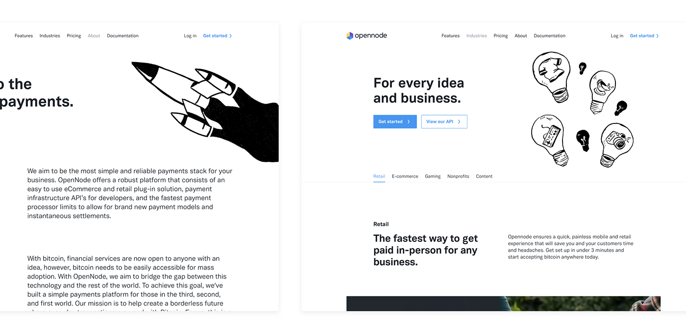
OpenNode is an easy to use eCommerce and retail plug-in solution, payment infrastructure API for developers, and the fastest payment processor to allow for brand new payment models and instantaneous settlements.
Colours
Our main colour palette relies heavily on the contrast between dark and vibrant colours. We defined specific colours for certain states and an orange as a connection point to Bitcoin, with blue as the main colour used for highlights and calls to action. For the backgrounds we used lighter versions of the main ones.r

Typography
Two different platforms, two different fonts. Vaud for that bold modern personality of the website. San Francisco, as the system font for MacOS, is optimized to give you unmatched legibility, consistency and performance on the Web App.

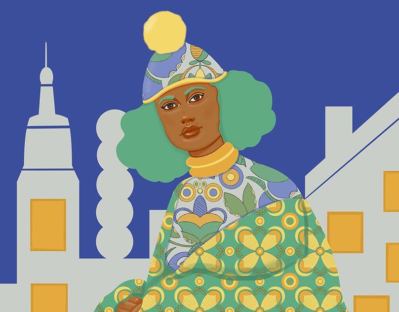
First Illustrations
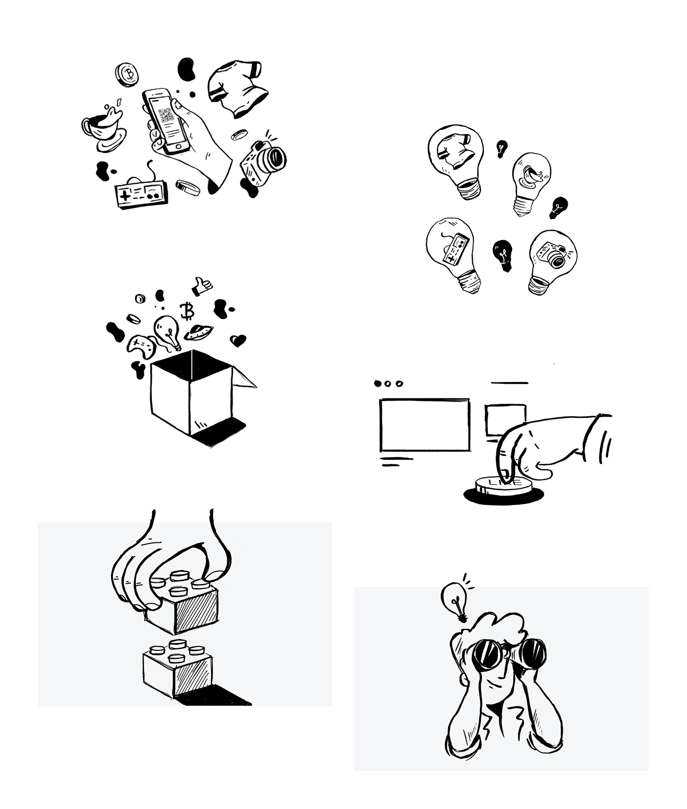
For the illustrations we tested multiple alternatives and styles. On the first iteration the concept was intimately related to people on a parallel dimension, using devices and other elements that were relatable to the product, and on the second we focused on 3D styled elements.
Final Illustrations
Sometimes even when we are happy with the results, if it doesn’t feel right for the project, we go back to the drawing board! After some brainstorming, and few sketches we decided to take some risks.
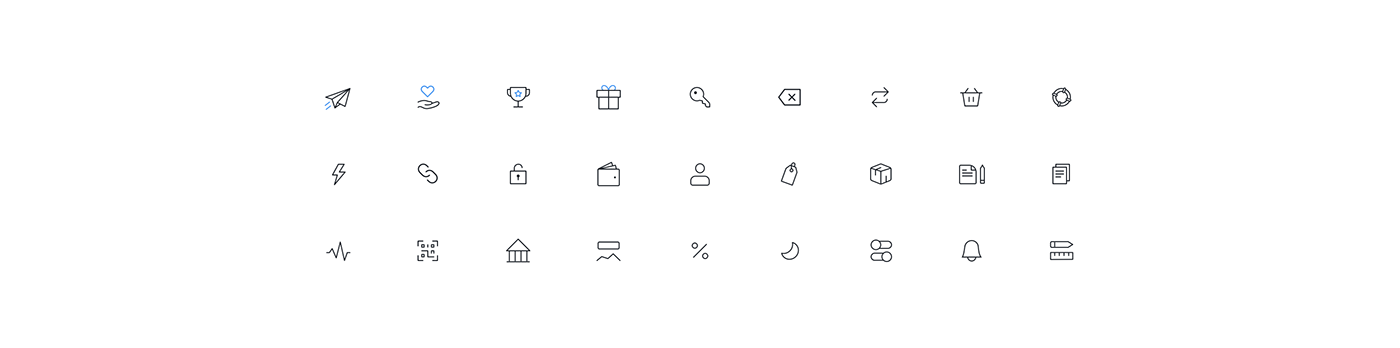
Icon sets
Just like the fonts, two different platforms, two different iconsets. For the platform we created a line icon set that would support the navigation items and actions.
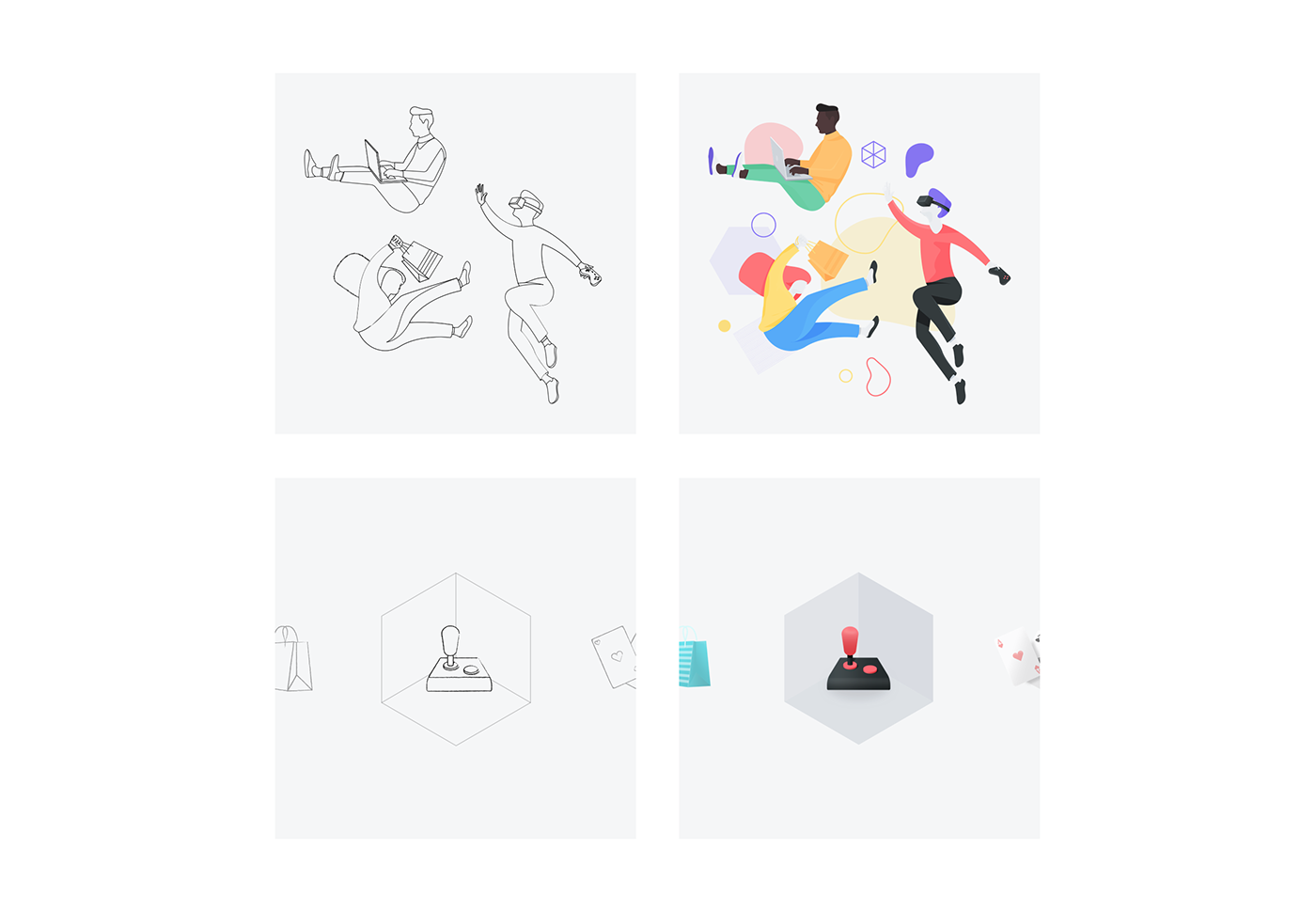
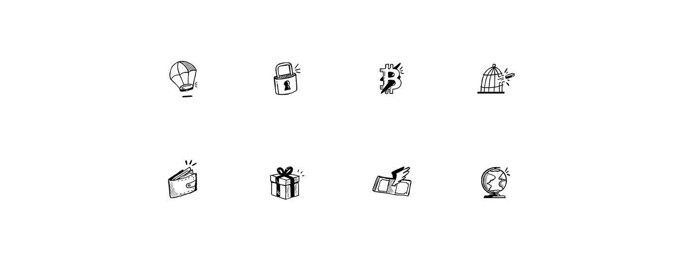
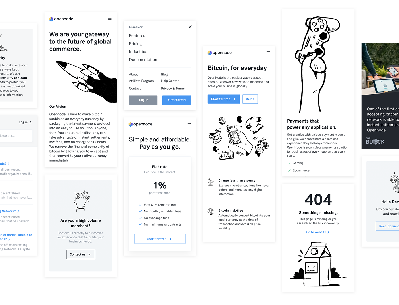
On the website, a set of illustrations that represent each of the platform's core features.
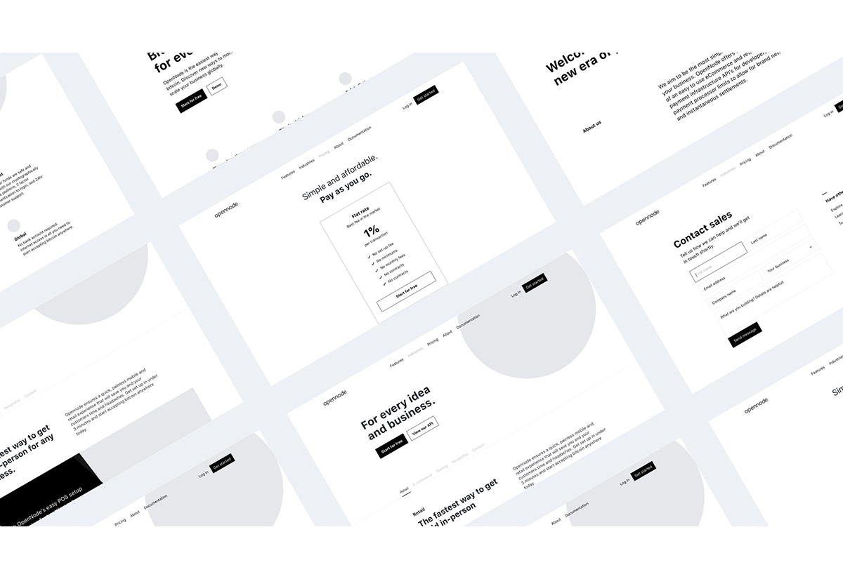
Wireframes
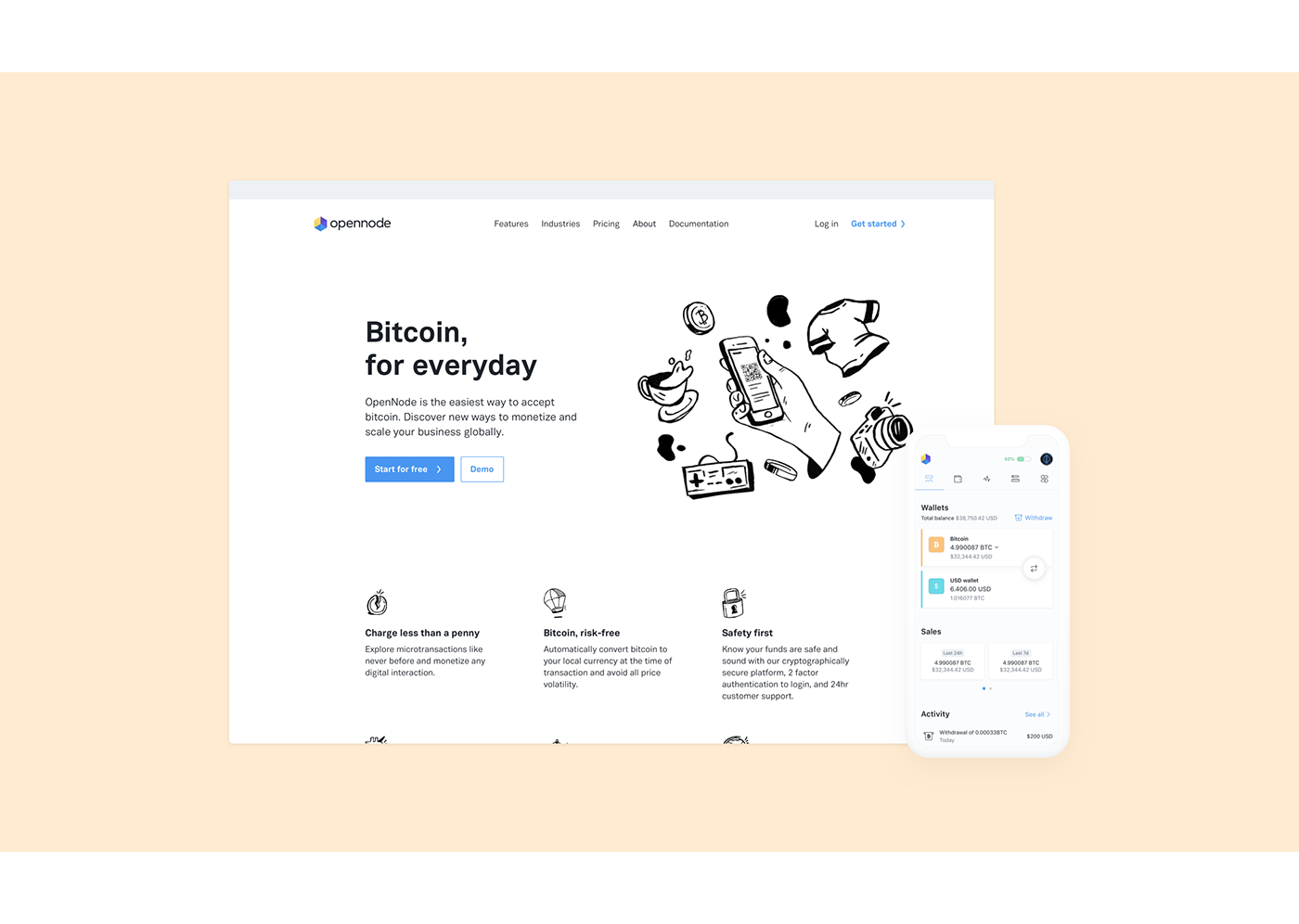
Our obejctive was to represent the future way of making payments, portray the product story and show its features clearly and effectively and create a website that grabs the user’s full attention. So before creating "pretty pixels" we began by defining structure and content.
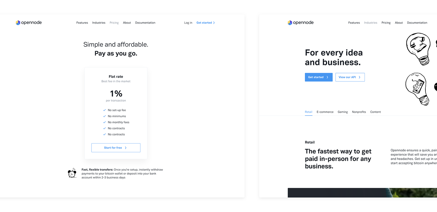
Website Launch
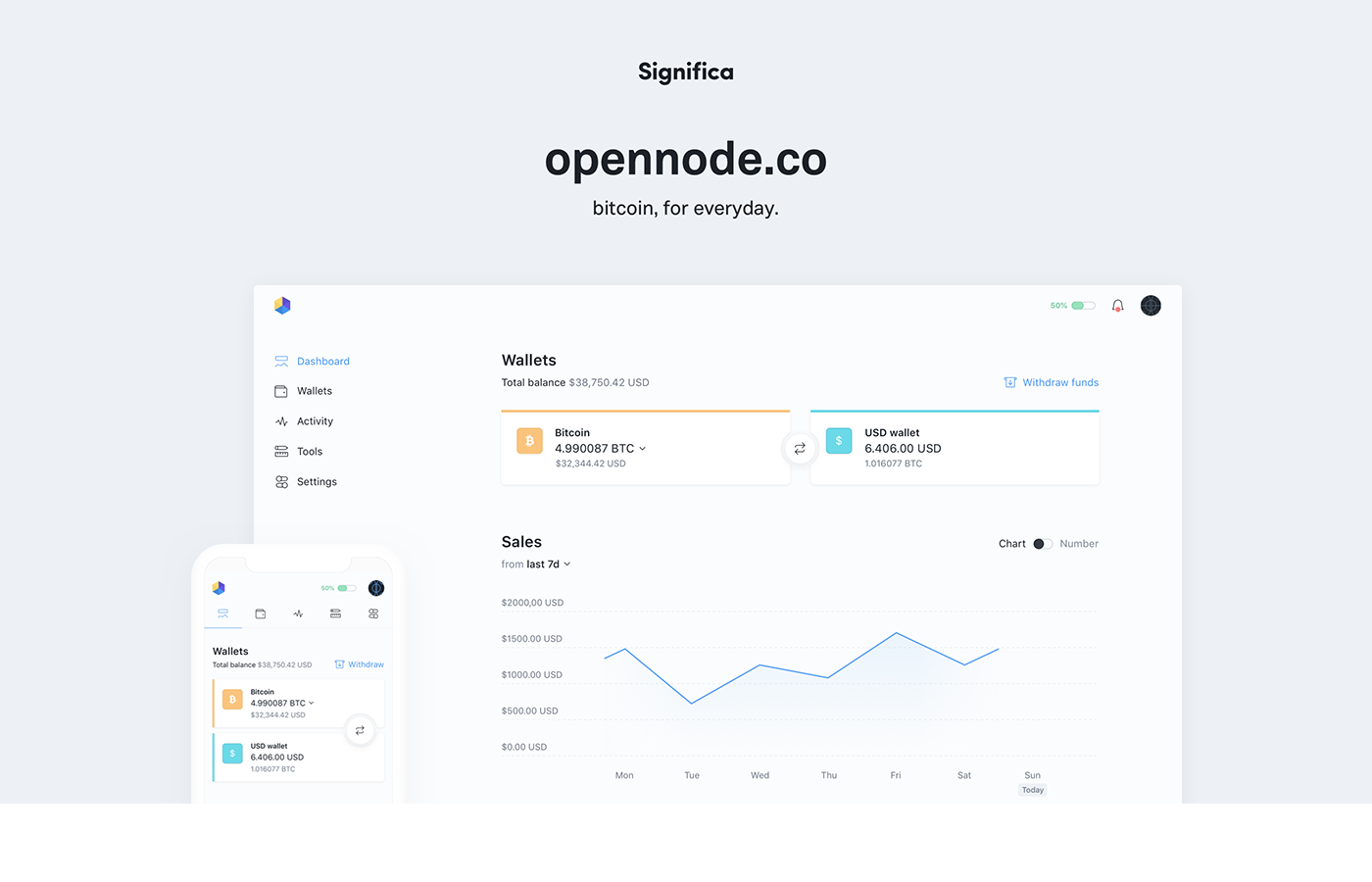
The website opennode.co was launched to showcase the platform’s beta version! A single source of truth to explain the platform’s core features!
Responsive
Even as a product for the future, we must not forget today's devices. We took that to heart and had special care when we designing the responsive version. Function was key when adapting the experience for on-the-go.
Platform Redesign
After analysing all functionalities, flows and the user feedback from the already existing version of Openndode, it was clear that we needed to create a brand new design language to create a consistent, intuitive and pleasurable platform.

Platform flow
n order to reduce complexity it was important to define priorities to achieve a platform that had a more intuitive user flows. We tried to understand which actions and elements had greater importance and relevance and which were the user's functional and behavioural expectations.

Platform Components
We created a design system that served as a visual guideline for consistency on the entire platform. We also kept detailed documentation that we updated regularly throughout the design process as single source of truth that ensured efficiency in our workflow.
Platform Onboarding
Not every change we made was a visual one! Even though we were building a brand new Web App we couldn’t disregard older Opennode users. For usability sake we needed to guarantee that ALL users knew where every main action was and how to execute them. To achieve this we created an onboarding tour that allows users to get a sense of the entire platform, just like we normally do when visiting a new city.
Getting started
Creating an account with Opennode is FREE and extremely simple. Name, email and password is all we need to do. But in order for users to experience the platform's full advantages they need to complete their profiles first.
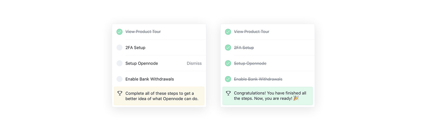
To simplify users' lives we created a checklist, so that in a simple and straightforward way, they could figure out which steps to complete in order to fully experience all the functionalities offered by Opennode.
To simplify users' lives we created a checklist, so that in a simple and straightforward way, they could figure out which steps to complete in order to fully experience all the functionalities offered by Opennode.
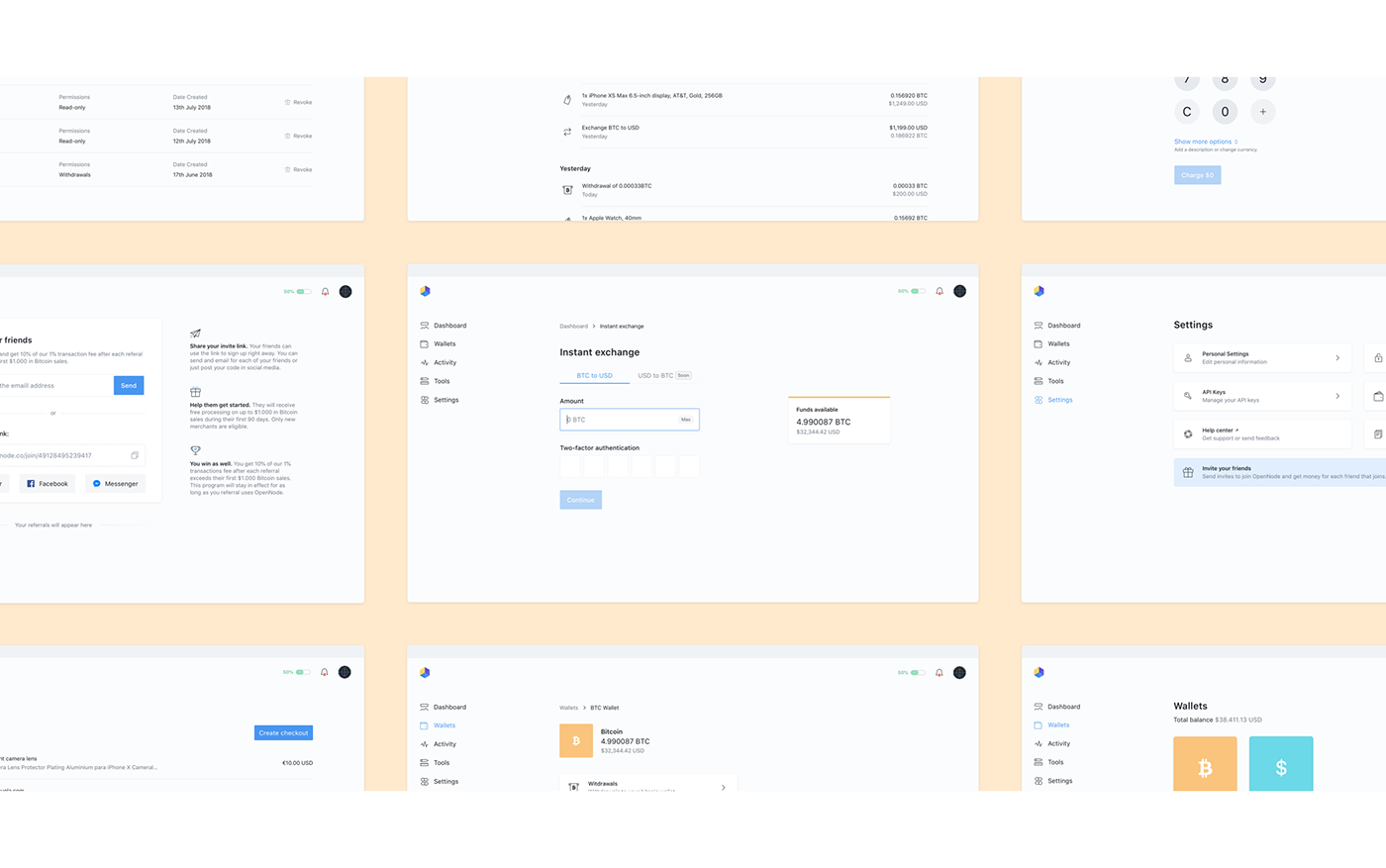
Instant Exchange
The old version’s instant exchange was creating some confusion amongst users.Two very relevant but different actions had the same visual treatment and were next to each other. To solve this we moved the instant exchange button and placed it between currencies.
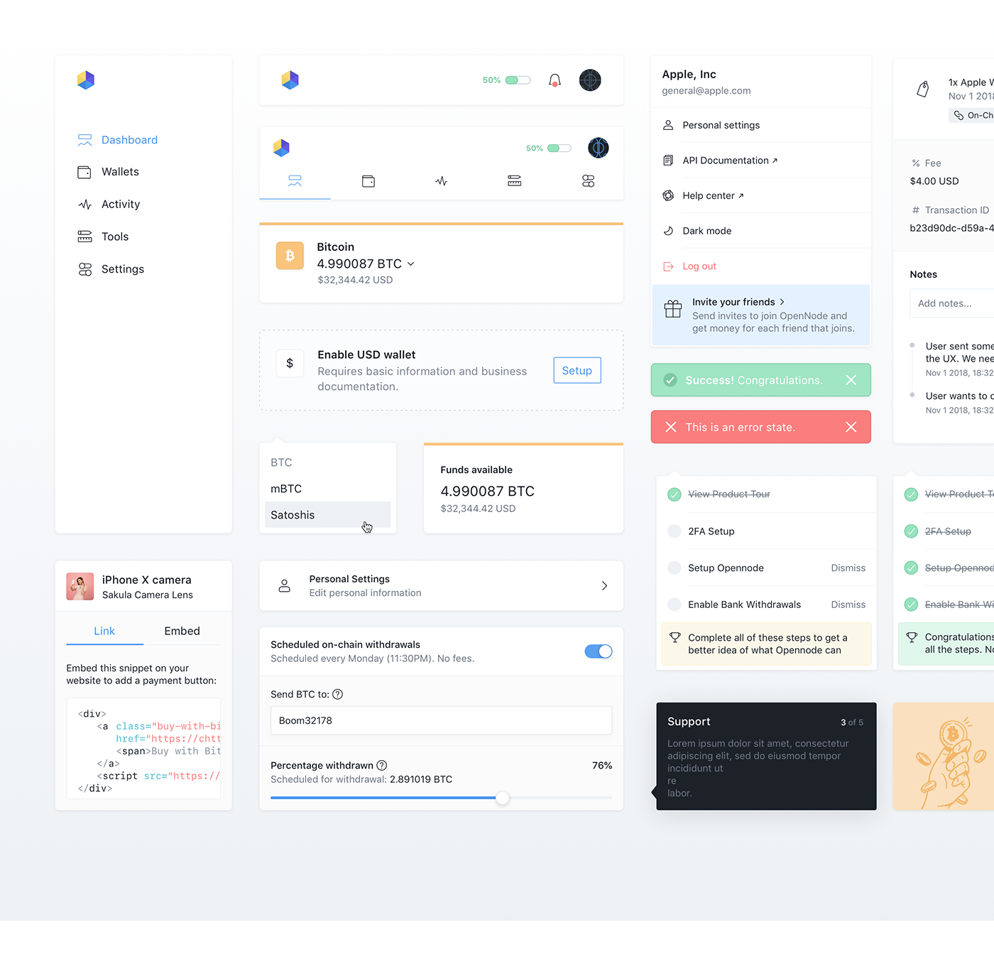
New Page vs Modal
One of the biggest experience flaws of the old version of Opennode was the abusive use of modals. Every action opened a modal which didn’t allow for much leverage on secondary actions and extra details. That’s why we opted to open a new page as a consequence of every core action, allowing the user to focus entirely on his actions with step navigation always within reach with the use of breadcrumbs. Modals become more secondary and are now only used to view details.
Modals
With modals now being used for details, we still had to manage the way they display information. We opted to show only the essential information from the get go, allowing the user to extend it only when extremely necessary with a “show more” button.
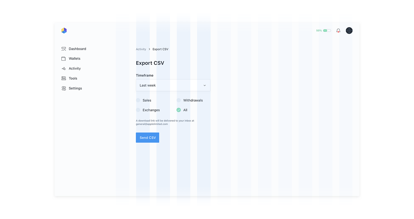
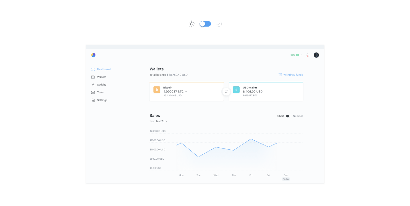
The Grid System
We created a grid that was indepent of the sidebar, allowing the user to focus on a more organised content. To enforce this idea, every action the user has to take is always placed on a small and specific area, highlighted below.
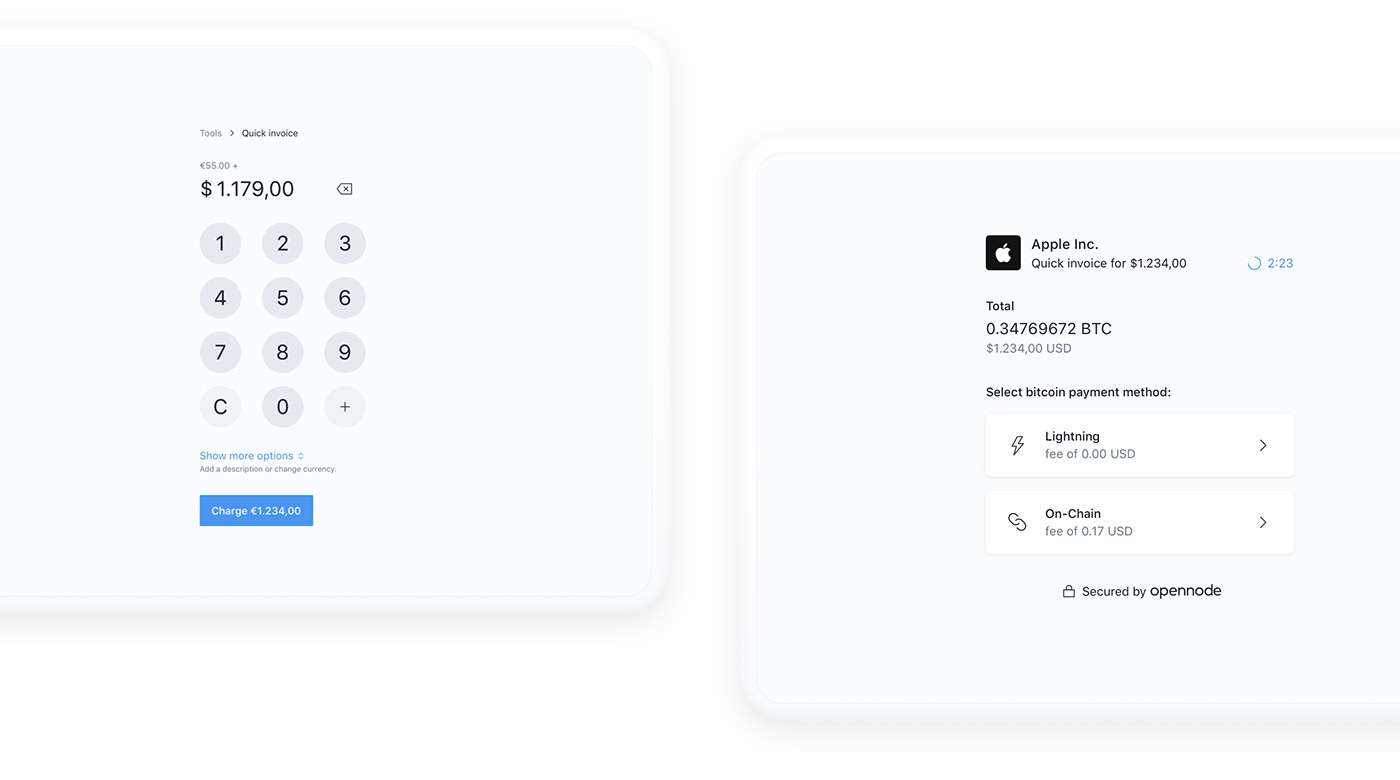
Retail Process
There are two ends to the retail process, the opennode user (the retailer) and the client. The process itself is very simple, the user creates an invoice for the purchased products and the client selects the preferred payment method.
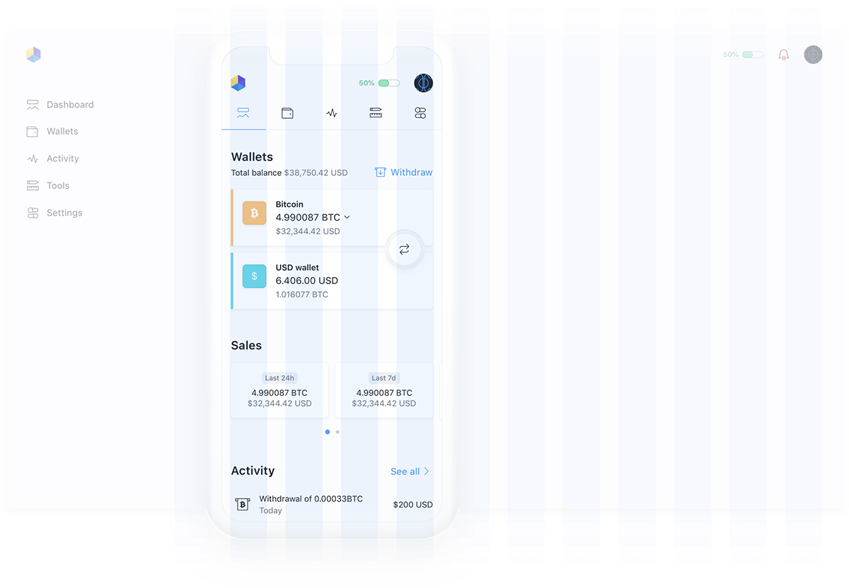
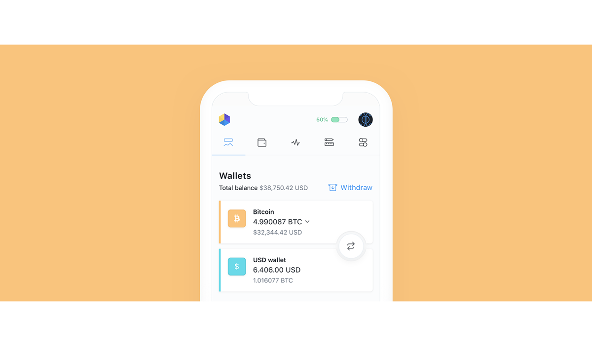
Platform Mobile
Built like a native app, the platform adapts to the device. For retailers, the process is mostly done on a tablet or on a mobile, and that’s where the platform really shines.
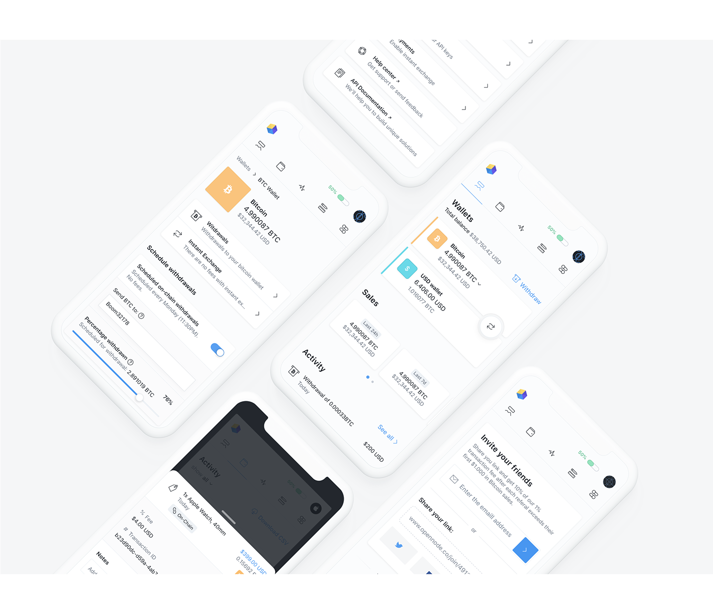
Mobile Grids
Using the same 4-columns section of the desktop grid, everything feels right at home in this responsive version. The same components in the same place, with the same size, adapting only to the limitation of the screen.
Mobile Navigation
On the desktop version of the platform, the sidebar serves it’s navigation purpose by giving the user quick access to the platform’s core pages. On mobile, to allow the user the same level of practicality, we transformed the sidebar into a top menu for easy finger access.
Dark Mode
For all the Opennode users that use the platform mainly at night, it was essential to create a dark mode. It not only lets the user focus more on the platform’s content but also isn’t too tiring on the eyes.


