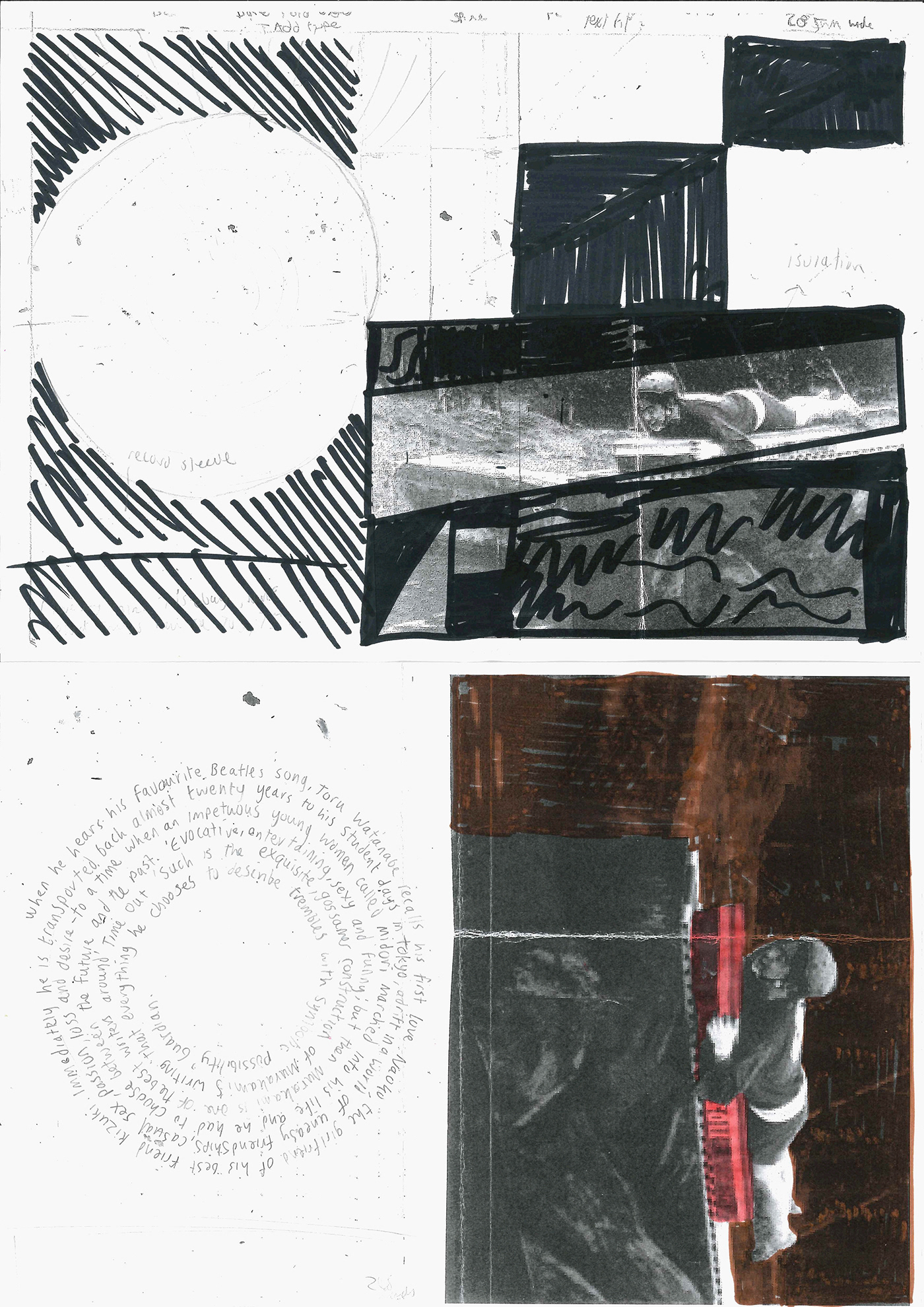
Norwegian Wood - Penguin Competition Brief.
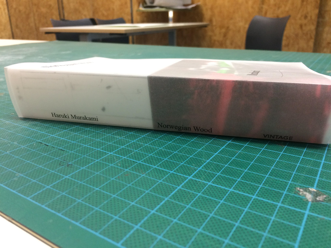
Murakami's storytelling is very engaging and continuously entertaining. My conclusion from the book is one about reflection, love and the kind of unique entertainment that makes you laugh out loud. Therefore one of my inspirations during the project was the Japanese TV show, Takeshi castle which first aired in 1986 the same sort of era that the storyline takes place. I used a serif typeface to reflect this. Tracing paper is inspired by Chip Kidd, which he used to protect the book. I like to presume that my cover concept is reflecting on Toru's youth and that the details are blurred and distant past which he desperately seems to look back. The green indicates the environment which often gets narrated at times, the pink is used to symbolise the love between the characters.

Image credit- http://www.ukgameshows.com/ukgs/Takeshi%27s_Castle.


One concept/prototype I had was to cut up bits of the world recognisable Starbucks logo due to the similarities this mysterious character that seems similar to Naoko. The curvy lines are consistently placed on both the front and back.
Thanks for looking. @crandon_graphic


