Native Leaf - Redesign
A Native Leaf é uma marca sediada na Inglaterra que leva o melhor da erva-mate América do Sul para a Europa.
Os empreendedores são sírios e o job foi feito pela Labis Design aqui no Brasil, através do Brand Language Design.
Mais global, impossível.
Native Leaf is an English brand that brings the best yerba mate of South America to Europe. The entrepreneurs are Syrians and the job
was done by Labis Design here in Brazil, through Brand Language Design. More global than that, it's impossible.
Era preciso reposicionar a marca e de consequência sua embalagem considerando os três novos sabores.
Definimos o conceito, a proposta de valores, o tom de voz para encontrar a sua verdade, e somente depois deste caminho
é que partimos para o caminho visual.
It was necessary to reposition the brand and consequently its packaging considering the three new flavors. We define the concept,
the proposal of values, the tone of voice to find its essence, and only after that we start to the visual language.
the proposal of values, the tone of voice to find its essence, and only after that we start to the visual language.


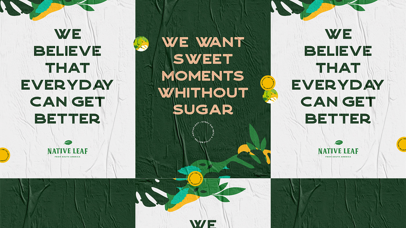
Manifesto & Conceito
O objetivo do manifesto era mostrar a história e a importância da erva-mate e a valorização de uma tradição ancestral.
Além disso, a grande diferenciação do produto é o fato de ser diretamente da natureza, verdadeiramente saudável.
Além disso, a grande diferenciação do produto é o fato de ser diretamente da natureza, verdadeiramente saudável.
Mas era preciso dizer tudo isso de forma emocional, direta e envolvente.
The goal of the manifesto was to narrate the history and importance of yerba mate and the appreciation of an ancestral tradition.
Furthermore, the great differential of the product is that it comes directly from nature, and for this healthy.
Furthermore, the great differential of the product is that it comes directly from nature, and for this healthy.
All these messages had to be said in an emotional, direct and involving way.

Conceito
O conceito “every day gets a little better” tem um duplo sentido: a erva-mate é amarga e por isso algumas pessoas não estão acostumadas. Mas é só uma questão de costume: a cada dia fica um pouco melhor, até que passamos a amar o sabor!
É uma planta que tem múltiplas propriedades benéficas e, além disso, a marca também tem uma postura otimista, e acredita que cada dia por ser melhor.
É uma planta que tem múltiplas propriedades benéficas e, além disso, a marca também tem uma postura otimista, e acredita que cada dia por ser melhor.
The concept "every day gets a little better" has a double meaning. The yerba mate is bitter, but it is only a matter of habit: it improves day by day, until you get to love its taste! At the same time it is a plant that has multiple beneficial properties.
The brand has an optimistic attitude and believes that everyday can be better.


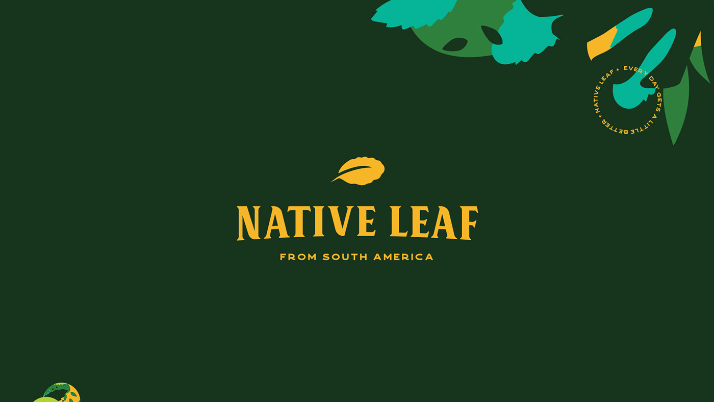
Logotipo
Optamos por um logotipo no estilo vintage all type, com uma sutil curvatura na parte inferior das letras e com o símbolo representativo da folha de erva-mate no topo, compondo assim um visual clássico, que faz referência às antigas tipografias utilizadas nas barricas de erva-mate. Ao mesmo tempo é contemporâneo, muito adequado ao propósito da marca, que promove o intercâmbio cultural, trazendo uma folha incrível da América do Sul para a Europa.
We opted for a vintage all-type logo, with a thin curve to the bottom of the letters and with a yerba mate leaf to the top. This choice offers a classic look that remember the old characters used in yerba mate barrels. At the same time it is contemporary, very suitable for the positioning of the brand, which promotes the cultural exchange, bringing an incredible leaf from South America to Europe.


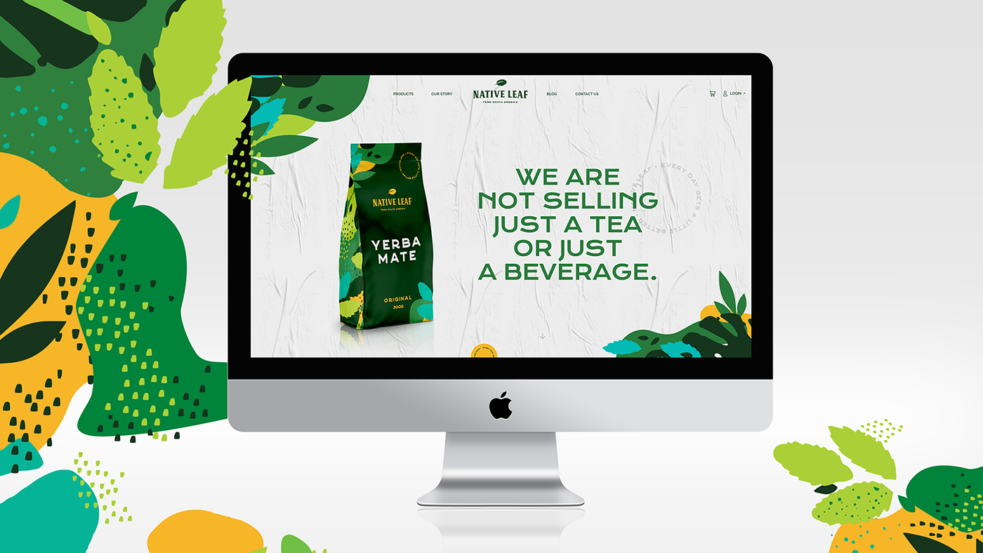
Embalagens
O redesign da linha de erva-mate contendo os 4 sabores – Original, Organic, Citrus e Apple & Pear – foi desenvolvido com o objetivo de criar uma identidade moderna, orgânica, flexível e natural.
The yerba mate range, containing the 4 flavors - Original, Organic, Citrus and Apple & Pear -, was developed with the goal to create a modern, organic, flexible and natural identity.
O trabalho de ilustração busca um equilíbrio entre extroversão e seriedade, abstraindo de cada elemento apenas o suficiente para que seja expressivo, mas não artístico e detalhado demais.
The illustration job results from the good balance between exuberance and seriousness, highlighting every element enough to be expressive, but not too detailed and artistic.
As cores, que se entrelaçam, criam um movimento único nas ilustrações e revelam um clima tropical, com combinações e contrastes diversos, simbolizando as variações de altitude e outros fatores característicos da América do Sul, juntamente com os principais ingredientes de cada blend.
The colors mix of the illustrations creates a unique movement and reveal a tropical atmosphere, with different combinations and contrasts, that symbolize the variations of altitude and other characteristics of South America, along with the main ingredients of each blend.

A hierarquia de informação é um dos princípios chave do design e para este projeto estudamos qual seria a melhor distribuição de forma a conduzir a leitura com foco no público alvo. Para tal, priorizamos o nome do produto, em seguida o sabor e o logotipo do Native Leaf com o tagline “from South America”, cuidando para que os elementos gráficos ficassem equilibrados e em harmonia com a leitura.
The information hierarchy is one of the key principles of design and we have studied what it would has been the best distribution in order to guide the reading of the people. For this reason, priority was given to the product name, flavor and logo of Native Leaf followed by the tagline "From South America", being careful that the graphic elements were balanced and in harmony with the reading.


O resultado final são embalagens simples e minimalistas, que seguem a mesma estrutura de layout e identidade visual, com as padronagens de folhas nas laterais, que trazem a atenção do cliente para o essencial de maneira clara e objetiva, de modo que ele faça uma compra agradável e bem informada.
The final result is a simple and minimalist packaging line, which follow the same layout and the same visual structure, with a leaves pattern on the both lateral sides parts, which lead the attention of the people to the essential in a clear, objective and pleasant way during the purchase.


Agência: Labis Design
Cliente: Native Leaf
Direção Criativa: Henrique Catenacci
Designers: Nataly Luana Nodari e Diego Carneiro
Conceito e Conteúdo: Bruna Castro
Cliente: Native Leaf
Direção Criativa: Henrique Catenacci
Designers: Nataly Luana Nodari e Diego Carneiro
Conceito e Conteúdo: Bruna Castro


