


Vasiér Jewelry
Vasiér Jewelry is a dynamic start-up retailer featuring iconic jewelry brands and serving customers through its online website and mobile app. The company was founded by the Vasiér Sisters and has quickly gained momentum in the retail industry. The goal of the Vasiér Jewelry team is to inspire and empower people to express their unique style with their stunning collection of jewelry.
Our primary objective for this project was to establish a bold and recognizable brand that would better connect with our customers. We achieved this by adopting a vibrant and distinctive visual identity that distinguishes our jewelry in the online marketplace. We wanted to create a brand that is adaptable to changing trends, circumstances, and time, ensuring that we stay relevant and responsive to the needs of our customers in the future.

Idea behind the icon
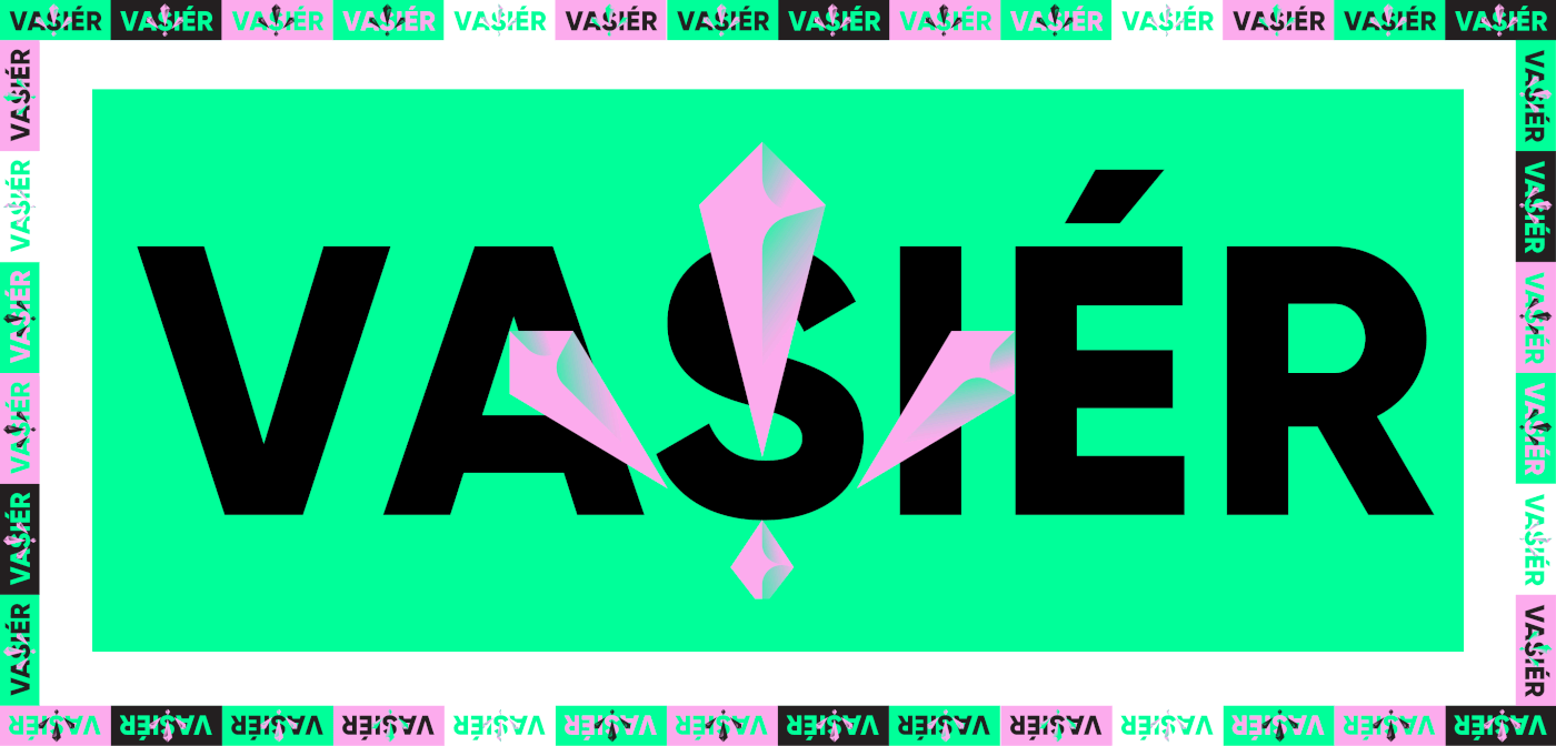
The idea behind the Vasiér Jewelry icon was to create a modern, distinctive, and practical symbol that would be simple in form yet memorable and evocative of luxury. The Vasiér team achieved this by combining a crystal form with a hidden "V" shape, resulting in an abstract and visually striking icon.
The crystal form conveys the idea of beauty and luxury, while the hidden "V" shape nods to the Vasiér Sisters' initials and adds an element of intrigue to the design. By transforming this concept into a simplified and elegant icon, the Vasiér Jewelry brand is instantly recognizable and easily distinguishable in the marketplace.


Color System and Scheme
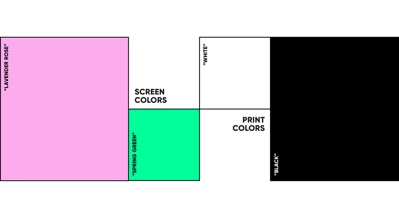
Colors play a significant role in creating a brand identity. Therefore, we aimed to create a bold and distinctive color scheme that would represent the brand's online presence as a source of excitement and optimism.
Since vivid colors can be challenging to print and more expensive, we carefully selected our brand colors and separated them into two categories. For our screen colors, we chose "Lavender Rose" and "Spring Green" as our primary colors. These hues provide a vibrant and modern look that resonates with our brand's personality. For print colors, we opted for a simple yet elegant black and white style that is both cost-effective and visually impactful.
By carefully selecting our colors and separating them into two categories, we were able to achieve a consistent and recognizable brand identity across all platforms.
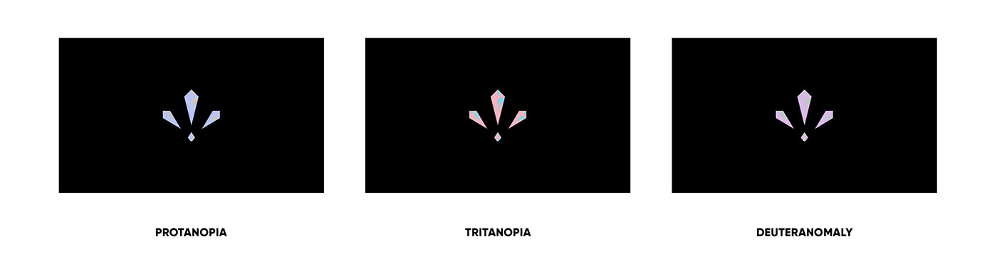
It’s important to remember that not everybody sees the same, and this is how colorblind people will see the icon colors.
Clear-space and Construction
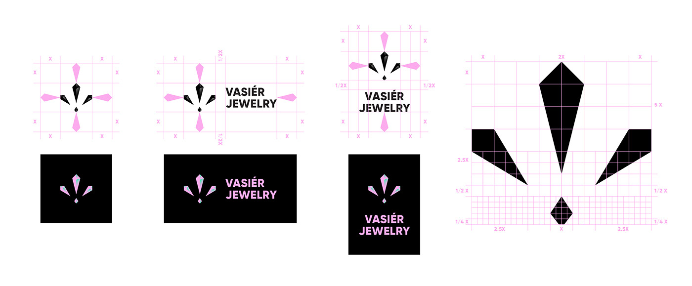
It is important that the logo should be surrounded by clear space to ensure its visibility and impact. To regulate this, we made an exclusion zone around the Vasiér logo. This exclusion zone indicates the closest any other graphic element or message can be positioned in relation to the logo.
To achieve geometric harmony in the icon, we used a grid to construct it. This approach ensured that every element of the icon was precisely aligned and positioned, resulting in a visually balanced and aesthetically pleasing design.
Fonts and Typography
Gilroy it’s the font that we chose as a primary font because it is a modern sans serif with a geometric touch and it suits well the bold and modern style of the brand. It comes in 20 weights, 10 uprights, and its matching italics. Designed with powerful OpenType features in mind. It could easily work for web, signage, corporate as well as for editorial design.


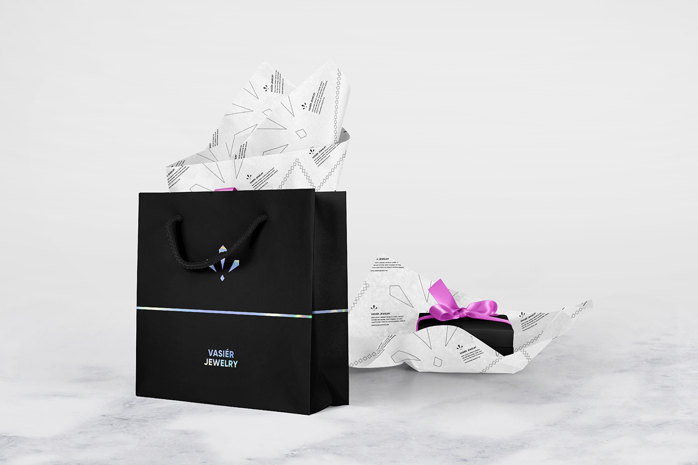
Stationary, Packaging
and Posters


Thanks for watching! ♥


