


01. Brief Case & Concept
The Problem & The Idea
PT/BR
O projeto se trata da criação de uma identidade visual e rótulos para a empresa Mai Kombucha. O grande desafio estava em desenvolver uma identidade que possua um conceito sólido, se conecte com o público alvo e mantenha o estilo de uma bebida saudável, moderna e leve. Também é importante que o logo esteja preparado para assumir posição com as ilustrações que serão feitas posteriormente para as embalagens de cada sabor, que serão desenhadas individualmente, criando assim uma identidade para a empresa.
ENG
The project is about the creation of a visual identity and labels for the company Mai Kombucha. The big challenge was to develop an identity that has a solid concept, connects with the target audience and maintains the style of a healthy, modern and light drink. It is also important that the logo is aligned with the illustrations that will be made later for the labels of each flavor, which will be designed individually, thus creating an identity for the company.

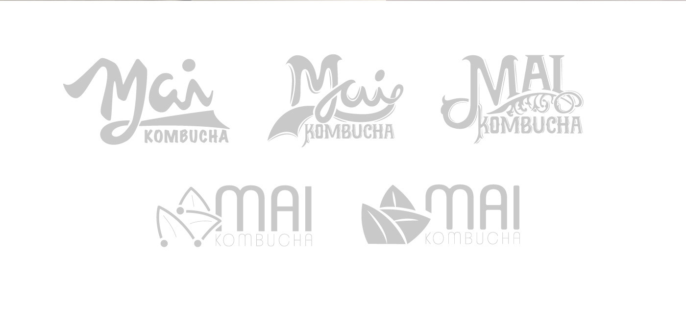
02. Identity
The Solution
PT/BR
Após uma grande exploração de ideias, foi decidido trabalhar um logo tipográfico com uma tipografia desenhada a mão sem a utilização de uma fonte como base para sua criação, seguindo um estilo sofisticado e moderno, sendo também um pouco ousado para o mercado visto que não existem muitos nesse segmento (Kombuchas) que seguem este padrão. Além da tipografia, o logo também possui alguns elementos ao seu redor trazendo ainda mais estilo e originalidade, criados com base em folhas, flores e natureza. O logo também não possui uma cor definida, pois assim consegue interagir com as ilustrações e elementos dos materiais em que estiver envolvido, trazendo ainda mais liberdade para a paleta de cores dos rótulos.
ENG
After a great exploration of ideas, it was decided to work in a typographic logo with a handrawing font made with no font as a basis, following a sophisticated and modern style, being also a little bold for the market, since aren't many logos in this segment (Kombuchas) with this style. Besides the typography, the logo also has some elements to bring even more style and originality, based in leaves, flowers and nature. The logo does not have a defined color either, as it can interact with the illustrations and elements of the materials in which it is present, bringing even more freedom to the color palette of the labels and materials.

03. Labels
Identity + Illustrations
PT/BR
Os rótulos foram trabalhados com ilustrações individuais, desenhadas referente a cada sabor, desenhadas usando íconografias e elementos e uma paleta de cores que facilite a assimilação do sabor, sendo possível reconher sem ler textos, olhando apenas a ilustração. Sendo assim, foi selecionado um estilo simples e leve, condizendo com o mercado de bebidas naturais, utilizando linhas e iconografias com uma paleta de cores pré definida para cada sabor.
ENG
The labels were individually designed, where the illustrations refer to each flavor, using icons, elements and a color pallette that makes easiear the assimilation of flavor, being possible to recognize without reading texts, looking at the illustration only. Therefore, a minimal and light style was selected, in keeping with the natural beverage market, using lines and iconographies with a pre-defined color pallette for each flavor.


04. Materials
PT/BR
Os materiais de apoio devem seguir o estilo natural e dentro dos padrões da identidade, podendo ser acompanhada de ícones, desenhos e ilustrações. O pôster foi representado por um floral ilustrado, desenhado a mão, com as garrafas dentro, o qual poderá ser utilizado para propagandas e materiais publicitários diversos.
OBS.: poster não oficial/material não aprovado.
ENG
Support materials must follow the natural style and the identity standards, and may be accompanied by icons, drawings and patterns. The poster was represented by an illustrated floral, handrawing, with the bottles inside, which can be used for advertisements and various publicity materials.
NOTE: Unofficial poster / unapproved material.
NOTE: Unofficial poster / unapproved material.


CLIENT: MAI KOMBUCHA
ART DIRECTION: STÉPHANIE MINUCCI
PROJECT DATE: AUGUST, 2018
Last update at 2020: new labels now have new logo updated by the company in 2020 with the label's illustrations made by me.
BRASIL, RIO DE JANEIRO / RIO GRANDE DO SUL

You can find me at:
@Instagram | @YouTube | @Twitter | sminucci@outlook.com.br
-
Also check out my personal Art and Comics projects at: www.instagram.com/artof.sm
Don't forget to appreciate the project if you liked ♥
↓


