ENDY 2018
Italians in Russia
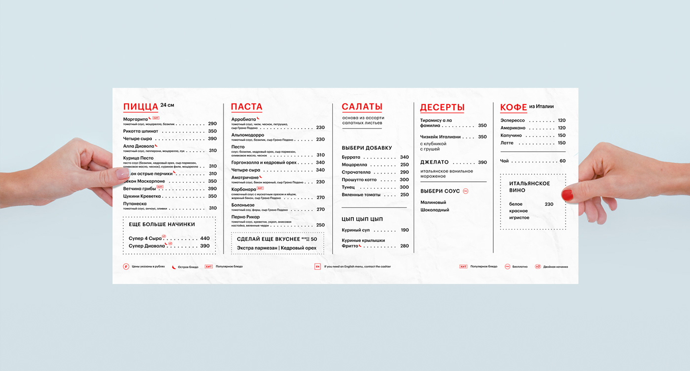
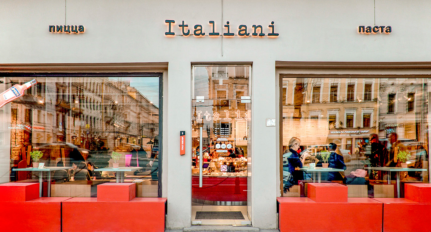
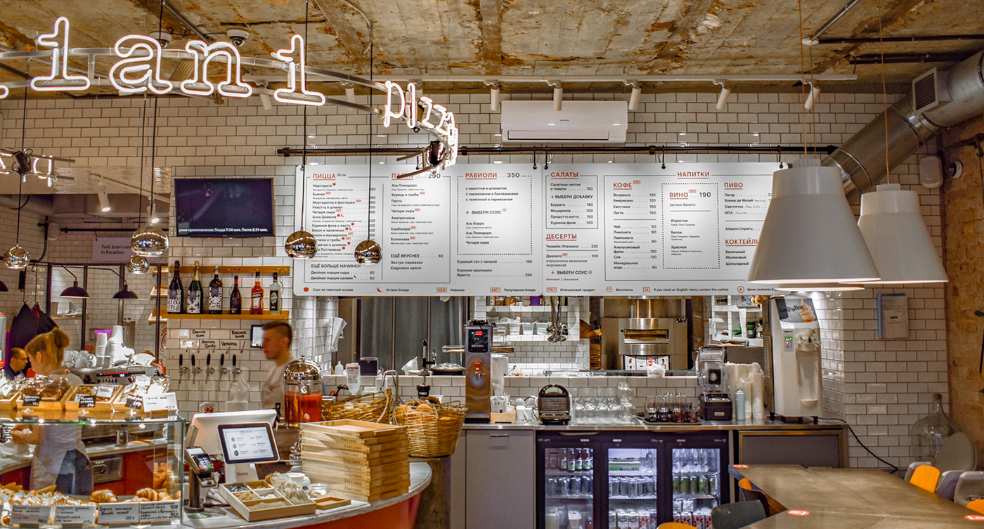
Italiani Restaurant from ITALY GROUP is located on Nevsky Prospekt, in the very heart of St. Petersburg. It offers Italian street food at an affordable price, whose quality matches that of more expensive ITALY restaurants. We have developed a corporate identity that shows the other Italy to convey the fast casual spirit new for ITALY. We moved away from classical symbols in favor of those no less national, but hardly ever used. Of course, we did not forget to highlight advantages of the restaurant.
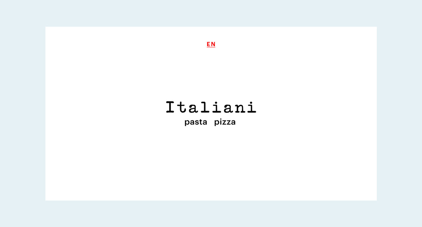
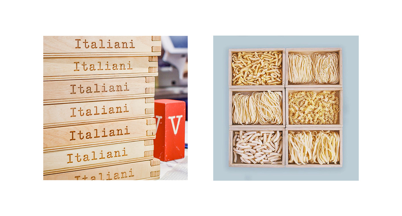
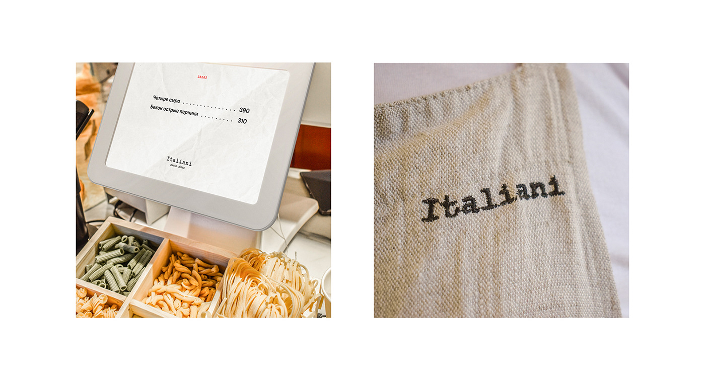
Italy cherishes its own heroes. One of them is Olivetti, the creator of typewriters. Back in 1969, the bright design of the Valentine red model hit the headlines. It inspired us to develop a logo and to use a type font for it.

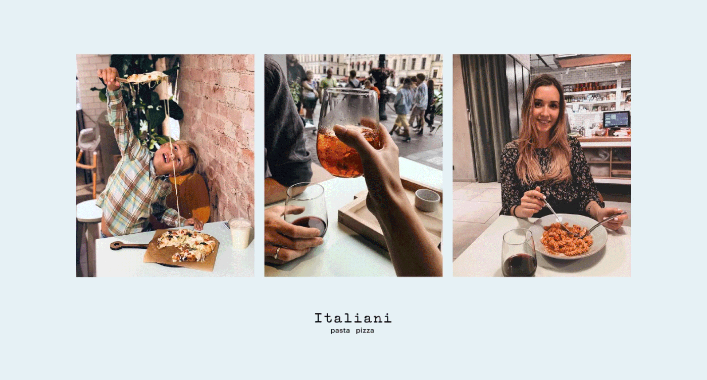
With its crumpled texture in the menu and on screens, flax aprons and shabby ceilings, this style both creates comfort and gives a sense of a place where you belong, without pretending to be an expensive Italian restaurant.
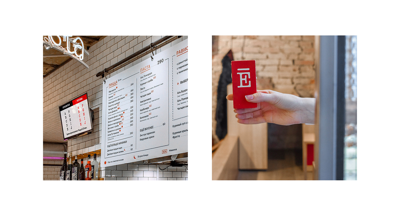
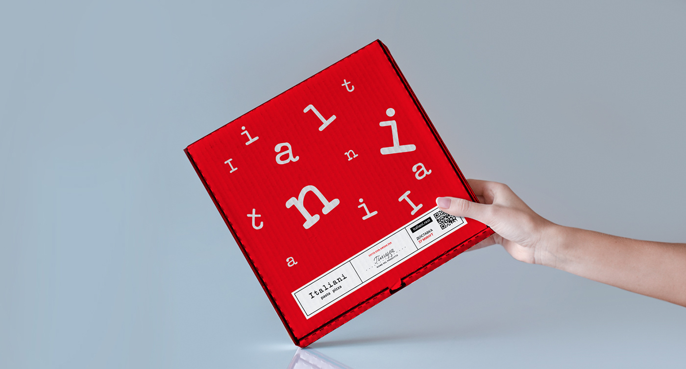
We used the metaphor of Formula 1 for packing and apparel of the delivery service. Letters taken from the logo are both dynamic and resemble logo stripes on the racer outfit.