

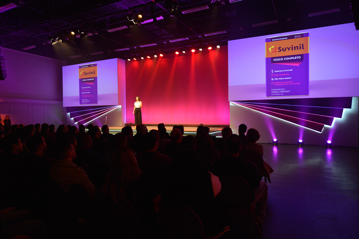
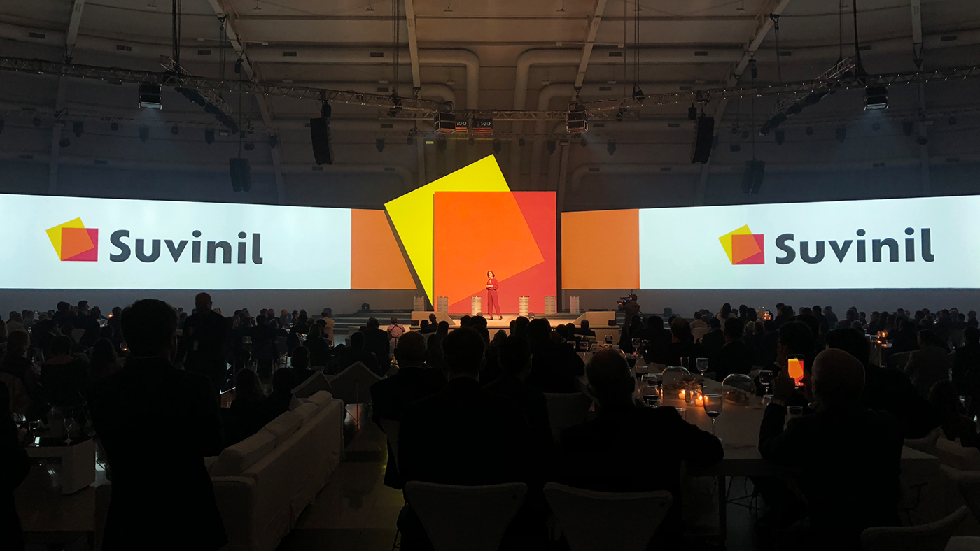
Painting a new story
Suvinil, the most traditional paint brand in Brazil, has just introduced their new positioning and identity, a project developed by Interbrand. Known for transforming living rooms, bedrooms and houses, Suvinil enlisted Interbrand to help transform its brand.
Suvinil’s rebranding is meant to differentiate the brand from its competitors and bring it closer to their consumer’s profile, which has evolved over time. Both Suvinil and Interbrand realized that those purchasing paint for their homes, are looking for an extension of their personalities, and a change in the color of the room reflects their own choices and feelings. From this idea, we created a strategy that was the foundation for Suvinil’s new positioning and confirmed their internal values, defined their key audiences, traced their brand’s personality and now, its new purpose.
Change goes far beyond the paint, brush and wall
The paint industry is known for a language that is undifferentiated and distant from what the consumers really need. For this reason, The first step to build Suvinil’s verbal identity was to understand what words and paint had in common, as both are a form of expression.
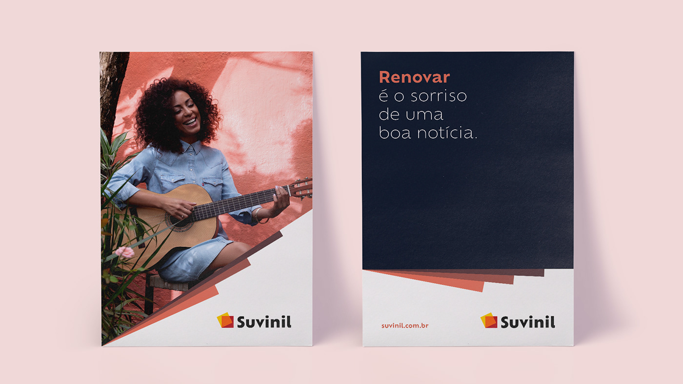
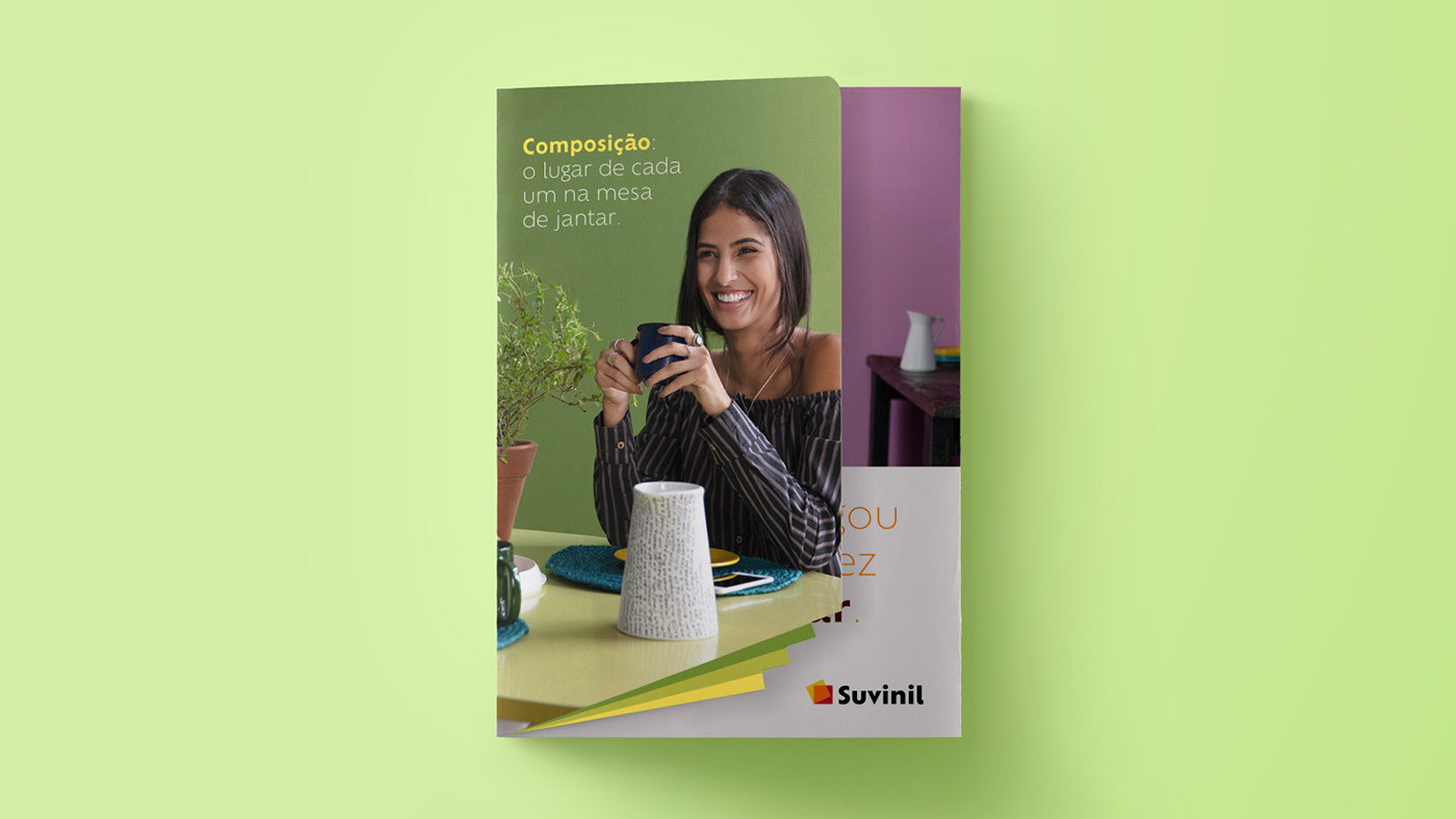
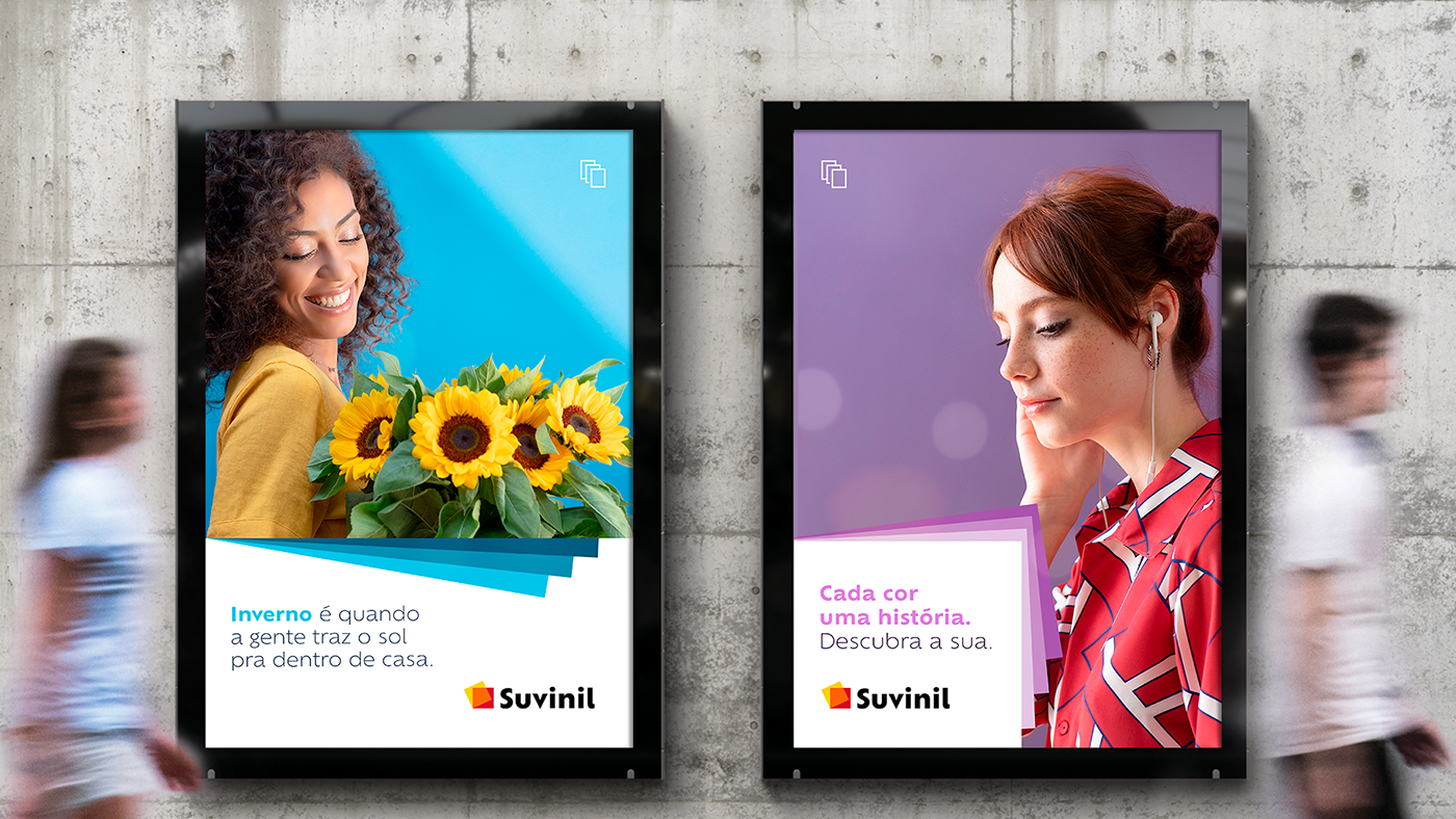
From there, we developed an effective linguistic tool with messages and tone of voice to carry the power of storytelling to all of the brands’ touchpoints. From every content produced for the new brand’s launch, to each attribute on Suvinil paints’ packaging, verbal identity helped to rethink the conversation with the consumers from the paint segment.
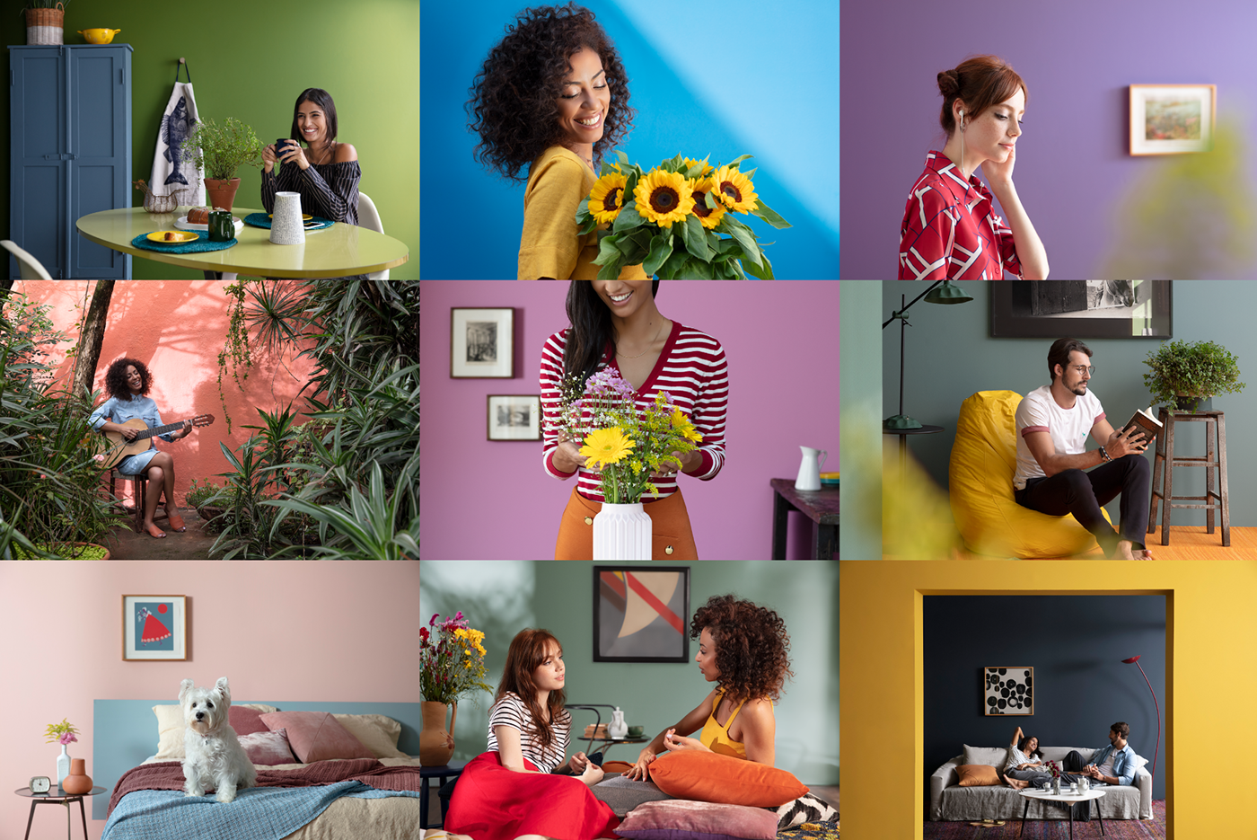
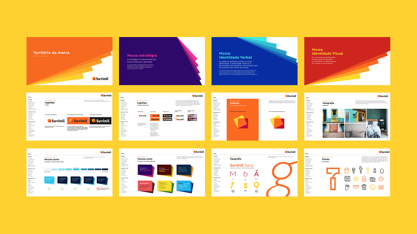
The brand’s new purpose is also perceived in the new visual identity, with simple, dynamic, and vibrant elements. The new brand values the stories behind every topic, combining colors, graphics, people, environments, and passions.
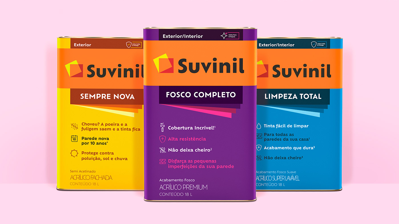
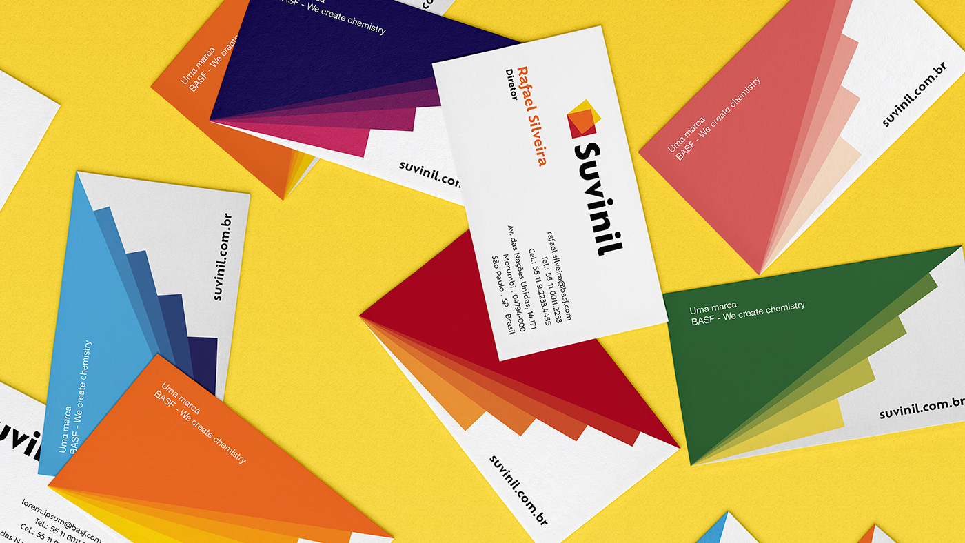
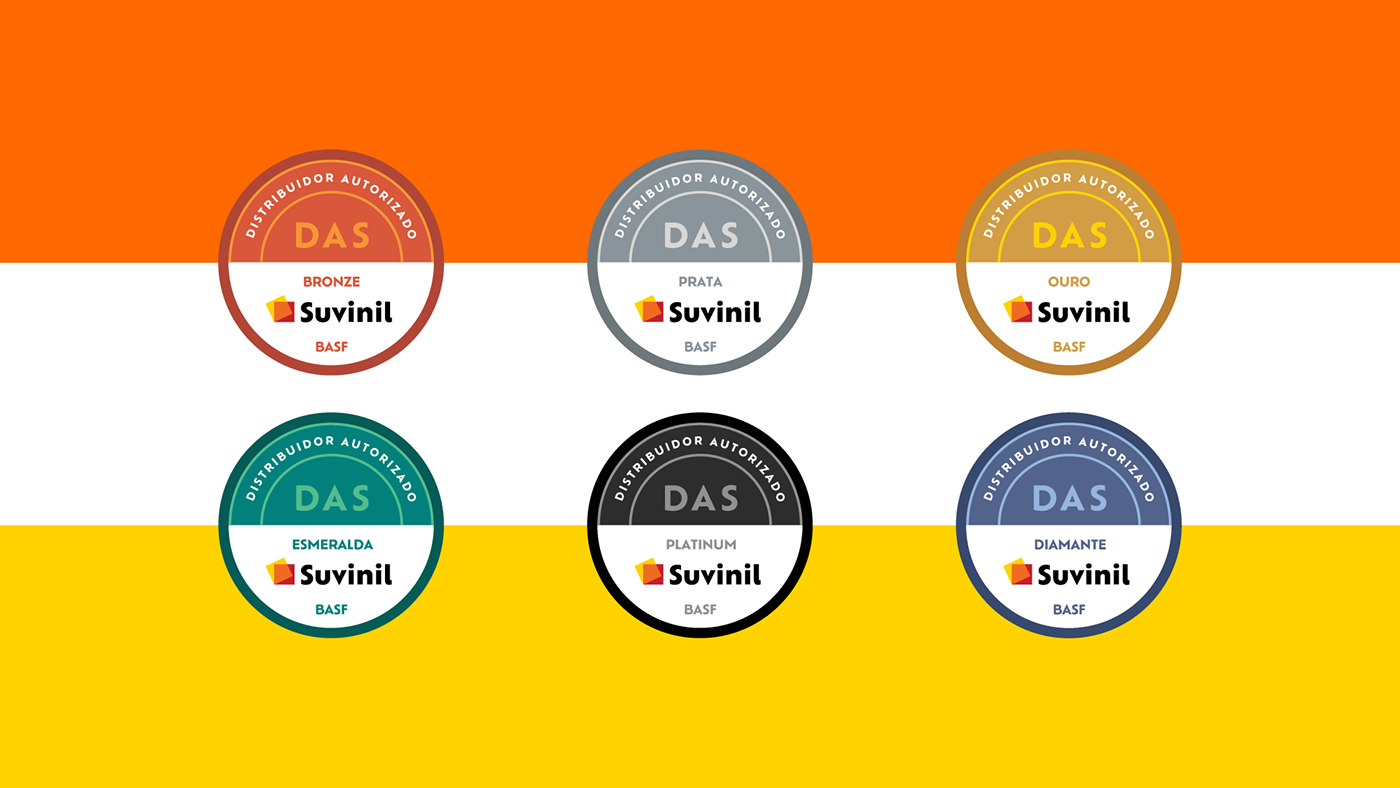
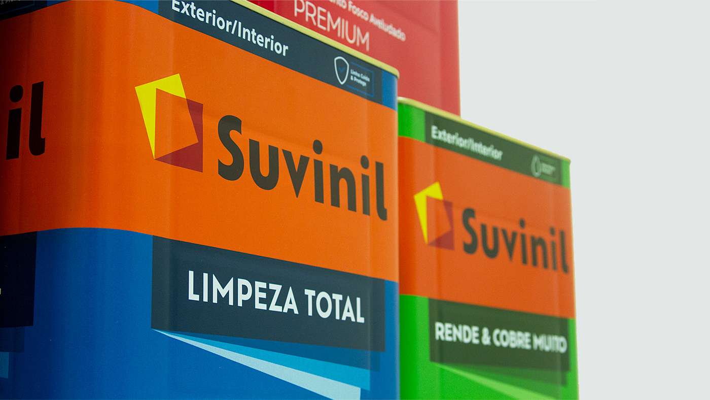
The new logo was designed to unfold Suvinil’s ideas and values, and is now composed of two key elements: the symbol, which preserves the renowned colors of the brand - red, yellow, and orange – has flow and energy; its layers represent the connection and transparency that Suvinil brings from its audiences’ stories. The typography is powerful, like the story of the brand, exclusive and easily recognized, introducing details that reinforce their personality. The design of the letters is present not only in the logo, but also in the visual universe and communication materials.
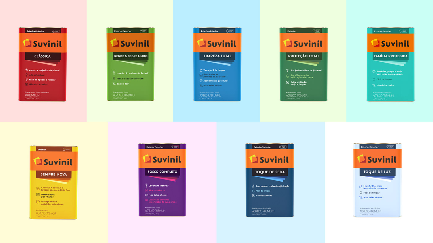
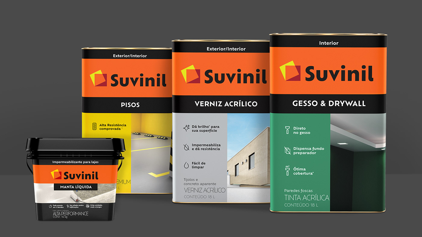
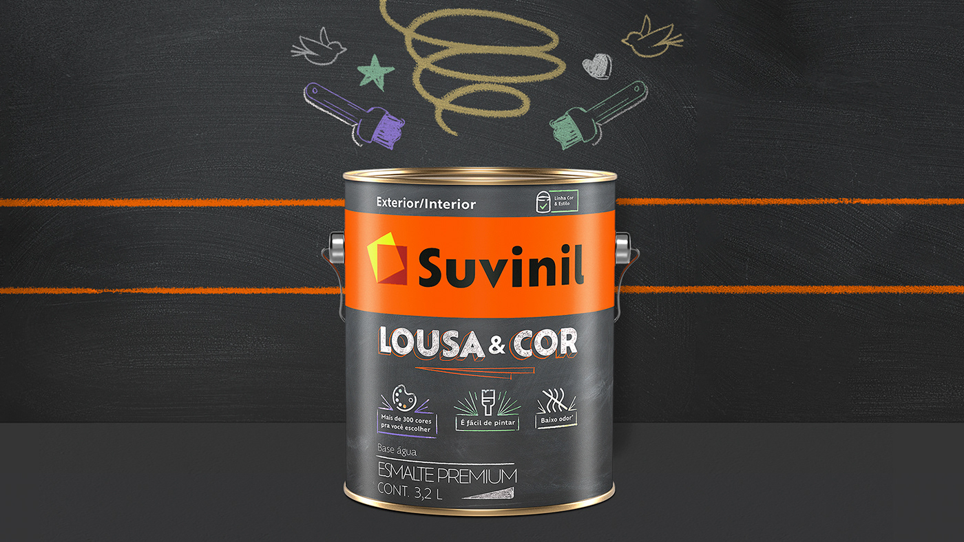
The changes also contemplate the packaging design for every Suvinil product, which now feature a cleaner universe, with direct information and easily identifiable symbols. The reorganization of the products’ portfolio made it more clear and easier for the consumer’s shopping experience, since it’s now focused on people’s needs. and Suvinil focuses on the real necessity of the consumer, without causing uncertainties. Every decision regarding the packaging was made with the consumer in mind, to increase their trust in the brand.


Project by Interbrand São Paulo
Creative Direction: Sergio Cury
Design Coordinator: Leandro Strobel
Visual Identity: Leandro Strobel, Carlos Teles, Caio Reis, Natália Zomignan, Lucas Mayer
Verbal Identity: Felipe Valério, Pedro Kastelic, Camilla Cossermelli, Giovanna Marques
Typography: BlackLetra
Brand Strategy: André Matias, Elaine Baio
Animation: Erick Fugii
Photograph: André Klotz