PT
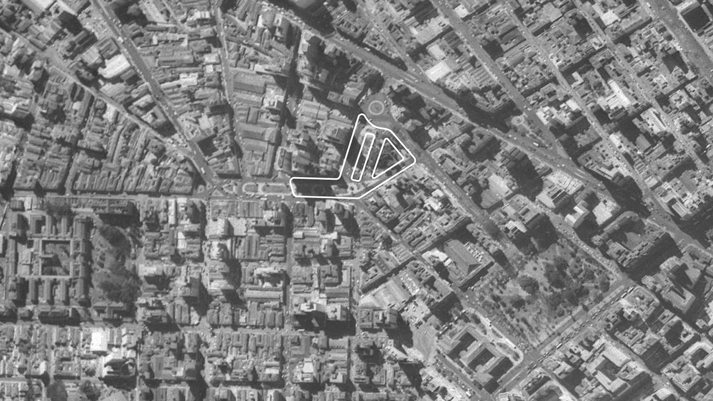
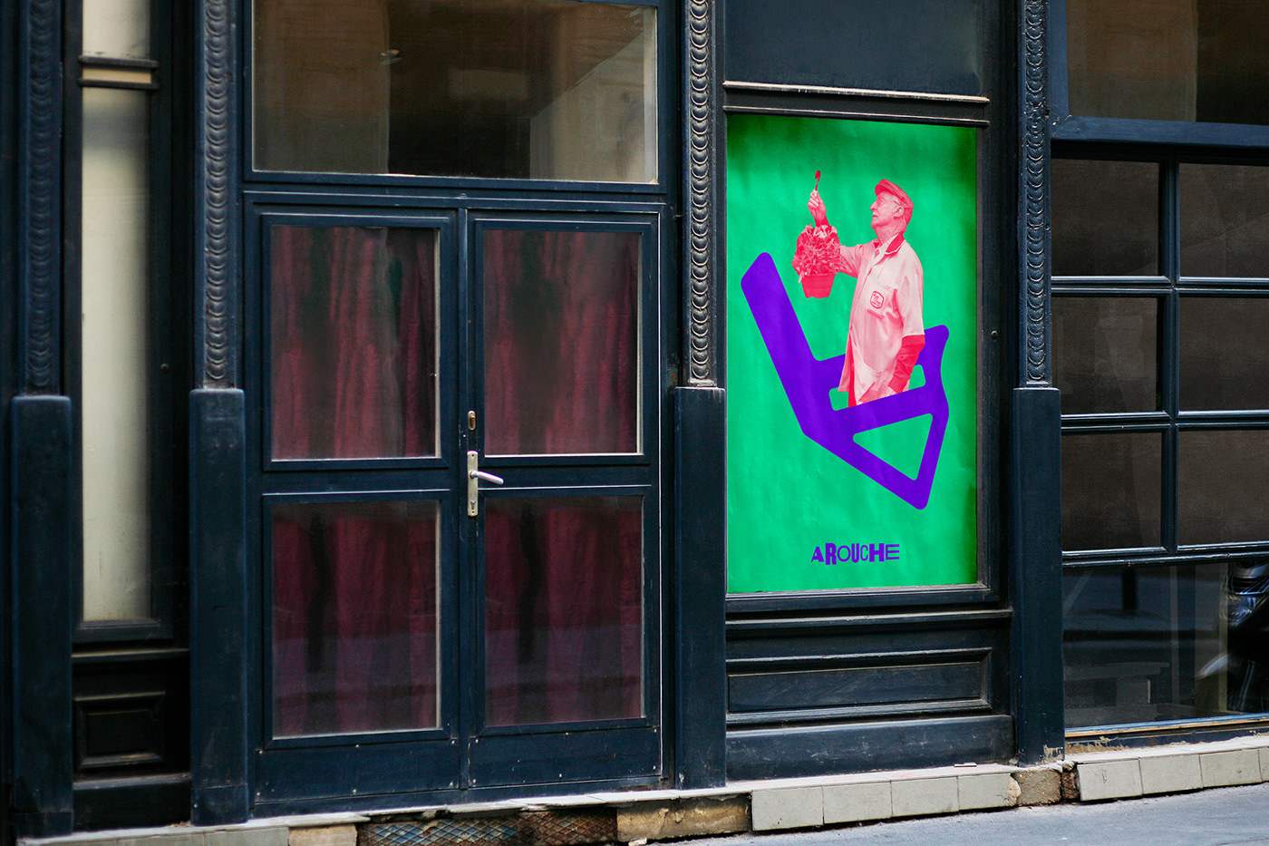
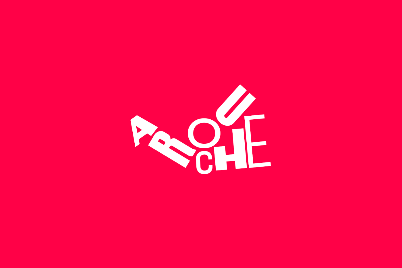
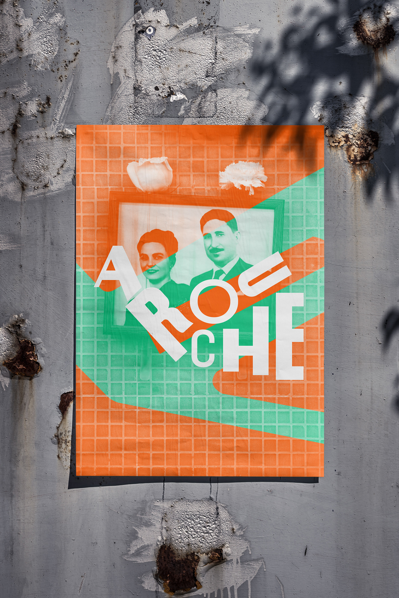
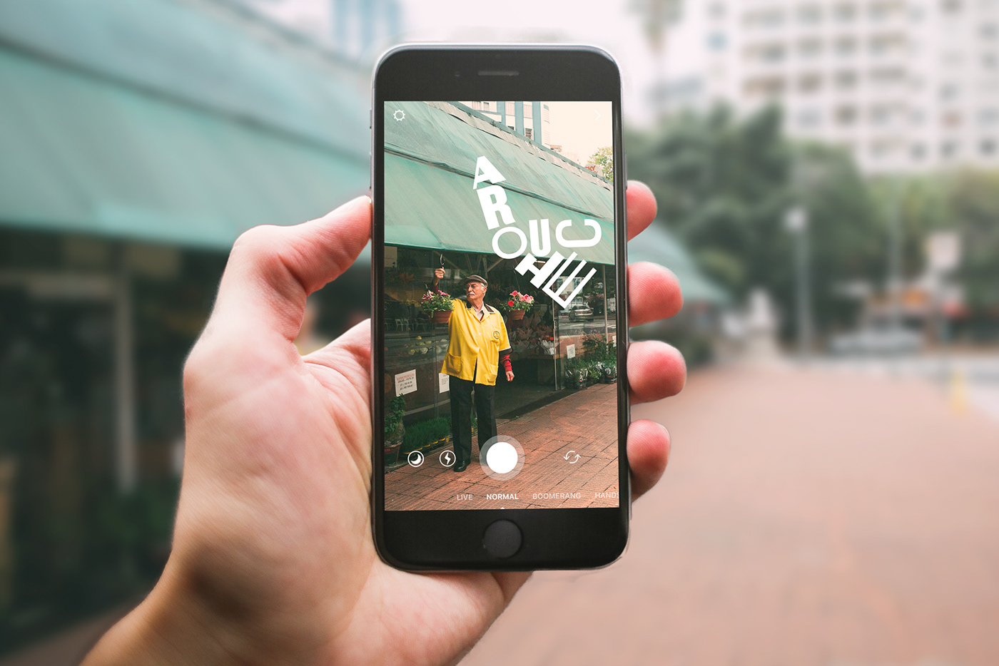
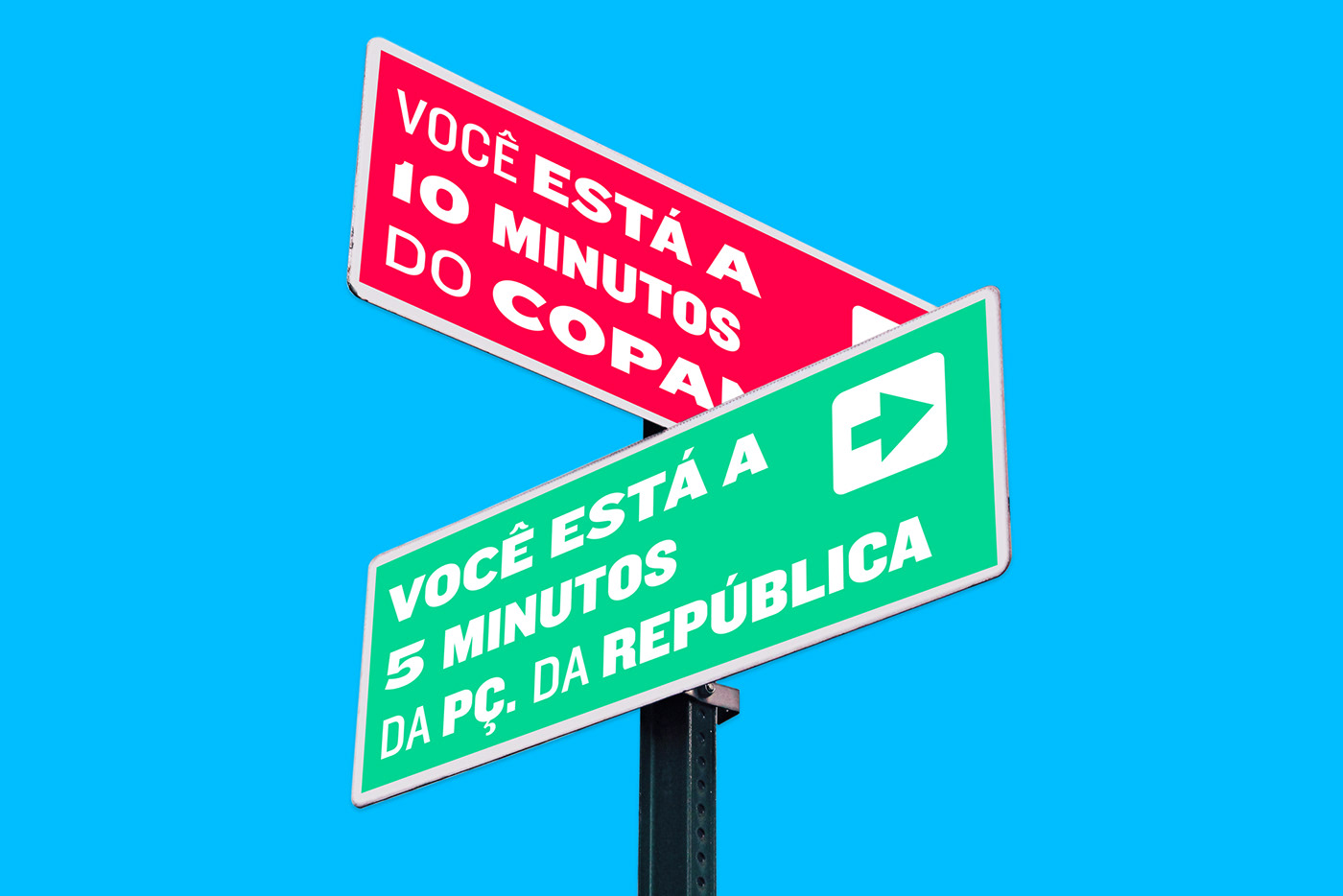
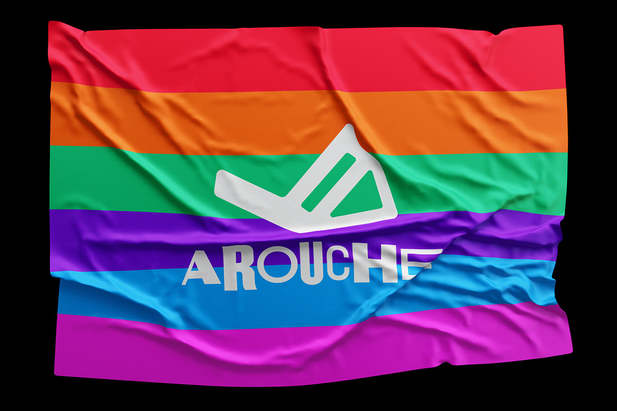
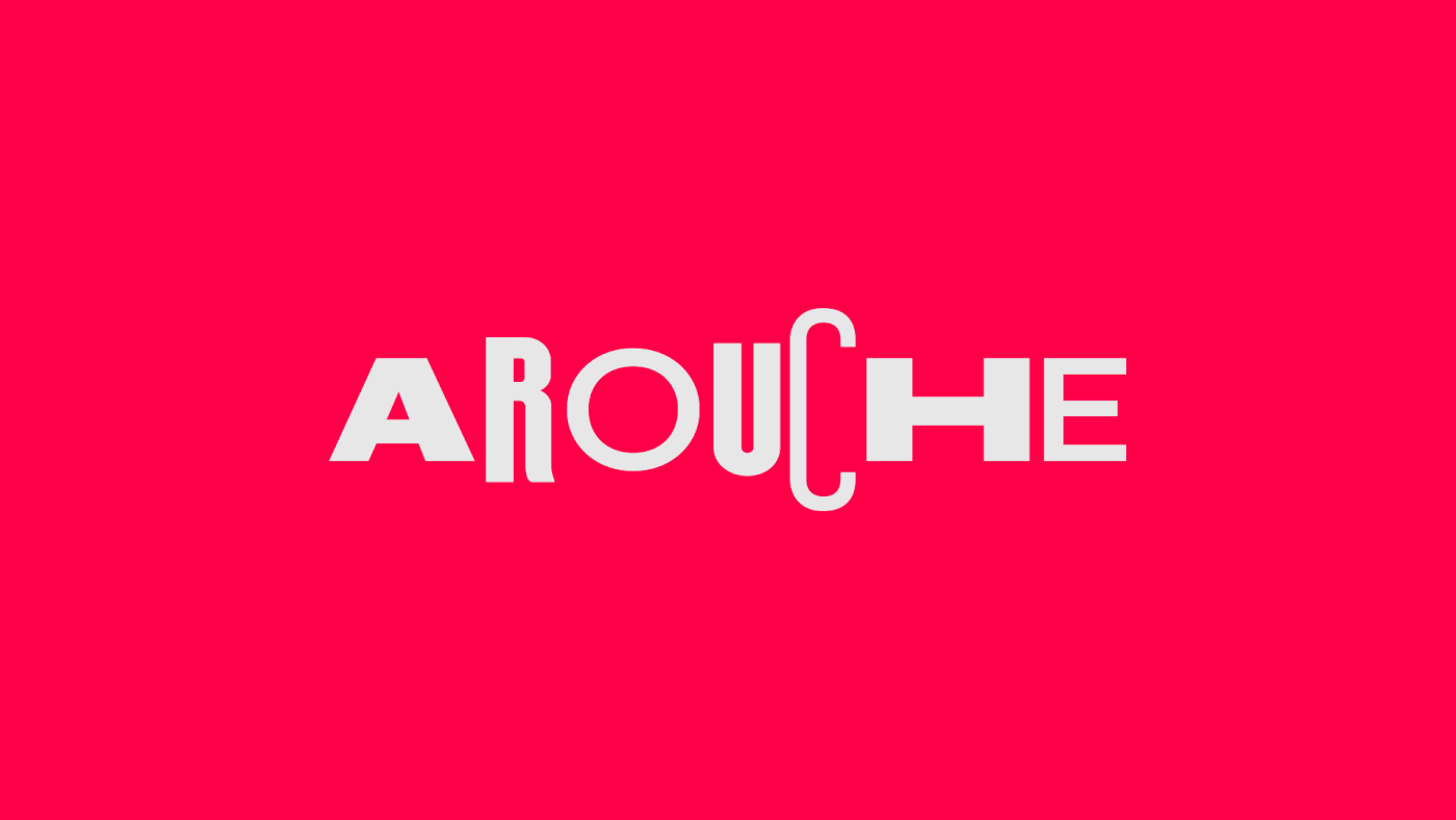
O largo do Arouche, praça tradicional do centro de São Paulo, abriga uma grande mistura de culturas, comerciantes e moradores. Originalmente inspirado na arquitetura de estilo parisiense, o marco da cidade se distanciou da comunidade nos últimos anos. Com o intuito de revitalizar o largo, o escritório de arquitetura triptyque desenvolveu um projeto para a prefeitura de São Paulo, e dele surgiu a oportunidade para a Interbrand desenvolver uma nova identidade, seguindo o mote “um lugar para todos”. De liberté a LGBT, Arouche é um lugar livre – um espaço humano. As variáveis da tipografia e a abrangente gama de cores representam um pouco de cada um que faz o Arouche viver.
O projeto foi premiado na categoria de branding pelo IF Design Awards em 2018.
EN
The largo do arouche (arouche square), a traditional square in the center of São Paulo, houses a great mix of cultures, merchants and residents. Originally inspired by the Parisian style architecture, the landmark of the city has distanced itself from the community in recent years. In order to revitalize the place, the triptyque architecture office developed a project for it, and then, we had the opportunity at Interbrand to develop the new visual identity, following the motto "a place for all". From liberté to LGBT, Arouche is a free place - a human space. The variables of the typography and the wide range of colors represent a little of each one that makes the Arouche live.
The project was awarded in the branding category by the IF Design Awards in 2018.
The project was awarded in the branding category by the IF Design Awards in 2018.
direção criativa / creative direction
sergio cury
sergio cury
coordenação / coordination
erick fugii
erick fugii
design
ronaldo vidal
ronaldo vidal
verbal / text
pedro kastelic
pedro kastelic
estratégia / strategy
daniela klepacz
daniela klepacz