Balloon & Whisk
designed by Thinking Room
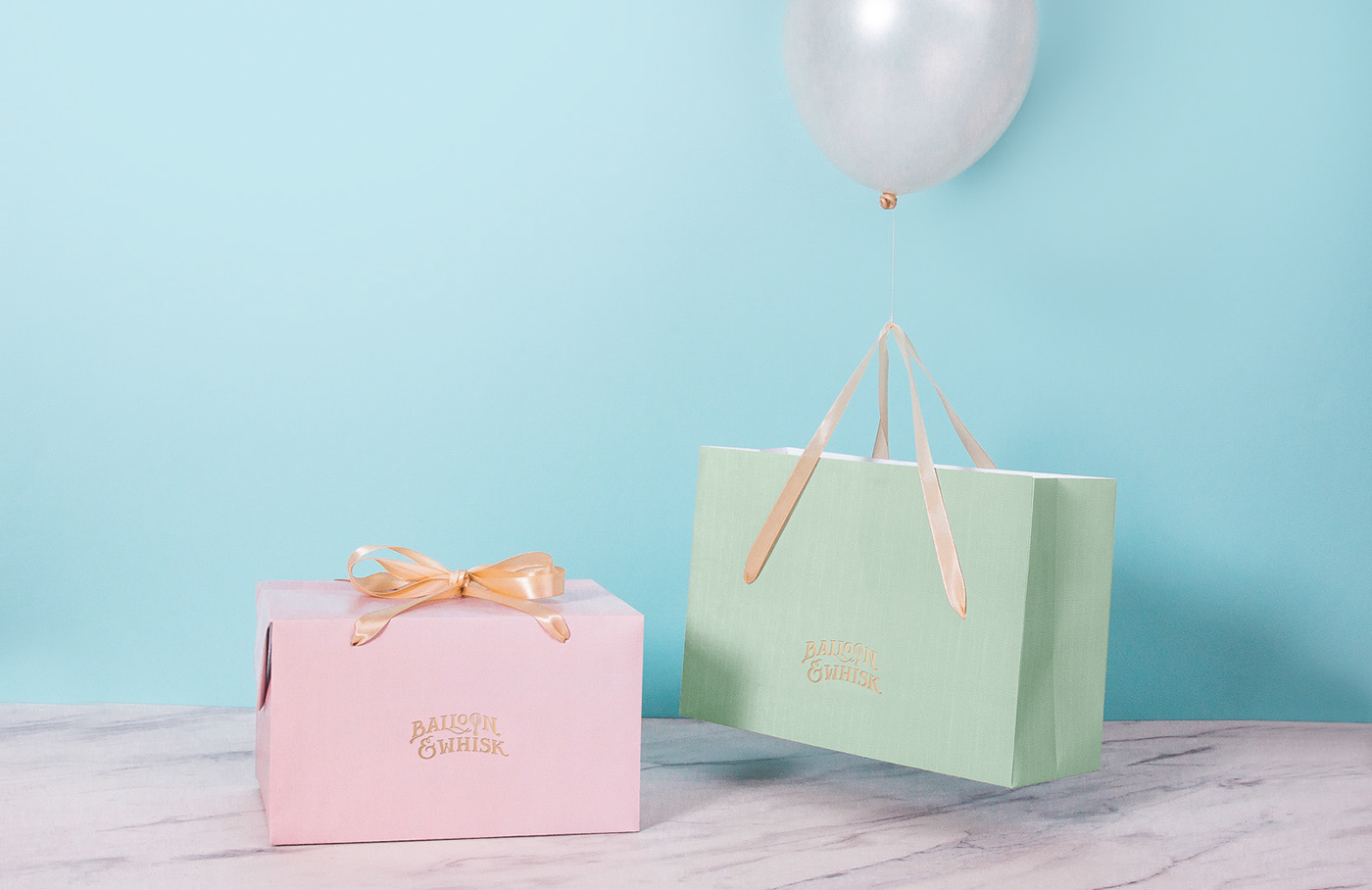
The branding revolves around the 'light' or 'air' theme, a theme shared in common by 'balloon' and 'whisk'. Balloon contains air, whereas whisk is a cooking utensil used to incorporate air into a mixture. The 'light' theme is prominent as well in the illustrated characters, each representing different flavours and delicacies. The personality of the products is represented by a set of illustrations. A wise man is used to represent wine, while tea is represented by a calm and mature woman. Also a sweet and cheerful boy and girl are used to represents various flavours of cakes and cookies.


Are you interested in designing tea packaging in Young Bird Plan 2018 Guanish Product Design International Competition ?
Please visit www.youngbirdplan.com.cn


