


金萱那提品牌行銷視覺設計
Jinxuan Latte: brand design of font marketing
主視覺設計:吳芷寧 jhih-ning ,Wu | 動態設計:陳巧育 Seed Chen| 影片配樂:曾元濃 Tyn Tseng
這是一套新字型的品牌行銷視覺專案,透過平面與動態視覺,在網路媒體上推廣這套新字型,並舉辦實體發表會,對外正式宣布新字型的誕生。
|金萱那提|
justfont 於 2018 年 8 月正式發表新字型系列「金萱那提」,為 justfont 金萱字型的延續之作,字型架構傳承金萱字型。金萱那提是一套混合圓體與明體的字型,外觀既有圓體的圓潤,又有明體優雅的曲線變化,圓潤之餘更有清爽感受。優雅的一面比喻為茶香,渾圓的厚度比喻為牛奶,justfont 將這兩大特點融合,成為全新的「金萱那提」。
In this project, we had fostered a key visual for our brand new font“JinXuan Latte.” The key visual is applied in forms of static images and motion graphics for both digital promotions and a special media event dedicated to this font.
In August 2018, justfont officially announced its new font family“JinXuan Latte,” which is a new work based on the structure of the original“JinXuan” the world’s first East Asian ideographic typeface realized via crowdfunding in 2015. The name Jin Xuan is from a famous Taiwanese tea. When designers put milk into this drink, it became Jin Xuan “Latte”,The style of “JinXuan Latte” is combined with traditional Mingti (aHanzi counterpart of Serif typeface) and modern Yuanti(Roundedtypeface). Through the idea of tea and milk, our key visual represents the elegance of Mingti and loveliness of Yuanti.
|視覺概念 visual concept|

|平面視覺|發想過程:從構想、實拍到向量
1. 構想
以「金萱那提」的造型外觀做發想,從具體物品的聯想再到抽象概念,大致規劃出主視覺的風格與方向。
圖形:抽象的、自然非尺規的曲線
色彩:多彩、清爽,明亮但飽和度適中
材質:Q彈、柔軟、具流動性但偏向固體型態
風格:活潑、快樂、可愛、無性別
2. 實拍
接著透過實驗性質的拍攝尋找靈感:「金萱那提」用牛奶表示渾厚的圓體特徵,因此以牛奶混合多種色彩的顏料,滴在透明塑膠片上,觀察並記錄其圓潤和流動感,以及非幾何的自然曲線狀態。
3. 向量
最後回到平面的視覺設計,嘗試主視覺的風格,並定義出圖形、色彩、材質的具體規範。

實驗性拍攝

定義圖形與色彩計畫

主視覺與延伸應用
|動態設計 Motion Design|

|動態設計|
影片為新字型發表的形象宣傳,概念以「混合」為主題。新字型的開發過程如同在實驗室做科學實驗,量身定做調配完美的比例,配方以金萱茶混合牛奶,添加圓潤 (Chubby)、鮮美 (Juicy)、Q彈 (Gummy),混合出美味的視覺風味。
風格轉變
前半段以實拍風格為開始,而後面的轉為向量的平面動態設計風格。由於行銷策略,我們以前半段當作活動的預告,引起大眾的討論與關注新字型的發佈活動,我們以保密的方式,直到當天產品發表會才公布字型的形象包裝。
Description
This is a video of marketing a font. The font is the latest concept published by justfont in 2018: Jinxuan Latte. Taking “mixing” as the concept of the film, the development process of the new font is like mixing mysterious elements in the laboratory to develop a new mixed style font.
The video starts with photography, but the middle section turns into the vectors that created with motion graphics.Because of marketing strategy, we design former section of the video to be a teaser that creates curiosity drawing people toward the new font launching. We kept the secret that the latter half of the video containing the image of Jinxuan Latte until the font was released in the official publication.
|形象影片 Promotional video|
|活動預告 Event Teaser|
|U+1F95B|
U+1F95B 為文字系統的國際碼 (Unicode) 編碼的字碼,代表表情符號中的一杯牛奶,在飲料文化中加入牛奶通常稱為那提Latte,而 Jinxuan U+1F95B 即為金萱那提,也是這次產品發表會和計畫的名稱。
“U+1F95B ” is the font's Unicode that presents an emoji, a glass of milk, means Latte, an implication of the name of the font. That's why the project name is Jinxuan U+1F95B.
|分鏡腳本 Storyboard |


U+1F95B : Event Teaser

金萱那提網頁
|視覺形象應用 Brand Application|
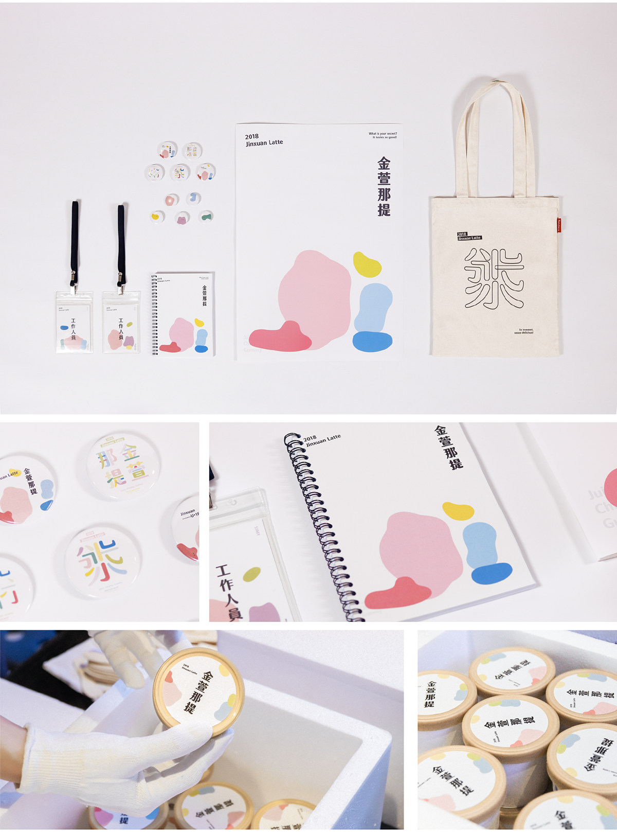
周邊設計:工作人員識別證、金屬紀念徽章、主視覺筆記本、主視覺海報、筆畫圖騰造型帆布袋,
與合作廠商推出的「金萱那提」口味冰淇淋
|產品發表活動 Event|

發表會紀錄:字型總監分享、發表會走廊與大廳入口動態牆面


