
Description
DOCKAAN is a distribution company aims to provide groceries with all fast-moving consumer goods through smart and automated service

Mission Statement
Is to create a Brand identity and a unique, modern graphic system that reflects the old grocery style in the Arab world and the vintage name DOCKAAN in modern tools and platforms, shape , reflection costume made designs.. by using the vintage effect and modern graphic styles in concepts, colors, shapes, sizes , typeface... to make a unique presence for the corporate in each and every detail.
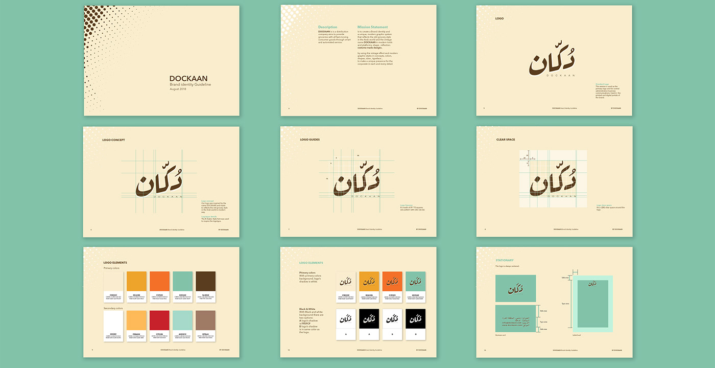
Logo concept
Our logo was inspired by the name DOCKAAN and made to reflect the old grocery style in the Arab world in a modern way.
Logotype Details The B Arabic Style font was used to inspire the logotype.
Logotype Details The B Arabic Style font was used to inspire the logotype.

Logo Elements:
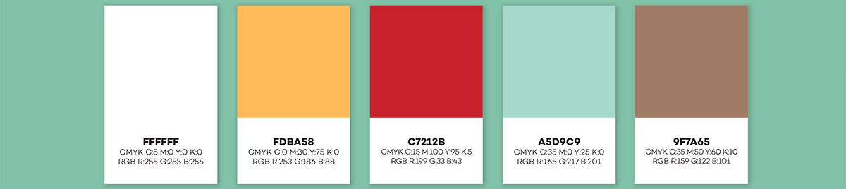
Primary colors

Secondary colors
With Primary colors background, logo’s shadow is white.
With Black and white background there are two options: 1/ logo’s shadow is FFEFCF or 2 / logo’s shadow is
in same color as the logo.

identity
Inspired by traditional patterns converted in a modern way. The identity system has been developed with great variations that can be flexible and playfully remixed to create hundreds of compositions.
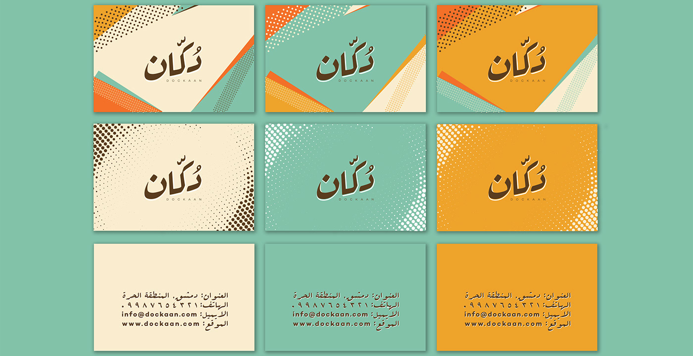
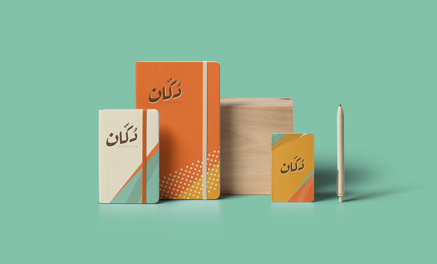
stationary.


mobileapplication.