Top Branding Design Works for your Inspiration
October – December 2018
Brand identity is a key component of every business both offline and online. It represents the core value, mission and vision of the company in distinctive visuals such as logo, color palette, typeface and other brand assets.
We've been exploring the internet and trying to find some really good new brand identity works. This is a selection of the best in Oct - Dec, 2018 according to our team. Some of them designed by freelancers, others by branding agencies, but all of them caught our attention and we thoughts that they worth sharing. Please scroll down to see some of them and feel free to share the list in your fav social network.

By author:
I've always thought it would be cool to design the branding/packaging for a candle range so in some spare time I threw together a quick style tile just for fun. I had this idea that the logotype would be slightly warped in line with the brand graphic but wasn't sure if it just looked a bit weird, you can see this version in the attachments - which one do you guys prefer?

By author:
Founded in 2014, Copper (formerly Prosperworks) set out to disrupt the world of traditional CRM software. They are dedicated to putting the end-user first by creating the best user experience possible – fast to deploy, easy to use, and built directly into G Suite. Copper asked Ueno to completely reimagine their visual identity. Our first task was to give them an entirely new name. We came up with Copper because it conducts energy, and has been a crucial part of currency for hundreds of years. We worked closely with the amazing Copper team to give them a new name, brand strategy, a new identity, tone of voice, a digital and an OOH presence. We designed the brand, website, developed the art direction and photography for all touch points.


By author:
Hi everyone, Showcasing the logo we did for Patch. Beautiful work by @Charlie Isslander Idea was to figure the use of letter "p" for patch. But also trying to indicate "a patch" of something, so we did a design where we would have a mediary element indicating "patch" (purple overlay) of middle ground between tenants and landlords. All the best, Balkan Bros.
By author:
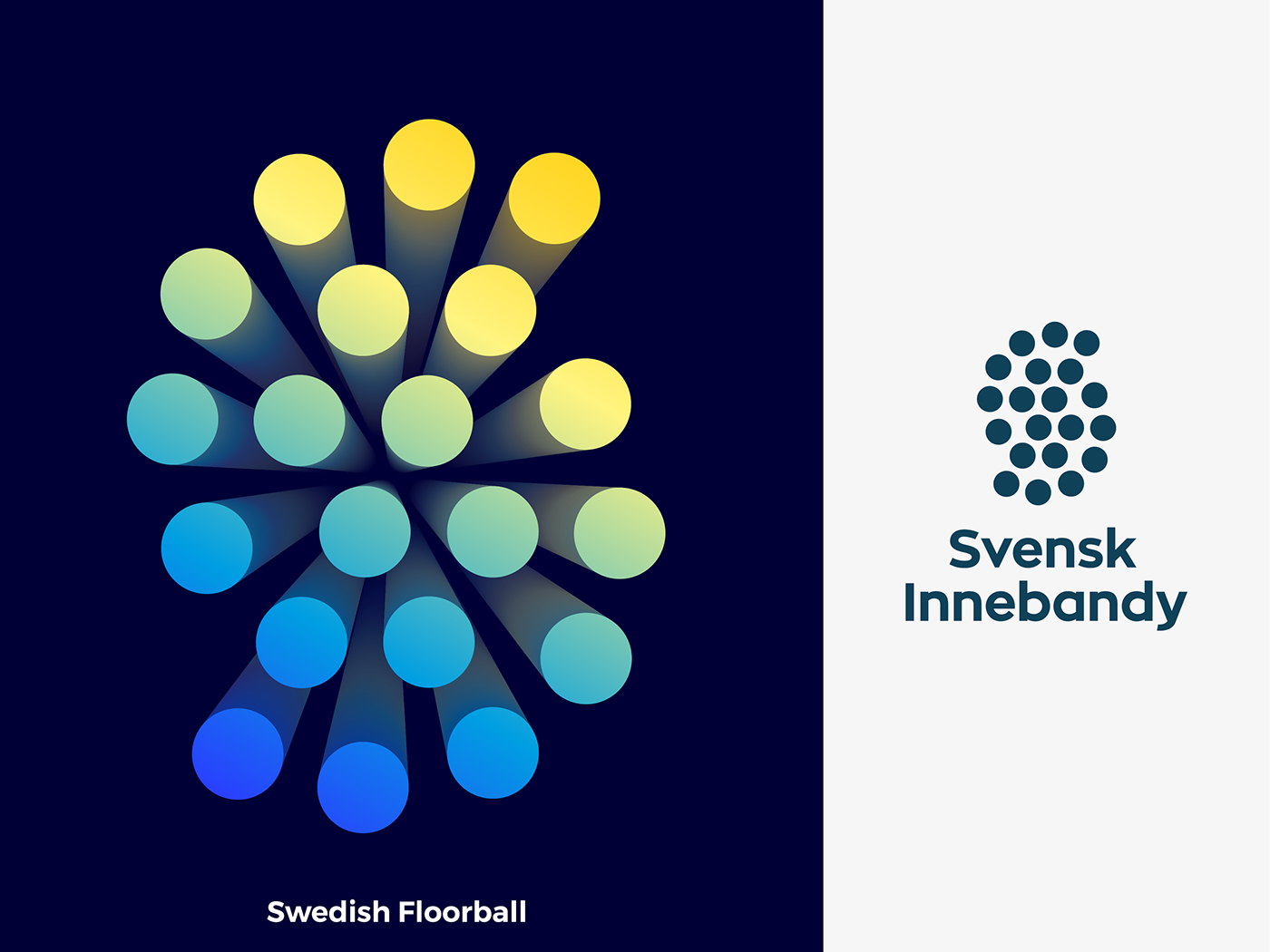
Hey guys, here is approved logo for Swedish Floorball Federation . Logo is inspired by S letter for Sweden, Floorball Ball and Team Play.

By author:
I designed this bag reusable bag for Target about 3 years ago and it was finally produced! How can something so simple be so cute?!

By author:
Hey guys, this Friday I decided to post the grid for Fitii logo that I've posted yesterday. Fitii is an fitness app based on competitive aspect with your friends, that keep you motivated during the training. The logo concept is inspired by fitness dashboard and F letter. The construction of this icon is based on a golden ratio grid, that is very similar to square grid but instead of 1/1 proportion it's 1/1,618. Did you ever have used this kind of grid?

By author:
Working on a rebrand for Chanel. Although I like their stark black and white, it seems that far too many other high end fashion brands have followed them down that road. So to be unique and let the brand shine, I've moved away from the black and white and created something that, hopefully, they can't follow. These are just a few shots of some basic mobile web concepts. Enjoy!

By author:
Last year Vintage Roadhouse out of Decatur, TX hit me up to rebrand them and do an overhaul to their stationery. Check out the attached PDF for a look at all of the cool stuff I got to put together for them.

By author:
It’s back! —LOGOTen— 💡⏱ I have decided to share a small case study of exploration logo work. The challenge is to give myself a random word and then I am only allowed to use one typeface and one color (in this case all colours due to the name) and have to come up with ideas within a 10 minute bracket. I think it’s gonna be fun to share the way in which I approach logo work and hopefully along the way help to inspire others

By author:
Branded Stationary for Mr. Bagelman - A Texas based chef with a mission to create delicious, hand-made bagels. We mimicked his process and limited quality ingredients with a very minimal color pallet and a variety of halftone patterns.

CBy author: Hi my friends, this is a letter "B" to do the basic design of the LOGO. Whether in our lives or at work. A good partner is very important. He/she is an important factor in the success of our work. In this design, I used the raised thumb as the center of vision. The purple color used in the color is the main color. Because my initial idea was to design for the baby-care brand.

By author:
I recently published on Behance 50 lettering style logos that I've had the privilege to design over the years.
By author:
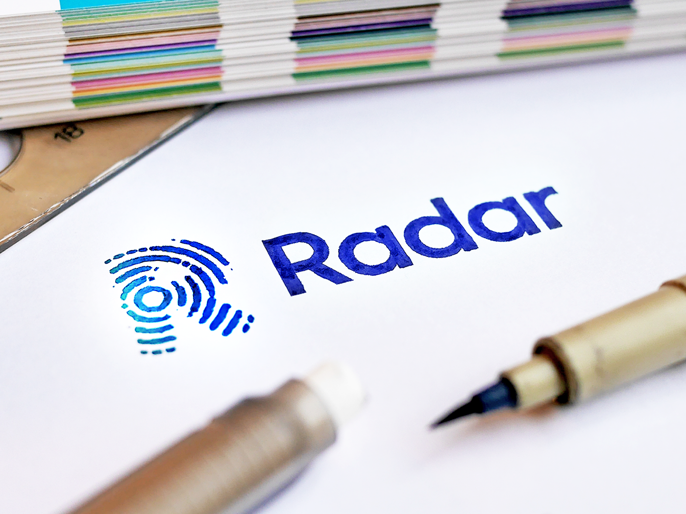
Radar identity - Brushed. A second exploration in this personal adventure in creating new identity designs. I used digital tools to create a ripple effect and tried to recreate it onto paper with my own brushes. Idea for this design: Re-design proposal for a Dutch TV show called Radar. They exposes consumer problems, but also tries to persuade companies and agencies to come to a solution. Happy to hear your thoughts!

By author:
This is my chosen logo from yesterday’s —LOGOTen— 💡⏱ Challenge. I've developed into a stationery set. I have decided to share a small case study of exploration logo work. The challenge is to give myself a random word and then I am only allowed to use one typeface and one color (in this case all colours due to the name) and have to come up with ideas within a 10 minute bracket. I think it’s gonna be fun to share the way in which I approach logo work and hopefully along the way help to inspire others. ———— Word is Wave.


