Task: to create a label design for the line of beer distillates.
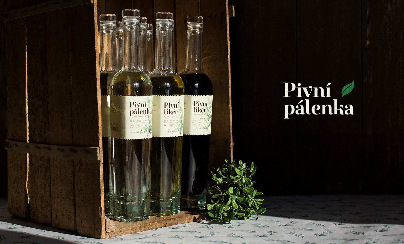
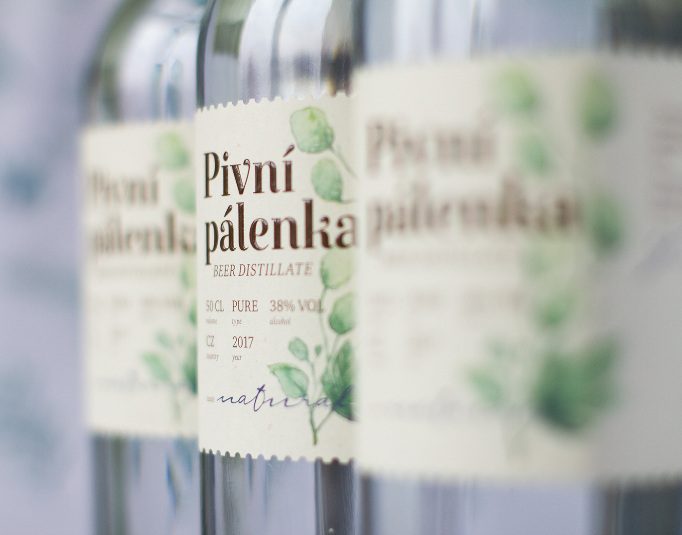
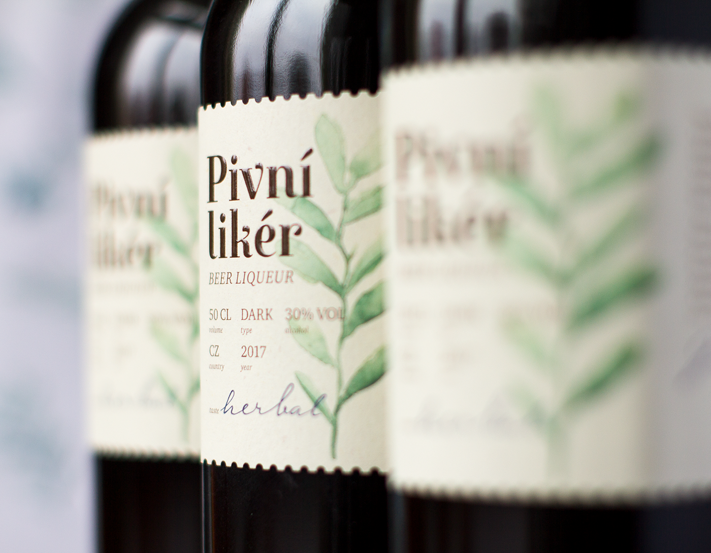
Beer distillate is a non-typical kind of alcoholic beverage. It is manufactured by the slow distillation process of a lager beer, which enriches the beverage with a specific flavor of beer foam and a taste of sweet malt. About 16 liters of a high-quality beer is needed to produce one liter of beer distillate. When L’OR Special Drinks had started to manufacture this kind of alcoholic beverage, a new label design was needed for the whole line of new products: pure beer distillate, sweet light beer liqueur, and bitter dark beer liqueur.

Solution.
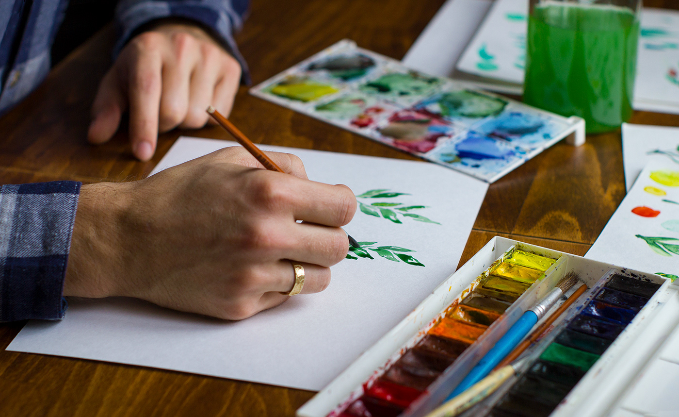
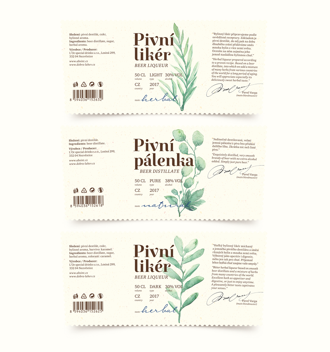
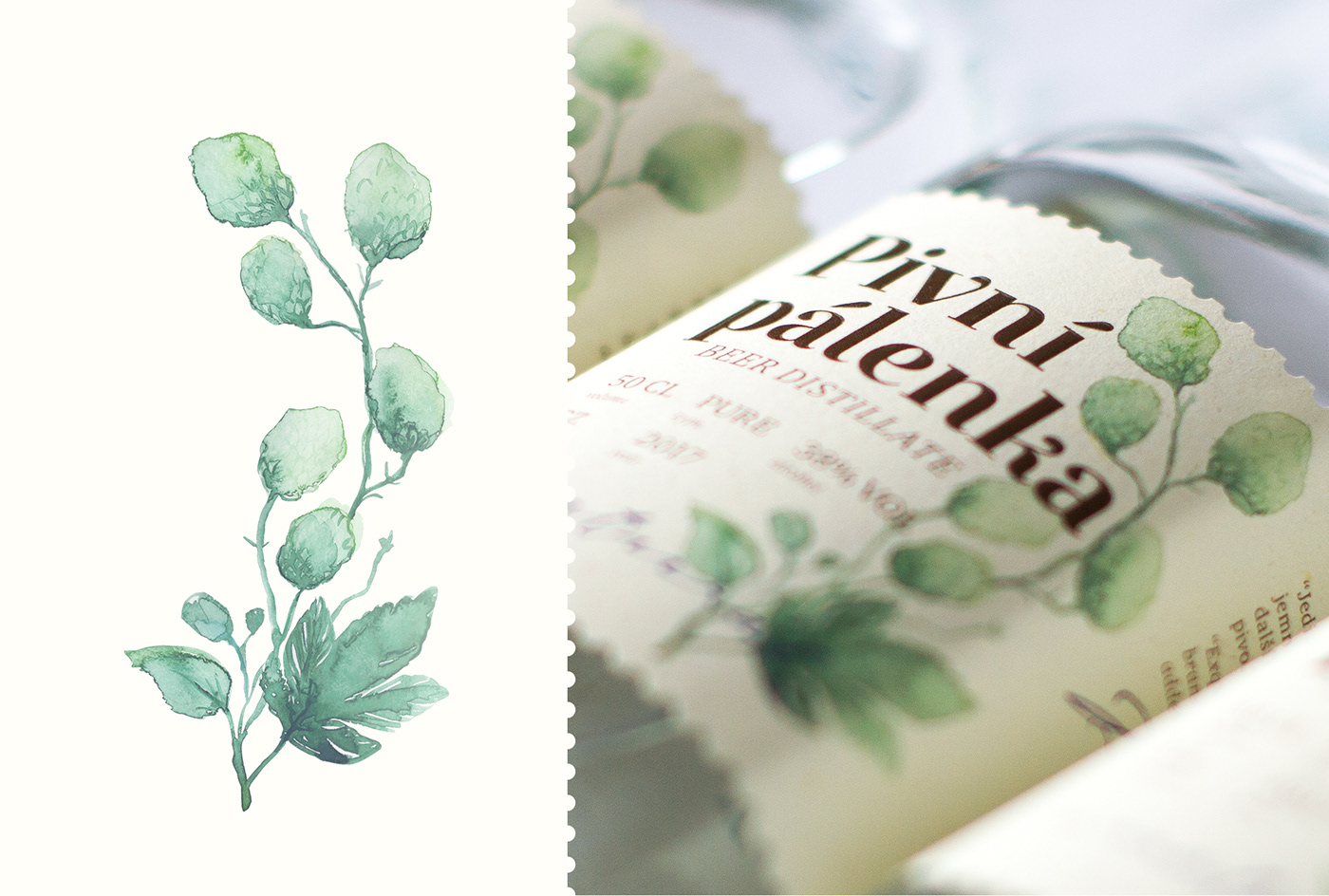
The product consists of organic and natural ingredients. The main approach was to focus on this fact and to depict the purity of the beverage on the label. Hence, a clean, simple, and light label with an emphasis on the herbal base of the product was created. The watercolor illustration technique was chosen to underline the naturalness of the ingredients. The combination of a lively illustration and texts, strictly aligned to the grid, is complemented by a massive but elegant main title. The edge of the label is also decorated by the dotted cut to add a rustic, “homemade” touch.


A bit of work in progress :)