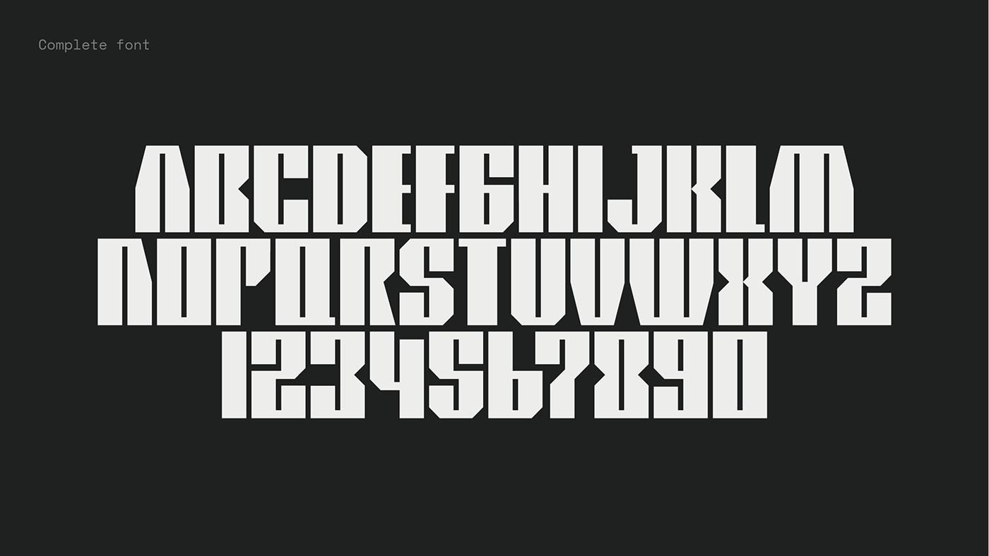
FERRATA Standard
Type design
_
Burel is a contemporary art museum located in Belluno, a town in the north east of Italy. For their brand identity and communication, Burel approached me to design a unique bespoke type. Our goal was to create a simple and recognizable type for the communication.
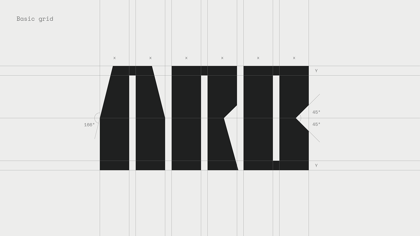
FERRATA is based on rectangular shapes, the letters are graven out from a hypothetical block of rock.
The type is meant to be used for posters, titles and short statements. As the intention of the use, the type was only develop in uppercase.