
“Simplicity and harmony are key visual elements that reflect the seamless connectivity and intuitiveness of Office apps. While each icon has a unique and identifiable symbol, there are connections within each app’s symbol and the collective suite.”
— Jon Friedman, Head of Microsoft Office design
Microsoft has paid incredible attention to detail in the design of the Office Suite and Surface hardware products. That same unique, thoughtful design thinking has extended into the design of the Office icons. Every corner radius and angle has meaning and purpose, aimed at enhancing the user experience.
Tendril collaborated closely with the team at Microsoft to create a reveal film that captures the essence of these values—The craftsmanship of the the icons and the design thinking that went into them—Drawing parallels between the design engineering of the Surface devices and the the icon designs. Read more here.


Process
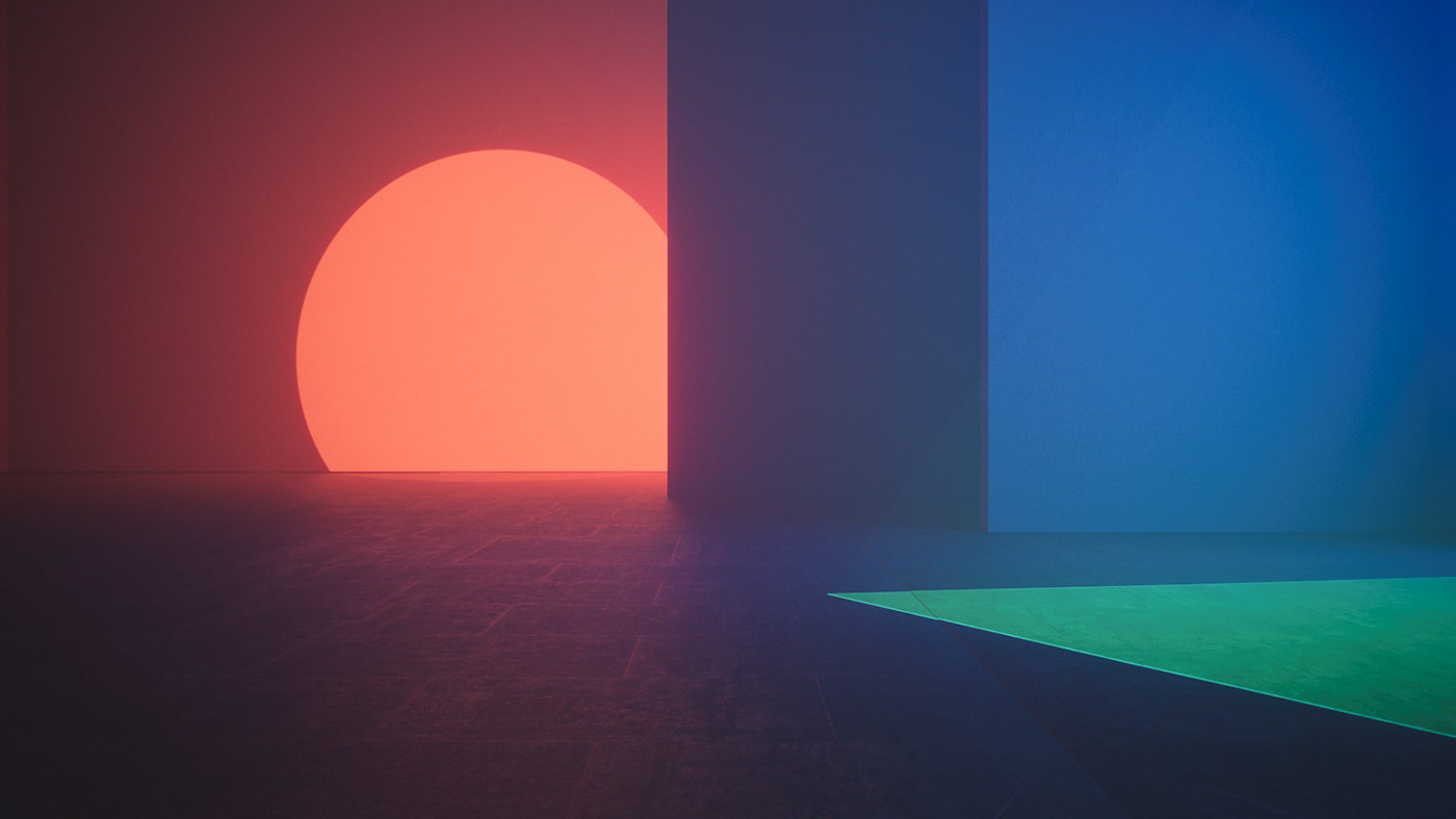
Opening with a sweeping camera move across an evolving landscape in timelapse, we nod to the icons of the past, honouring Microsoft’s heritage while diving into the future.
We are then transported to a modern architectural space and slowly introduce the carefully crafted designs through a variety of visual techniques.


Visual Development


