
Introduction
There are numerous problems that UI-UX designers can challenge themselves rather than designing trendy music and cryptocurrency apps. I try to observe and note down unusual but real obstacles in everyday life and turn them into design projects to improve my problem solving skill.
The Design Challenge
Approximately 20% of American report some trouble hearing (2017). They have great difficulty in communication and suffer from social insecurity. With the rapid advancement in smartphone and multimedia technology, how can you help them in everyday life situations?
There're numerous ways to approach a design challenge, I'm trying to develop my own process based on a solid design framework. I find the Double Diamond from British Design Council is a good model to start and easy to remember. The general idea of the model is quite similar to other model like IDEO’s human centred design ideology so it's just the matter of personal preference. There're 4 stages, either diverging to generate as many ideas as possible, or converging to narrow down what works.

The double diamond model from Designcouncil.org.uk
Next I'm going to make a to-do list and UX tools suitable for the project scale and requirements.

Stage 1: Discover
1. Research on hearing impairment
I started the project without any knowledge about hearing impairment so finding information about the subject is the first thing to do. Using Google and Wikipedia gave me an overview about the definition of hearing impairment, symptoms, causes, classification and severity. I also looked into hearing test, treatments for hearing loss and demographic.

Information about hearing impairment from nidcd.nih.gov
2. Find information on related technology
Obtaining hearing aids has always been difficult because a prescription is required. The new US law in 2017 has enabled over-the-counter hearing aids access to people with mild-to-moderate hearing loss. In 2015, the Bragi Dash introduced the first wireless earphone but the release of Apple's Airpod in 2016 has truly started a race for the mass market. Some of the new earphone model has begun to incorporate some of the technologies previously only available on hearing aids. We're seeing more and more advanced and affordable earphones each year and this is a promising prospect for people with hearing impairment.
More powerful smartphones and machine learning have allowed better AI assist voice recognition, which was still quite clunky just a few years ago. This video of Google assistant making an appointment gives me some ideas of what AI tech can do to help the hearing impaired.
3. User discovery
Based on the statistics, the target users' age range is rather large. However, people at the age of 50 and above is the most prominent in the demographic. This can be a challenge because this age group is usually not very tech savvy. Due to limited reach for target users, I tried other ways to collect insights. Online groups of hearing impaired and Reddit is one way to gather information.

After reading and collecting data, I created 2 empathy maps for 2 age groups: the young age from 18 to mid 40s and age above 50. The empathy map for age above 50 is mostly assumptions from articles that I can find, it's tough to find opinions of this age group in online communities.


4. Identify stakeholders
When designing any app, it is crucial to keep stakeholders in mind to ensure you are going in the right direction. For this personal project, I listed people who have direct impacts and the user groups who are affected by the product and try to find which one to put most effort in.

5. Discover competitors
Since I haven't set a clear goal on the app's functions, I tried to discover what currently available apps that are useful for the hearing impaired people. There're a lot of apps trying to solve different problems but I can put them into groups of most popular functions. There's one app that even try to gamificate their process (SonicCloud:Hearing app), which I find quite interesting.

2. Define
1. Define users' pain points
I tried to consolidate the data I had found, continuing with the target users. I used the Job Story from Intercom to further see the problems and situations users may have to solve in real life.

I created job stories based on what users said or might say. This is still semi-assumption but it helps me imagine real life situations.

Combined with findings in the Discover stage, there're some overlapping pain points:
• Hearing aids are somewhat unreliable in separating speech and background noises.
• Users tend to use some text apps to communicate in noisy environments.
• It's difficult to hear alerts, horns...which can be dangerous.
• It can be difficult to contact doctors or practitioners, especially for senior citizens.
• Hearing aids aesthetic and price can be a barrier for some people, even though they can greatly benefit from assistive hearing technology. This is a problem of hardware design though and an app alone cannot solve these problems.
I have some ideas for the features of the app to tackle these pain points:
Assistive hearing features: Modern common ear buds can already separate speech and background noises and are very affordable. These features will utilize modern ear buds to assist people with mild to moderate hearing impairment. At this level, most people don't have to use hearing aids yet and hearing aids are expensive and must be custom fitted. Using ear buds as introductory hearing aids will greatly improve their life quality.
However, these features can be quite challenging to develop for generic ear buds due to differences in hardware and the need of evaluation from professionals. I think more specialized ear buds will be manufactured as this is still a very young market.
Hearing tests: As hearing loss can get worse with time, these tests serve as simple check up to see if the users need to visit professionals. They are also used to create personal sound profiles for the users.
Text features: People with hearing impairment benefit greatly from text and speech recognition features. Currently these features are somewhat scattered,I want to organize them into a group that work seamlessly together.
Noise detection features: These features can do something like detecting sudden loud noise such as alerts, car horns or remember pre-determined sounds like doorbell and notify users.
Professional contact features: These features can use users's location and list nearby ENT physicians and audiologists. Maybe users can schedule appointments and update their hearing condition for professionals.
Regular contacts: Just as regular contact list, but each contact has audio profile to assist the app.
2. App idea SWOT analysis
I did a SWOT analysis for the app ideas. A real client would probably slim down the app to focus on a certain set of features.

3. Develop
1. Design solutions and app flow
Based on app feature ideas, I created a mind map to explore more details for each features. I focused on the text features because audio related features would require more research and input from experts.

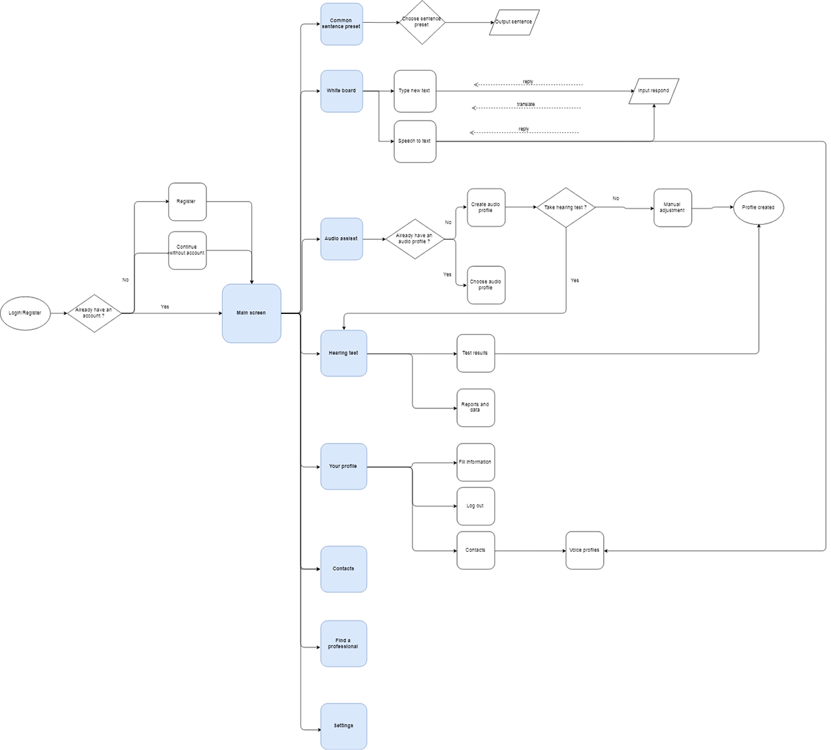
After that, I made a basic flowchart for the app. This served as the backbone for app wireframe and I continued to update it as the development progressed.
2. Sketches and wireframes
After I did some sketches on paper, I moved to Figma for the wireframe. I designed on iOS because it feels a bit more reliable and might be faster for the developers to work with. If the app is multi-platform, I need to change some interactive patterns but the layout will be relatively the same.
I only focused on text features for now.

I created some specific situations to test user interaction with the app. However this only works well with predetermined features, I find it quite difficult to test text inputting by linking images like this.
If the developers can make a prototype quickly, I'd to test these following metrics before designing high fidelity UI.
Completion rate – The percentage of users who are able to successfully complete a task.
Error rate – The percentage of users who made an error or mistake during a task. For example, navigating to the wrong part of a website.
Average number of errors – The number of errors or mistakes users made on average during a task.
Time on task – The length of time it took users to complete a task. This is especially useful for measuring the potential impact on user productivity.
Ease of completion – The ease with which users were able to complete a task.

3. Designing high fidelity UI
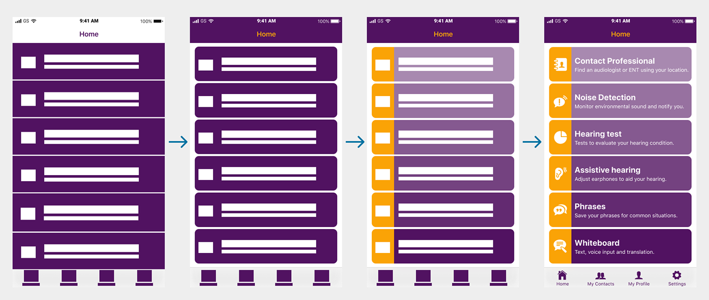
A couple of initial ideas. After a while, I decided that for the 6 features on the Home screen, a vertical card layout would be better than the tiles. If the features ever increase more than 7, this layout will be cluttered and must be changed. More important features are put near the bottom for easy access. A global navigation bottom tab will minimized confusion if the users get lost.
I also wanted to include captions whenever possible as this app also target more senior users. For this reason, I also try not to use hamburger menu.
I also wanted to include captions whenever possible as this app also target more senior users. For this reason, I also try not to use hamburger menu.

I created components and styles as needed in Figma, it's time-consuming at first but it's easier to adjust when the app get more complicated. Colors are selected to meet contrast at least 5:1 and suitable for colorblindess.

This is my typical progress from wireframe to high fidelity UI. Using a single primary color was quite distracting and unfocused. I’d like the user to be able to quickly scan the icons on the right to realized the features as quickly as possible and focus more on the features near the bottom, which is likely more frequently used.
That's about it for now. I may return to this project should a opportunity arise.
You can check out the interactive prototype here on Marvel app

Thank you for reading!

