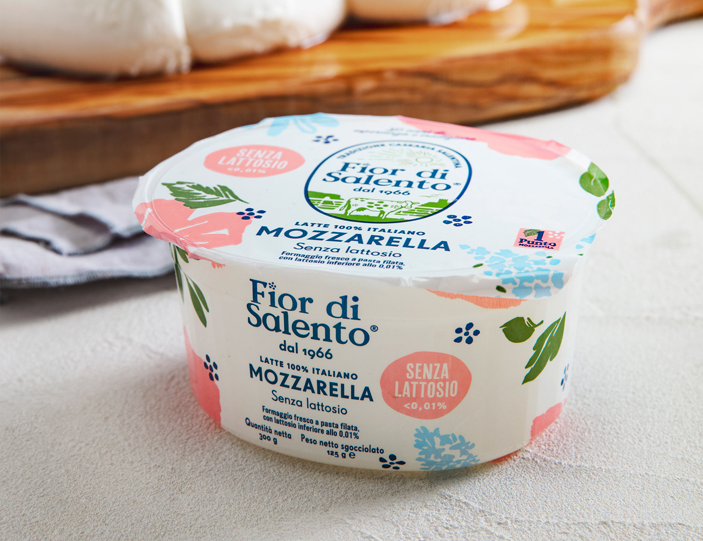

Newlat Food commissioned us a repositioning project for one of their brand, a dairy company from Apulia called Fior di Salento. The objective was to make the brand more appealing and more recognizable in a market full of competitors.
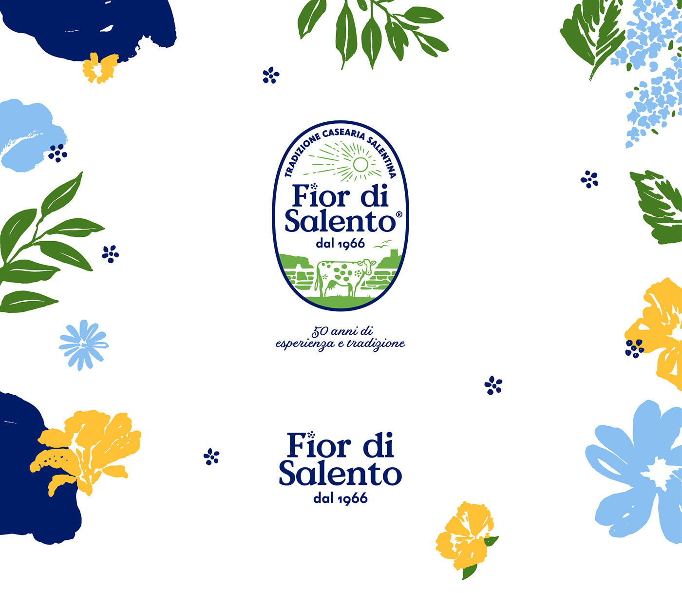
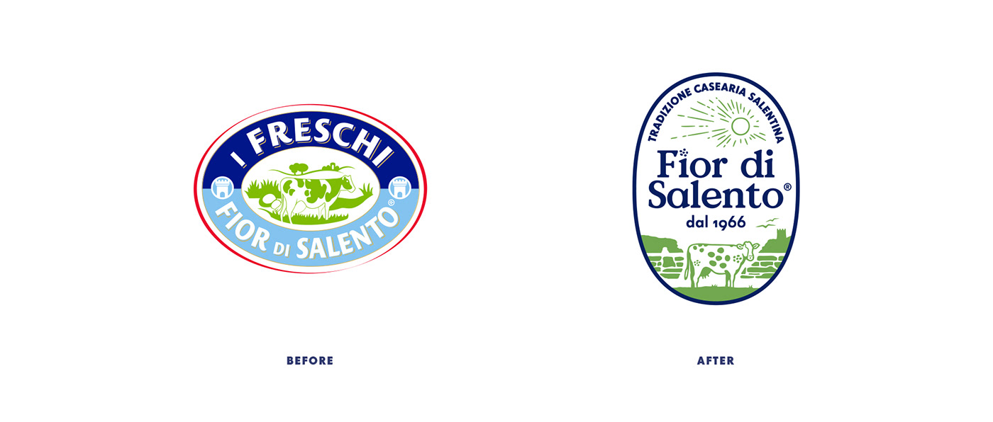
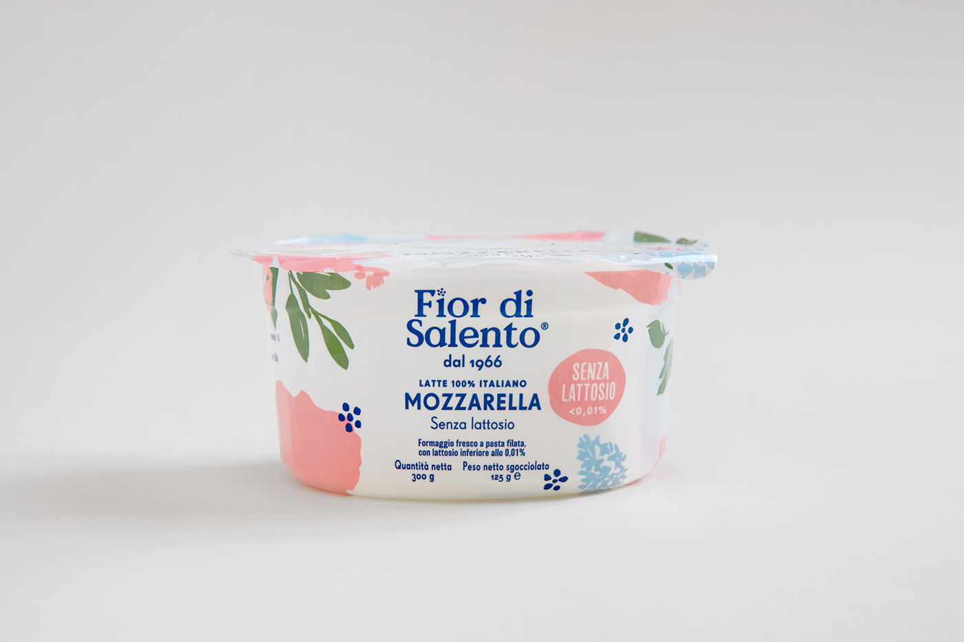
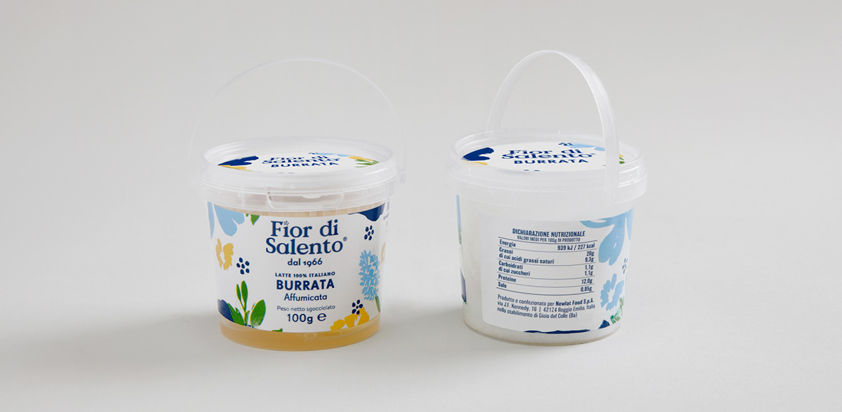
We decided to pay a tribute to the brand's area of origin, Salento, designing a vibrant and dynamic identity to pair with a trustworthy, classic crest logo.
We decided to pay a tribute to the brand's area of origin, Salento, designing a vibrant and dynamic identity to pair with a trustworthy, classic crest logo.
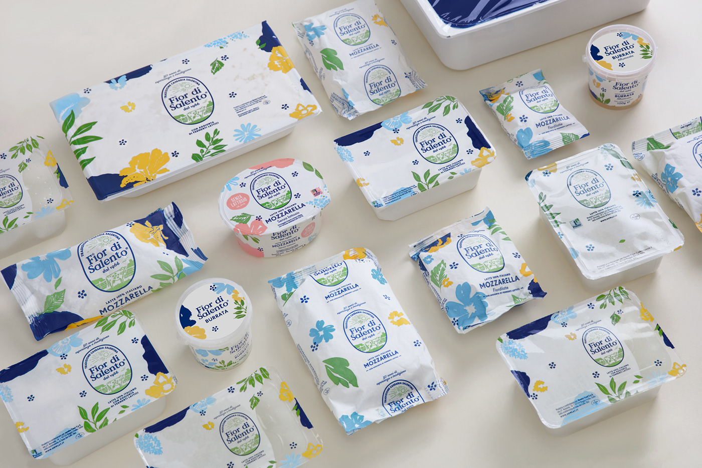
Salento is well known by the Italians and European sea lovers as the tip of the Italian heel. It is bathed by two seas and offers dramatic landscapes, tiny baroque villages and plenty of vineyards and olive fields.
During spring, thousands of wildflowers bloom in the countryside, creating a breathtaking scenery.
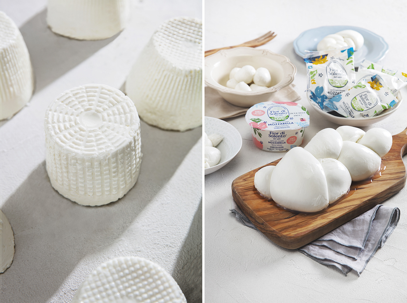
We wanted this product to be prominent on the display shelves, while resonating a warm Italian summer sunshine feeling in the consumers' mind.
We wanted this product to be prominent on the display shelves, while resonating a warm Italian summer sunshine feeling in the consumers' mind.
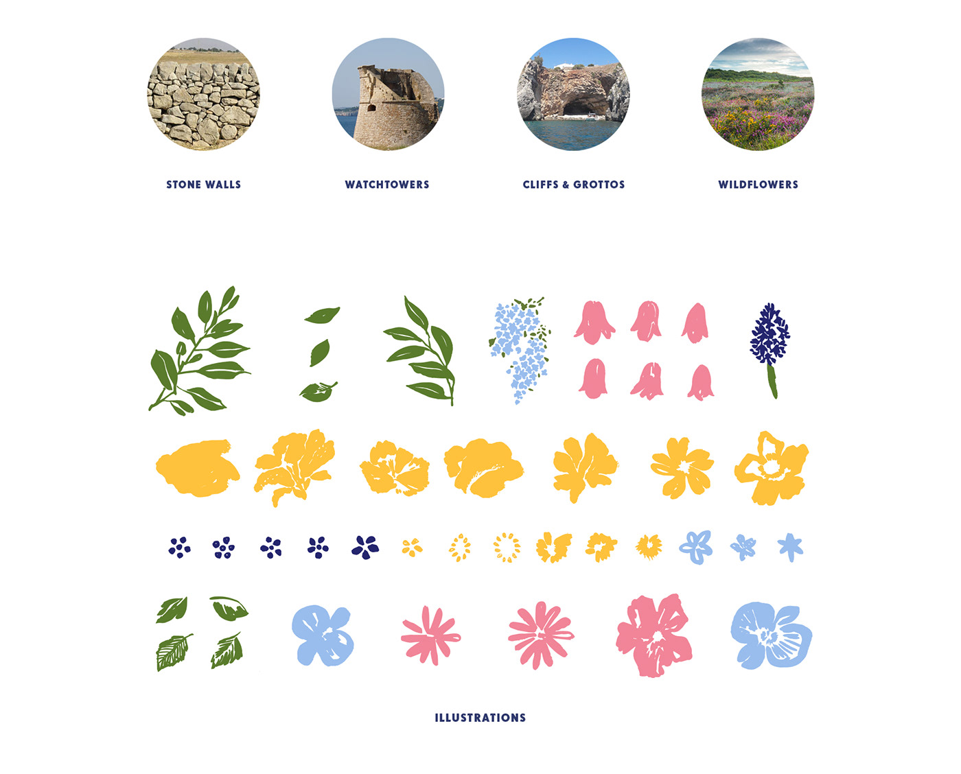

Above: the original watercolors behind the final vector illustrations.






Get in touch with us on instagram @carosellolab
