


The project was created as a development of the winning logo design in an open competition for Beskidy (Beskydy) Euroregion.
My final assignment included the logo and visual identity manual containing simple and understandable guidelines for brand’s visual communication system which where suppose to be easy to implement in print, digital and public space.

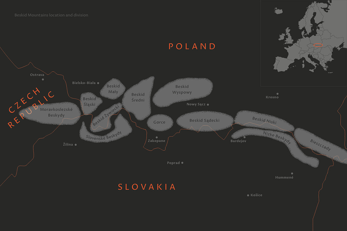
The Beskydy Euroregion is a tripartite Polish-Czech-Slovak cooperation. Its aim is to undertake joint activities for the balanced and sustainable development of the region and the approximation of its inhabitants and institutions in the border areas.
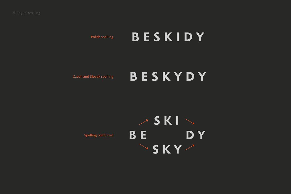
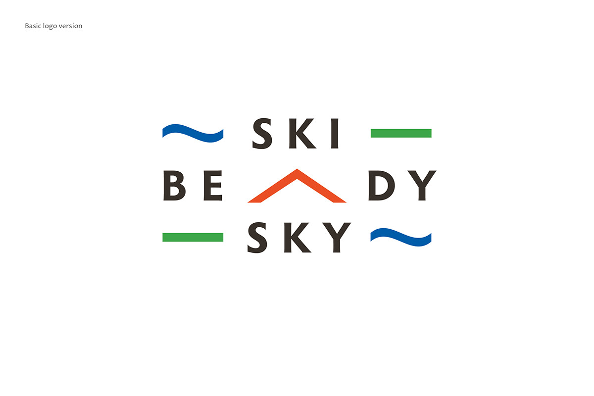
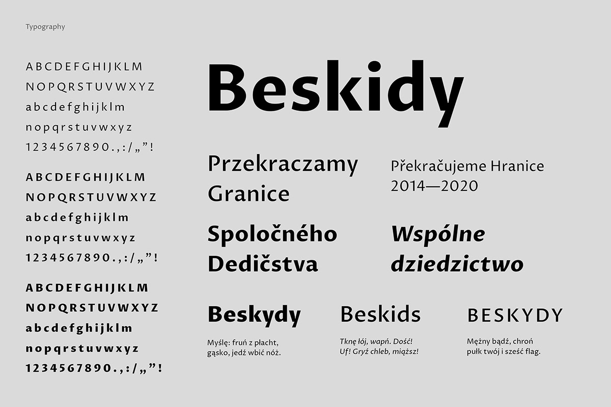
The logotype concept answers the problem of multilingualism of the region's name - „Beskidy” in Polish and „Beskydy” in Czech and Slovak. The characteristic features of the region's landscape were used as an inspiration for the color scheme, typography and the logotype’s construction elements.


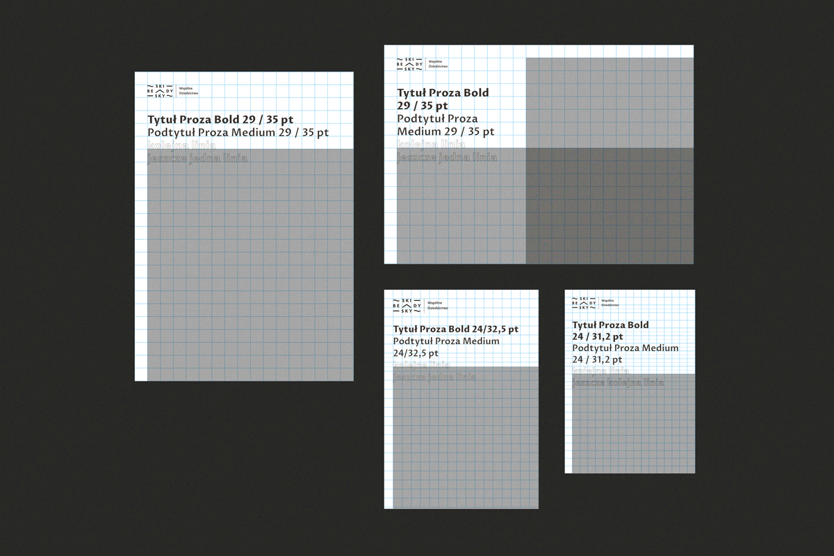
The typography used in communication materials refers to the craft and traditions of the region. Advertising and information materials are based on a modular layout, which adjusts depending on format.
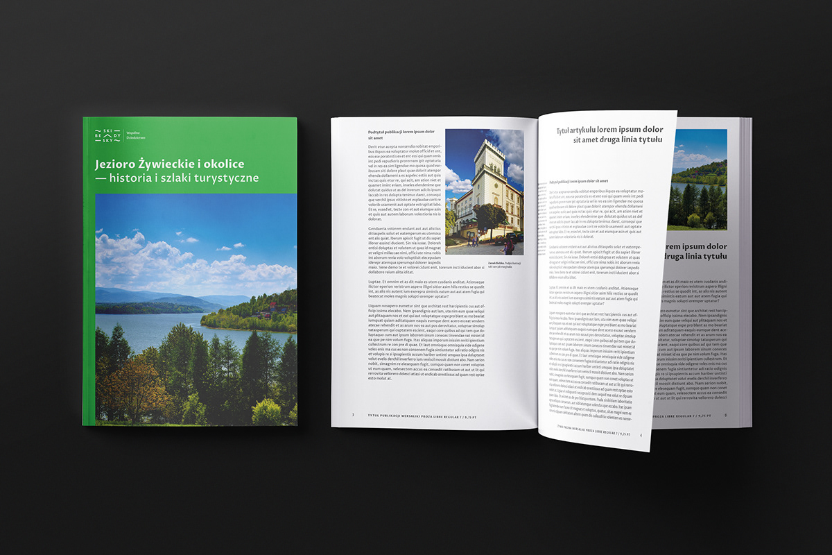


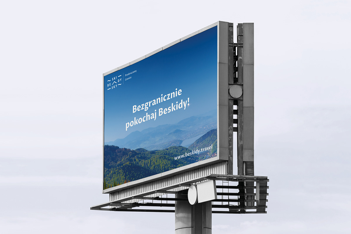
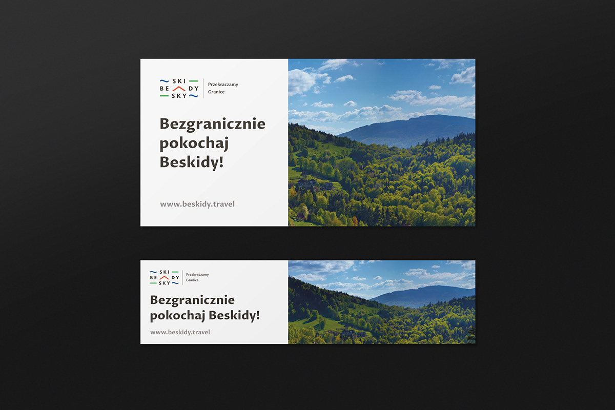


The photos used in the project's presentation come from the resources of the Beskidy Region Association
Art Direction & Design: Wojtek Staniewski


