Short Description
—
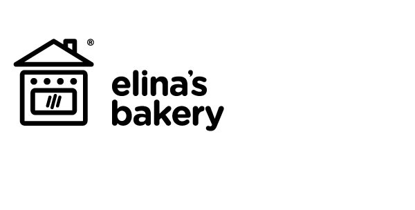
In the creative process of designing the logo, major role played the following key elements: How elina's bakery is coordinated by one person and particularly from a personal space (home). At the same time we had in our mind that it contains a vision and an ambition, in case elina's bakery develops, to maintain its original value (homemade sweets). Also key was that it is not targeting only in a specific product (cupcakes, which is well-known) but also in more sweets. Ultimately the logo includes all of the above and the way to capture it is as follows.
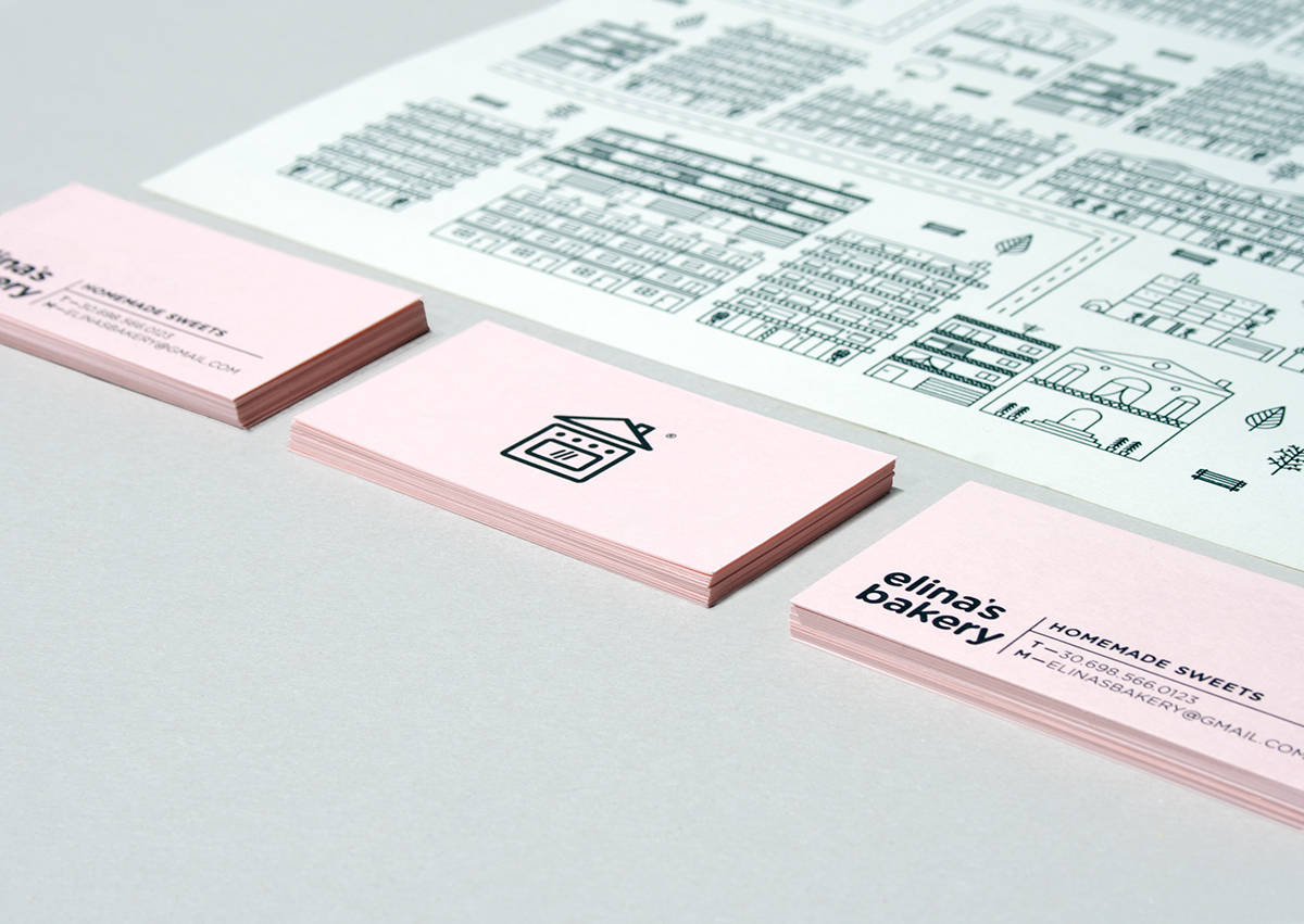
A home oven with a roof. The features of the logo are the recognizable home oven with the buttons and the glass of the facade. That is the core of the design of the house which is closed and protected by a roof. The rounded corners and soft contour make the logo more friendly and work together and consistently with the soft rounded letters. The verbal part of the logo is written in lowercase letters in order to verify the friendliness and immediacy.
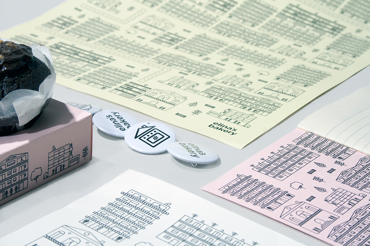
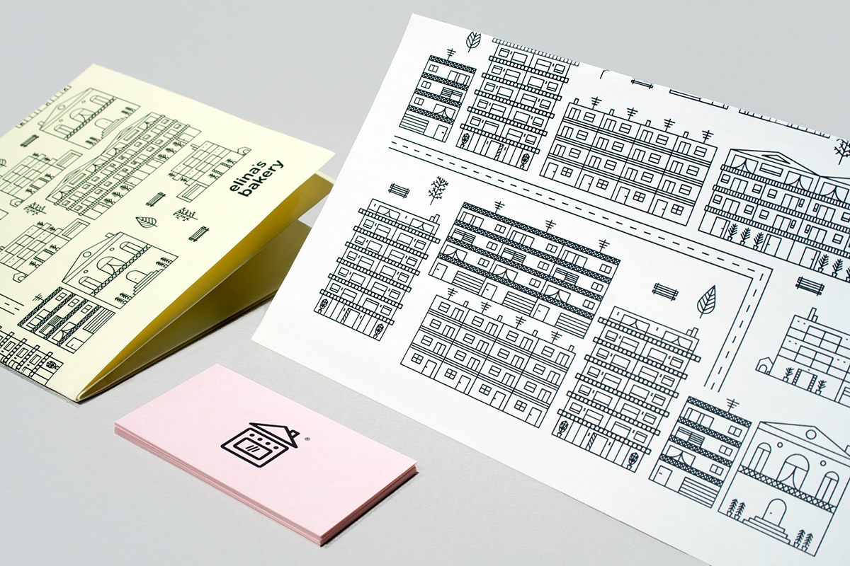
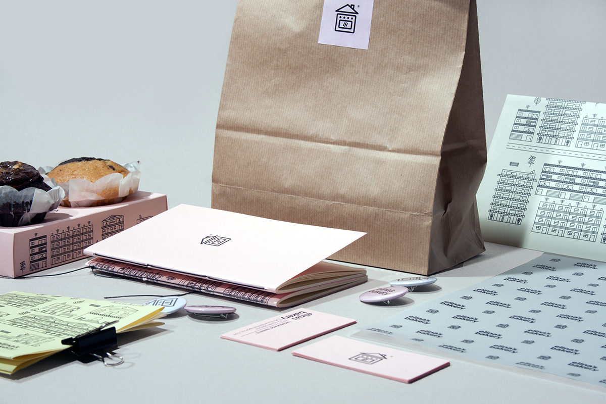
The logo has a fixed color, black, which is on the one hand the color that indicates quality and stability, on the other it adapts dynamically and easily both in print and web applications. Regarding the print applications of the logo, a pale pink was chosen as the most suitable color. It is a color that combined with the general concept and the homemade sweets gives a vintage atmosphere, but the way the logo is adapted is modern. The combination of pale pink and the dynamic logo, makes it classic. Some other key features of this color is that it confers cleanliness and hygiene, as well as it districtly verifies the name. (Elina's)
For the design of applications presented, other than the logo and paper that play the main part, an illustration was designed to enhance the logo, which is applied to the recipe book. Enhancing the urban character surrounding the logo (house) led to the idea of designing larger and more complex buildings, but less special, mainly so Elina's house stands out between them , ie the logo.
Specificity and uniqueness still remains the goal.







—
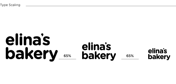
Typeface
Gotham Rounded
Papers
Perrakis papers
Printed by
Alphabet S.A.
Book binding
Giannis Evaggelidis
Text editing
Georgia Nikolitsea
Duncan Skinner
Photography
Konstantina Yiannakopoulou
George Strouzas
Follow TheBirthdays™

