


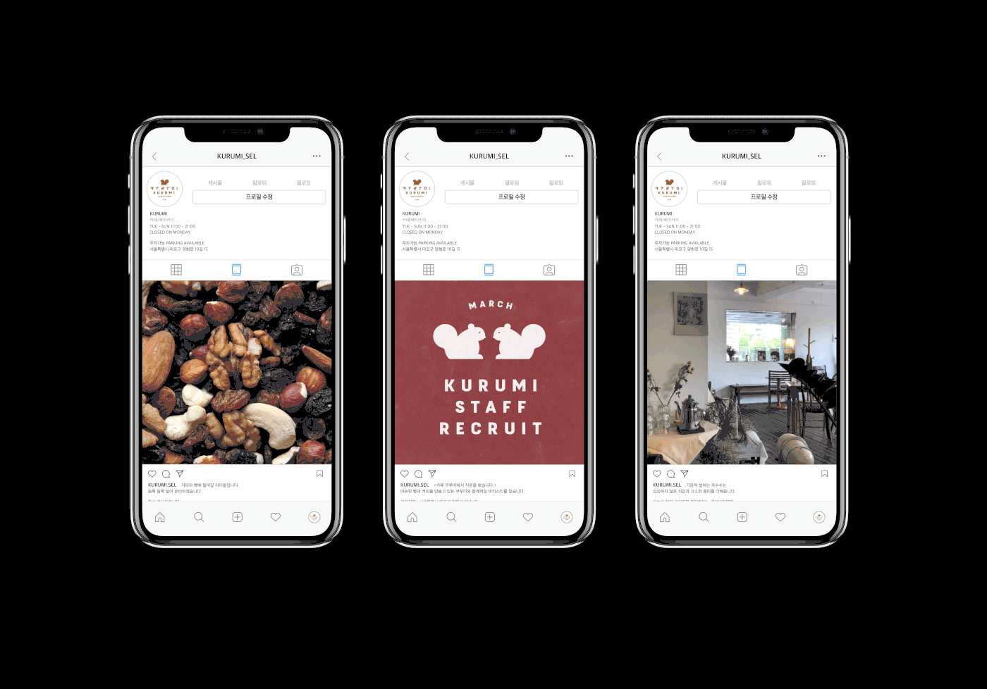
Visual identity for CAFE KURUMI.
카페 쿠루미
쿠루미(胡桃)는 일어로 ‘호두’라는 뜻으로 호두를 포함한 견과류를 이용한 일본식 음료와 티 푸드를 제공하는 카페입니다. 일본식 커피와 주류 그리고 견과류를 넣은 쿠키를 맛보실 수 있습니다.
.
상호를 한글 자음과 모음으로 풀어쓴 후 그것에 히라가나의 특징을 적용하여 레터링하였습니다. 그리고 다람쥐 심볼과 조합하여 로고로 사용합니다. 전반적으로 따듯하고 부드러운 컬러를 사용하였고, 상호의 정체성과 잘 어울리는 fuji sans와 본고딕 서체를 사용하였습니다.
CAFE KURUMI
KURUMI is a cafe that serves nuts and tea foods, including walnuts, in Japanese meaning 'walnut'. You can enjoy cookies with coffee, beer and nuts in KURUMI.
.
The logotype is made by applying Hiragana(japanese alphabet) characteristics to Hangeul(korean alphabet). And it is used as a logo in combination with a squirrel symbol. Overall, I used warm, soft colors and FUJI SANS and NOTO SANS.


Thanks for watching.
I'm waiting for your opinion!
▼


