


Google Fonts is an interactive directory of free hosted application programming interfaces for web fonts started by Google. Google Fonts was launched in 2010 and revamped in 2011 by Google to provide an Open font foundry. Many of the fonts are released under the SIL Open Font License 1.1, while some are released under the Apache License, both are free software licenses .
This is version 2.0 of the earlier google fonts project. I have tried to achieve latest in design styles using google fonts, based on different principles of design. I also have provided detailed font formatting for each style and some brief info about the effects used and how it can be achieved .
This is version 2.0 of the earlier google fonts project. I have tried to achieve latest in design styles using google fonts, based on different principles of design. I also have provided detailed font formatting for each style and some brief info about the effects used and how it can be achieved .
Principle - Emphasis
Emphasis is defined as an area or object within the artwork that draws attention and becomes a focal point. Subordination is defined as minimizing or toning down other compositional elements in order to bring attention to the focal point.
Google Fonts Used - Oswald


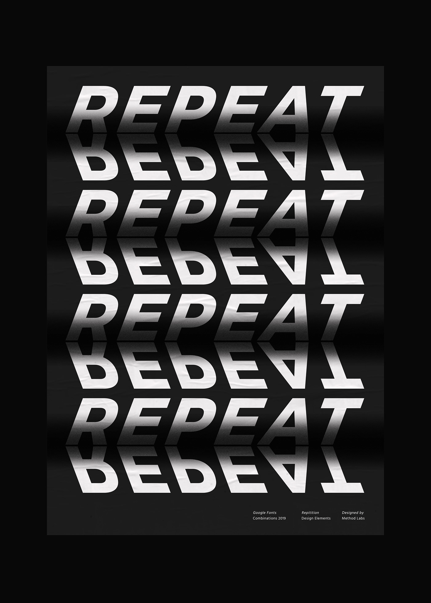
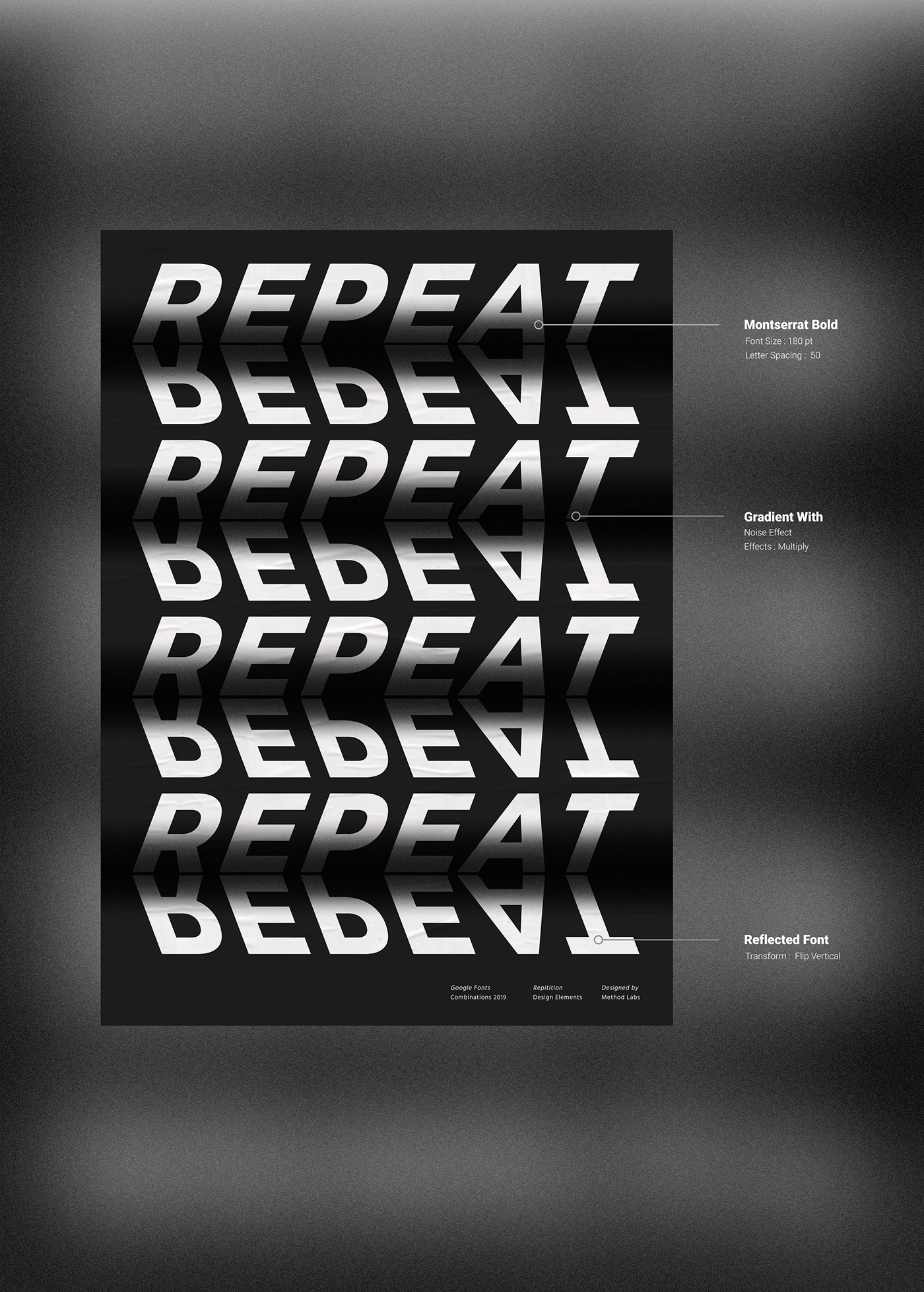
Principle - Repetition
The principle of repetitionsimply means the reusing of the same or similar elements throughout your design. Repetition of certain design elements in a design will bring a clear sense of unity, consistency, and cohesiveness.
Google Fonts Used - Montserrat

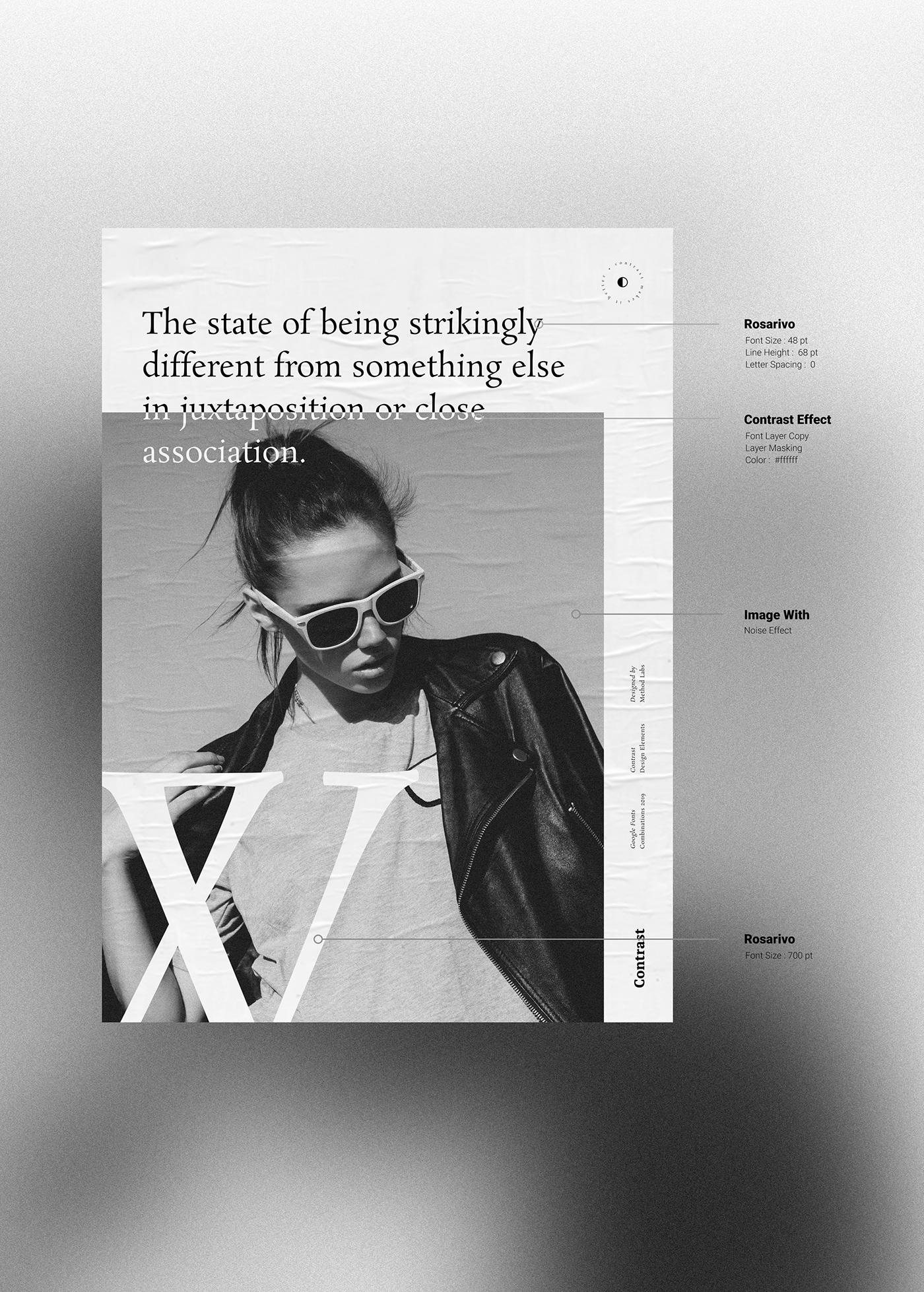
Principle - Contrast
Contrast refers to the arrangement of opposite elements (light vs. dark colors, rough vs. smooth textures, large vs. small shapes, etc.) in a piece so as to create visual interest, excitement and drama. Use this page to gain a better understanding of how contrast can be used in art.
Google Fonts Used - Rosarivo

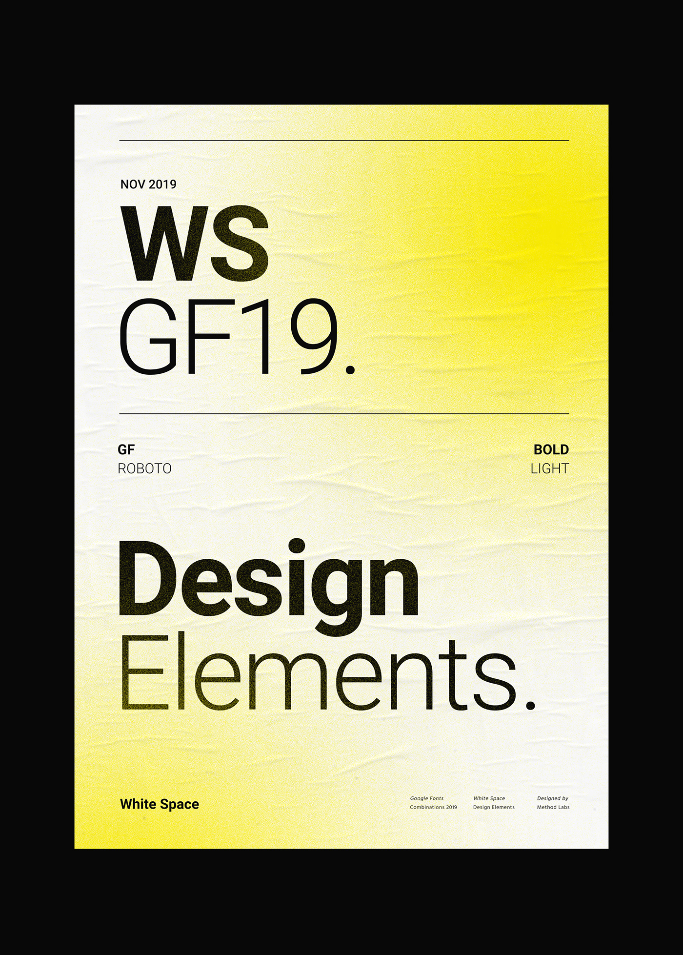
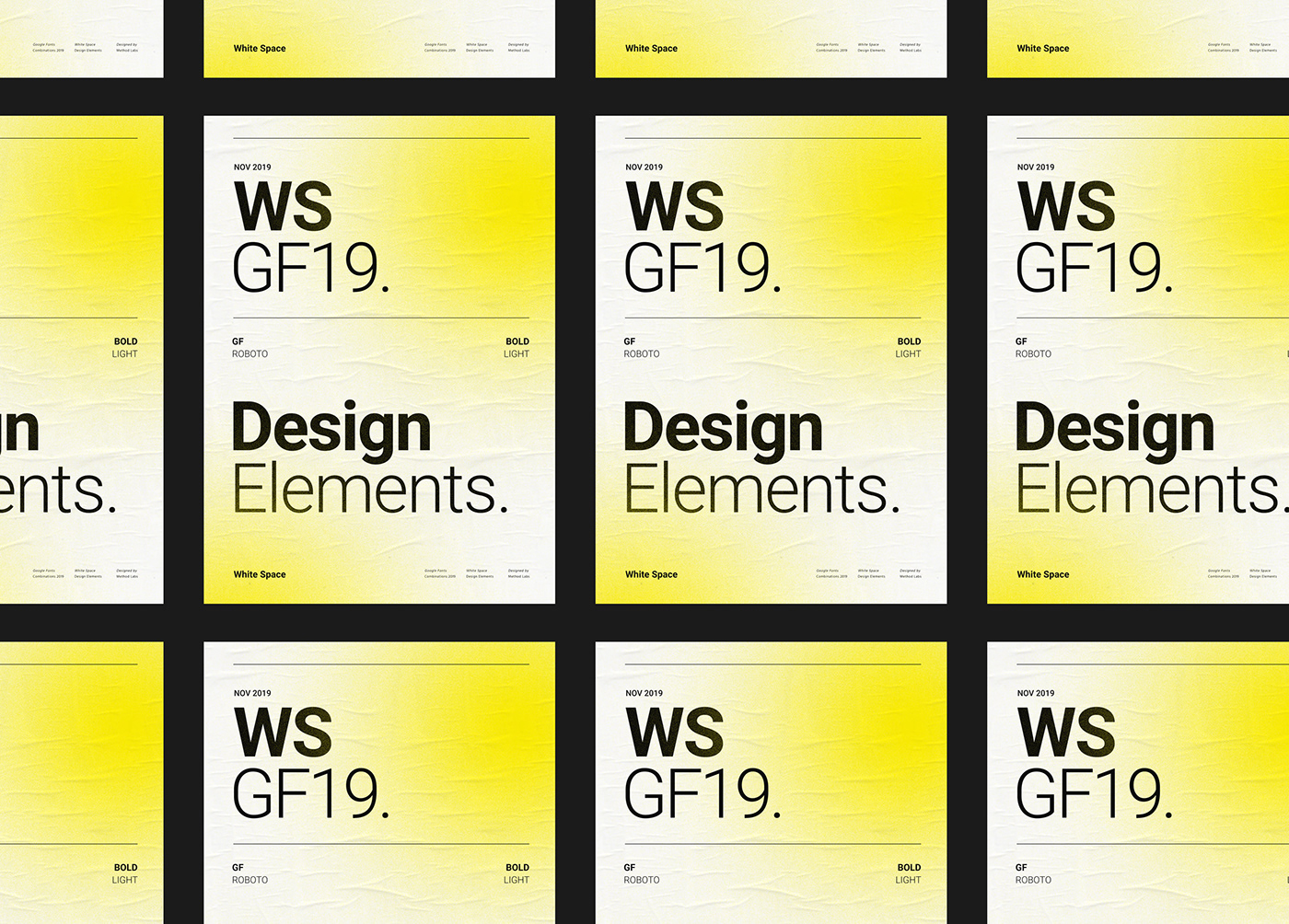
Principle - White Space
In page layout, illustration and sculpture, white space is often referred to as negative space. It is the portion of a page left unmarked: margins, gutters, and space between columns, lines of type, graphics, figures, or objects drawn or depicted. The term arises from graphic design practice, where printing processes generally use white paper. White space should not be considered merely "blank" space — it is an important element of design which enables the objects in it to exist at all; the balance between positive (or non-white) and the use of negative spaces is key to aesthetic composition. Inexpert use of white space, however, can make a page appear incomplete.
Google Fonts Used - Roboto

Principle - Proportion
Proportion refers to the relative size and scale of the various elements in a design. The issue is the relationship between objects, or parts, of a whole. This means that it is necessary to discuss proportion in terms of the context or standard used to determine proportions.
Google Fonts Used - Archivo Black


