BACKGROUND
–
Eu Yan Sang is a health and wellness company founded in 1819. They specialise in chinese medicine and aims to keep chinese medicine relevant as part of mainstream healthcare and mordern lifestyle. Eu Yan Sang is commonly perceived to be meant for middle aged adults or elderly despite it not being the case. Therefore, my intention for this project was to recreate a series of packaging to appeal more to younger audiences such as teens or young adults. (*This is a school initiated project completed at Singapore Polytechnic)
THE IDEA
–
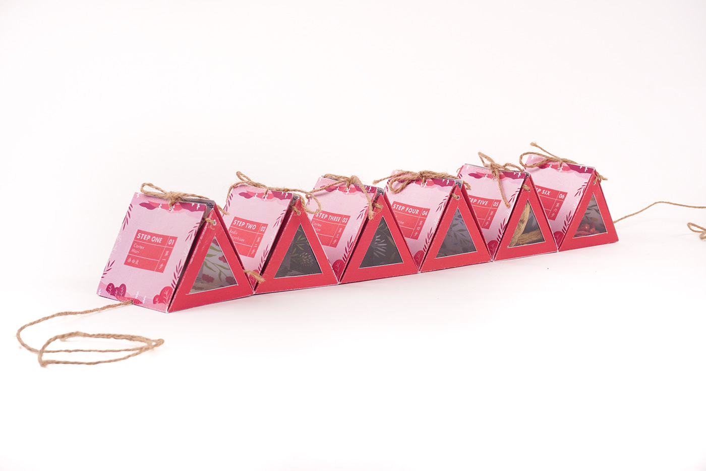
I redesigned the packaging for three of Eu Yan Sang's soup packs – the Fresh Breath, Wind Expulsion and Revitalising soup. In this repackaging, I redesigned both the surface graphics and the structure of the package. For the structure, I created it in a shape of a hexagon and when opened, it can be layed out to reveal smaller triangular packages where the user can follow the steps to cook. As the exisiting packaging did not have step-by-step instructions, I thought that doing so would simplify and make the experience of cooking the soup less daunting for younger audiences, as most of them would be cooking it for the first time. For the surface graphics, I decided to use illustration to reflect the benefits of each soup loosely through colour and depicting a different scene for each packaging. For instance, the colour blue and a mountain landscape for the Revitalising soup pack in association with its calming benefits, the colour pink and fields of roses for the Fresh Breath soup in association with fresh scents, and the colour green and nature for the Wind Explusion soup in association with healing.