


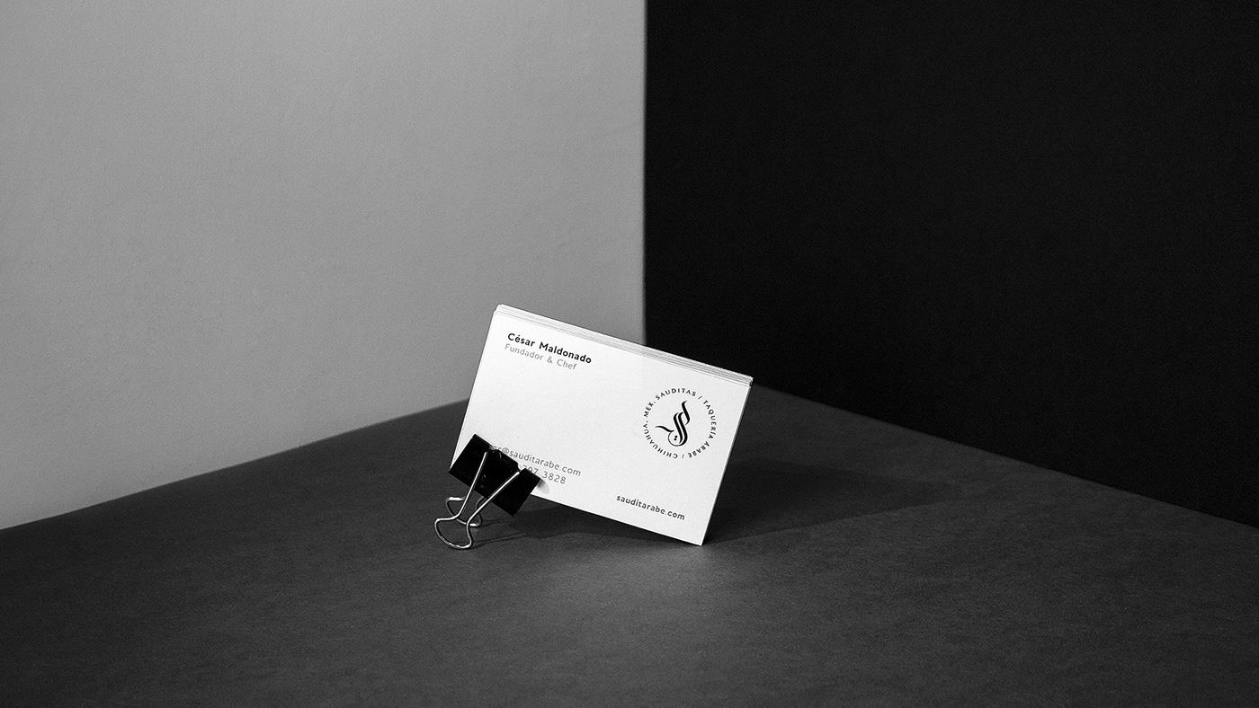
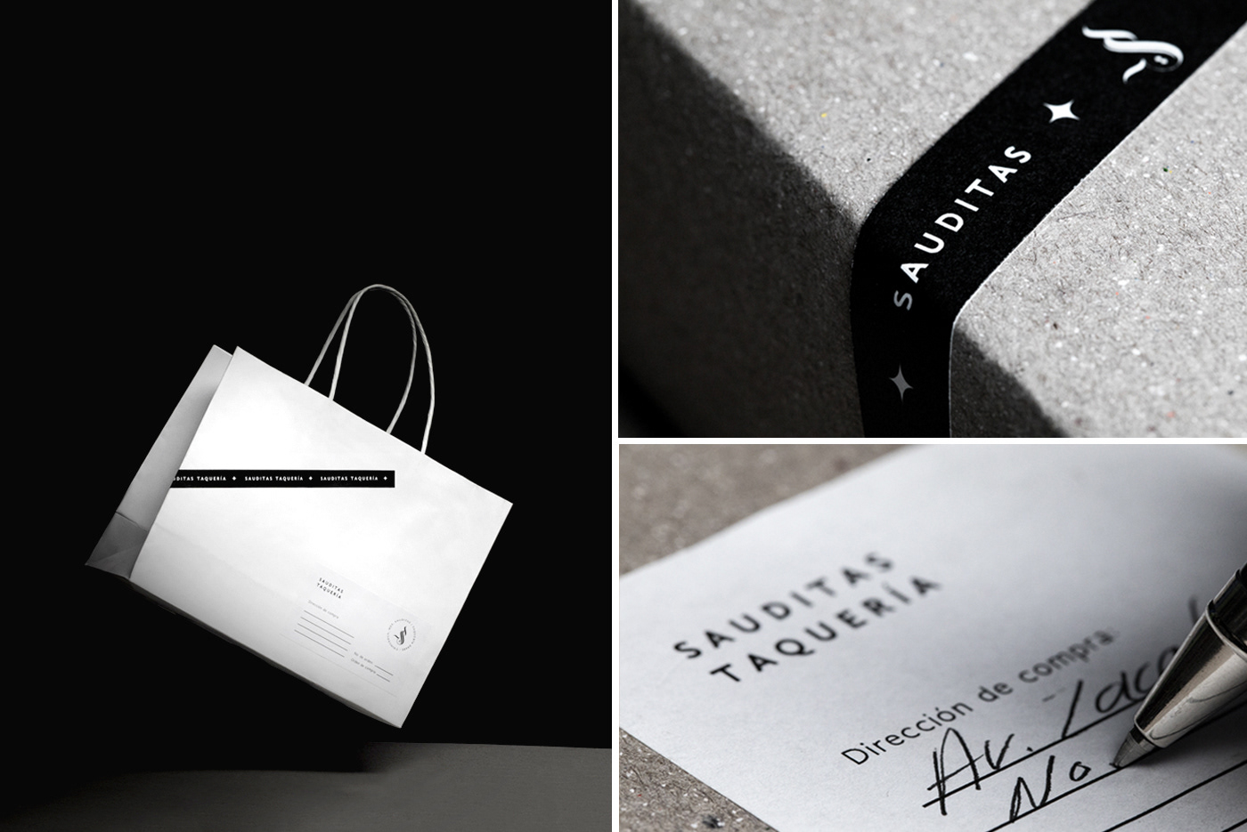
Cliente: Sauditas
Año: 2018
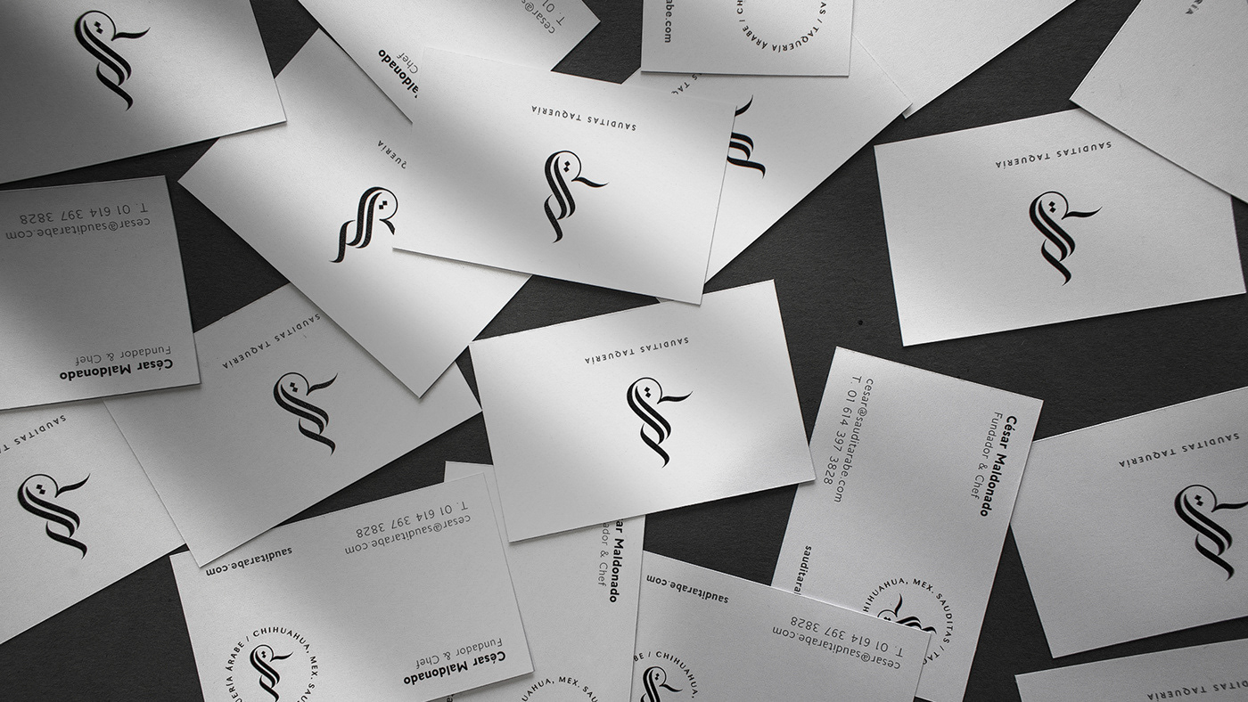
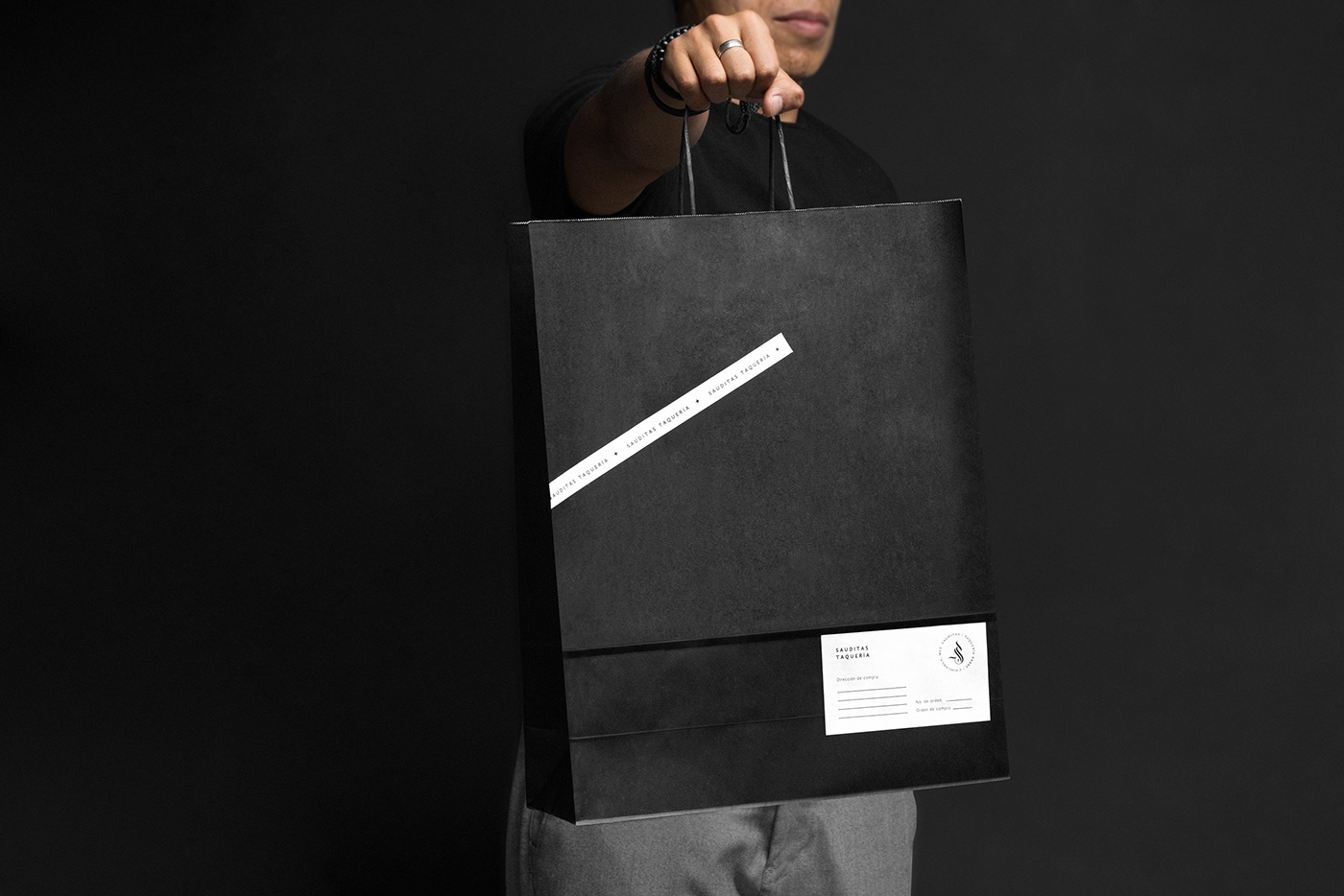
S A U D I T A S T A Q U E R Í A /
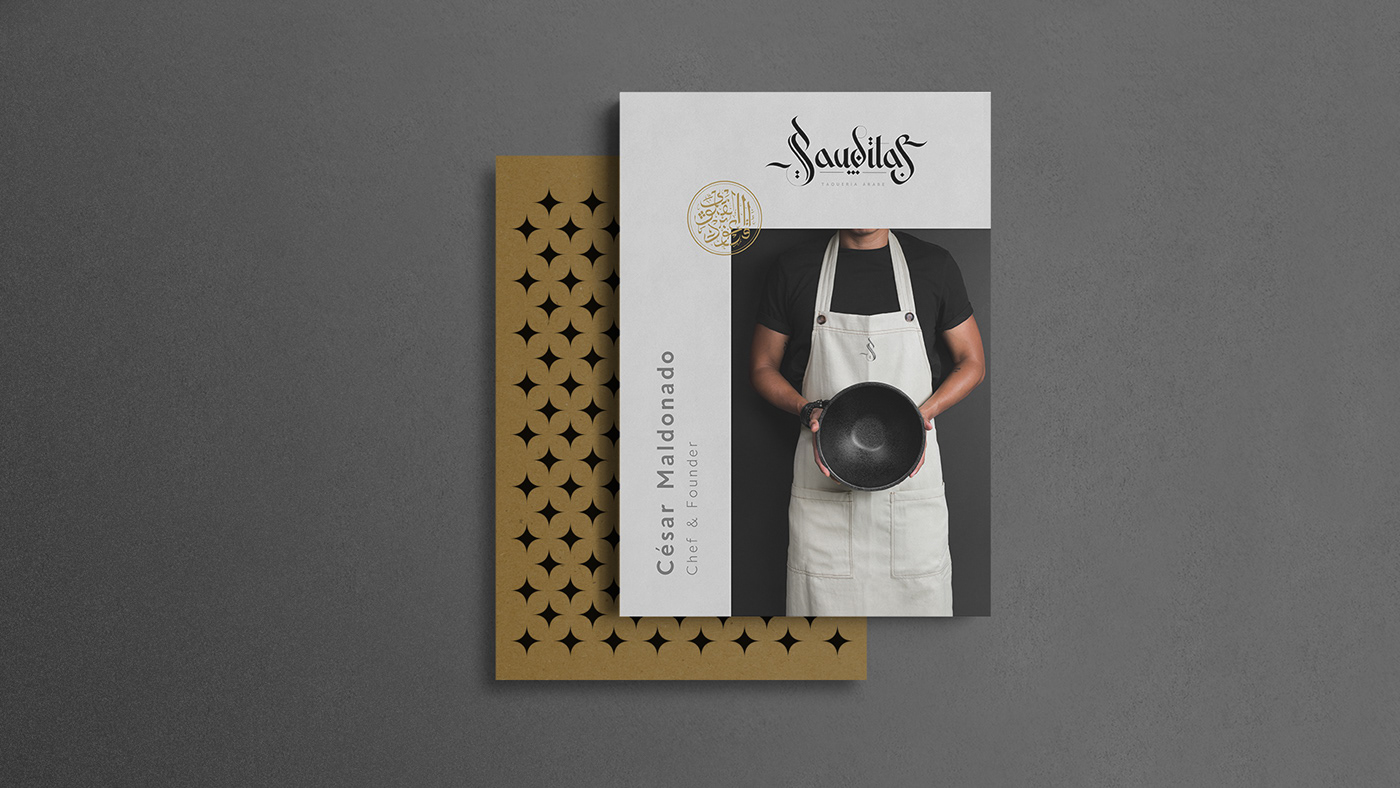
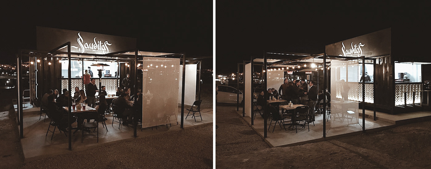
Objetivo: Diseñar la identidad gráfica para Sauditas, un local implementado en un contenedor, reutilizado y re diseñado para darle un uso comercial. La taquería especializada en servir tacos árabes, kebab y bebidas variadas. En colaboración con un despacho de arquitectos de Chihuahua, se logró el resultado esperado.
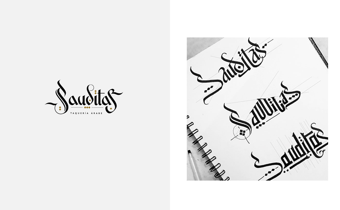
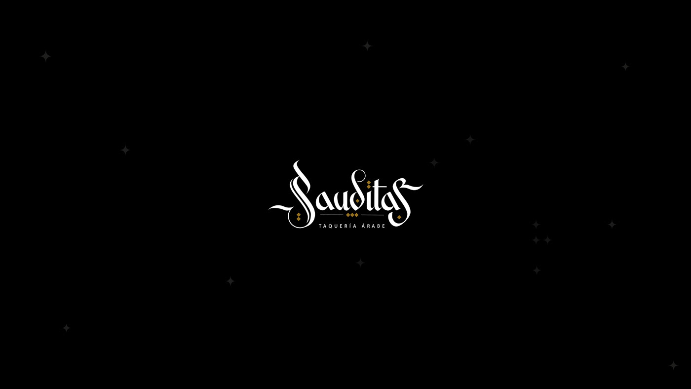
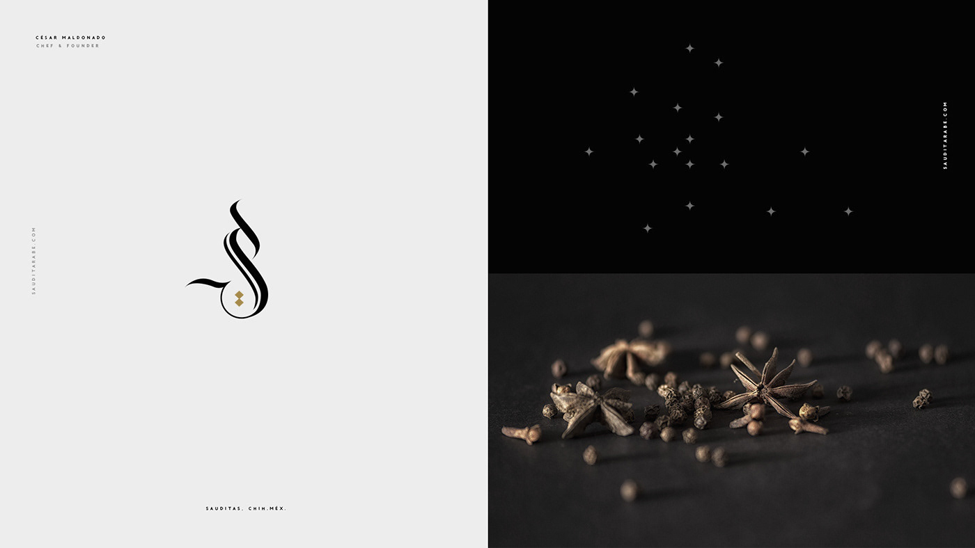
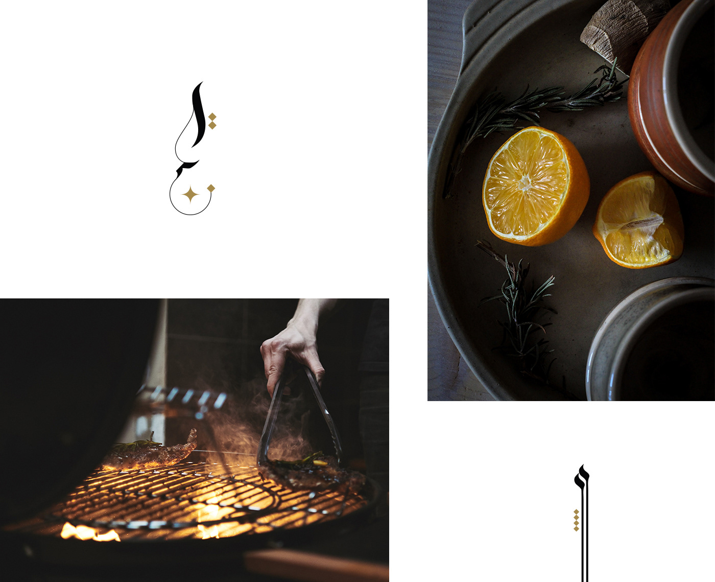
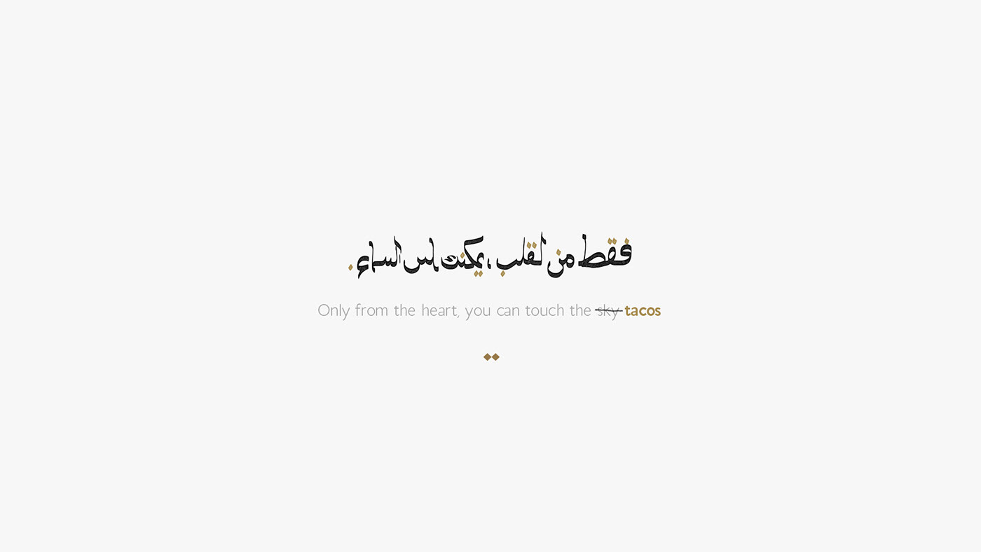
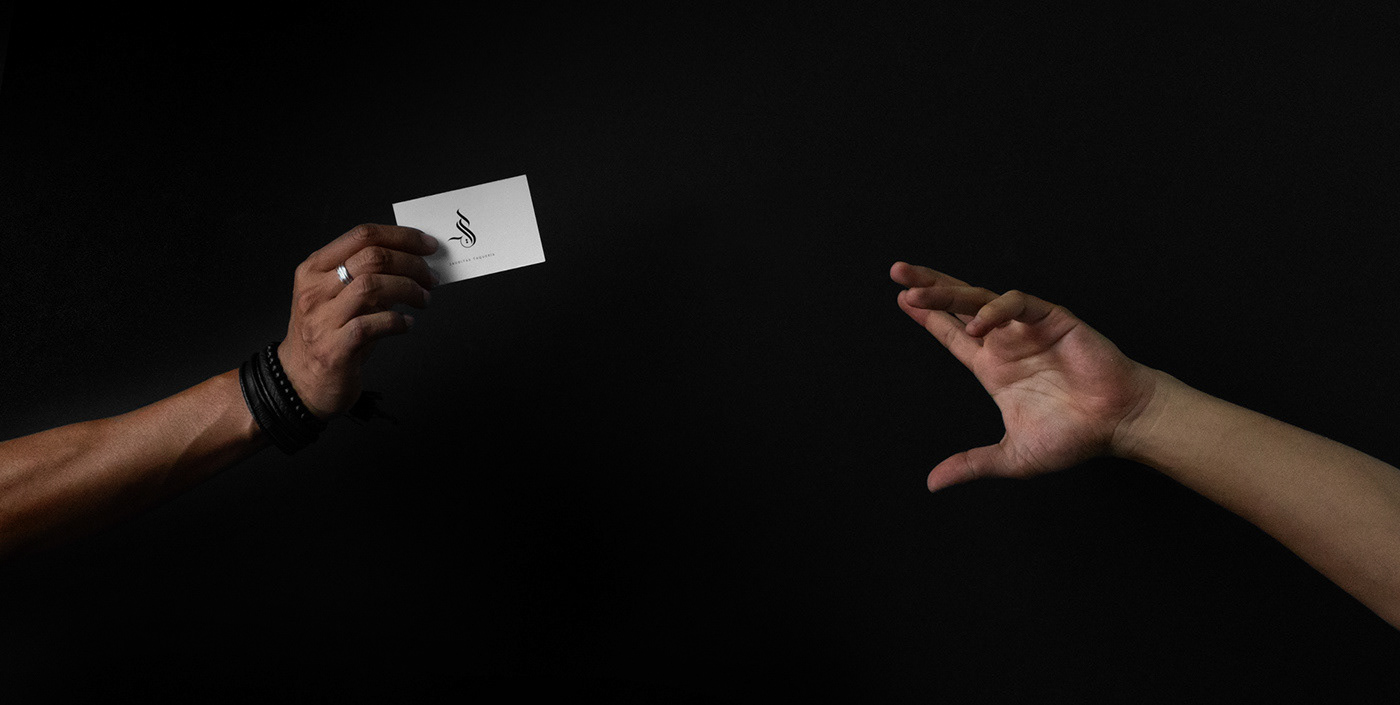
Desarrollo: La gráfica del logotipo convive en una atmósfera de medio oriente; figuras, trazos, colores, contrastes, caligrafía árabe, todo, en una estructura paralela y armónica dentro de este contenedor. La Letra "S" es la marca principal que engloba el concepto y nombre de la taquería.
/
Objective: Design the graphic identity for Sauditas, a place implemented in a container, reused and re designed for a commercial use. The taqueria specializes in serving Arabic tacos, kebab and various drinks. In collaboration with a firm of architects from Chihuahua, the expected result was achieved.
Development: The logo graphics coexist in a Middle Eastern atmosphere; figures, strokes, colors, contrasts and Arabic calligraphy, everything in a parallel and harmonic structure inside this container. The letter "S" is the main brand that encompasses the concept and name of the taquería.
Development: The logo graphics coexist in a Middle Eastern atmosphere; figures, strokes, colors, contrasts and Arabic calligraphy, everything in a parallel and harmonic structure inside this container. The letter "S" is the main brand that encompasses the concept and name of the taquería.
Chihuahua, Chihuahua. MEX.


Art and design: Studio Mano Negra
Art Direction: Anibal Pharrell
Branding photo: Isrrael Rodríguez-Chávez / @estampidafilms
Photos: Wordwood themes, Radovan, Christine Siracusa and Yong Chuan.
Client: Sauditas Taquería
Country: Chihuahua, Mex.
--


