Project:
Brand identity created for innovation company.
The company use innovative technologies to solve customer problems. Like applications, augmented reality, virtual reality, etc...
Brand identity created for innovation company.
The company use innovative technologies to solve customer problems. Like applications, augmented reality, virtual reality, etc...
The visual language adopted is minimalist and was thought to have relevant identification points (colors and elements).
More than that is to make each part of the elements of the brand independent and not leave the responsible identification only for the logo.
With a visual structure different from competitors (which, in most cases, uses neutral, sober and cold colors) the company
With a visual structure different from competitors (which, in most cases, uses neutral, sober and cold colors) the company
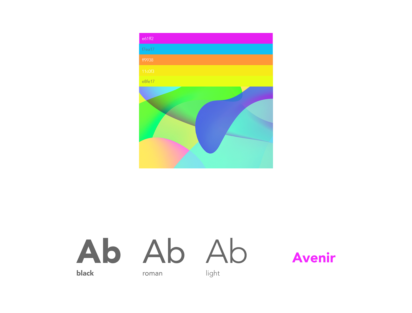
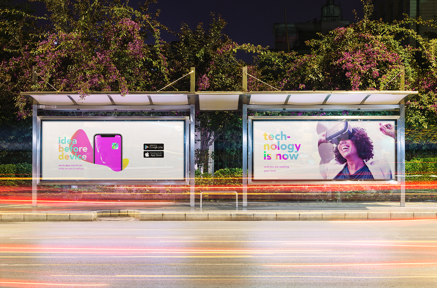
stands out for the versatility and visual body. Exploring a vivid color scheme, we reach a point of strengh.
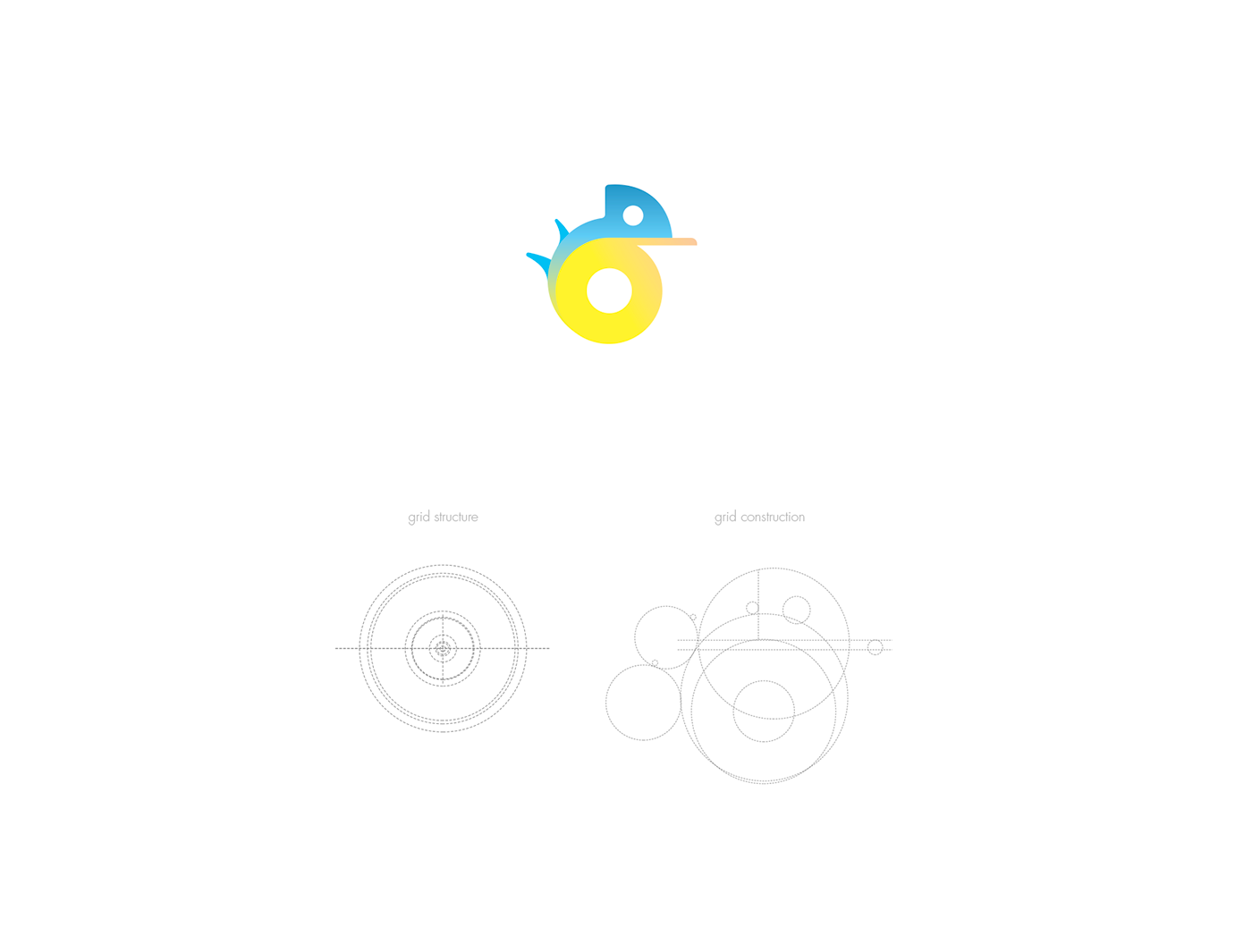
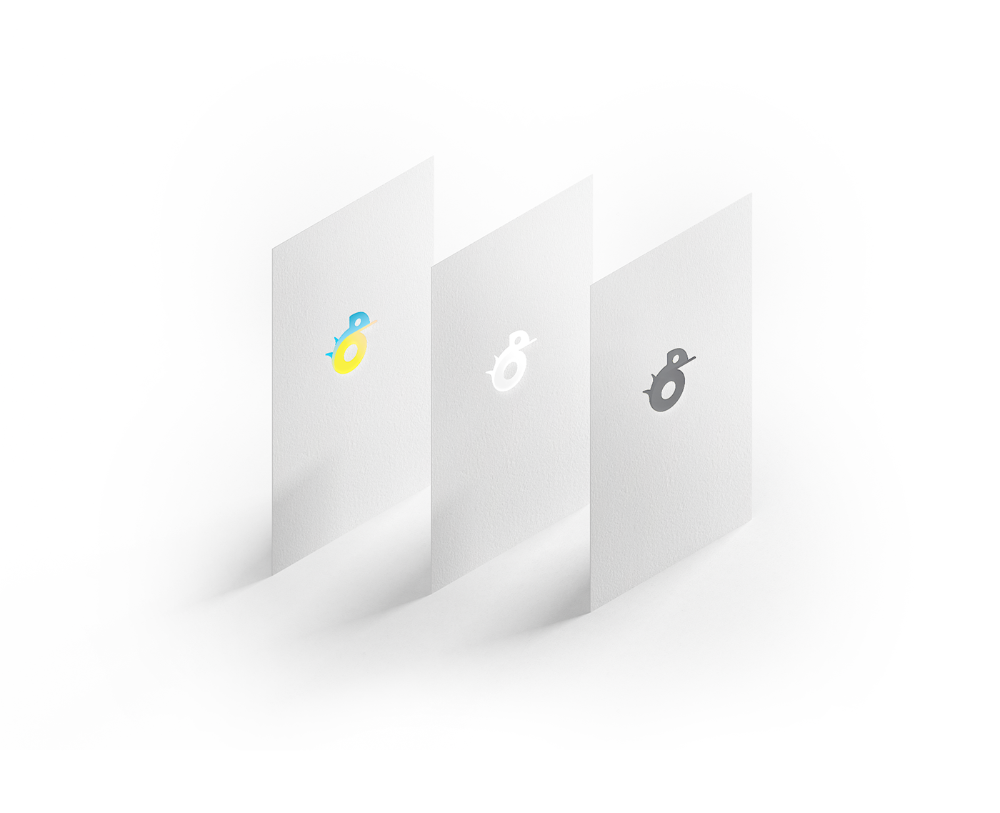
Symbol:
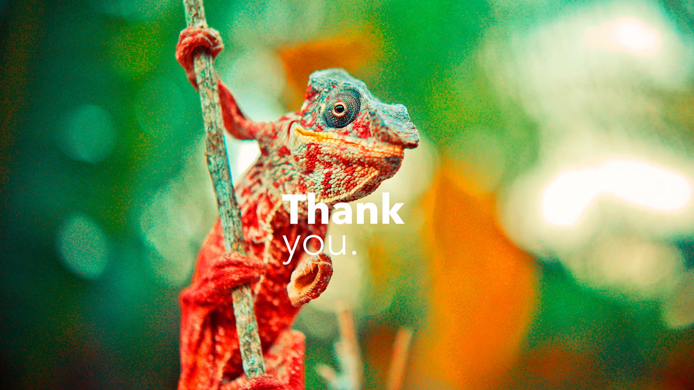
The symbol used is a representation of the chameleon. Peculiar animal with unique characteristics. It has 360º vision and can change the color of your skin to adapt in different places. Seeking this vision for the business, these characteristics make the company stand out in the market.
Achieving looking at all directions and adapting to different scenarios is a big differential.
The well-opened color scheme with bright colors makes reference to one of the characteristics of the chameleon.
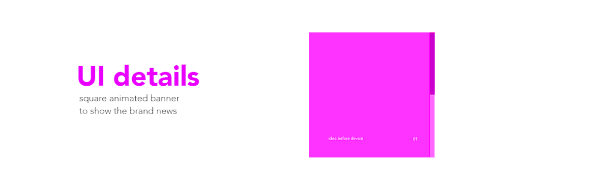
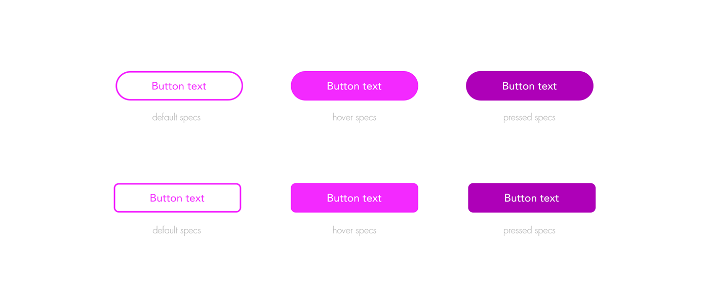
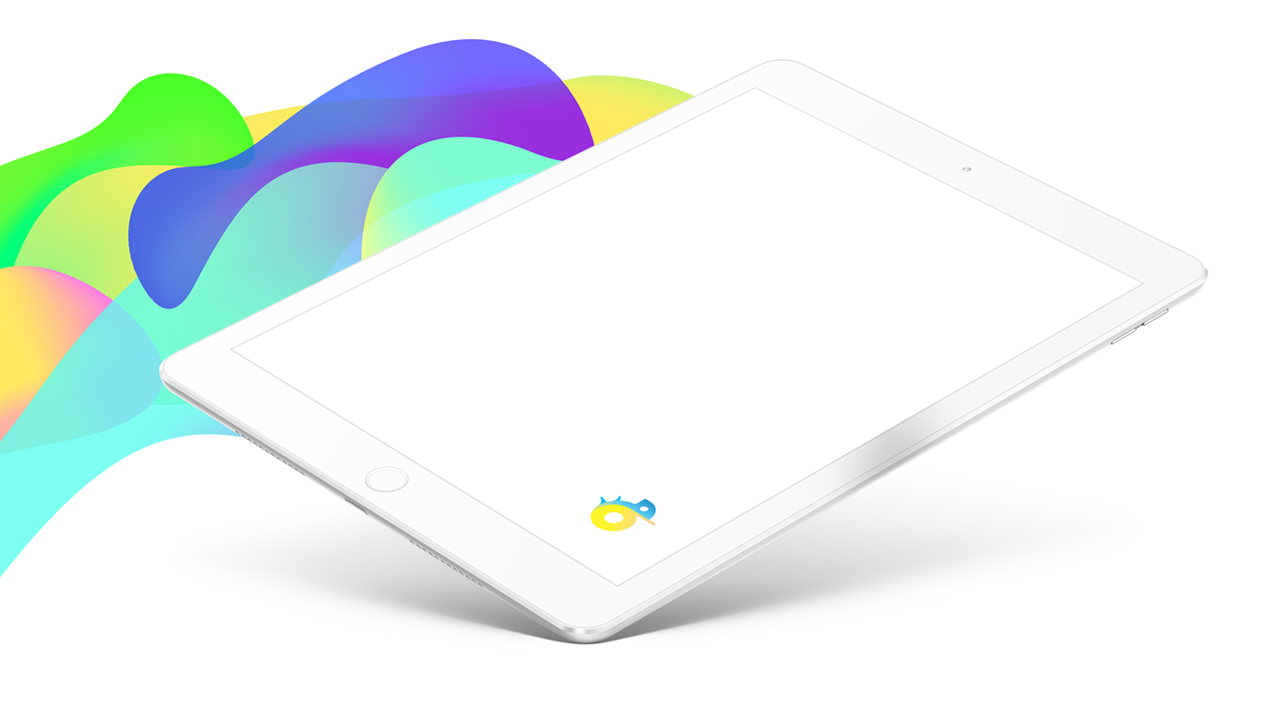
Check out the best parts of the project.
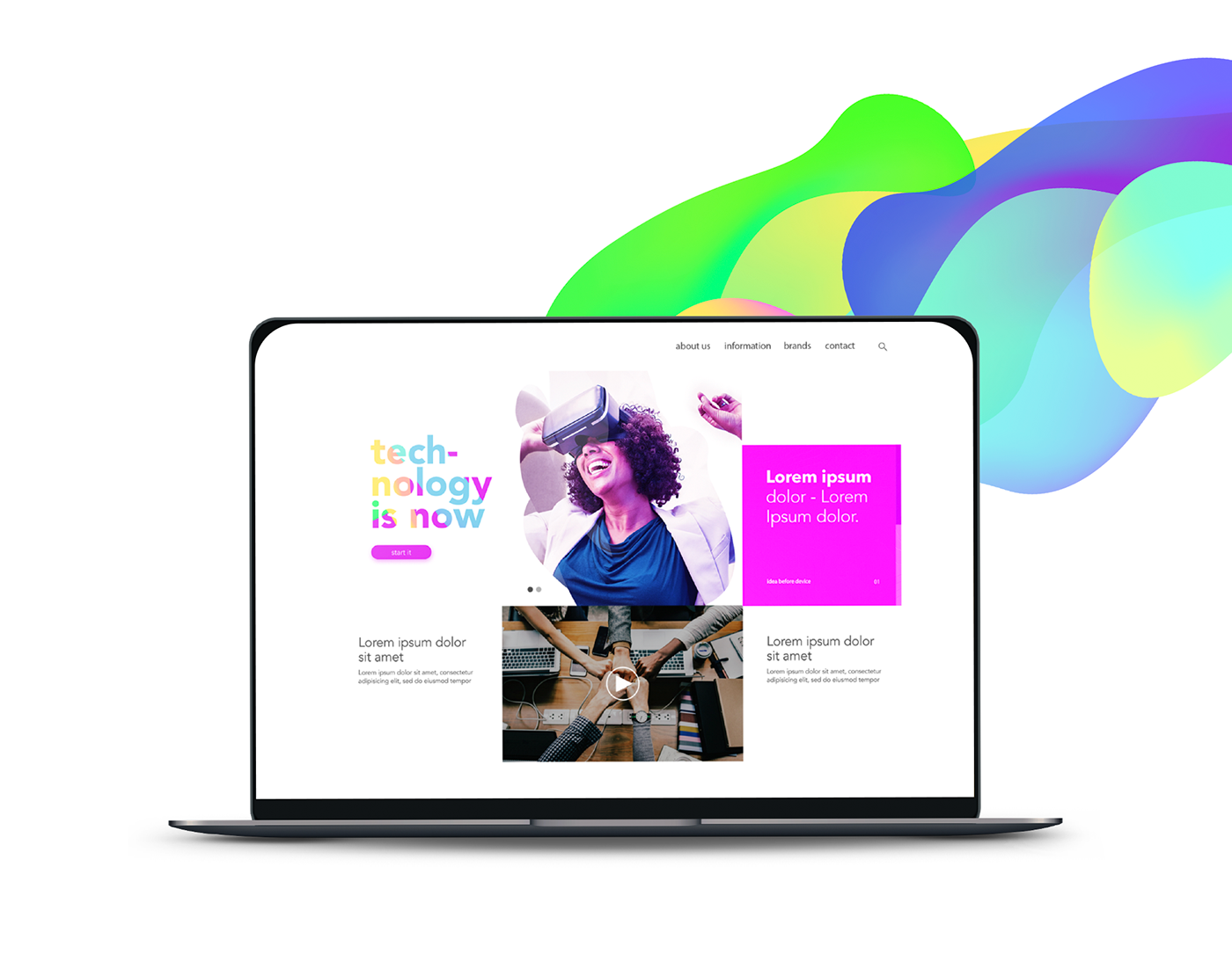
Logo, colors, shapes, website, icon and key vision for disclosure.
Logo, colors, shapes, website, icon and key vision for disclosure.
And if you ask me why the brand does not have a name, I'll tell you what happened:
I had a customer problem resolving not to pay for the project, so I had to remove the company name.
As I liked the result I was having with the brand concept, I chose to continue it anyway by and for myself. The project, which was only Logo and visual identity, became something more complete.
I had a customer problem resolving not to pay for the project, so I had to remove the company name.
As I liked the result I was having with the brand concept, I chose to continue it anyway by and for myself. The project, which was only Logo and visual identity, became something more complete.
It means that if you are interested in the project as a whole or part of it, we can talk. The project is available for sale. :)