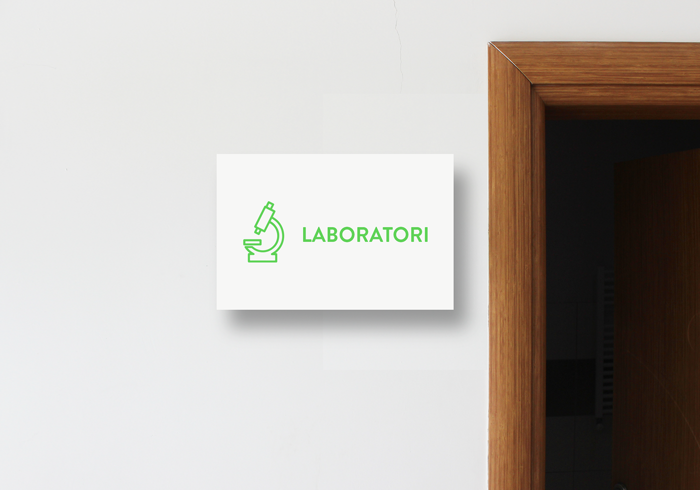
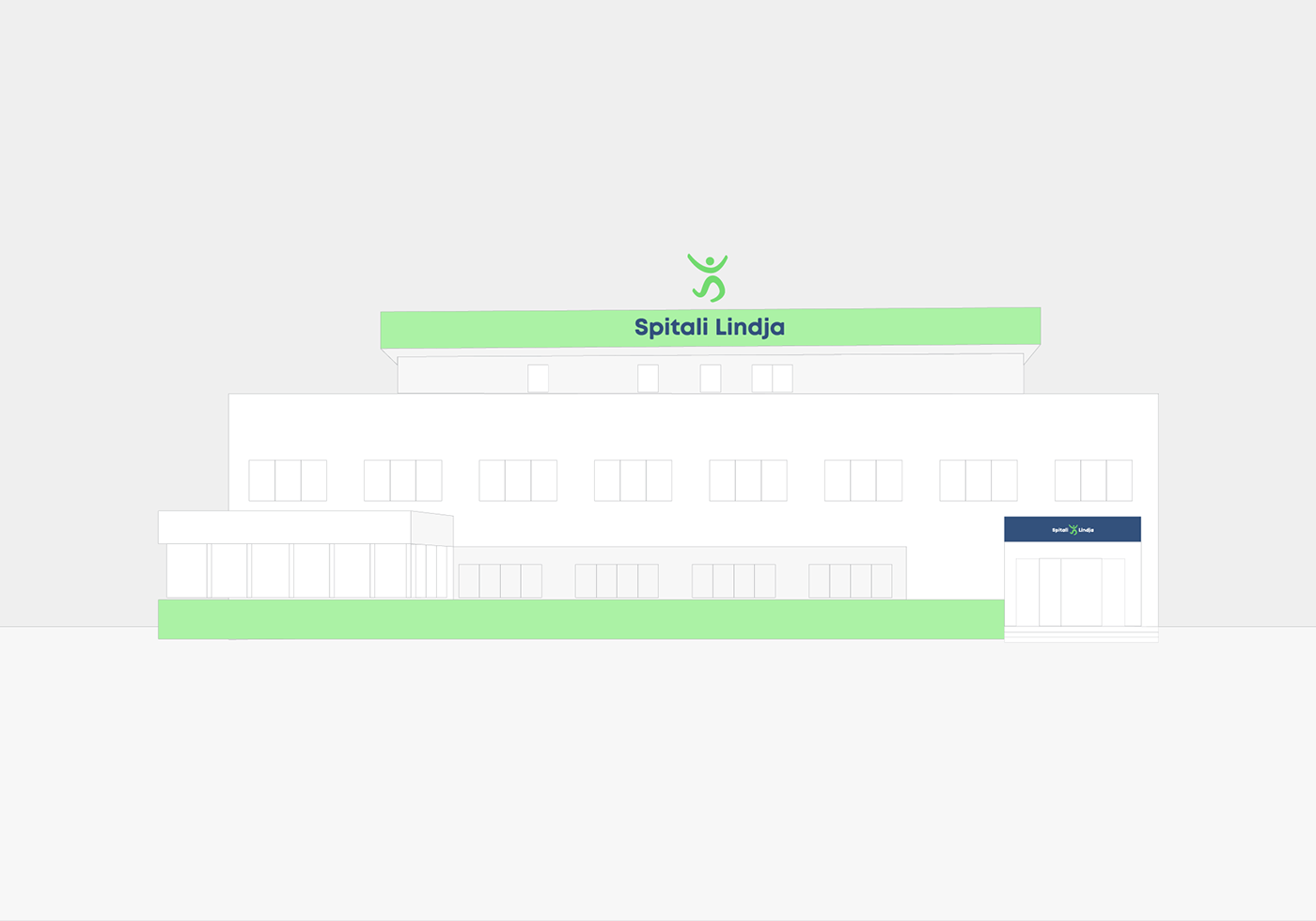
Armend Berisha and team at UNITED PIXELS: Redesigned Logo for Spitali Lindja (Hospital Lindja) based in Prishtina.
The redesigned logo below is made for a Hospital called Lindja (Est.1996, originally called SPITALI LINDJA). For more than 22 years experience Spitali Lindja has shown credibility, professionalism with best quality of healthcare services with an emphasis on field of Gynecology.
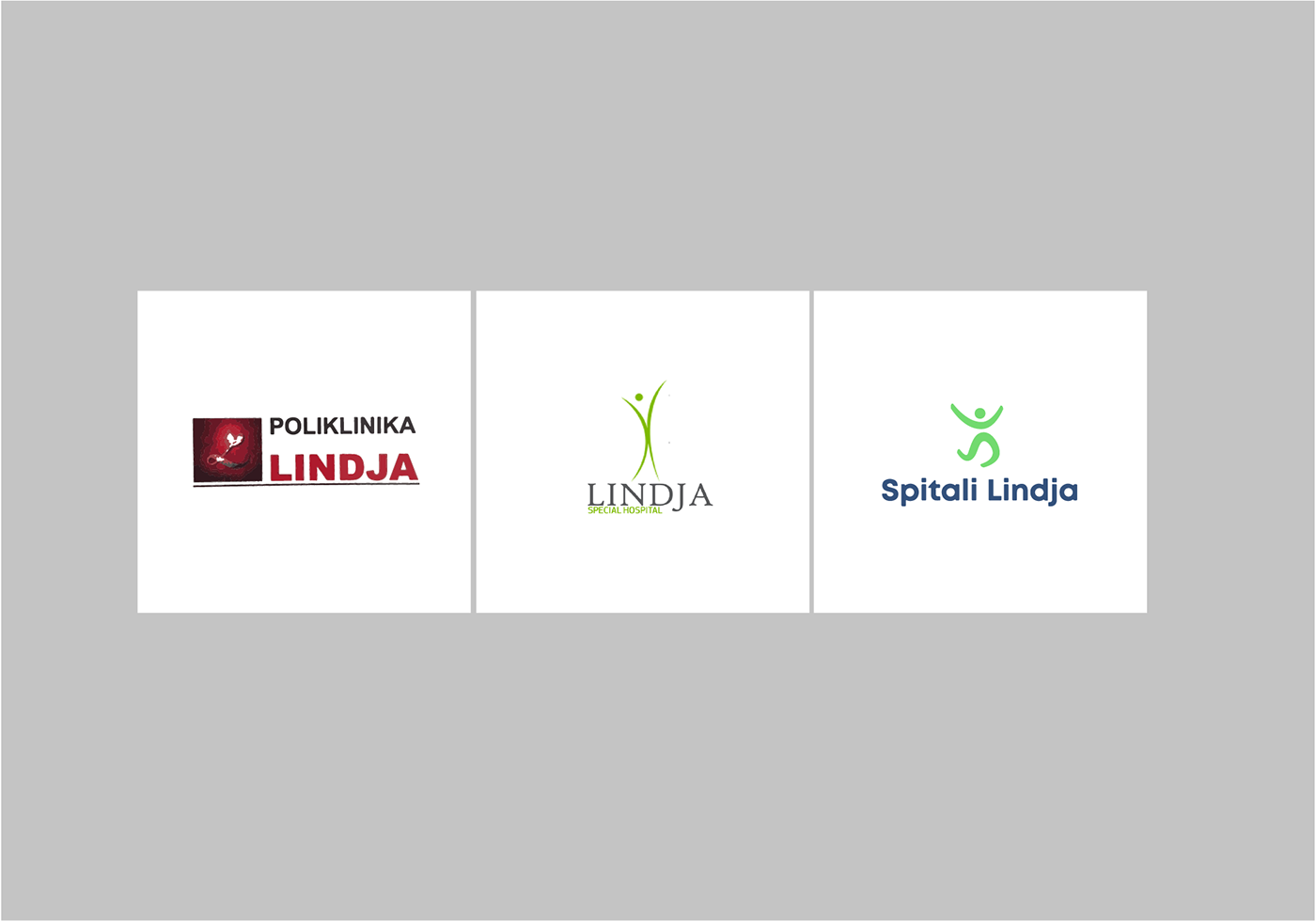
Since 1996, Spitali Lindja has had two logos created at different time intervals. The second logo (the longest used) had a pretty good concept but unfortunately with an weak execution, a happy man with open arms in center completed with a green color that is synonym of Nature Energy Renewal nevertheless LIFE.
To complete the journey from old logo to new, specially when you have to deal with a hospital that has more than 22 years experience, it is quite challenging.
Our aim was to create a transition from old logo to a new modern illuminating identity always knit together and in synchronization with their past.
Our aim was to create a transition from old logo to a new modern illuminating identity always knit together and in synchronization with their past.
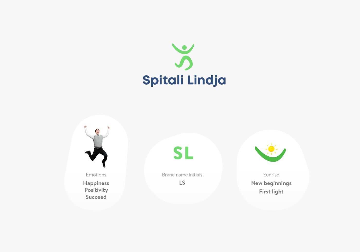
First by incorporating two initials (S&L) we created a new icon of a man that is in state of happiness. We tried to find the best position that man can show emotion explosions (usually synonym for birth of a child or just when you have a good news). At first glance the happy jumping man transmits positivity, succeed, bright life that increases furthermore the credibility in healthcare services provided by SPITALI LINDJA.
At the same time the logo buildup even more character, if you concentrate in upper part “L” initial and “HEAD” we visualized a sunrise figure (the sun in between two hills) that represent the new day, new life, new beginnings nevertheless it is a visual translation of word LINDJA (Alb-birth, rise, new) by allowing us to have even larger use of the logo.
The spirit of green color with a wide spectrum of meaning( Harmony Freshness Safety Fertility ect.) stayed untouched in logo.
Hence, by redesigning the logo and incorporating new elements in logo we build freshness, liveliness, a modern spirit all lined well with the past identity and binded well with the philosophy of “SPITALI LINDJA”.à