


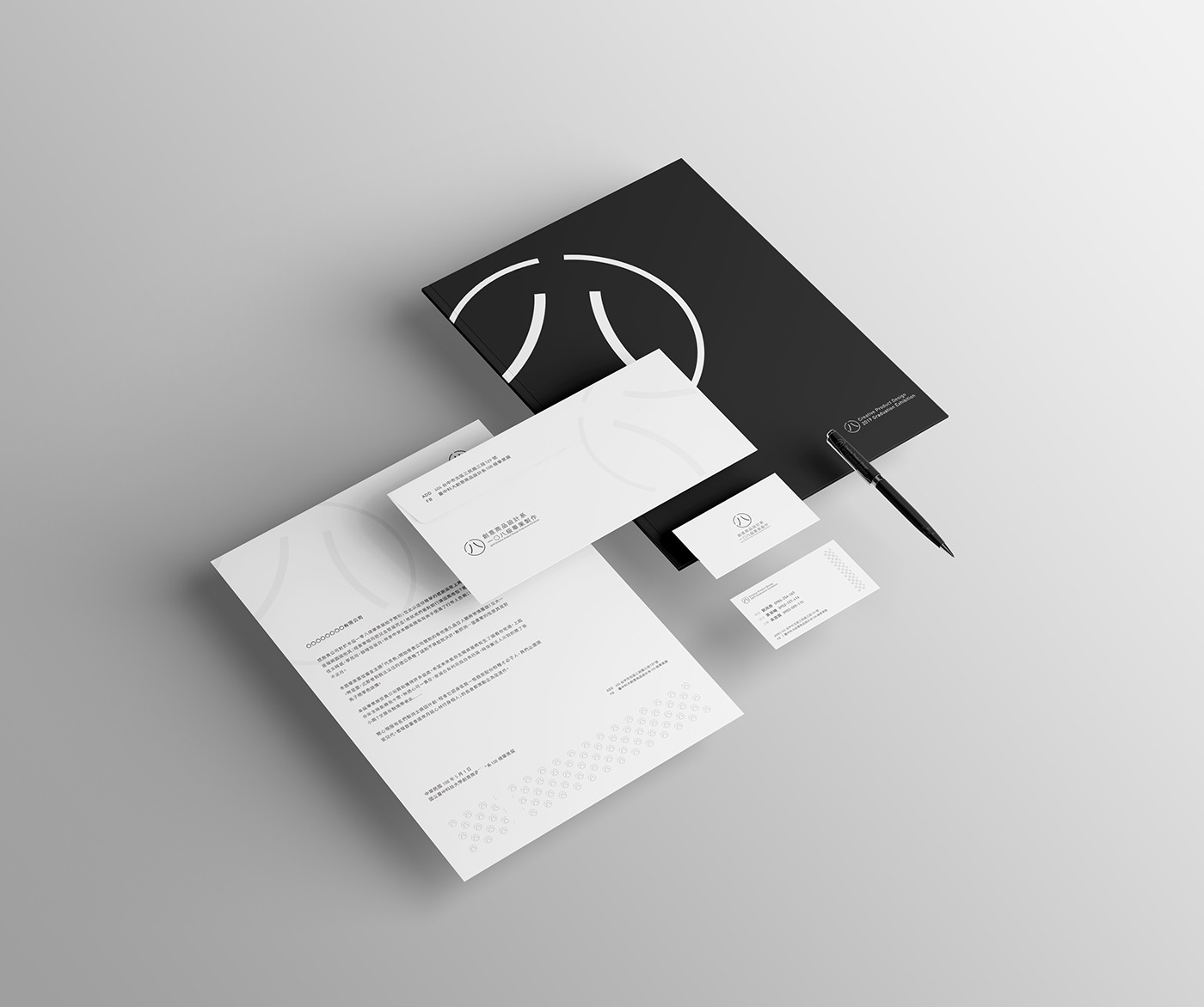
國立臺中科技大學創意商品設計系一〇八級畢業製作標誌識別系統設計。
系上首次以視覺傳達科系標準建立畢業製作形象視覺設計組,將為創意商品設計系劃下一個新的里程碑。
The brand identity system of 2019 NTCUST CPD graduation design exhibition is executed by a BI design team. A new milestone is reached by applying high quality standard of visual image planning and design.
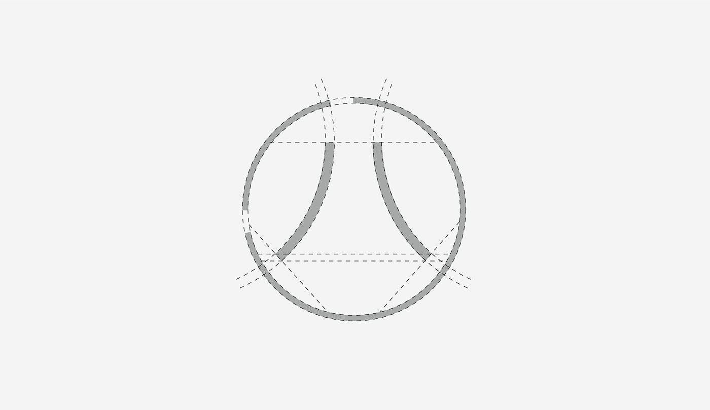
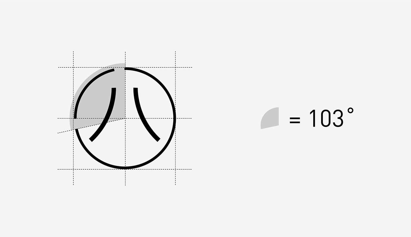

整體標誌以「一〇八」為構成概念,開口與圓心角度象徵本屆畢業製作班級入學年份(民國一零三年)。
在標誌外型上以圓和漢字「四」為概念,希望從四年級開始為期一年的畢業製作能夠順利圓滿。
The logo is based on the concept of "one, zero and eight". The opening and center of the circle symbolizes the year of enrollment in the current graduation class. In the logo appearance, the concept of the circle and the Chinese character "four" is used. It is hoped that the one-year graduation production from the fourth grade will be successful.

標準字的部分特別在「〇、八和業」的部分做了較其他文字特別的轉變:
〇與八承接了標誌上的特色;而「業」字部分在文字最上面呈現宛如踏步的變化,是雙腳腳踏實地的意涵。
Part of the logotype has been specially changed in other parts of the "〇,八和業" section: 〇 and 八 have taken over the characteristics of the logo; and the word "業" has shown a change in the top of the text.That means "down to earth".


色彩計畫部分以本屆畢業製作班級的特色定義顏色。 沈穩黑象徵經歷淬煉而蛻變而出的每一位同學,
沈著穩定且擁有實力。 毅力灰象徵個個同學都擁有強大的毅力,一路走到畢業製作,堅持且努力。
The color according to the characteristics of the current graduation class. Elite black symbolizes every student who has undergone tempering and has evolved into a stable and powerful position. Perseverance gray symbolizes that all students have strong perseverance, go all the way to graduation production, persist and work hard.


國立臺中科技大學創意商品設計系一〇八級畢業製作-視覺識別系統
NTCUST Dept. of Creative Product Design 2019 Graduation Exhibition-Brand Identity Design
C:國立臺中科技大學創意商品設計系一〇八級畢籌會
D:吳政錩
-----------------------------------------------------------------------


