Fallen Titans' Apex EP
Label design and packaging designed for Fallen Titans' first EP "APEX", progressive metal band from Colombia.
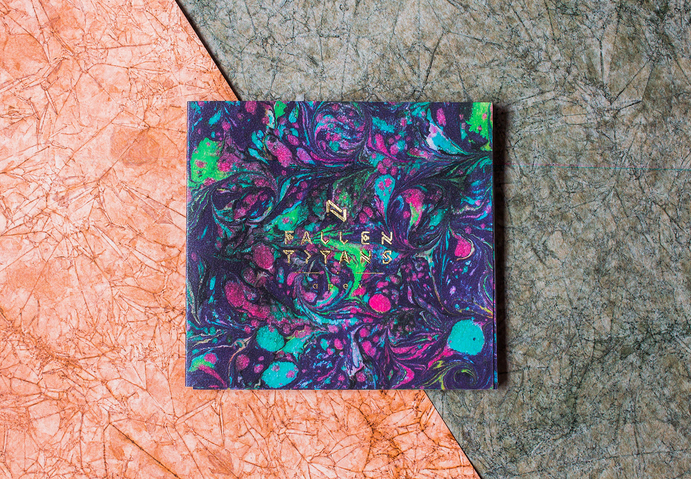
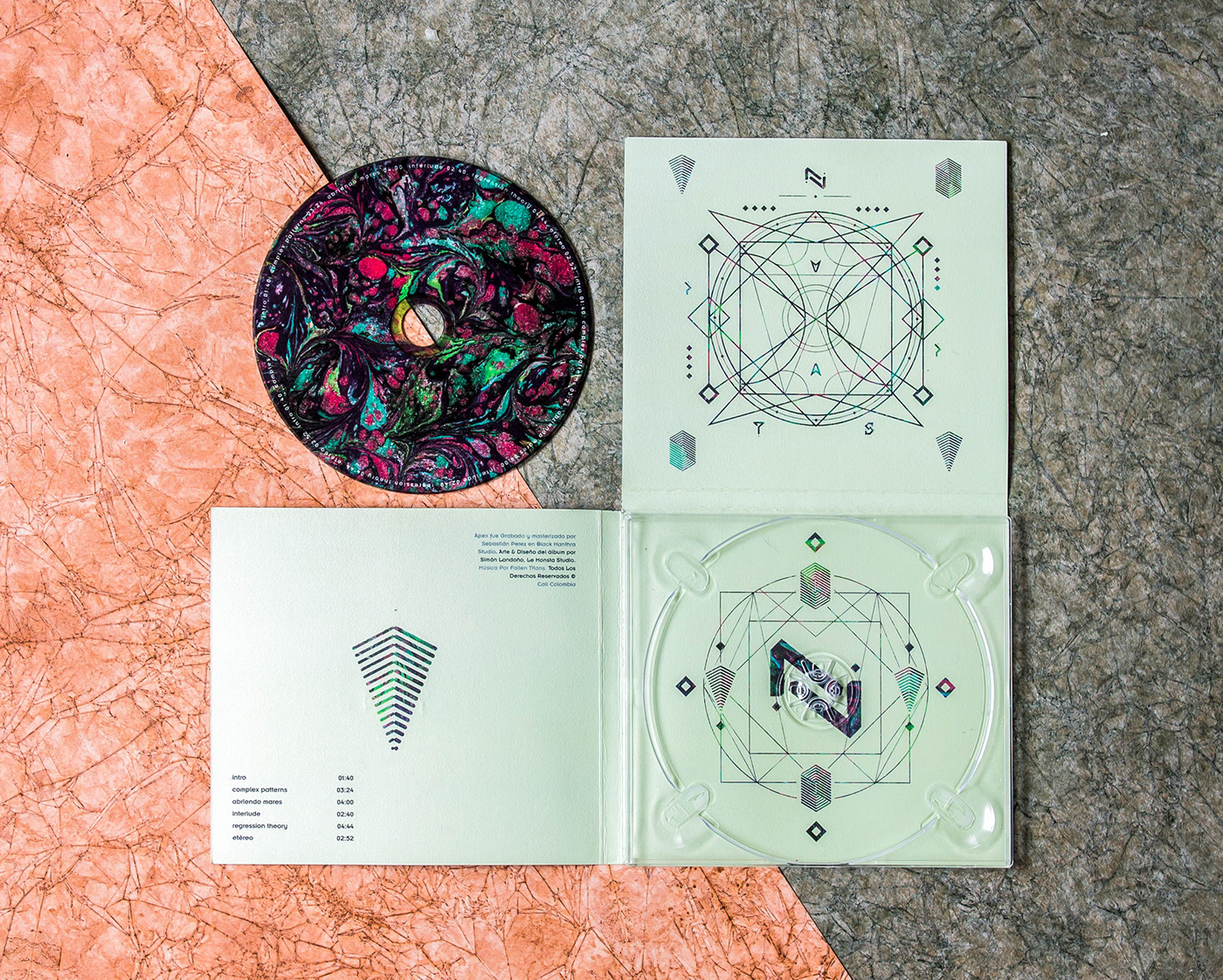
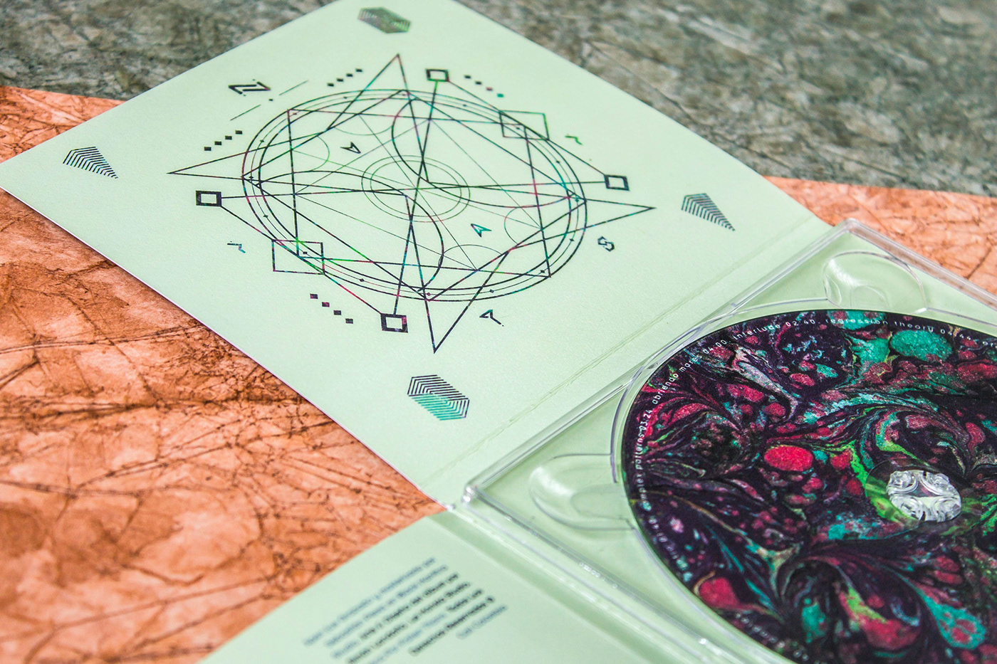
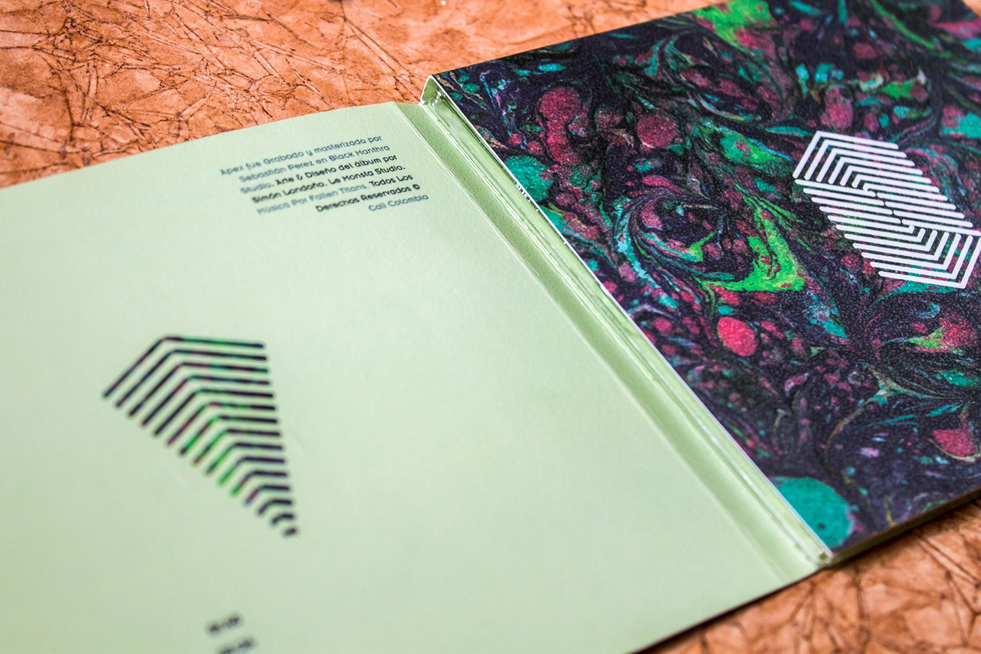
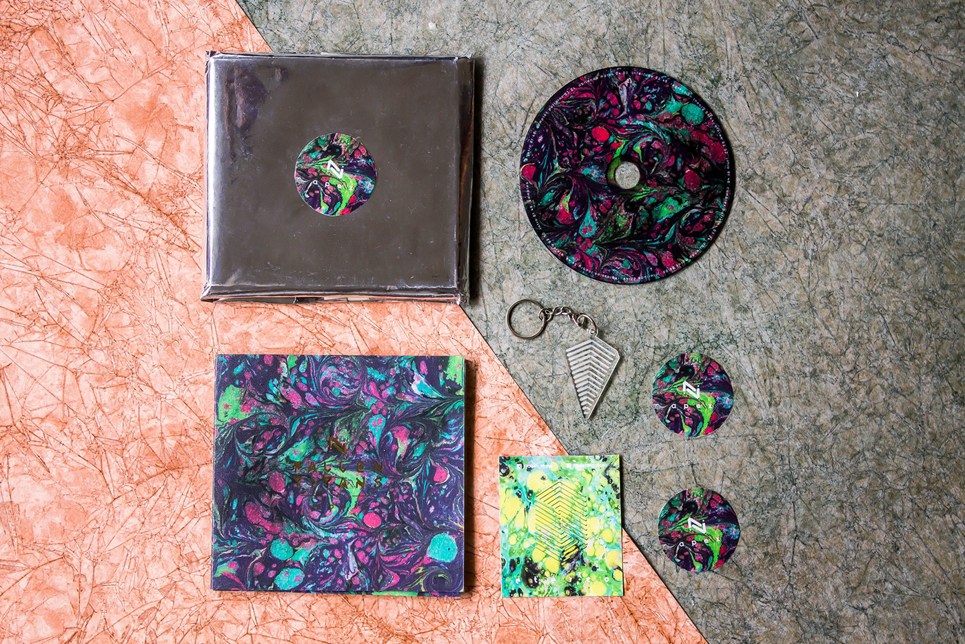
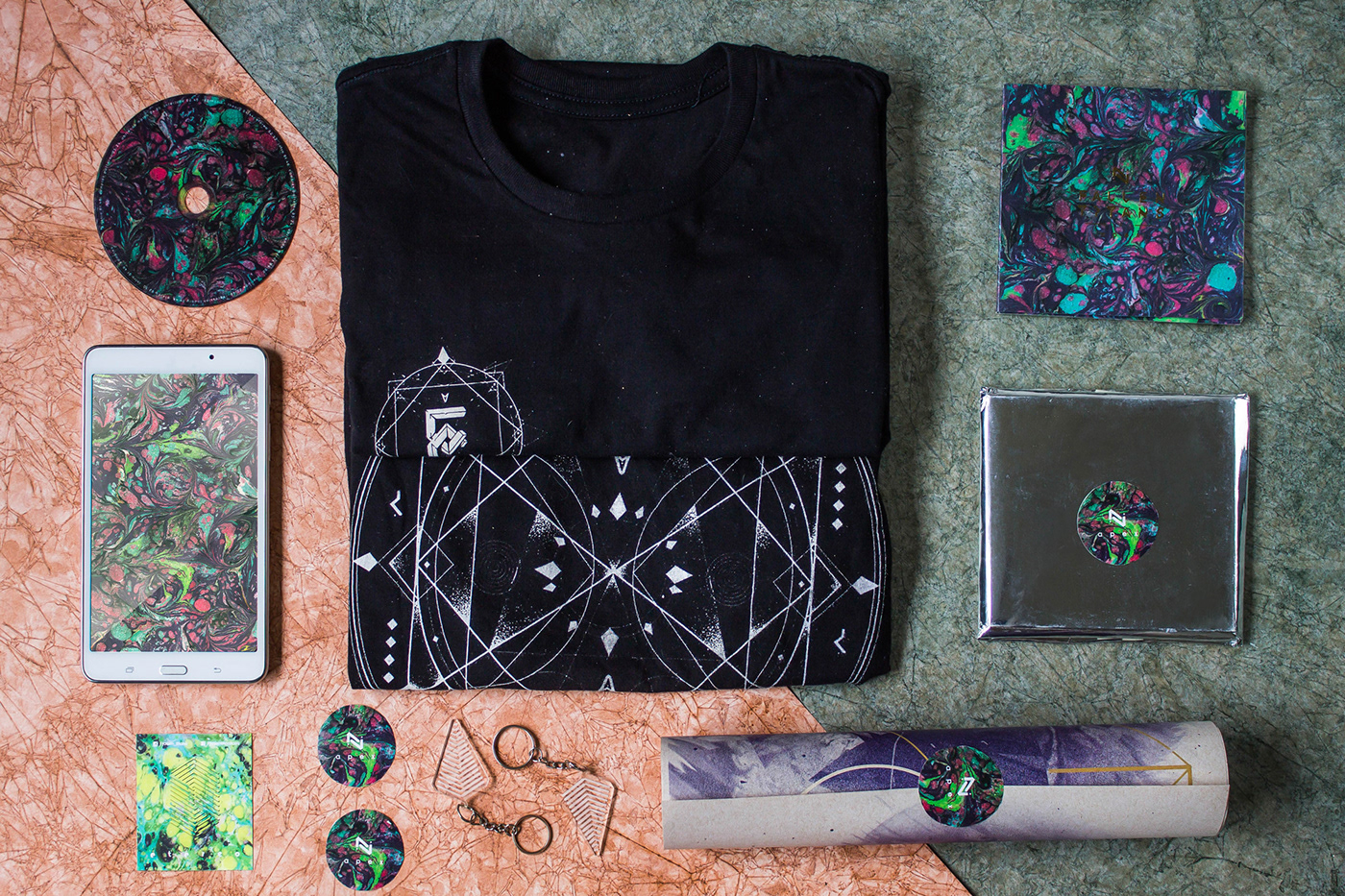
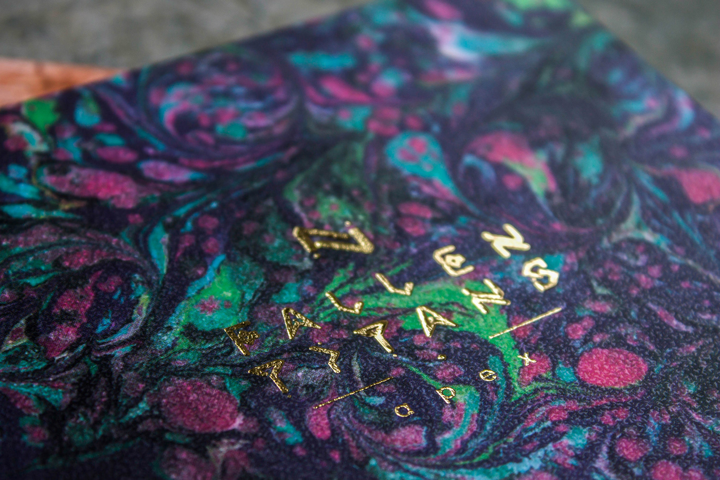
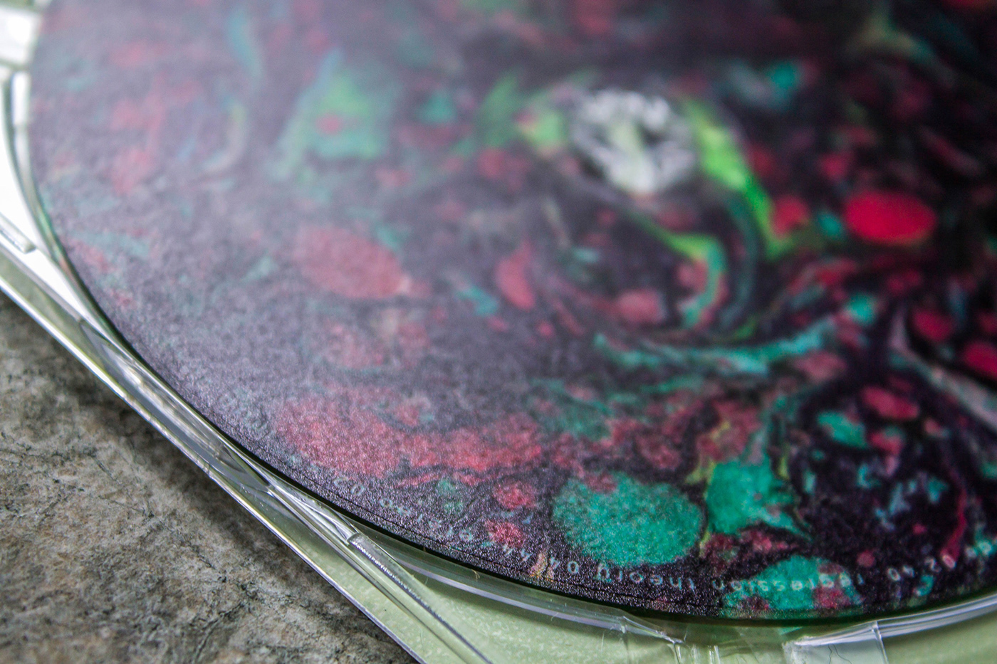
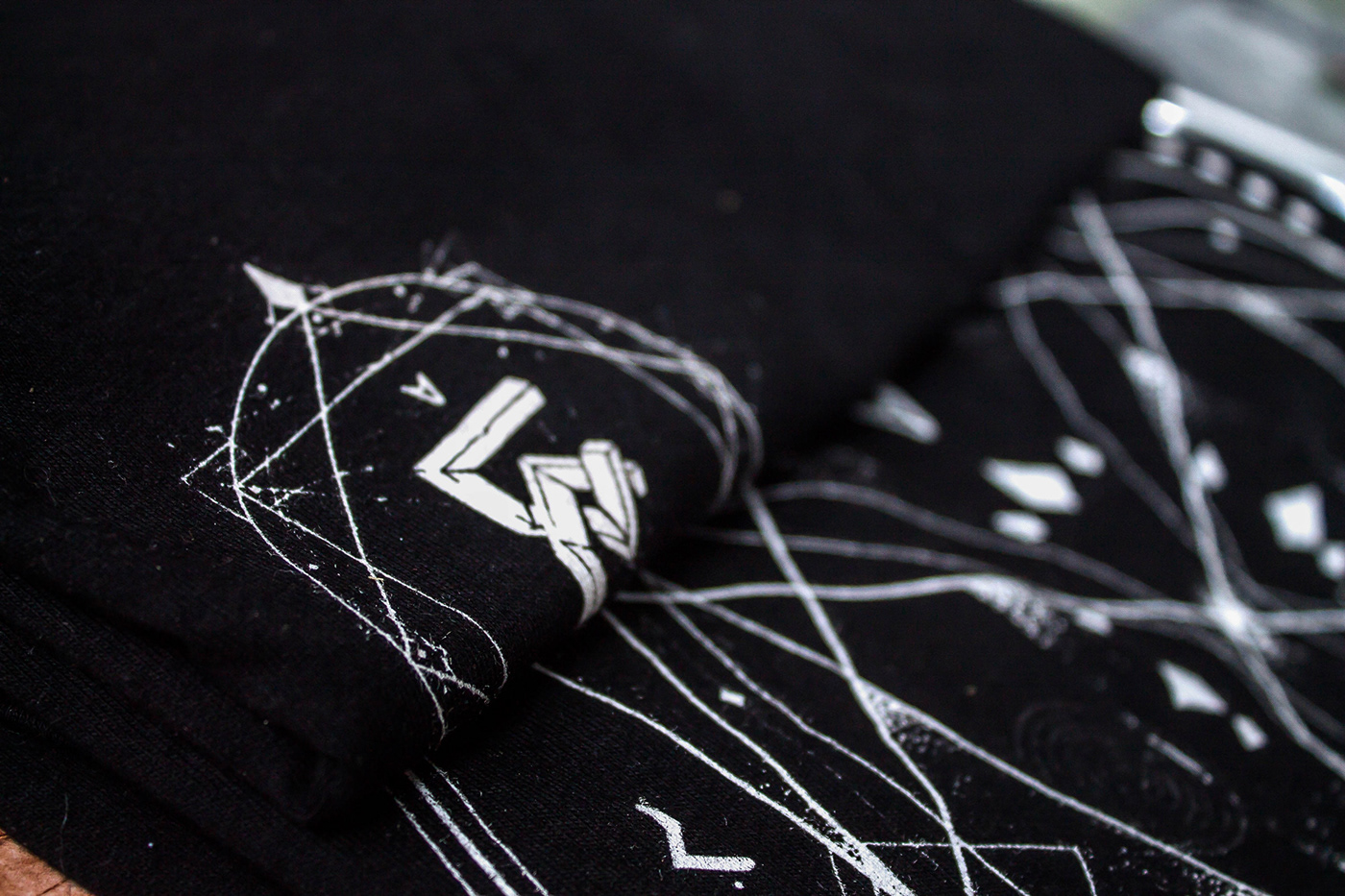
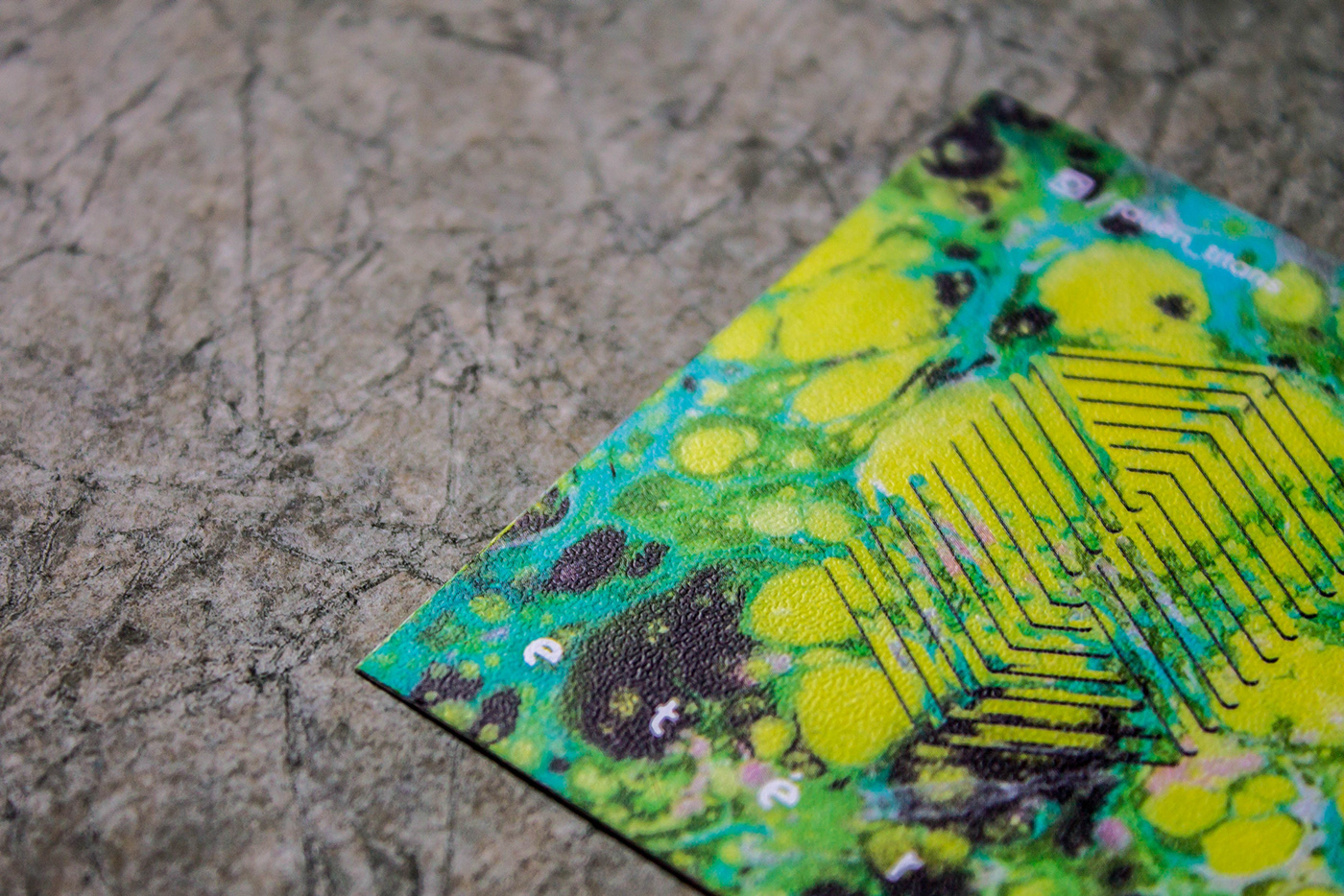
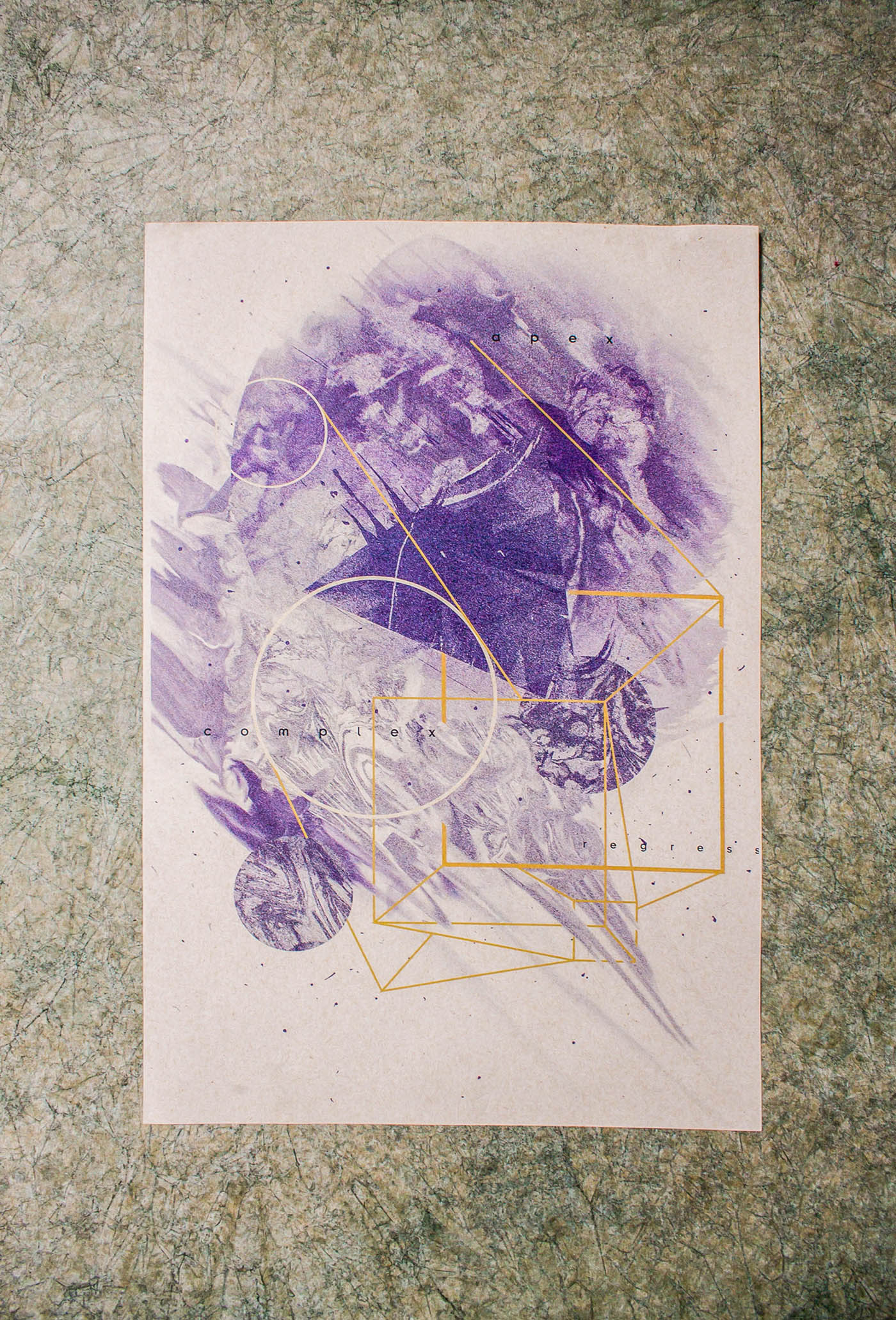
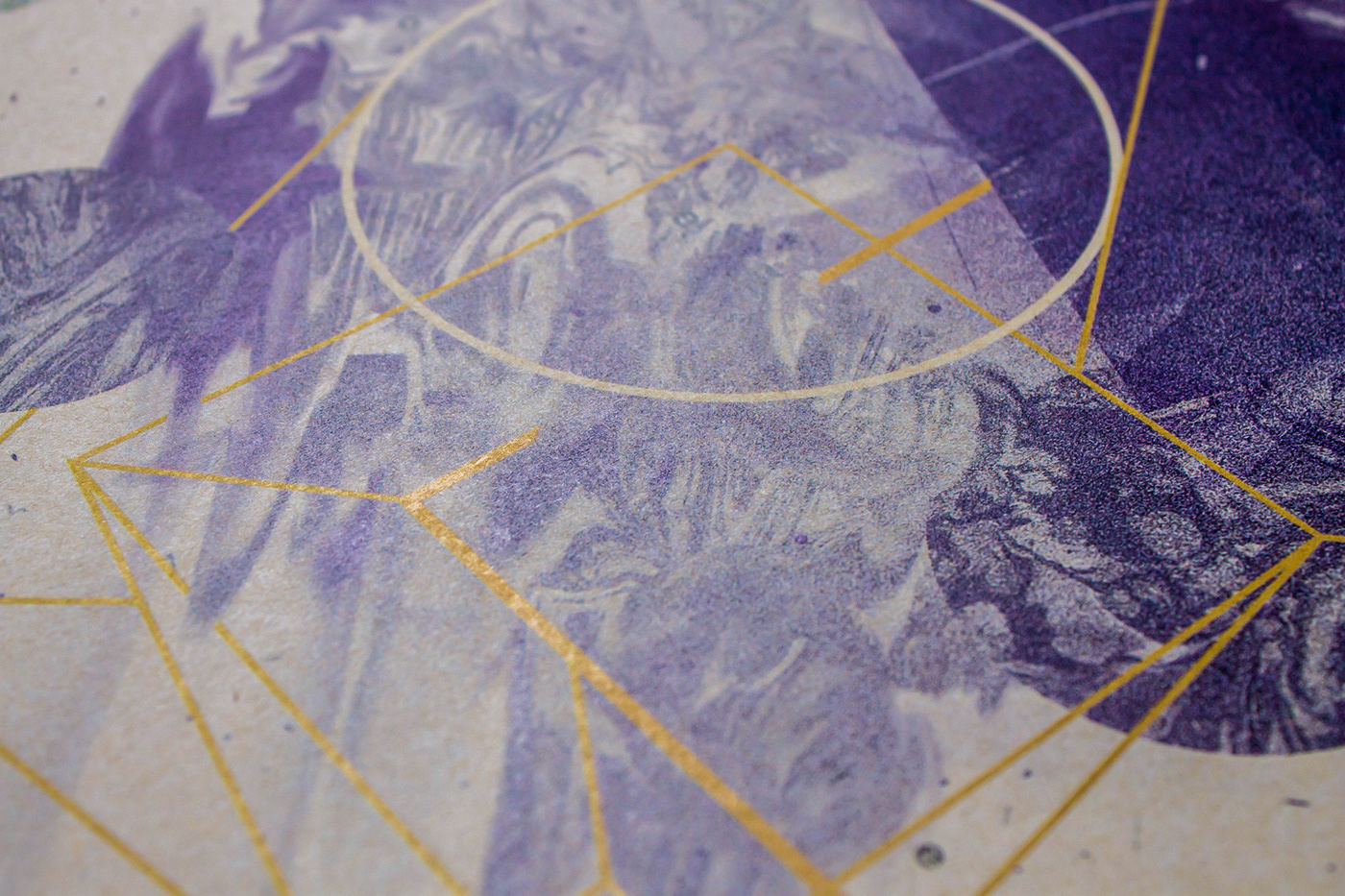
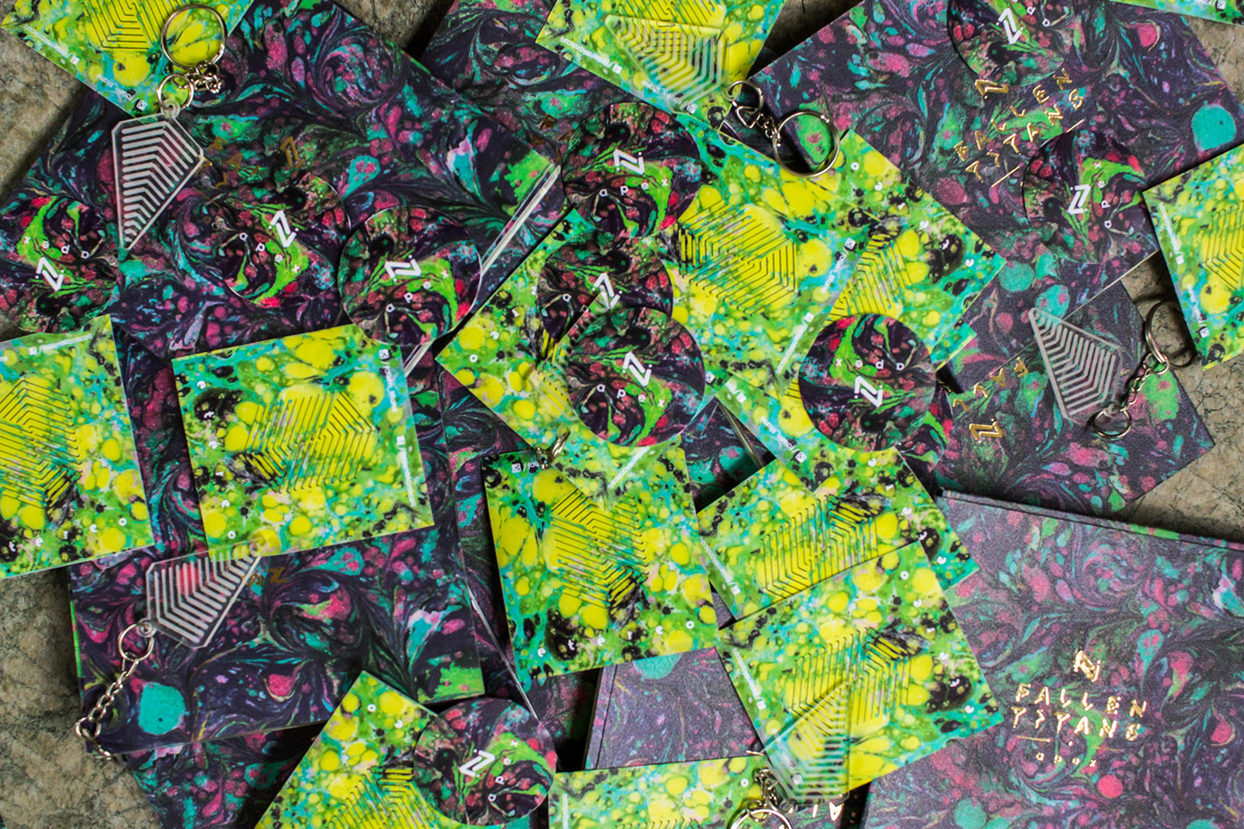
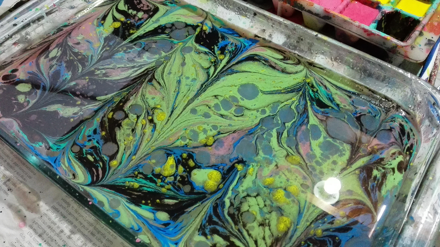
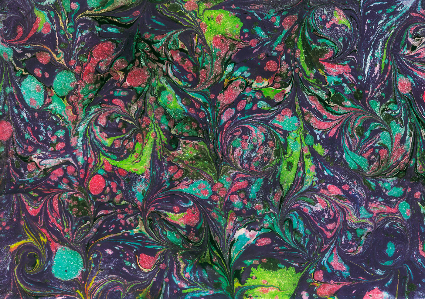
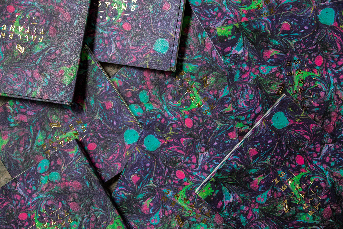
We tried to represent a voyage to the inner cosmos, the soul, a research of self. The marbled paper's textures and colours represent the mind, as a primordial soup, full of ideas, concepts, creativity an chaos, and the maps and letters of the logo represents the guides or coordinates for this travel. Lettering was custom designed for this EP launching. We produced the paper by hand, offset print for the whole information and graphics, and cover logo printed on golden foil. The CD label was digitally printed and the souvenir where handmade and laser cut.
This is maybe the most important progressive metal band in our country so we wanted to make an unique packaging design and cover art so everybody could understand the concepts behind the music, so we could make a difference on the industry.