
Manor Studio
Identity work for a new company that provides architectural and spatial design for both commercial and residential clients. Sister company Manor Properties specialises in property development and investment. To accommodate their dual identity requirements, we devised a restrained set of wordmarks that are subtly accented by the mathematical symbol for exponentiation. The adoption of a grid device in the stationery, with which one can come up with variations of geometric shapes, completes Manor's identity system.
Work done under Manic Design.
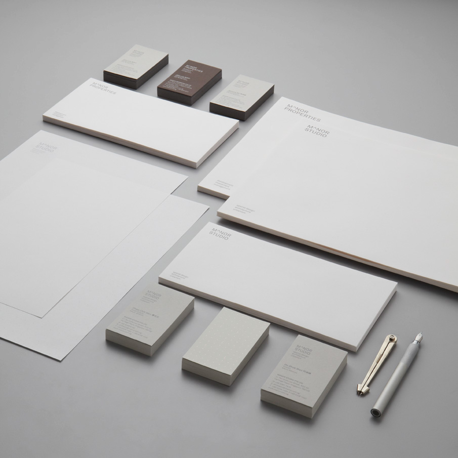


UV hotstamp of the grid on the underside of namecards.

Duplex of white + gray for the studio namecards.

Variations of 'M' can be traced out.


