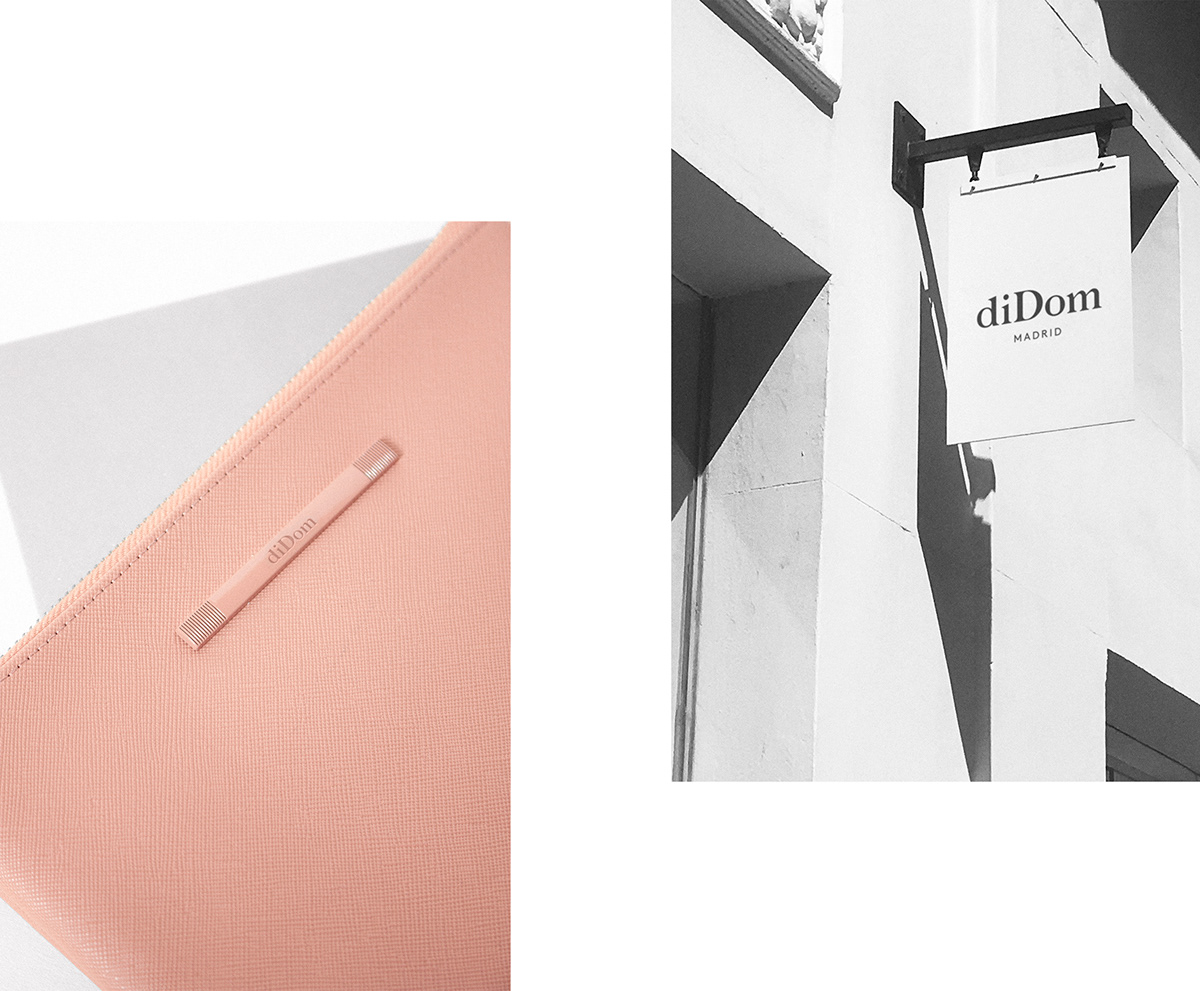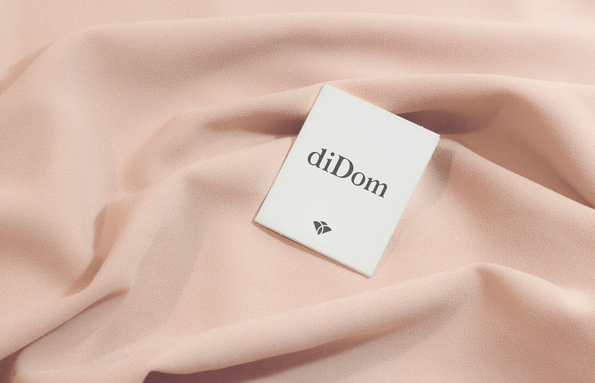


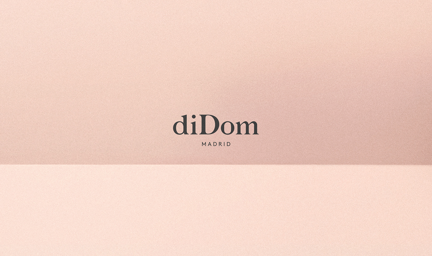
diDom is a store located in the heart of Madrid's Golden Mile with more than 30 years of history, specializing in the sale of shoes and accessories for weddings and celebrations. We were asked to redesign the entire brand to completely change its old-fashioned image and position themselves in today's wedding markets.
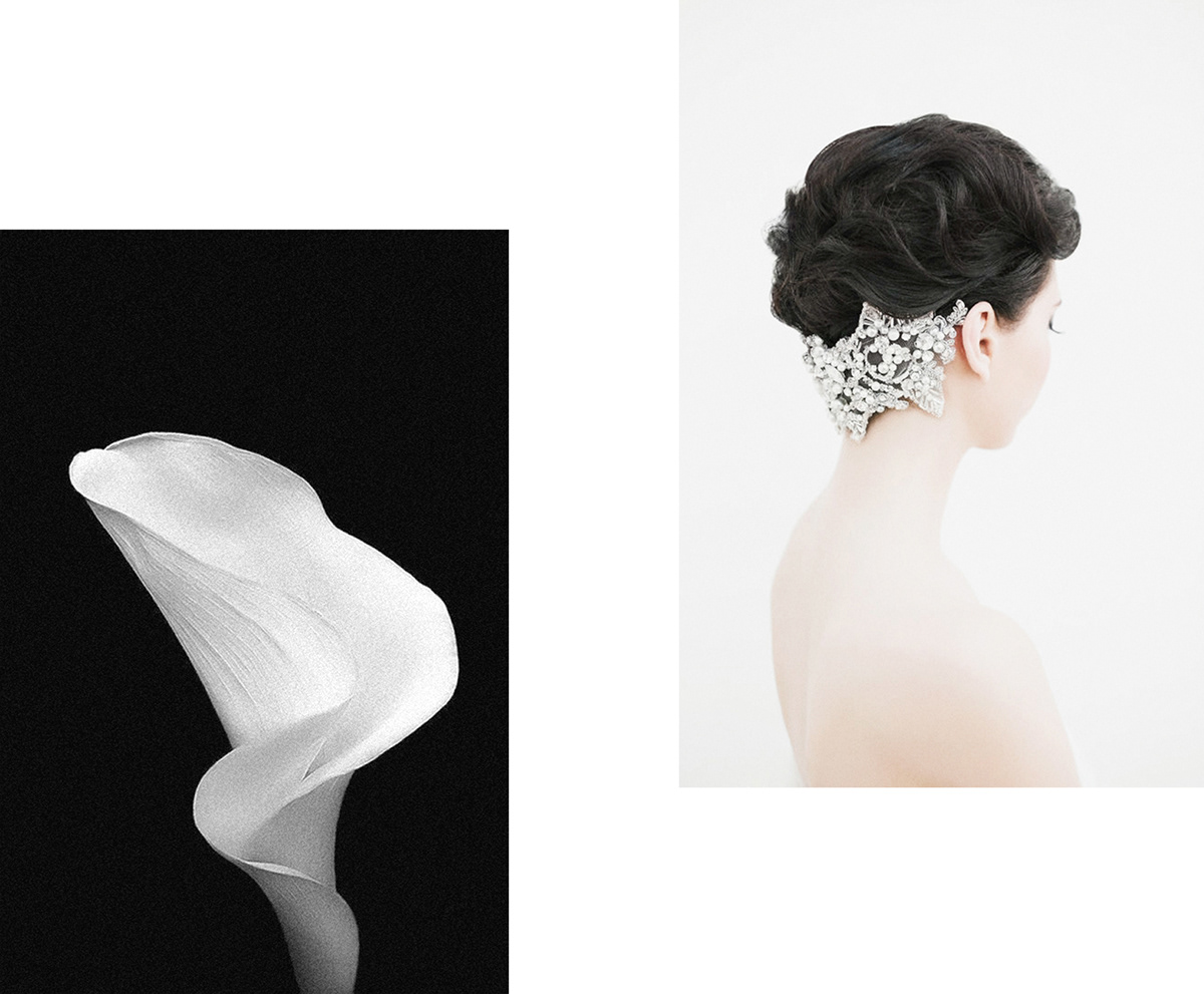
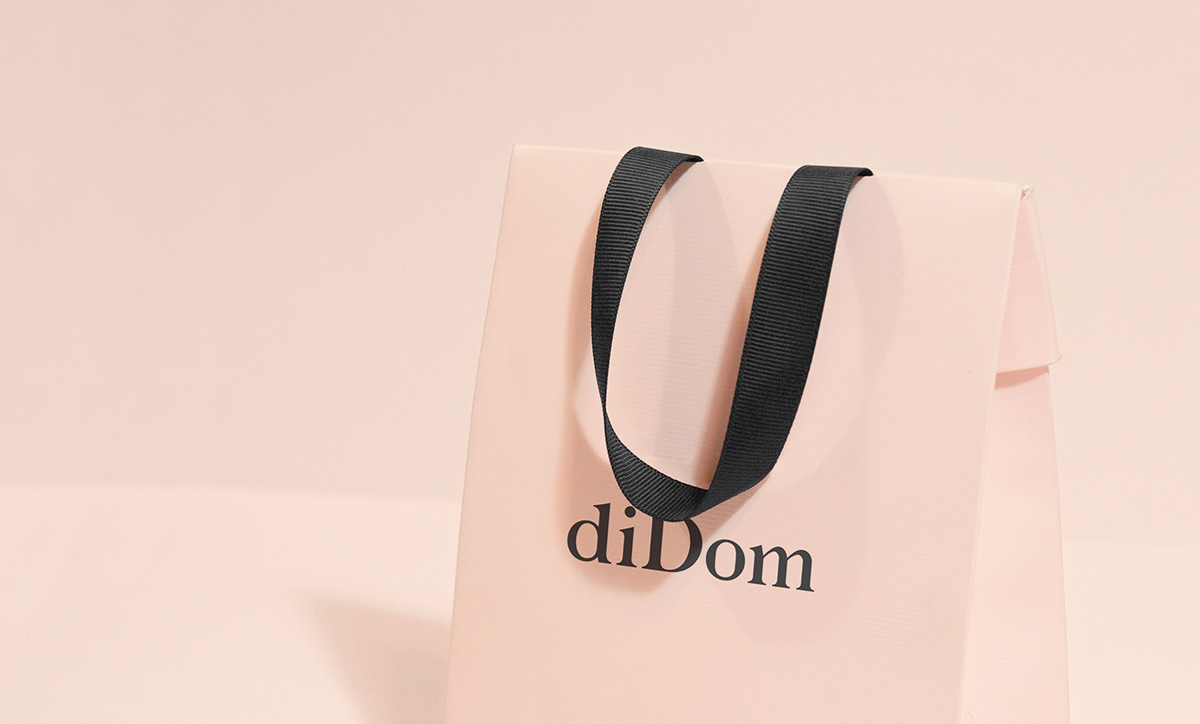
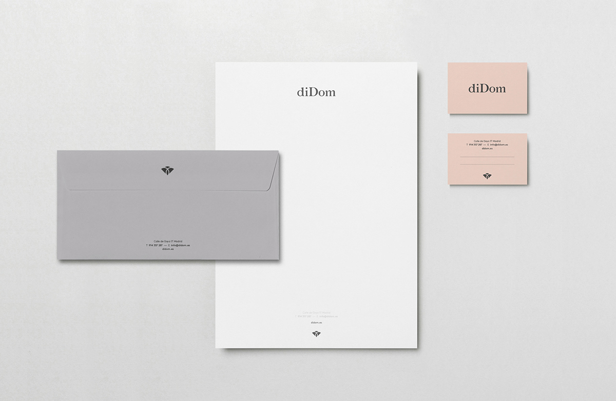
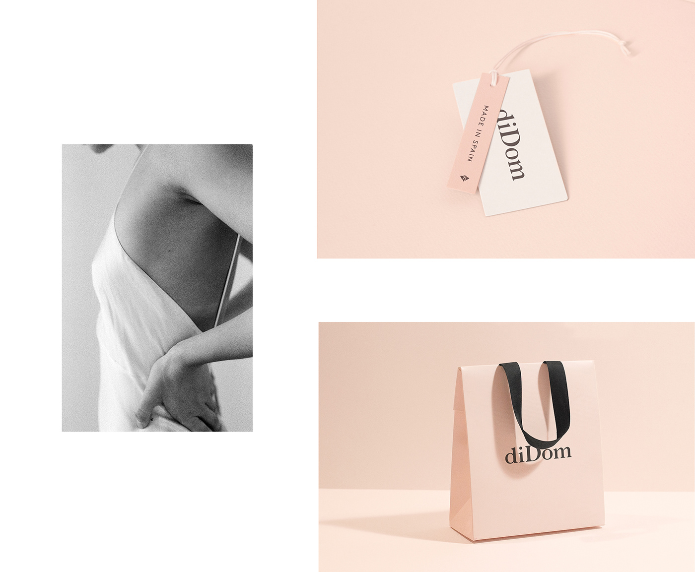
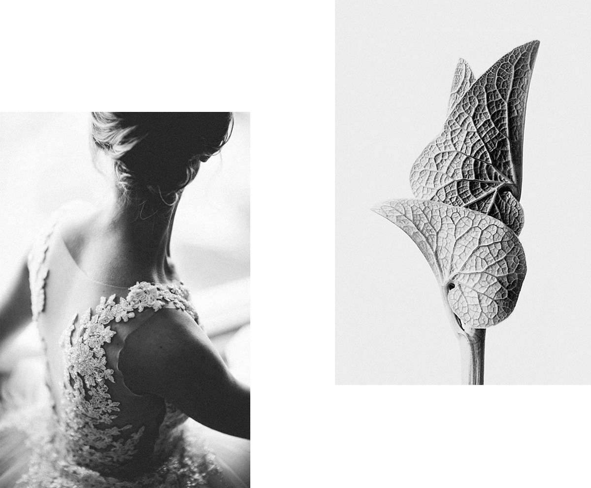
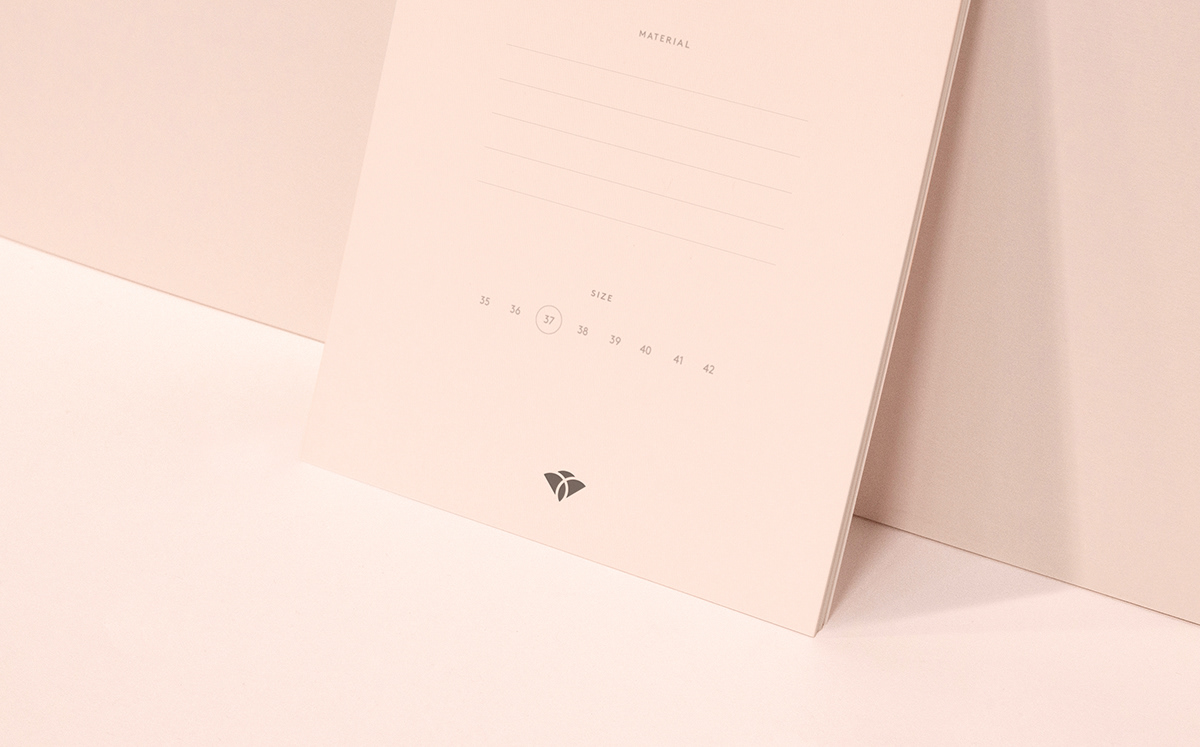
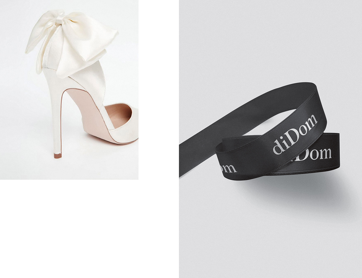
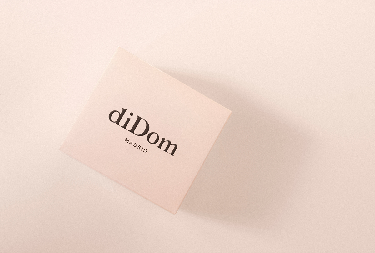
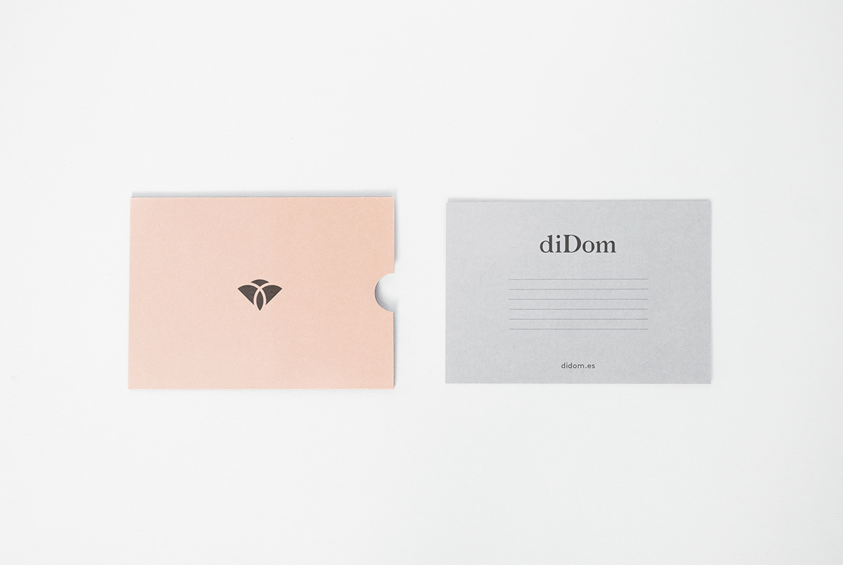
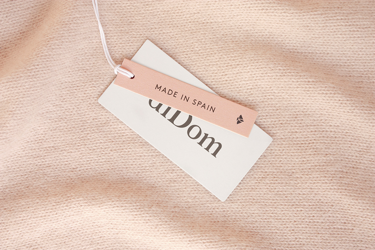
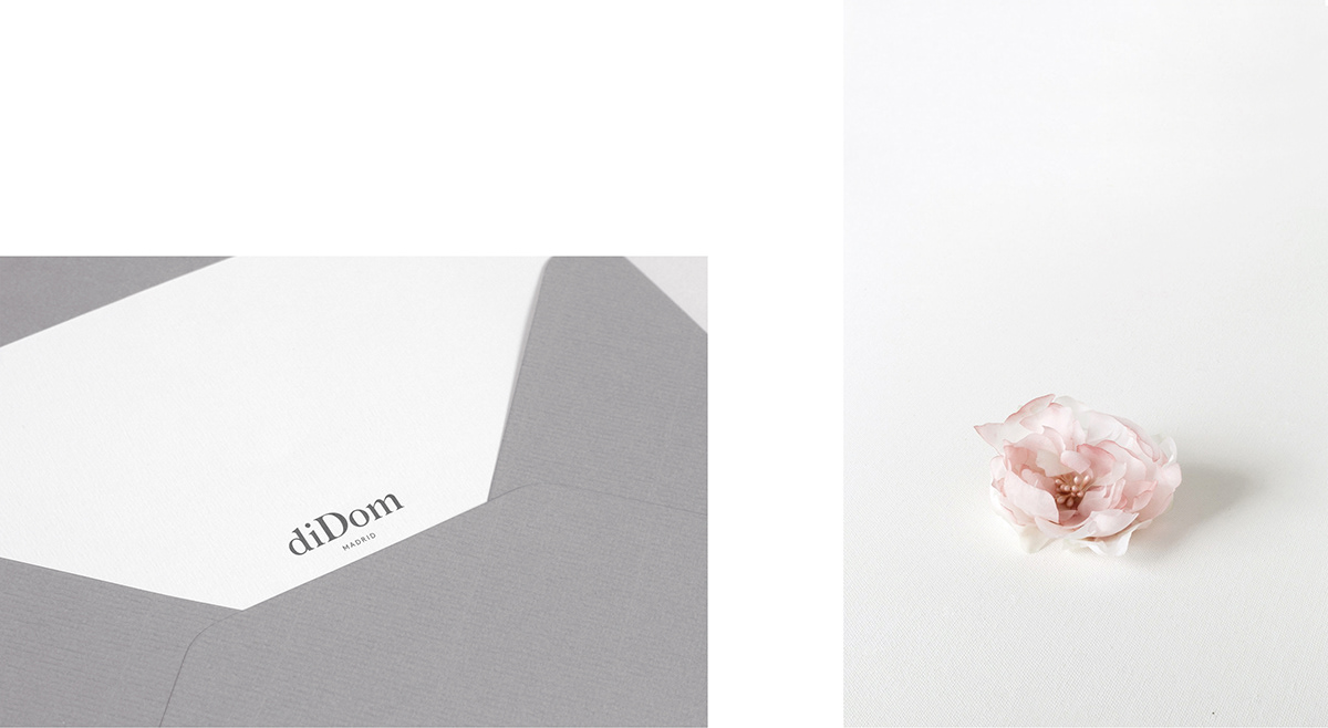
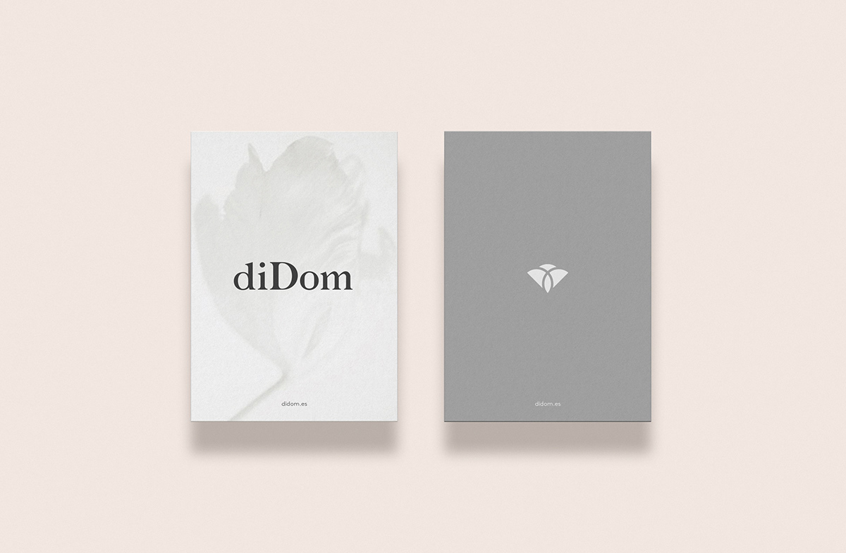
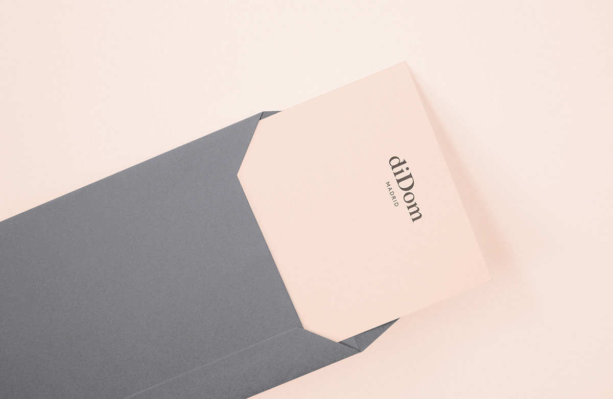
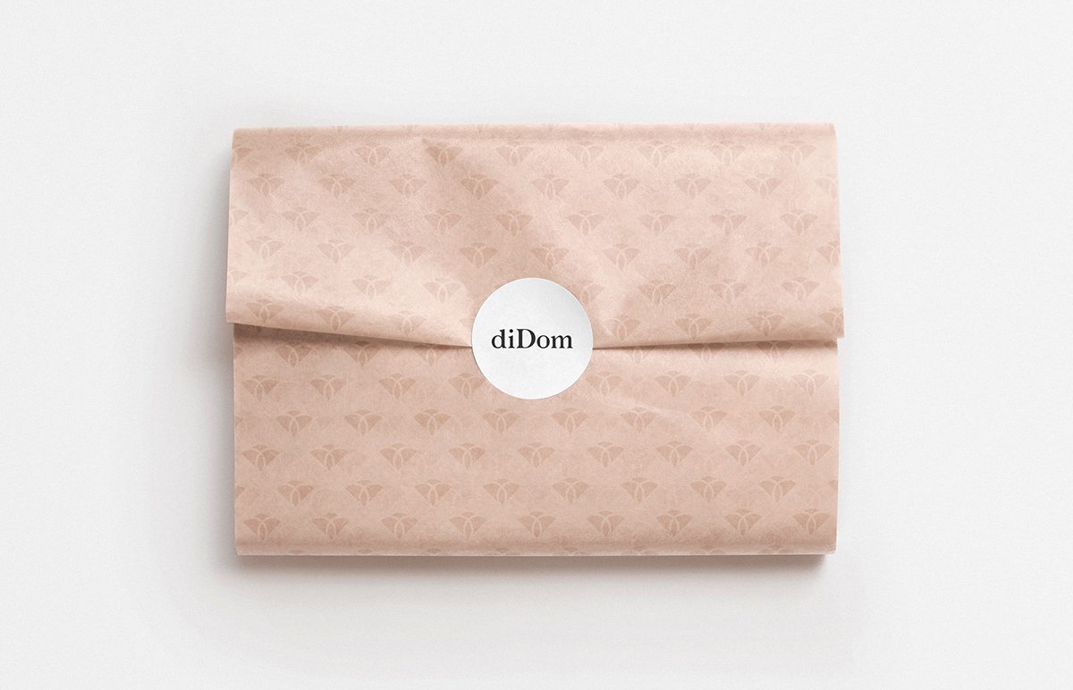
We wanted to reflect on the elegance and delicacy of the brand identity, as well as the quality and design of its products. We have developed a customized typographic logo and a symbol that occasionally accompanies the brand. The symbol was born from the union of the two letters D present in the name of the brand, building the elegant silhouette of a flower, with soft shapes in reference to the forms of women and reflecting some of the most representative emblems of weddings and celebrations: The union of two people. We decided to use a palette of soft corporate colors, supported in black and white. Design, quality and elegance.
We wanted to reflect on the elegance and delicacy of the brand identity, as well as the quality and design of its products. We have developed a customized typographic logo and a symbol that occasionally accompanies the brand. The symbol was born from the union of the two letters D present in the name of the brand, building the elegant silhouette of a flower, with soft shapes in reference to the forms of women and reflecting some of the most representative emblems of weddings and celebrations: The union of two people. We decided to use a palette of soft corporate colors, supported in black and white. Design, quality and elegance.
Services: Art direction, Corporate Identity & Collateral design.