Armend Berisha and team at UNITED PIXELS design a new identity for DIE FRACHTWELT based in Switzerland
The logo created below is made for a company that is open Online platform, that combines the digital advantages with professional advice from logistic experts for absolute reliability and full transparency of worldwide ground sea and air shipments.
The biggest challenge for us was combining all these elements and translating them in one appropriate line. We believed that Die Frachtwelt logo should contain a memorable and remarkable graphic that tells the story of who they are, what they do, what they aim and all in synchronicity with business name for easy interpretation and identification.
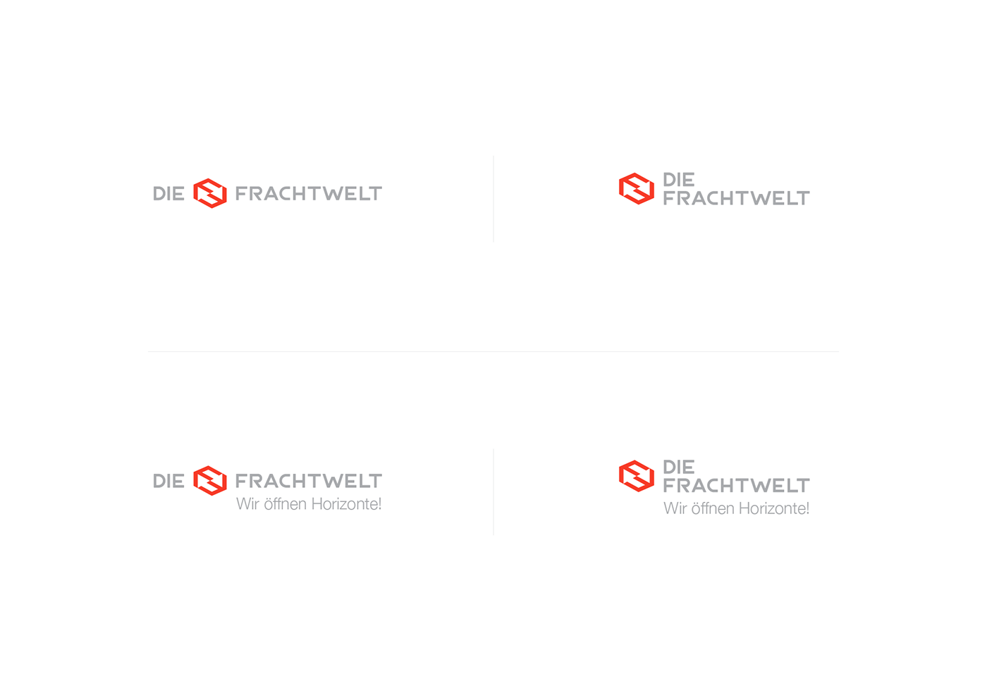
The first element that we wanted to be represented in logo was the first initial of “Frachtwelt”, letter F. With a special construction of the letter F and by duplicating it and placing it in two opposite directions we created a negative- mirror reflection where we acquired the Arrow Symbol that is usually used as a symbol of movement and direction. Combination of an up and downwards Arrow Symbol in this logo speaks on behalf of sea-air-ground freight nonetheless speed. The upward Arrow represents air-freight at the same time north west side while the downward Arrow the sea-freight and south east side, by creating in the middle a fine line that appears for ground-freight and at the same time we obtain a speed symbol that represents speed of freight.
By binding all of the elements above we created a cargo box form, that is one of the key elements we wanted to be represented.
Hence, by creating the logo that embrace all these elements we have managed to visualize the concept and philosophy of Die Frachtwelt company.