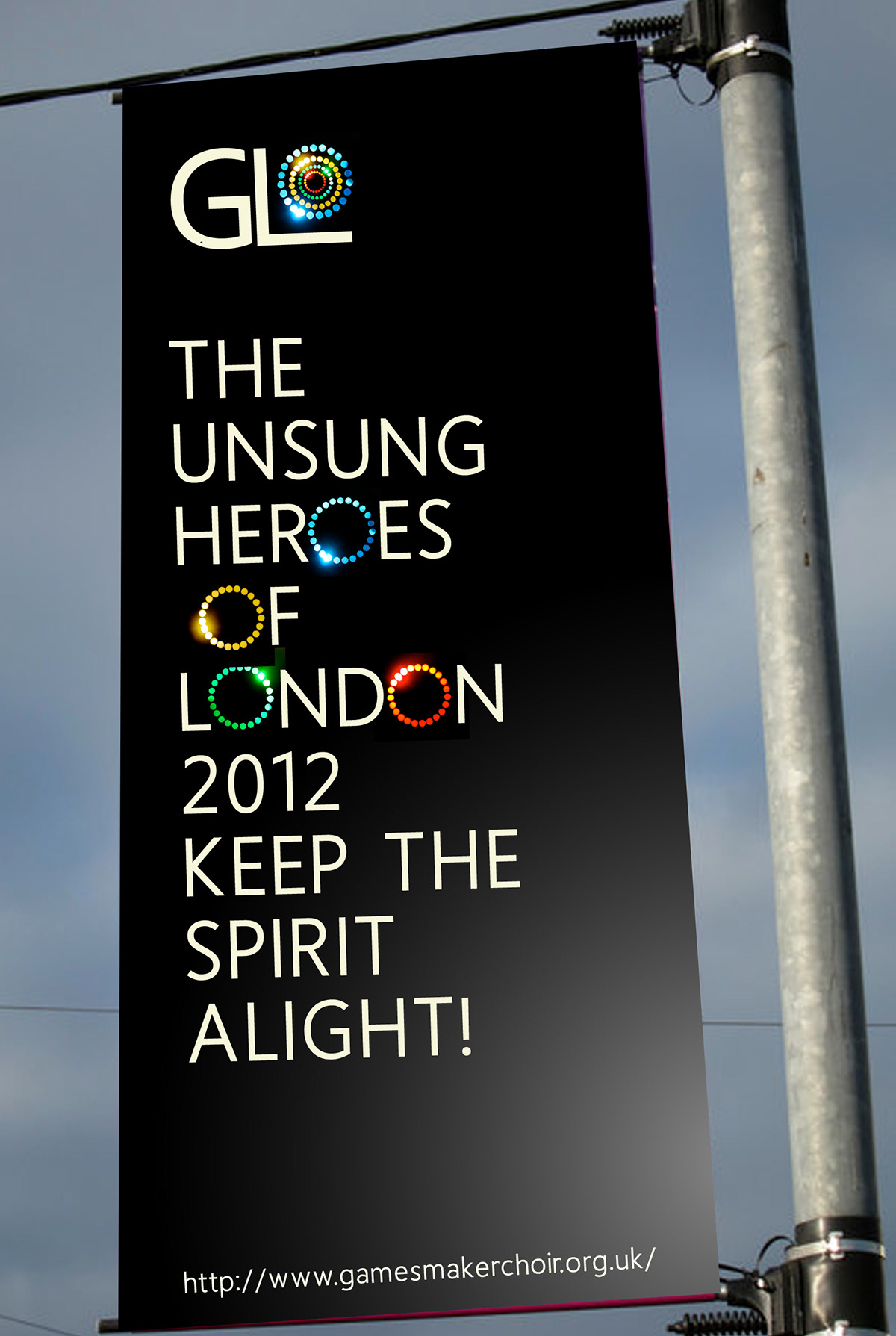
This project was a competition entry for the 2012 MPA roses awards, the task was the brand the olympic game makers choir. celebrating the success of the games and the make it a lasting legacy.
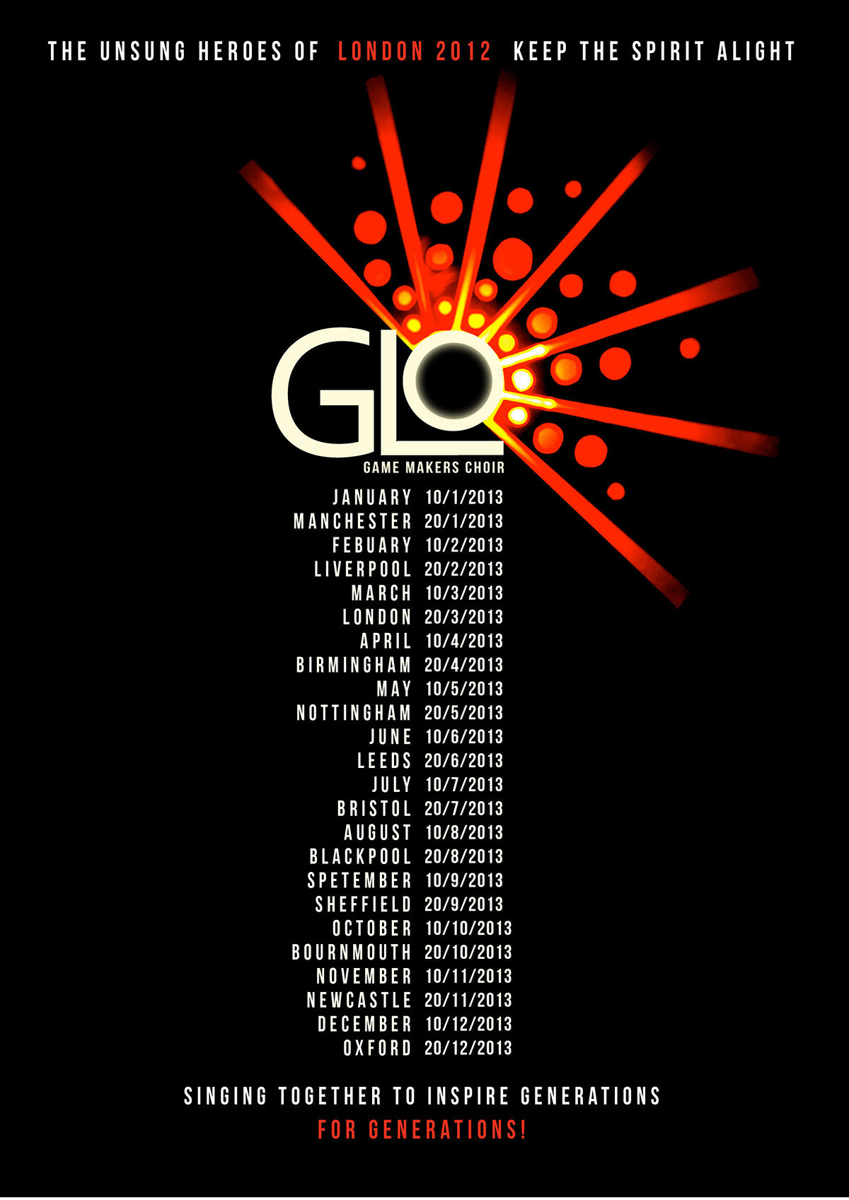
As the 2012 Olympic games has been such a colossal event and a roaring success for London, I wanted to echo the feelings it provoked to all those involved. A sense of unity, achievement and pride. However none of it could have been possible without the help of the volunteers and they were the true unsung heroes coming back together to carry on the legacy of the games.
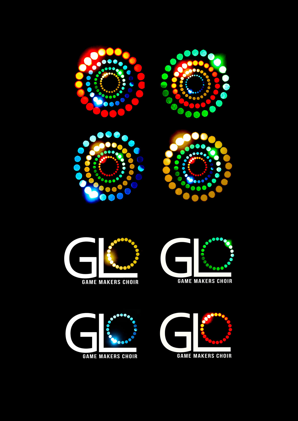
Within my design I wanted to celebrate the game makers joining together and putting a glow back in Britain. I wanted my branding to be bursting with life and energy therefore something that is eye-catching and bold. Using real light and shining it through paper cutouts allowed me to capture the desired glowing effect.
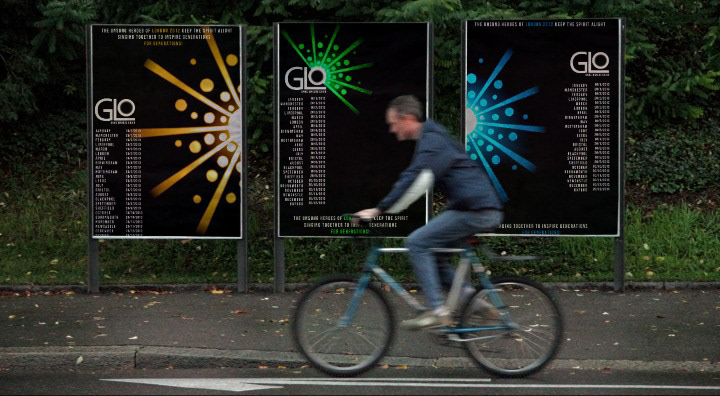
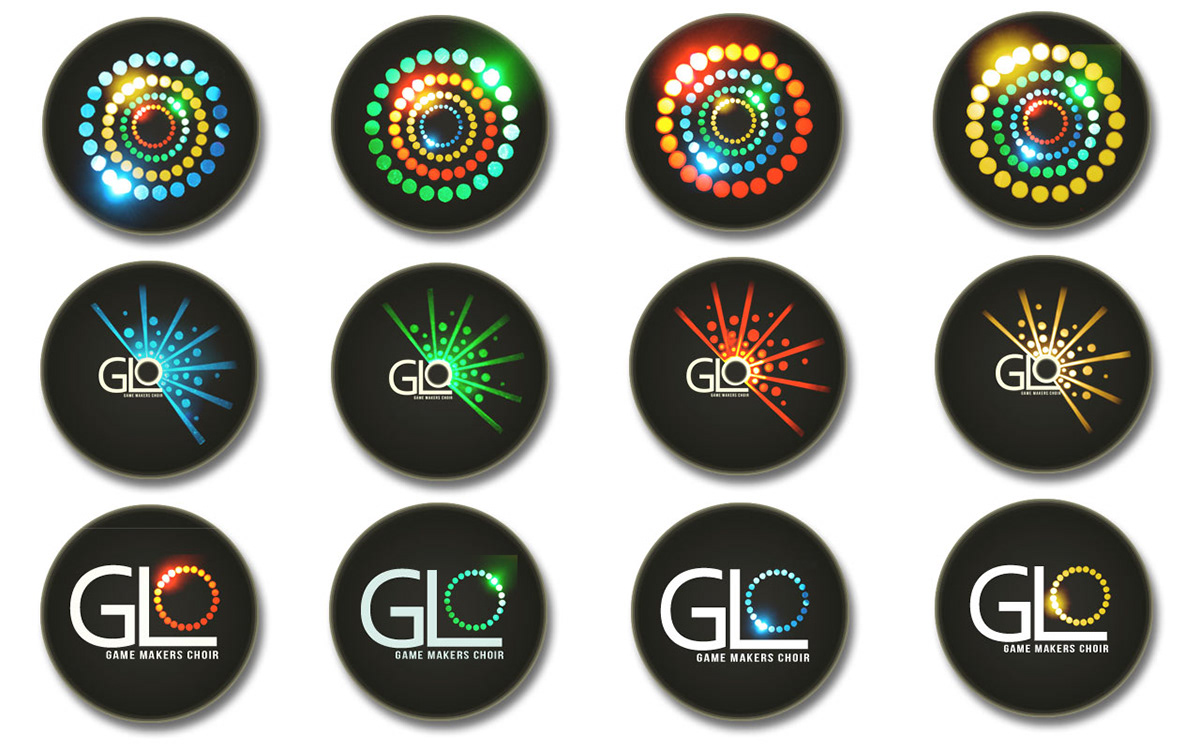
I created 3 versions of my logo to create a broad visual identity for the choir. All created to serve different purposes, one for those involved in the choir itself. The logo is made up of a complete circle with a glow where the circle connects and is formed together. One for spreading the word of the choir, showing beams of light and the circles coming back together. The final logo is to represent the overall experience of the choir and the atmosphere it creates, made up of all the rings contained in a solid circle.
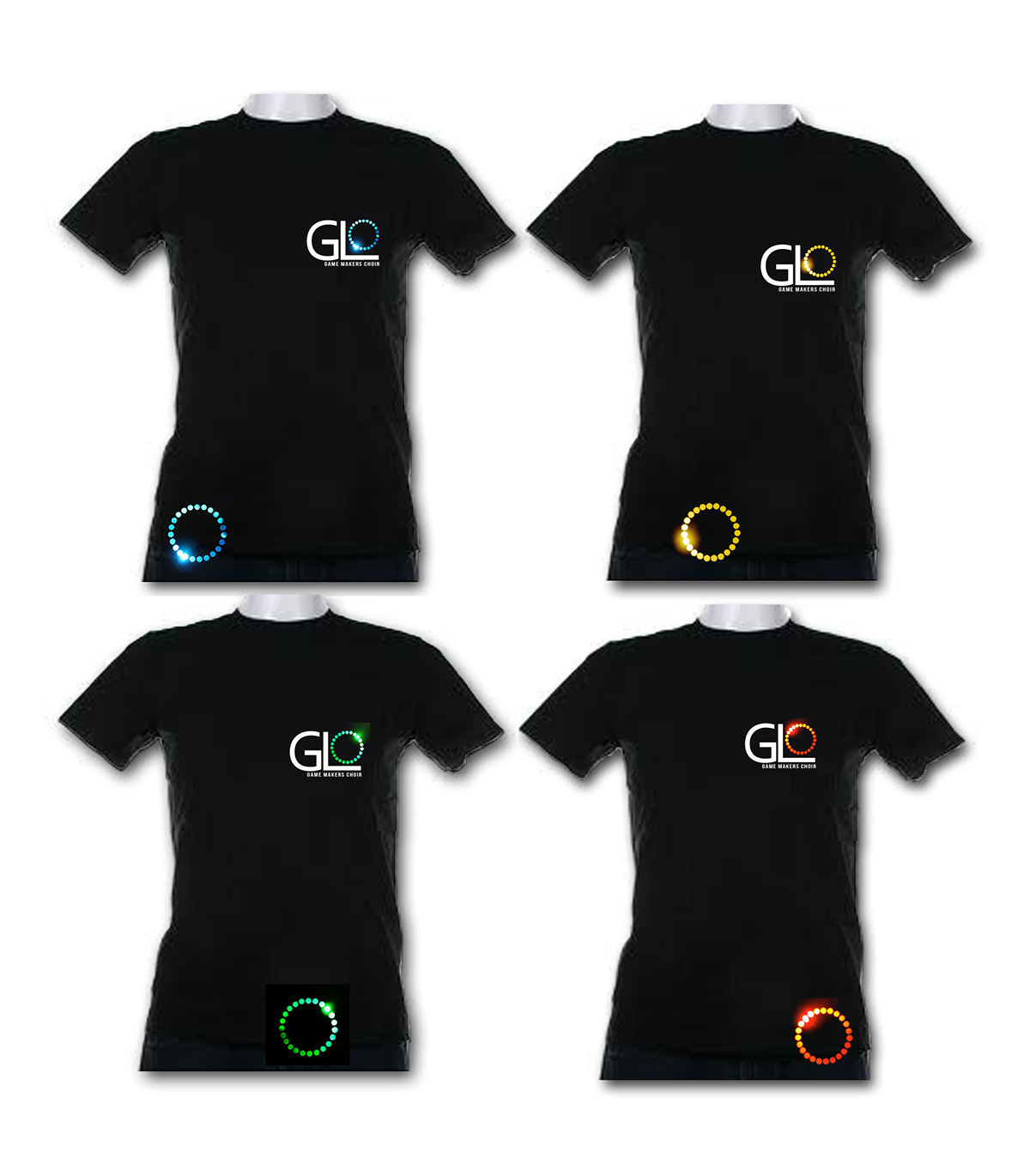
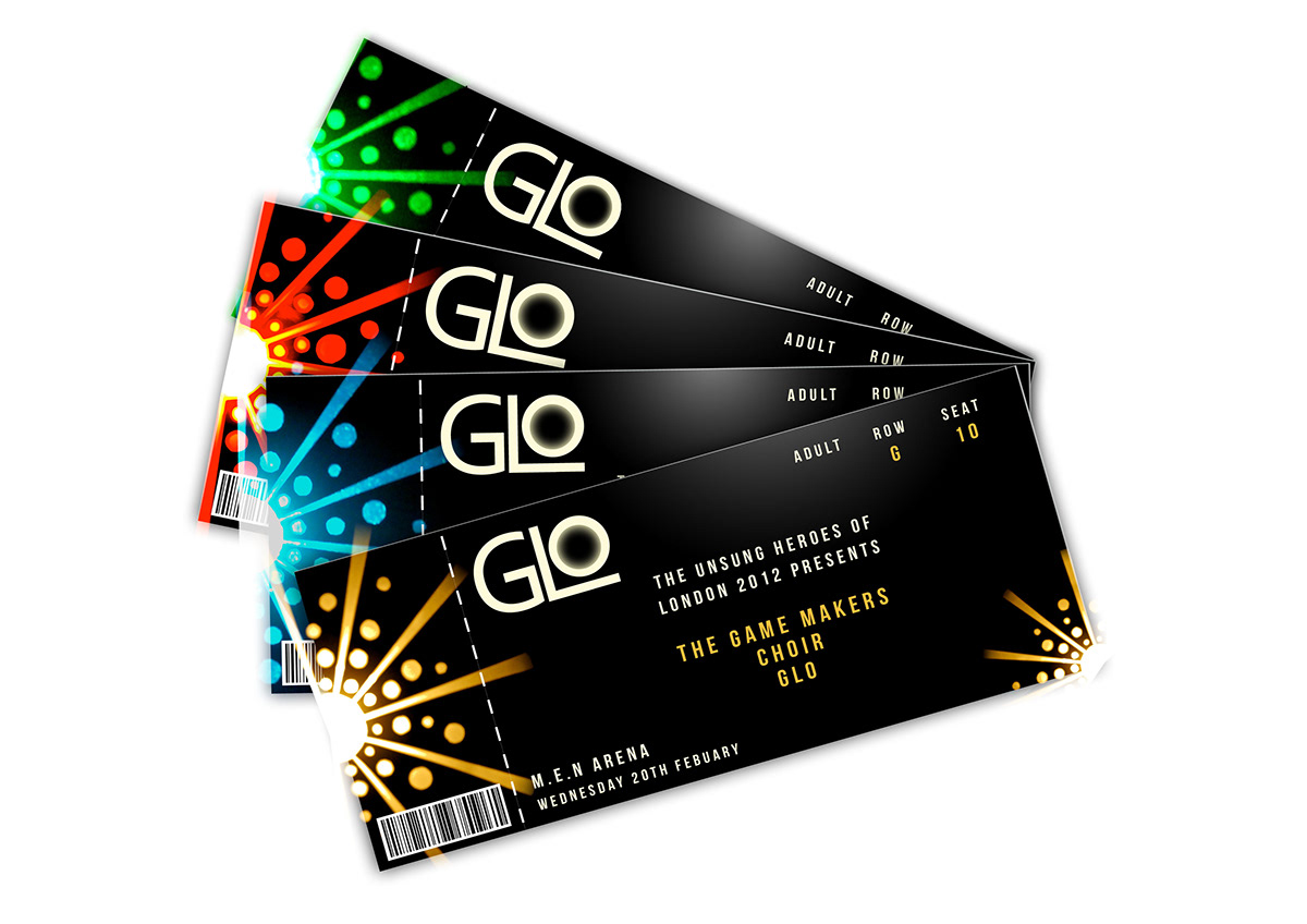
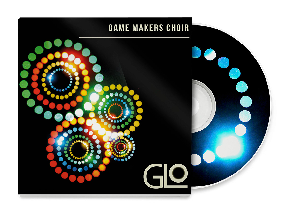
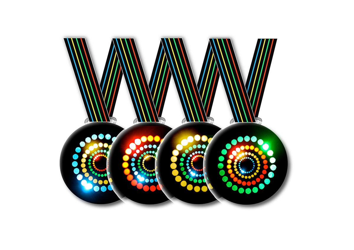
With all the money raised from the choir going to charity I have created merchandise such as medals, badges and T-shirts that can be bought in shops and from stalls after the concerts. I wanted to change the traditional aspects of a choir when it came to the design and create something exciting and current to encourage the public support.