nano•pod
A submission for Adobe Hidden Treasures: Bauhaus Dessau Design Challenge.
Founded as a German art school in 1919, Bauhaus was a breakthrough before it was closed under pressure from the Nazi regime in 1933. However, its ideology remained strong and left a profound influence upon subsequent developments in art and design, from architecture, interior design, product design, to graphic design.
The 2018’s Adobe Hidden Treasures celebrates Bauhaus and its lost typography. Five beautiful alphabets have been meticulously completed and digitized by an international team of students guided by renowned type designer Erik Spiekermann. On this occasion, Adobe set up a design challenge based on the restored fonts. The brief was to build a Bauhaus-inspired brand identity—logo, poster, business card, web design, and other elements—using the Bauhaus fonts.
*Update: On October 3rd, 2018, I was announced as the winner of this competition. Big thanks to Adobe and Behance!
Concept
The Bauhaus ideology is very clear and precise, therefore the brand identity would work well if paired with the right type of business, so that it would suit the theme more. The capsule hotel business was chosen because it has a similar principle with the Bauhaus ideology. Some very well-known Bauhaus principles are: “form follows function” and “less is more”, and those principles are the ones that a capsule hotel has.
A capsule hotel, also known as a pod hotel, is a type of hotel developed in Japan, that features a large number of extremely small “rooms” intended to provide cheap, basic overnight accommodation for guests who do not require or who cannot afford the services offered by more conventional hotels. The trend has been followed in many other countries.
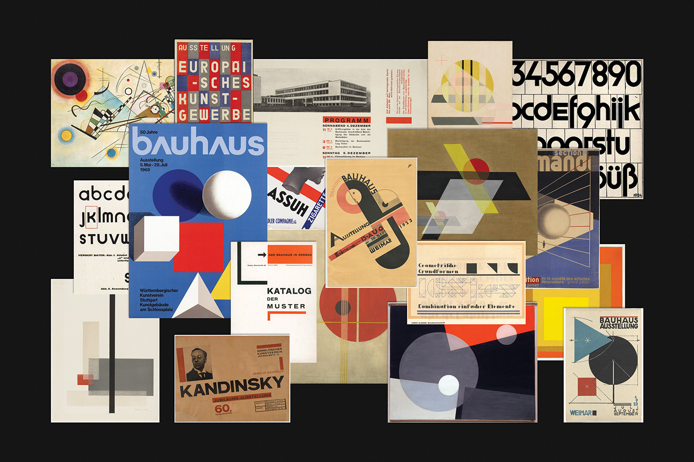
The brand identity was inspired by the Bauhaus principles as well as the works created by artists and designers that lived during that time. The works of Herbert Bayer, Josef Albers, László Moholy-Nagy, Max Burchartz, and Joost Schmidt were among many others that influenced the brand identity.
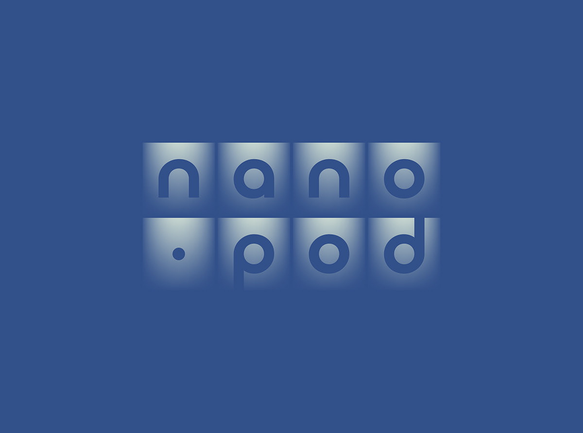
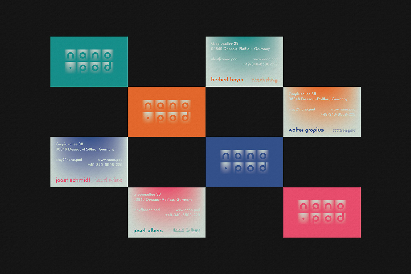
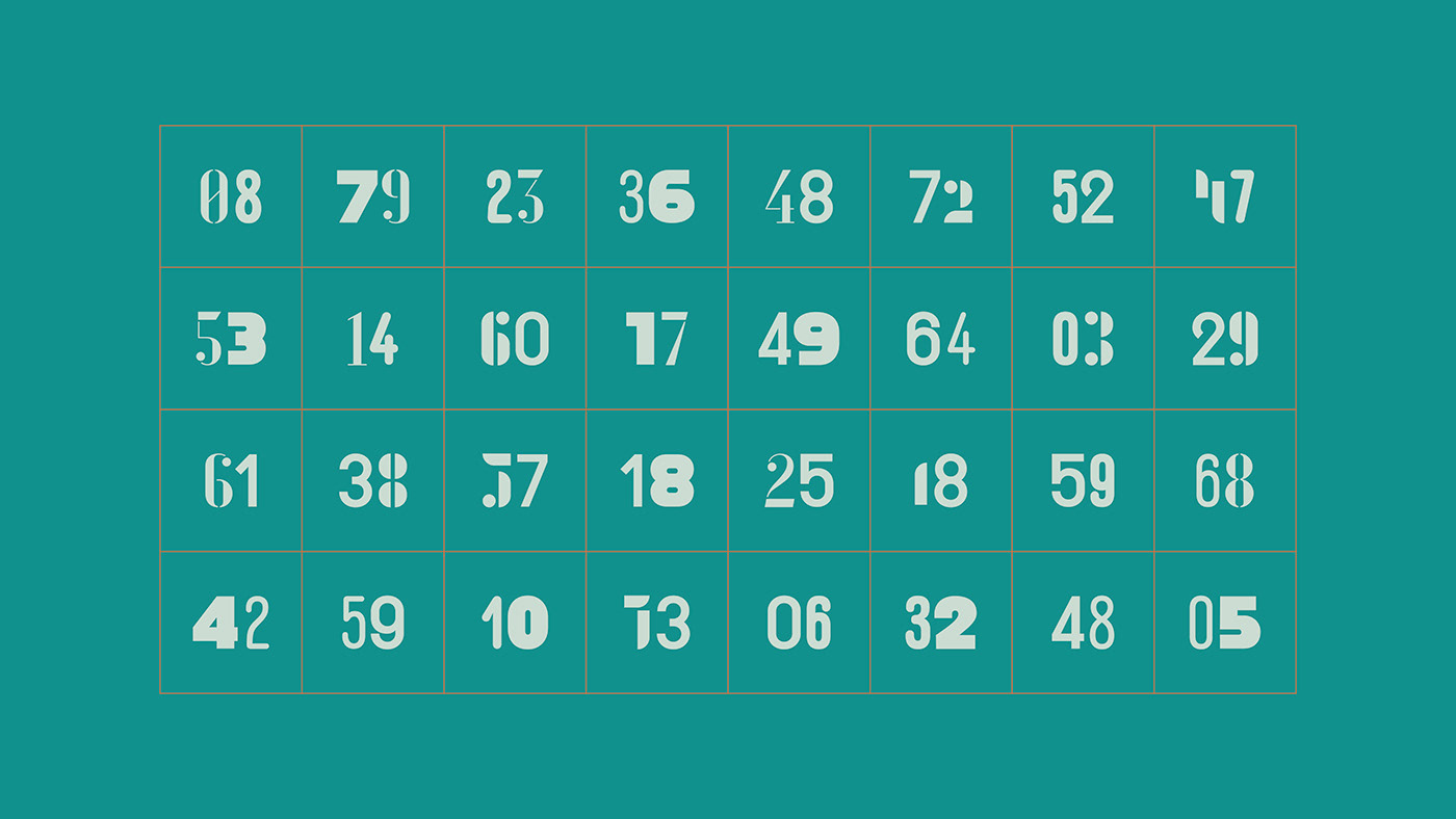
The logo is a depiction of the bedrooms inside a capsule hotel. Usually there are at least two levels of bed stacked vertically, and arranged horizontally with other beds. This resembles the basic function of a grid system. The primary typeface inside the “rooms” can be changed to other secondary typefaces on less formal application—it is a nod to different kinds of guest that stay in the hotel, each with their own unique characteristic and behaviour.
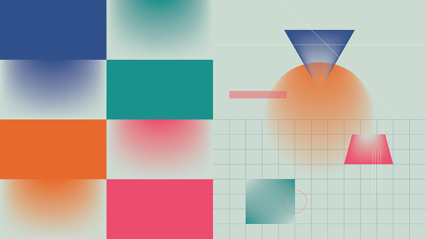
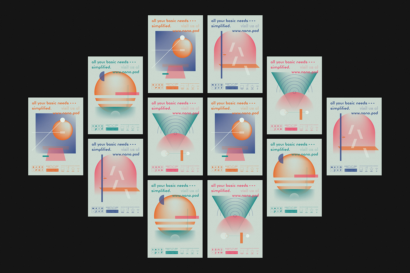
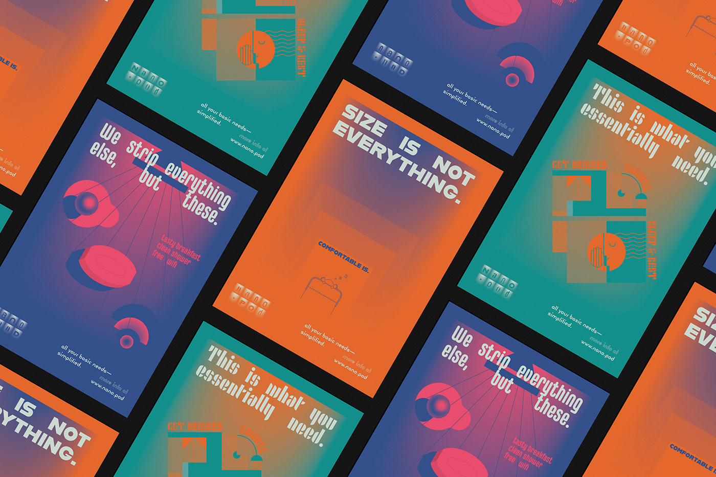
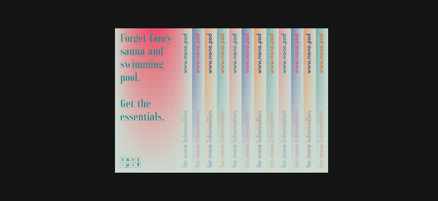
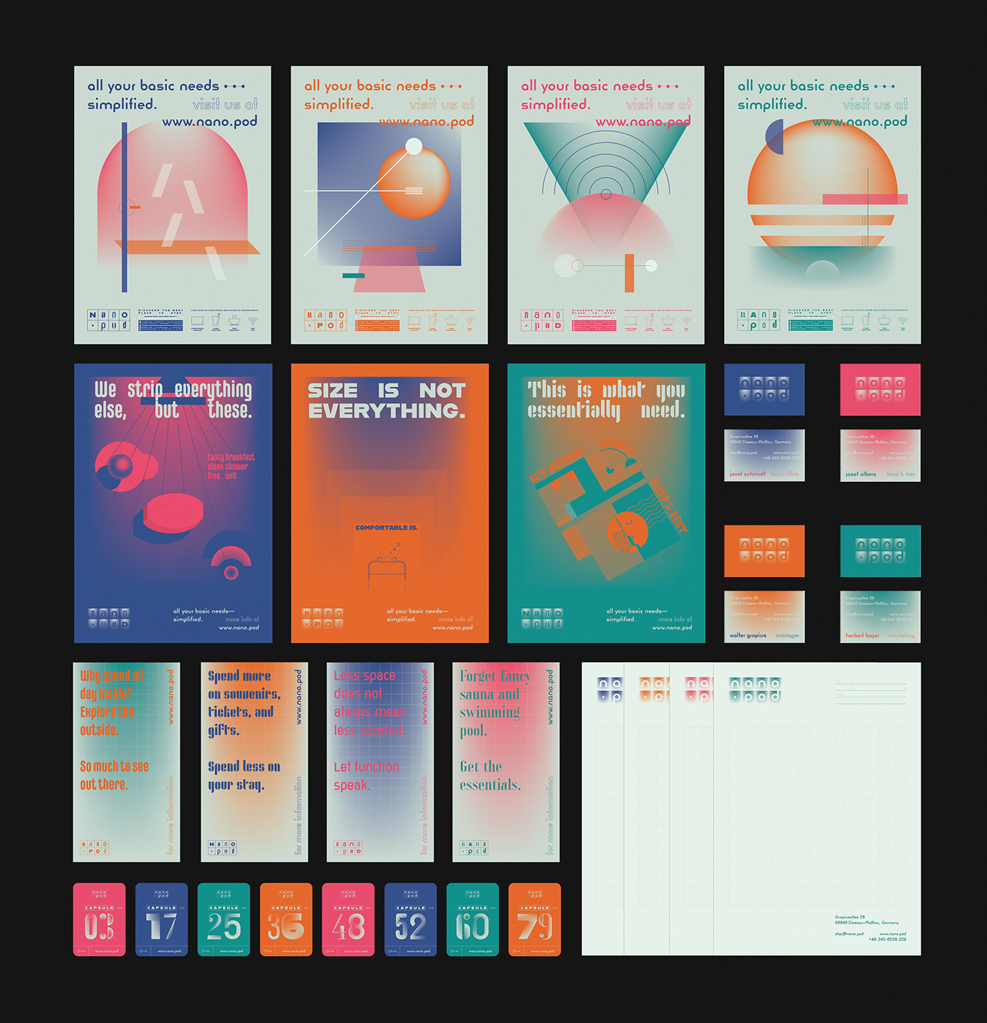
The primary graphic style (key visual) was inspired by the light that comes through the curtain, which functions as a door. The key visual was applied on corporate, operational, and promotional items. It was explored more through the use of basic shapes and colours in a simple yet dynamic way.


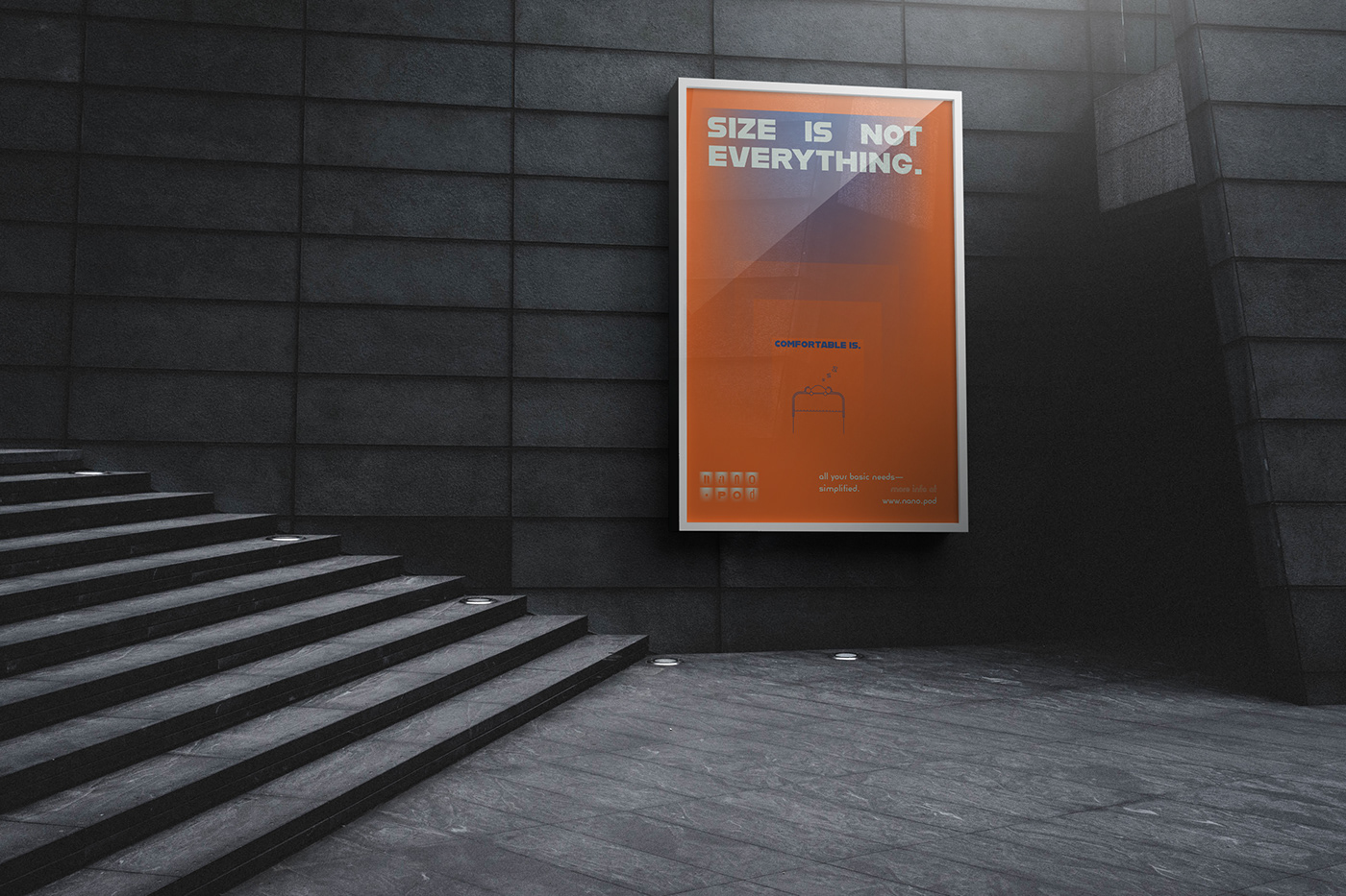
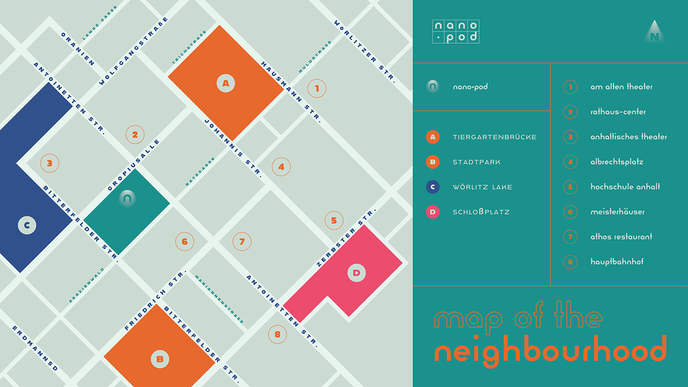
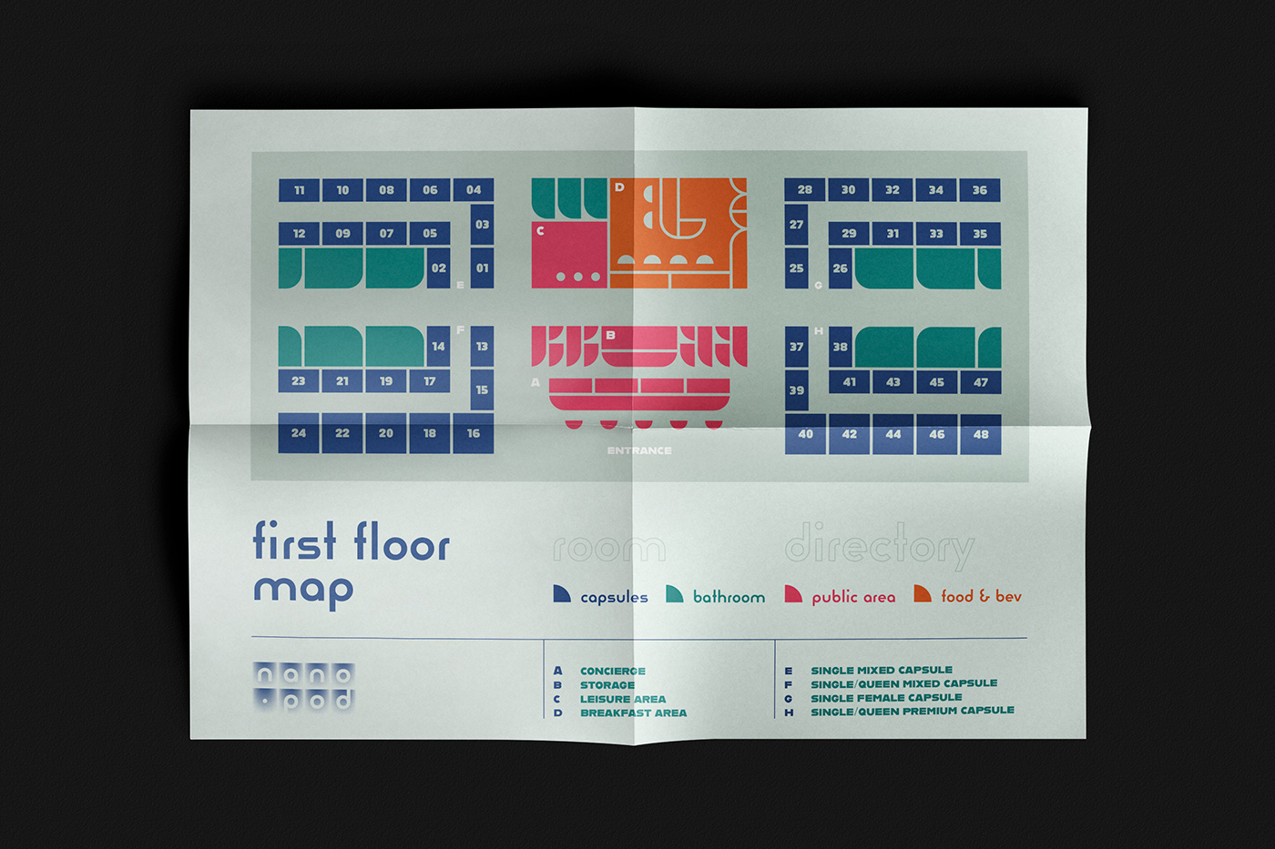
Some compositions were influenced by the Bauhaus artists and designers. For example, the advertisement posters was unmistakably inspired by Josef Albers’ “Study for Homage to the Square” (1963), Herbert Bayer’s “Section Allemande” (1930) and “50 Jahre Bauhaus” (1968), and Joost Schmidt’s “Staatliches Bauhaus” poster (1923). Other set of posters was inspired by László Moholy-Nagy’s works on shape composition. The floor map of the hotel was inspired by the typeface Joschmi Regular, while the map of the neighbourhood was inspired by several Bauhaus posters that used diagonal axis as base layout.
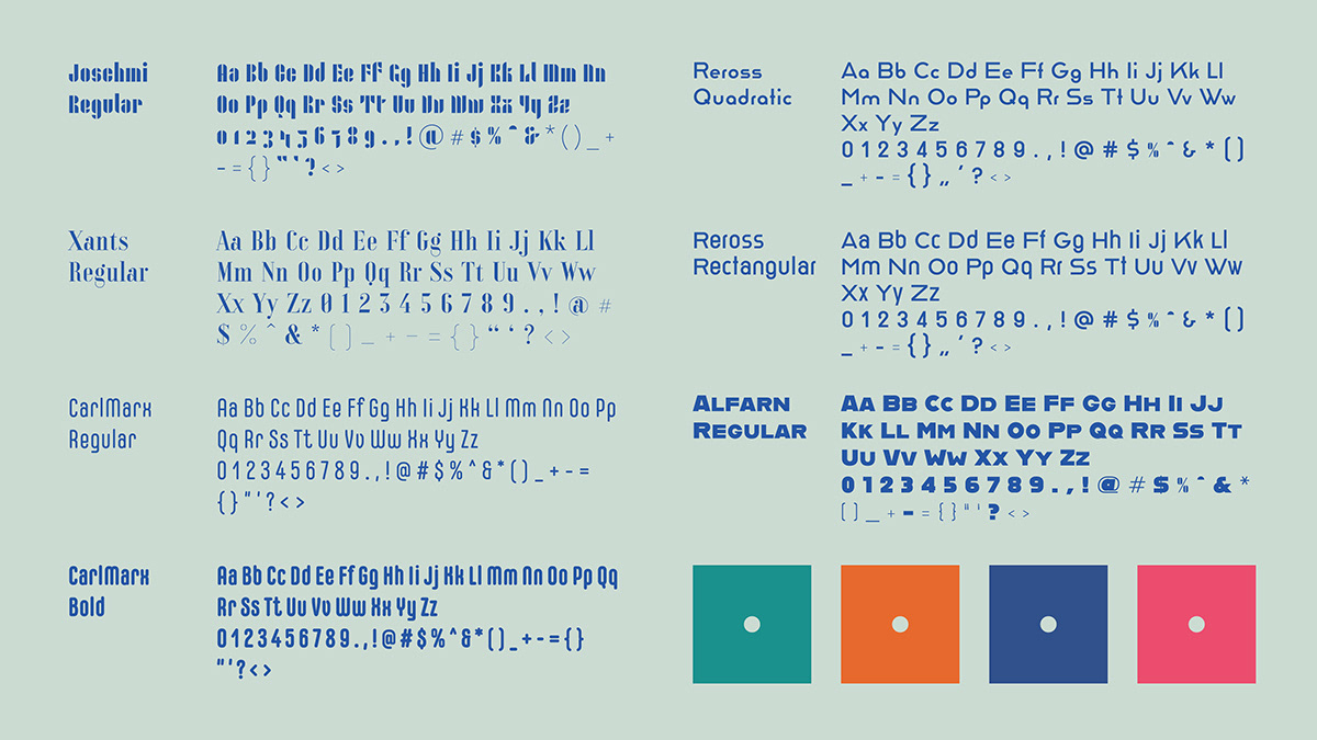
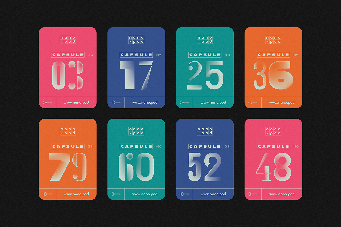
The various font pairing system seen in the logo was used again on the keycard numbers. In total, all the Bauhaus fonts provided were used. They are: Joschmi Regular, Xants Regular, CarlMarx Regular, CarlMarx Bold, Reross Quadratic, Reross Rectangular, and Alfarn Regular.











Follow me on Instagram for updates about my upcoming projects.
