Project completed at inkey Design (Shanghai)
Brand visual identity and the fundamental visual system design for Ningbo Contemporary Arts Festival (Ningbo Fest).
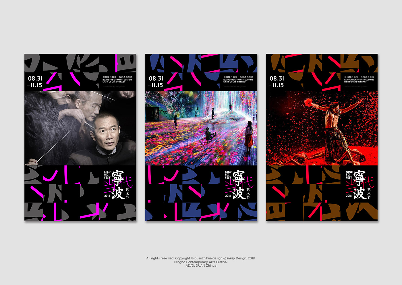
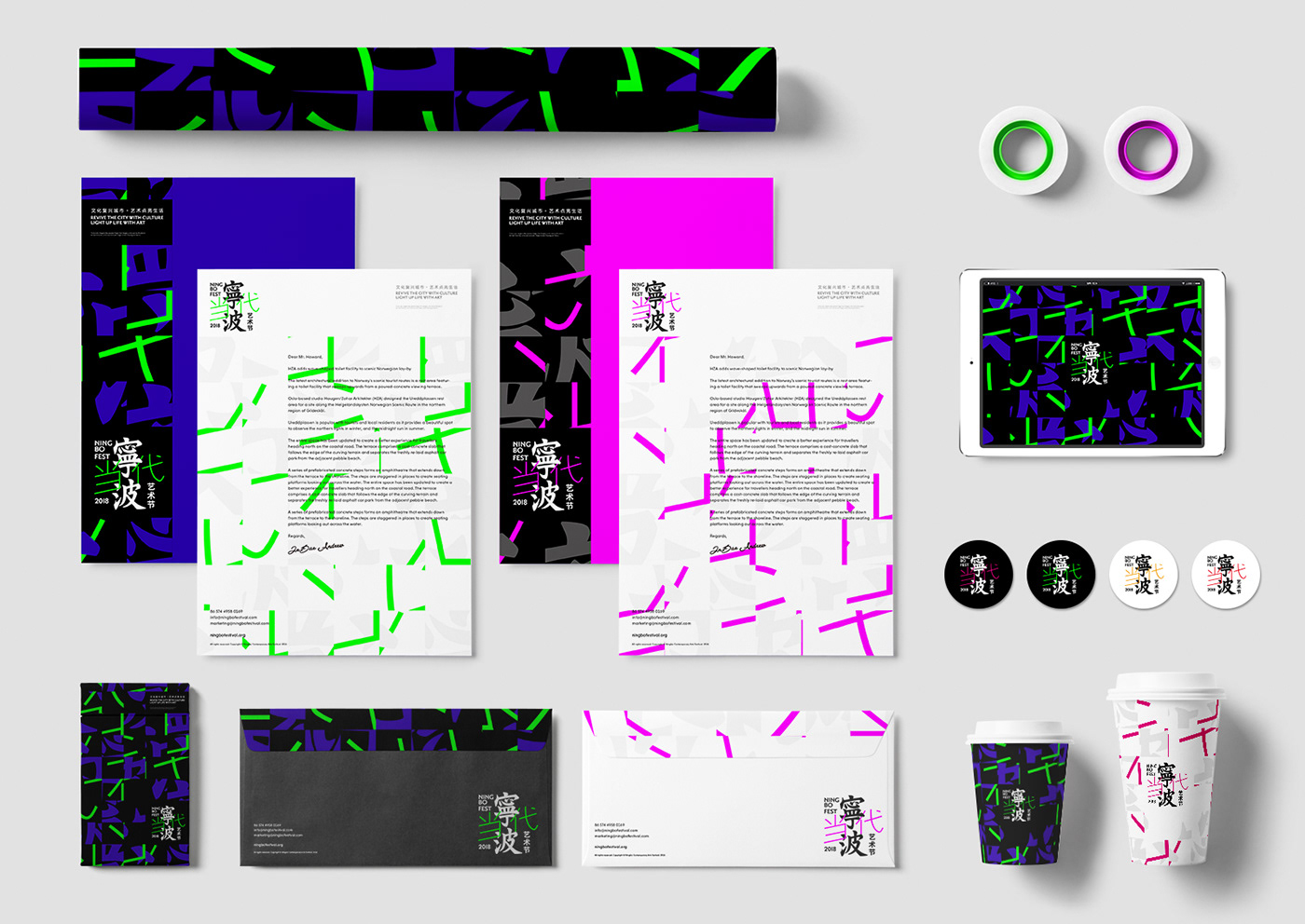
When TRADITIONAL meets CONTEMPORARY; when HERITAGE meets RADICALNESS; when MEMORIES meets FUTURE. Using types directly translate the relationships and the contrasts. The city’s name 寧波 set in vertical traditional Chinese with deep colors represents the traditional, heritage, and memories; while the direction of the event 当代 (contemporary) set in horizontal simplified Chinese with fluorescent colors represents contemporary, radicalness, and future. The conventional Chinese typeface 寧波 is designed base on the most famous Ningbo calligrapher of Tang dynasty — 虞世南(YU Shinan)’s master pieces. Extracts strokes from different characters and reassemble them into the final types.
為寧波當代藝術節進行的視覺識別與基礎視覺應用系統設計。寧波作為一座擁有悠久歷史文化底蘊的城市,一直以來給人的印象除了古典文化與歷史以外即是港口優勢帶來的商業與貿易。因此,當地政府與文化部門決定要通過打造一個全新的當代藝術節的方式幫助寧波塑造更加關注當代文化與藝術的全新城市形象。
在這次時間緊迫的設計任務中,我們直接通過文字塑造視覺識別的方式來描摹寧波這座城市和這項藝術節在古典文化與當代文化之間的拉扯與並存:豎排的繁體『寧波』二個書法字型來源於『初唐四大家』的寧波籍書法家虞世南的書法,橫排的簡體且向右上傾斜的『当代』二個黑體字型則對應當代與未來的姿態。將英文全稱 Ningbo Contemporary Arts Festival 簡寫為 Ningbo Fest 一方面在造型上適合文字組團,另一方面也更簡練與平易近人。
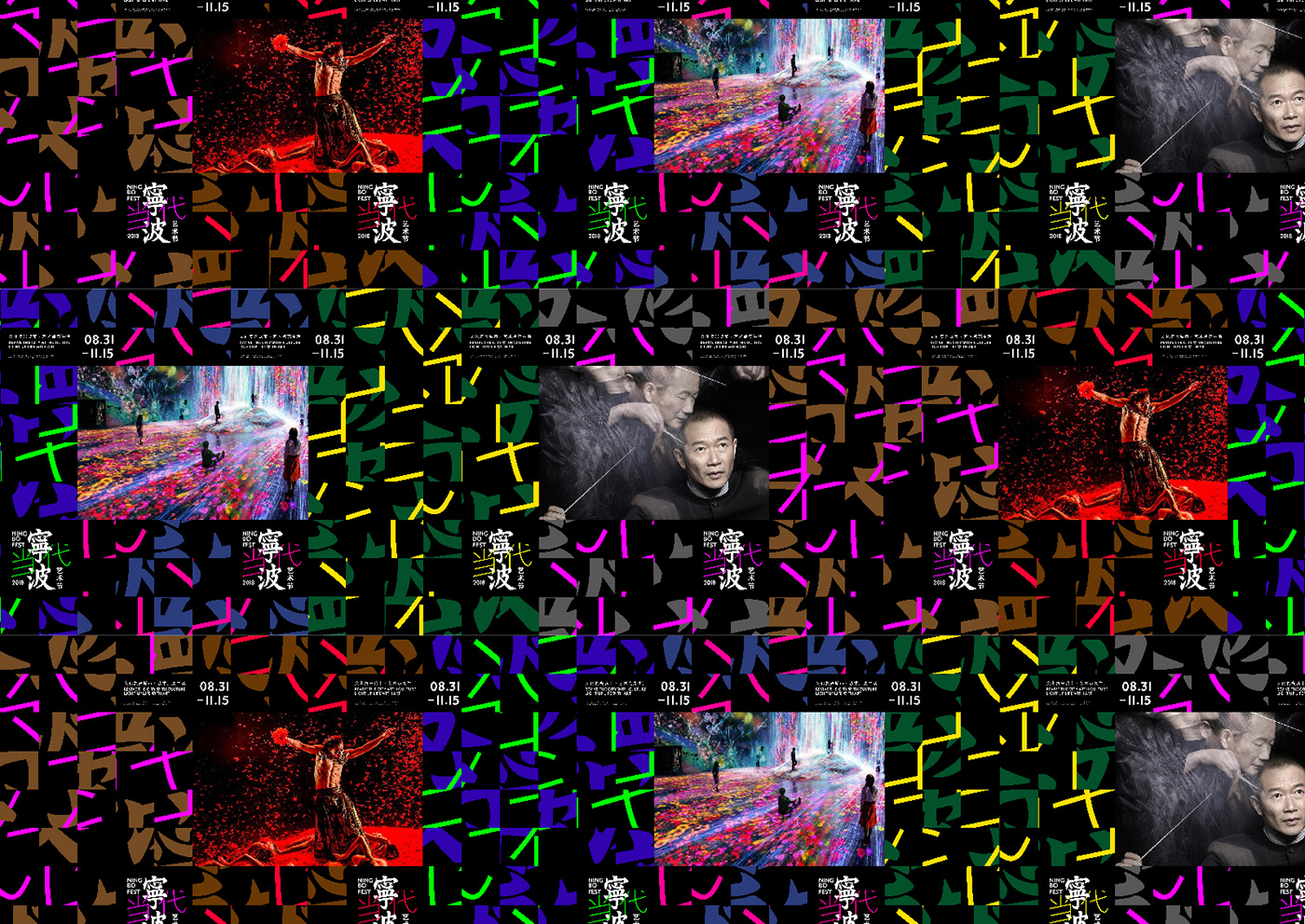
通過使用 8×8 的網格劃分、裁切、打散、重組藝術節的視覺識別文字組團,既保持了原本視覺識別的蹤跡,又充滿自由與顛覆,在恰當的迴應了古典藝術與當代藝術的關係的同時,也創造了極具適用性和延展性的基礎視覺識別使用規則。
在這次時間緊迫的設計任務中,我們直接通過文字塑造視覺識別的方式來描摹寧波這座城市和這項藝術節在古典文化與當代文化之間的拉扯與並存:豎排的繁體『寧波』二個書法字型來源於『初唐四大家』的寧波籍書法家虞世南的書法,橫排的簡體且向右上傾斜的『当代』二個黑體字型則對應當代與未來的姿態。將英文全稱 Ningbo Contemporary Arts Festival 簡寫為 Ningbo Fest 一方面在造型上適合文字組團,另一方面也更簡練與平易近人。
通過使用 8×8 的網格劃分、裁切、打散、重組藝術節的視覺識別文字組團,既保持了原本視覺識別的蹤跡,又充滿自由與顛覆,在恰當的迴應了古典藝術與當代藝術的關係的同時,也創造了極具適用性和延展性的基礎視覺識別使用規則。