

Done at ZAK.
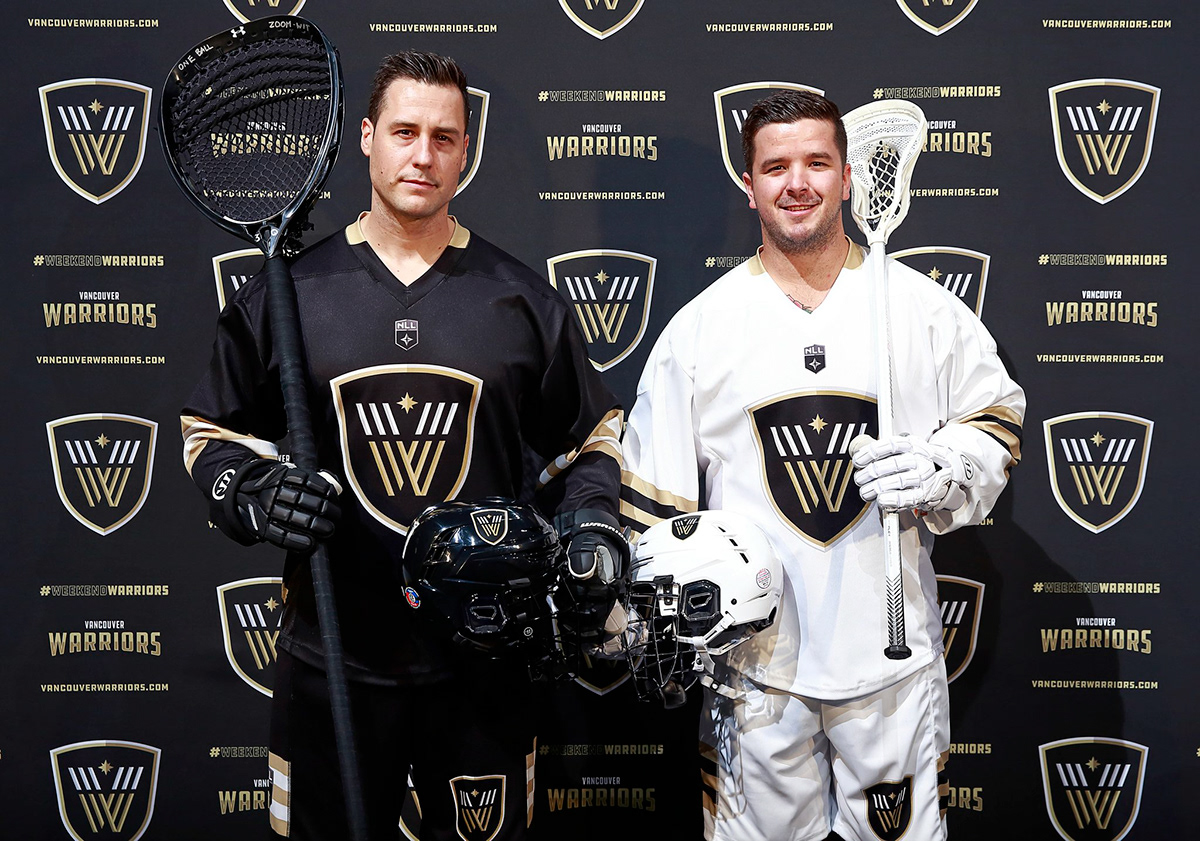
ZAK worked with Canucks Sports & Entertainment to develop the brand identity for the Vancouver Warriors, a new professional lacrosse team in the NLL. With a tight turnaround, we quickly ideated concepts while working alongside key stakeholders to come to something that satisfied the brief.
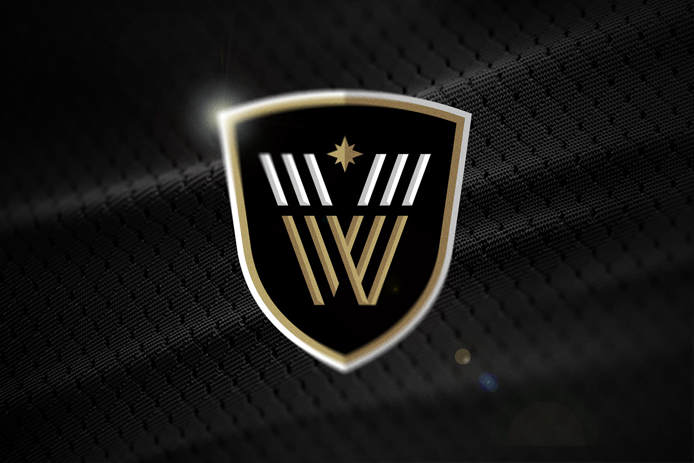
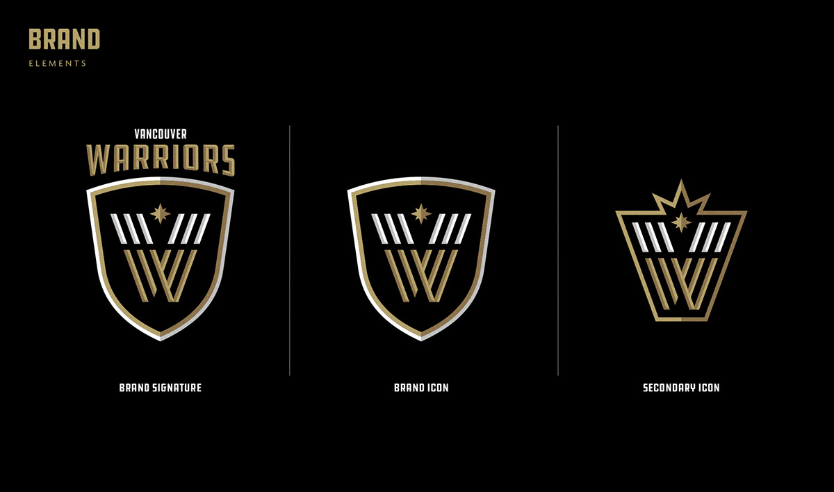
We ideated to create a logo that represents warriors as protectors and guardians. The simple, yet bold mark is inspired by three distinct elements: the shield, the north star and the monogram with three forged stripes embodying the traits of a warrior - athleticism, protection, and strength.
ZAK worked with Canucks Sports & Entertainment to develop the brand identity for the Vancouver Warriors, a new professional lacrosse team in the NLL. With a tight turnaround, we quickly ideated concepts while working alongside key stakeholders to come to something that satisfied the brief.
We ideated to create a logo that represents warriors as protectors and guardians. The simple, yet bold mark is inspired by three distinct elements: the shield, the north star and the monogram with three forged stripes embodying the traits of a warrior - athleticism, protection, and strength.


Brand collateral for this project is continually being developed – a full case study will be coming soon!


