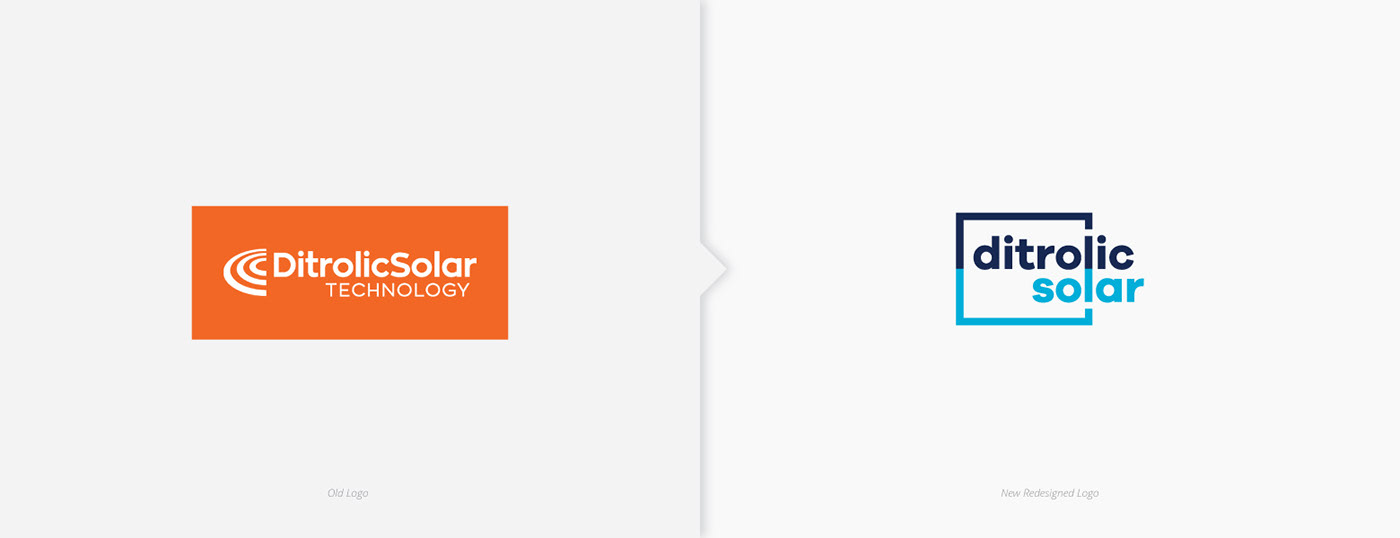
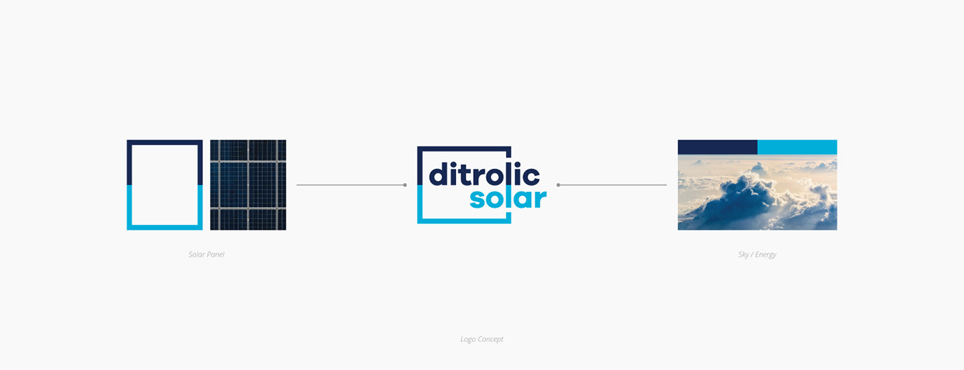
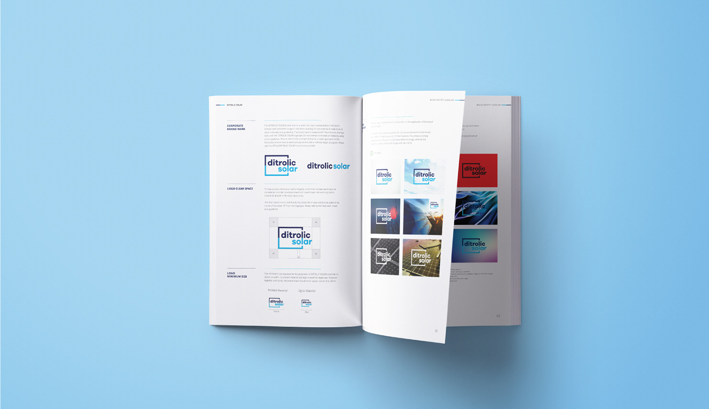
Inspired by the nature of business as the element for the logo design, the corporate logo design has a square that represents solar panels. The placement of the font and the square are meant to give the impression that the company charges the solar panels. The colors implies that the company have strengths and peaceful.


Agency - Dot Creative Design
Creative Director - Alan
Designers - Lim Eng
Copywriter - Pearl

