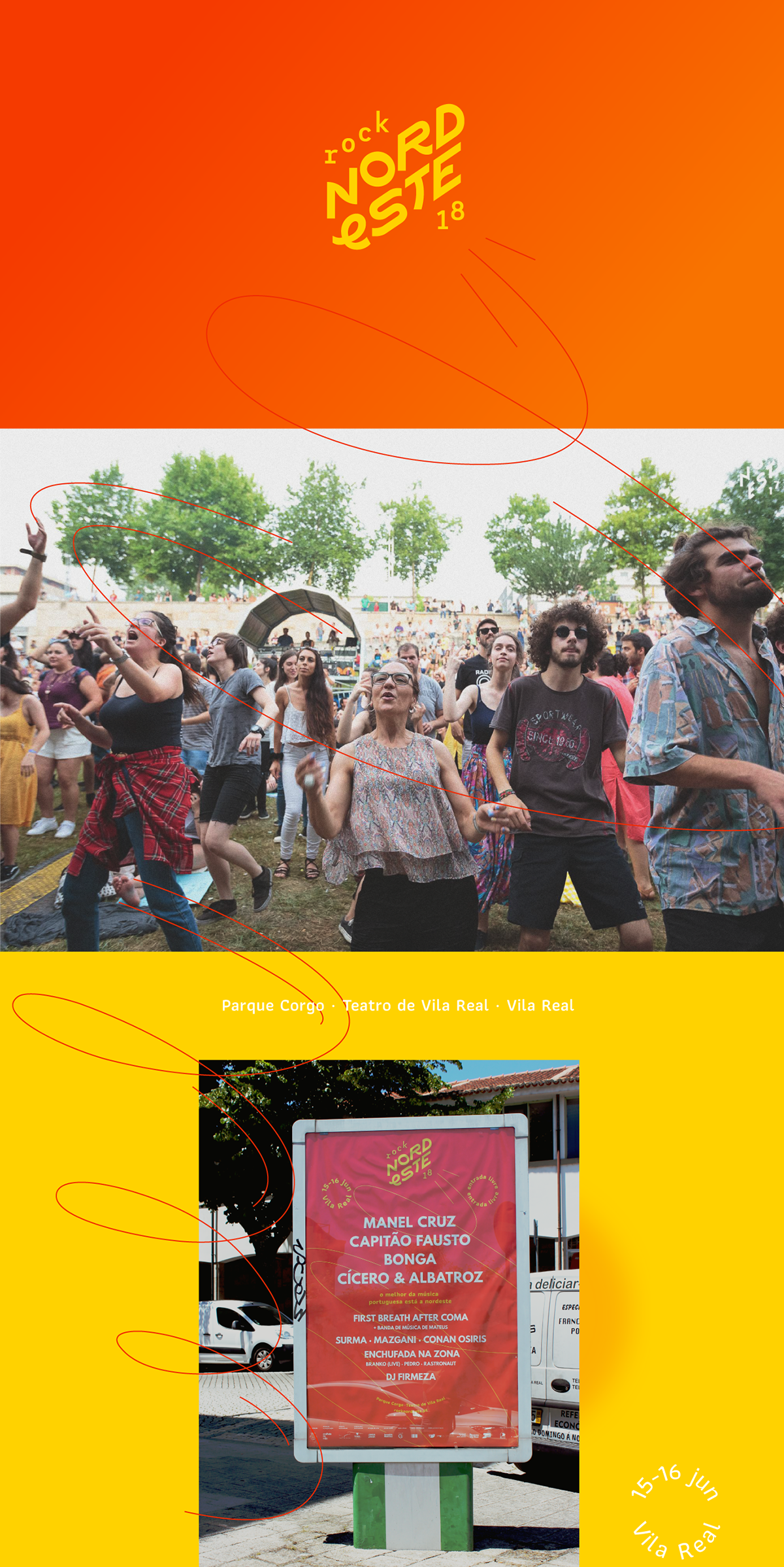
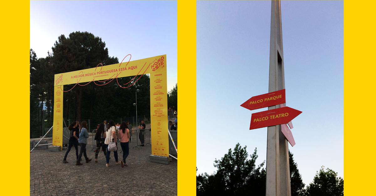
Nordeste is a music festival that happens every summer in Vila Real, Portugal. The mood is of movement, party, colour, heat and breaths of life in a part of the country (sometimes forgotten) that is proud of its national music.
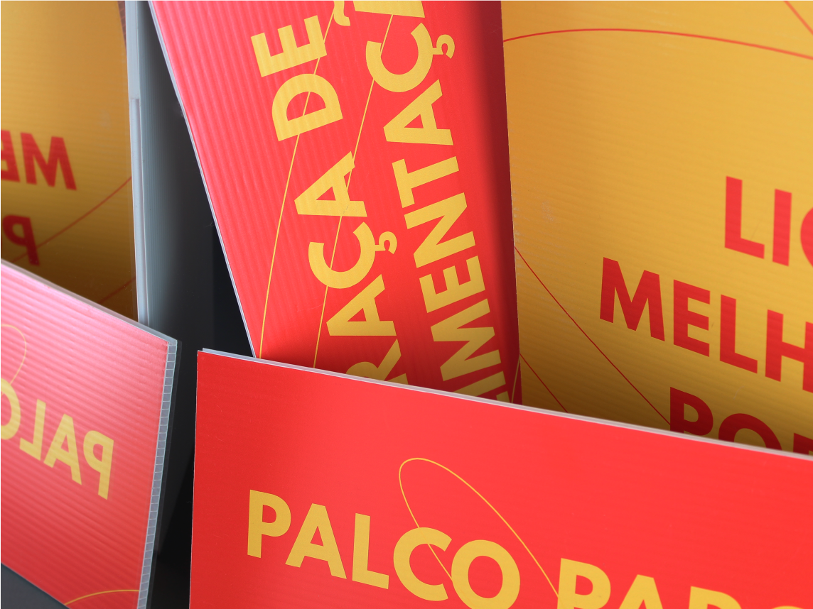
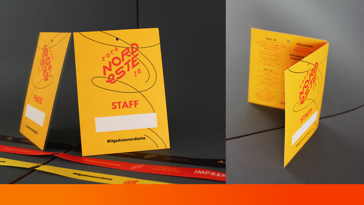
The brief was to redesign the brand, keeping the previous identity recognizable, but redifining brand values. The custom-made logotype is the first step for that redefinition. Maintaining the same angle as the previous one, a reference to the cardinal point the festival borrows its name from, but not much else. Its fresh and sharp forms suggest movement and diversity.

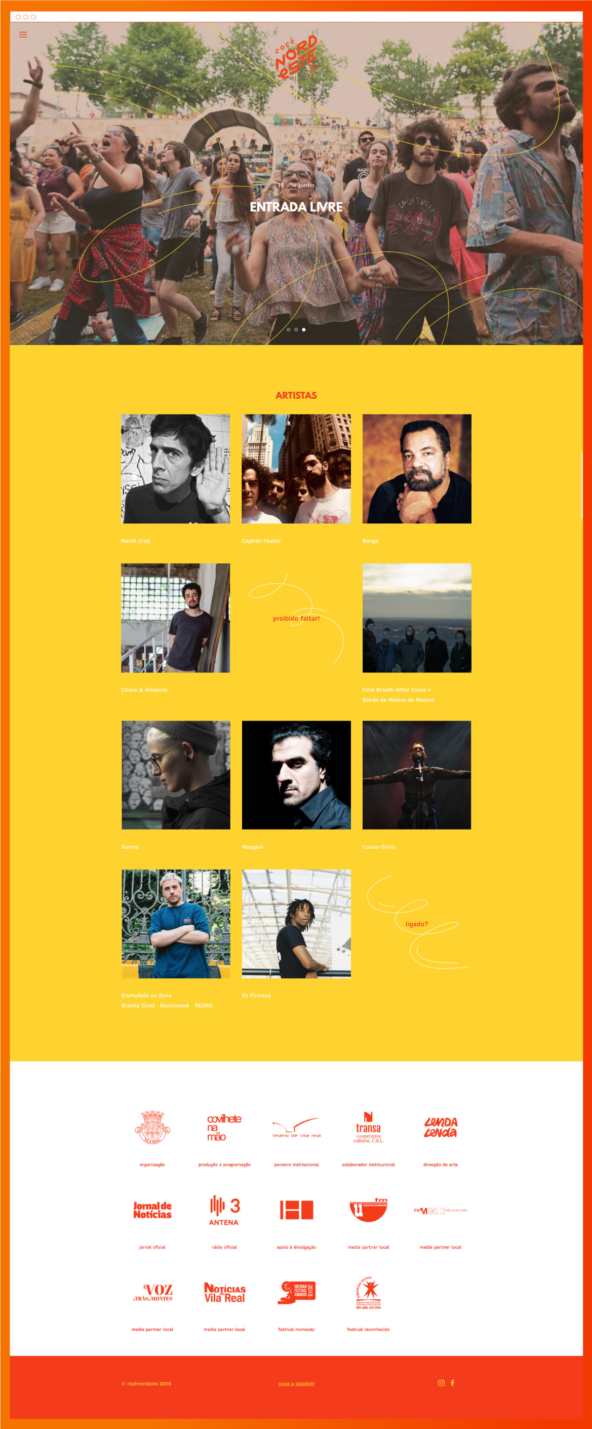
Nordeste is where the best portuguese music is. But not only that!
The 2018 edition is, for the first time, opening up to lusophony from across the seas. Think Angola or Brazil.
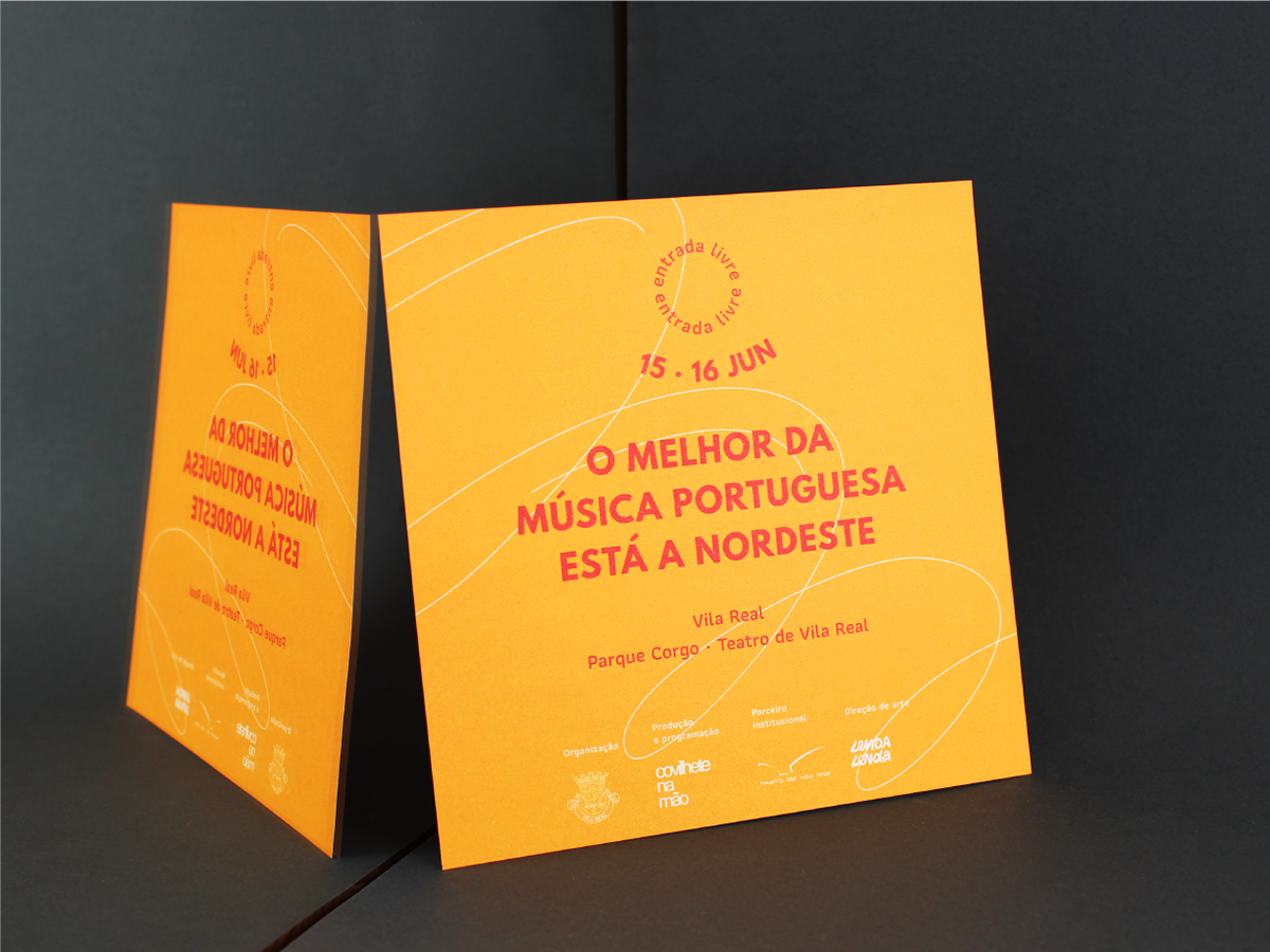
From that new semi-tropical alignment came inspiration for the colours: a sunny-yellow and a blazing-hot-orange.


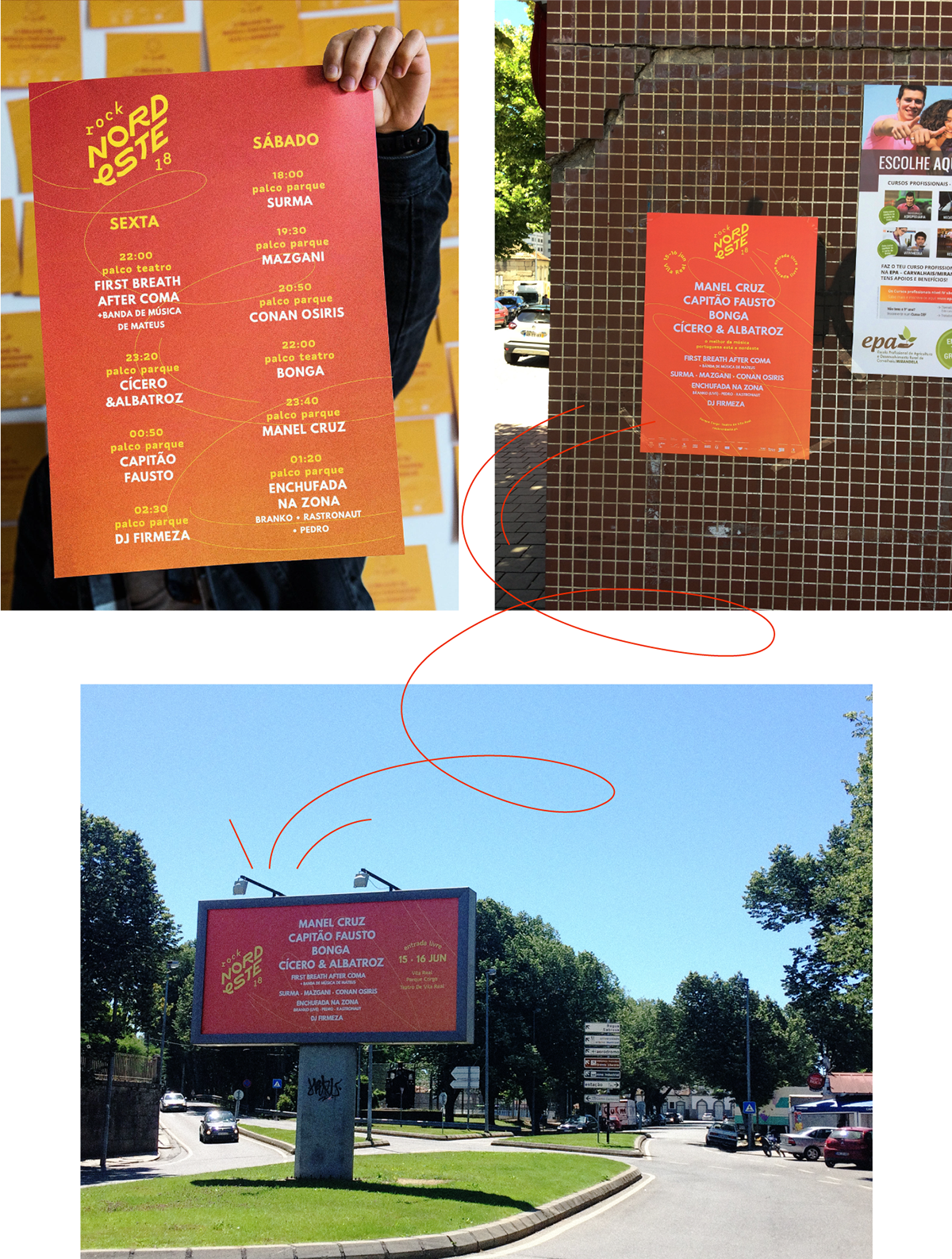
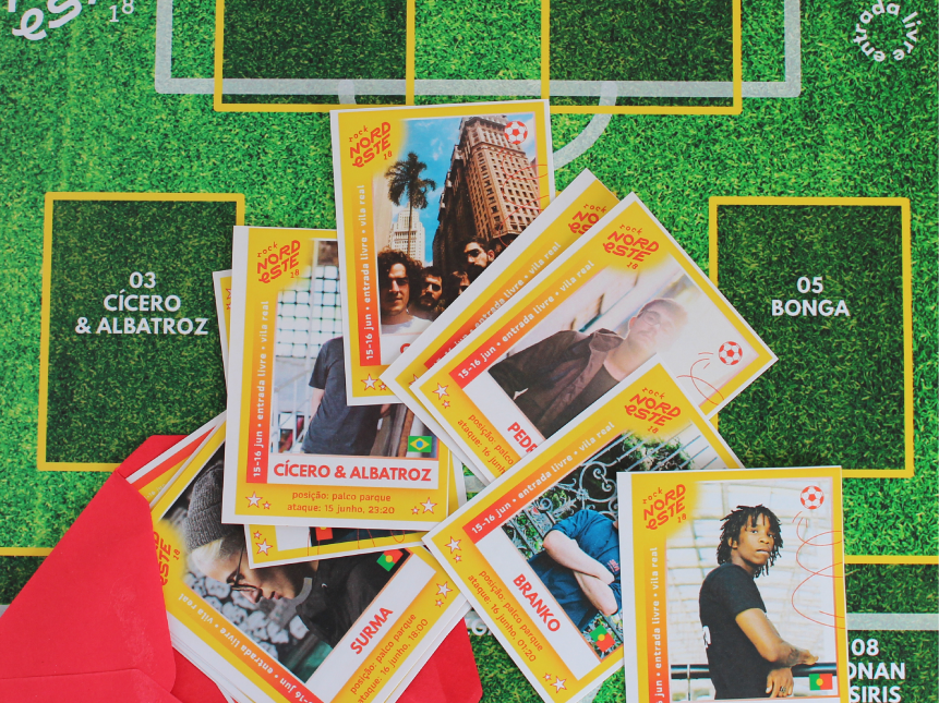
The festival coincided with the football world cup, so, as a gift to the artists playing, sports-like cards were designed for each of them. Just like collectibles they could be sticked onto a poster designed as a football field. It turned out to be the biggest activation campaign for the 2018 edition, given that many artists shared and signed each other cards.


Thanks for scrolling!
#ligadosanordeste


