


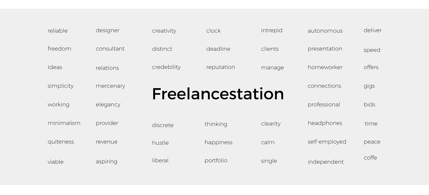
Story
Freelance station is a blog that serves valuable articles, voice podcasts, and educational videos all about Freelancing & Design mainly for freelancers, designers, and all creatives out there.
The idea is to make everybody share their "Daily experiences" in freelancing, all types of content served in this blog must be practical and not just theoretical, because you can get all the information you want from thousands of sources in all over the internet, but its almost impossible to find a real-life experiences and case studies that answer the questions that you don't really know how to ask, this is every beginner's nightmare and that's what we will fix!
The idea is to make everybody share their "Daily experiences" in freelancing, all types of content served in this blog must be practical and not just theoretical, because you can get all the information you want from thousands of sources in all over the internet, but its almost impossible to find a real-life experiences and case studies that answer the questions that you don't really know how to ask, this is every beginner's nightmare and that's what we will fix!
Challenges & Task
The task was to create a logo that's based on Arabic letter to emphasize the purpose of the blog which is to enrich the Arabic content. But, the real challenge was to give this letter a certain message that reflects the blog's name and vision, in other words, "the logo message."
Message
The logo message is simply "You're a freelancer, you don't have to be the same as the rest, you can work from wherever you want, whenever!"
Mood board
These are the images I used for inspiration and extracting logo main features.

Sketches
While I was exploring the Letter trying to find a way to solve this riddle because it's kind of hard to deal with Arabic letters, they're so delicate and any small change can make a huge impact, But the moment I sketched this one I knew It was a winner!

Concept Idea
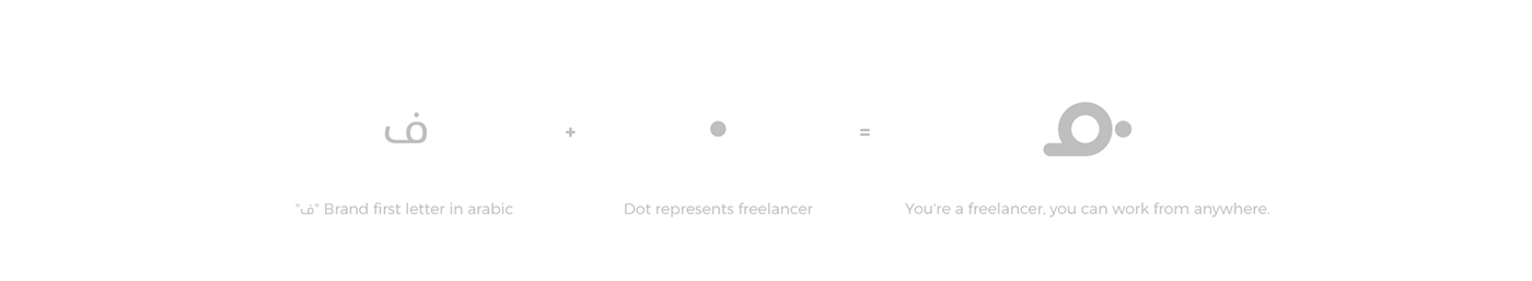
The Symbol is simply an F letter in Arabic "ف" but instead of the usual letter shape, I moved the dot 45°, to elaborate the message that you're a freelancer which means you're not conventional, the second thing is that you can work from anywhere you want not where you MUST be.
Symbol Construction
To transform this quick style sketch into a real logo I had to use Golden Ratio and circles alongside with Grid system to give it that motivational feeling of the curves and rounded edges and also to make sure that everything is perfectly done.
Typography exploration
As I said the logo is mainly Arabic, so that wasn't an issue, the real issue is trying to find a perfect match for this Arabic typography to preserve the logo consistency and balance and also have the same feeling, I had to explore more than 50 different styles to be able to make it happen.

Finalizing the logo
After being able to find the perfect Typography for the symbol now it's time to make sure that everything looks perfect.
Logo Animation
The best way to deliver the logo message is to animate it, this way it will say even more!

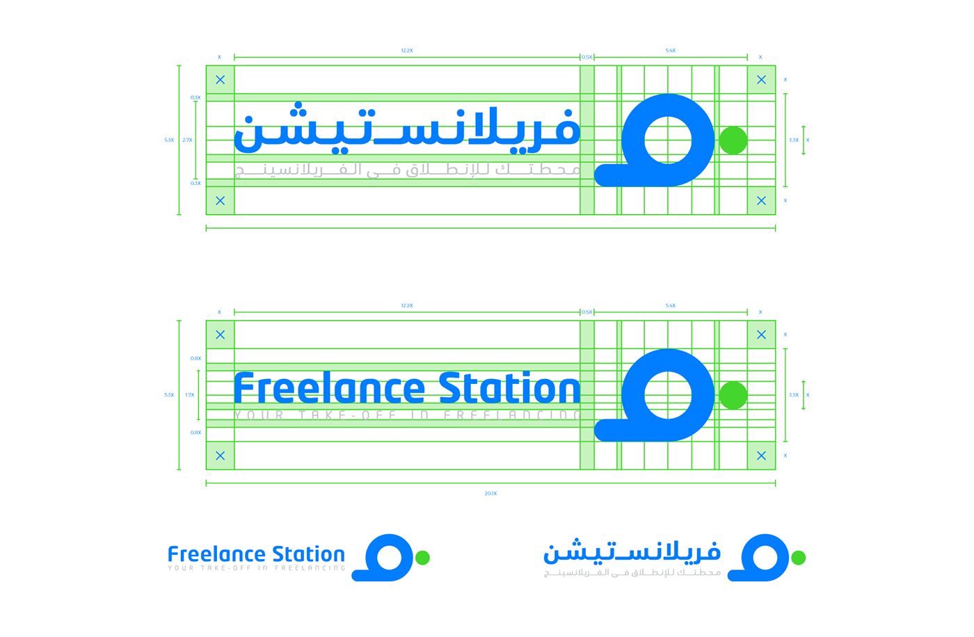
Clear spaces
The logo should be surrounded by a clear space to ensure its visibility and impact. This clear space should be equals to "x" x= "Dot"

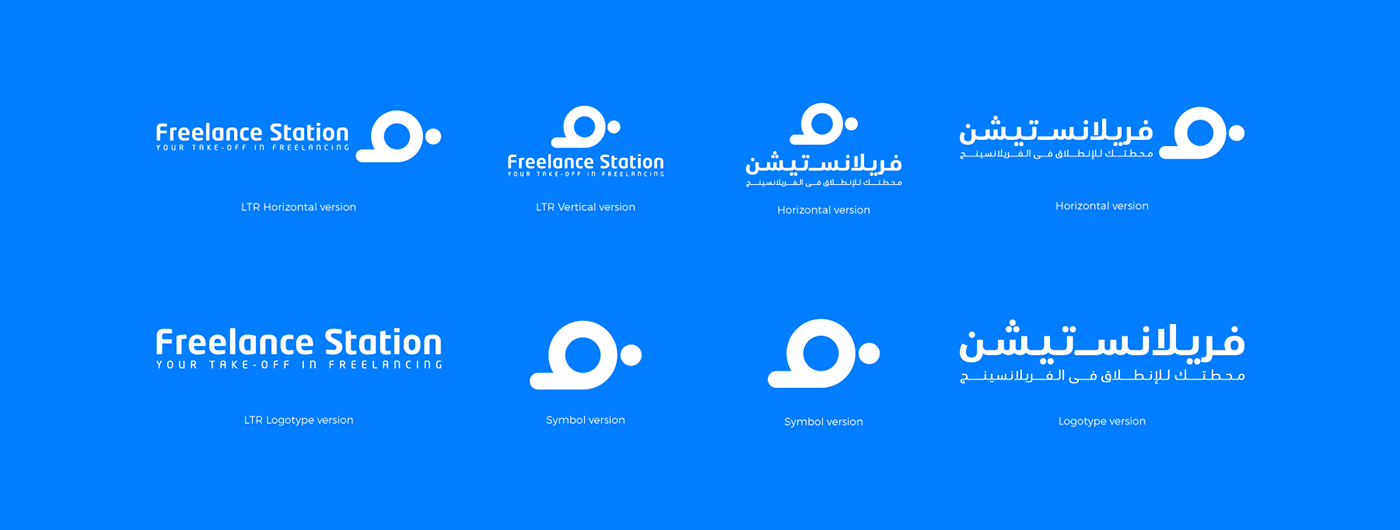
Logo Variations
The Logo has to be responsive to be used on different applications without problems, Vertical, Horizontal, and stand-alone symbol versions are made to make it even more responsive and applicable.
Colors
The main approach was the feeling of motivation and creativity, so I mixed
Azure Radiance (~Pantone 2727 C) to emphasize energy, creativity, innovation, and improvement.
With Lima (Pantone 802 C) to emphasize hope, motivation, generosity and growing
Azure Radiance (~Pantone 2727 C) to emphasize energy, creativity, innovation, and improvement.
With Lima (Pantone 802 C) to emphasize hope, motivation, generosity and growing

Colors Variations
The Logo should always contrast with the background. There are 6 versions of the Logo colors to ensure simplicity and readability in all printing processes and digital needs.

Color Codes
In order to enhance our blog readers experience or even social media fans, I created a "Color Codes" for each type of articles to help making everything understandable in a glance! This will be used all offer the brand to ensure consistency and visibility.

Fonts
To make sure that people actually read what you're writing, I have to create a hierarchy for both Digital and printed typography, this typography hierarchy is essential to make the brand speaks louder and clearer.

Brand Guidelines Book
Because creating a Brand is something and how to use all the brand elements to achieve the brand's vision is something else! This book explains all the tiny little details and how to use them in the best way.


Stationary
Just because its a website doesn't mean that its only digital! The brand also has an awesome stationary to complete the Digital presence also when it's offline.


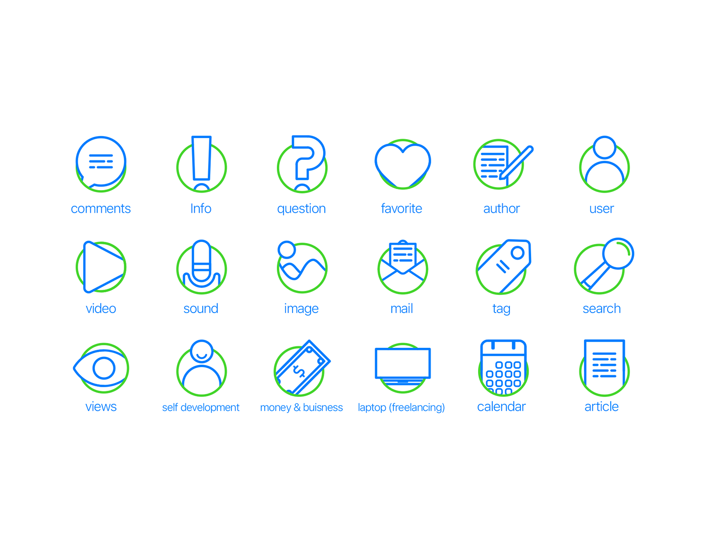
Icons
Let's face it, there are thousands and thousands of Icons out there and they are almost all the same! It's hard to express yourself and be different using any of those! So, we had to design a whole Icon set to be exclusively used for the brand to help to differentiate it even in the smallest spaces.

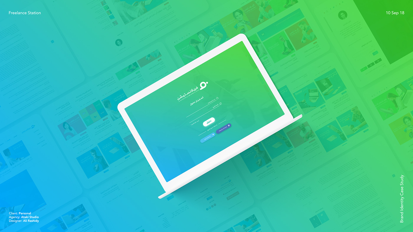
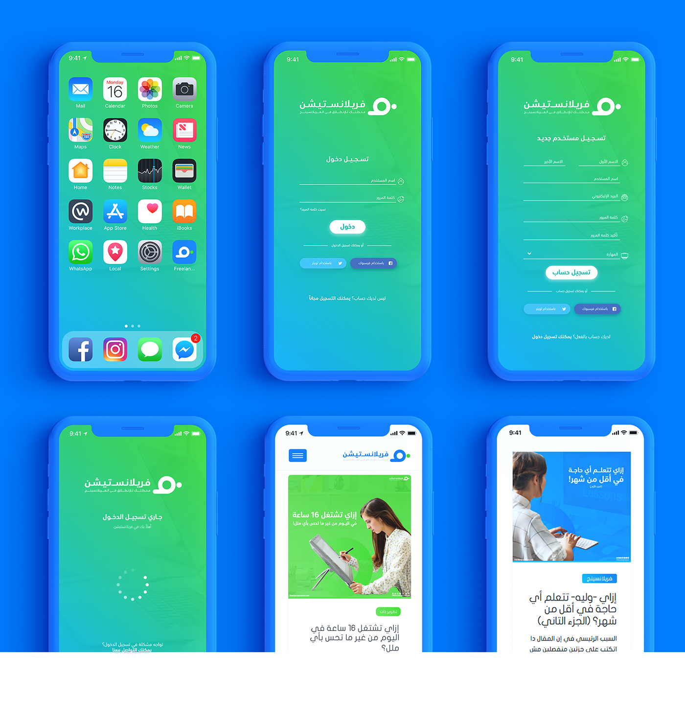
Website and Applications
At this point everything was ready to start building the brand's digital home, it's website!
The website was designed by Baianat awesome team, the rest is ours, let's have a look at all these cool stuff.
The website was designed by Baianat awesome team, the rest is ours, let's have a look at all these cool stuff.


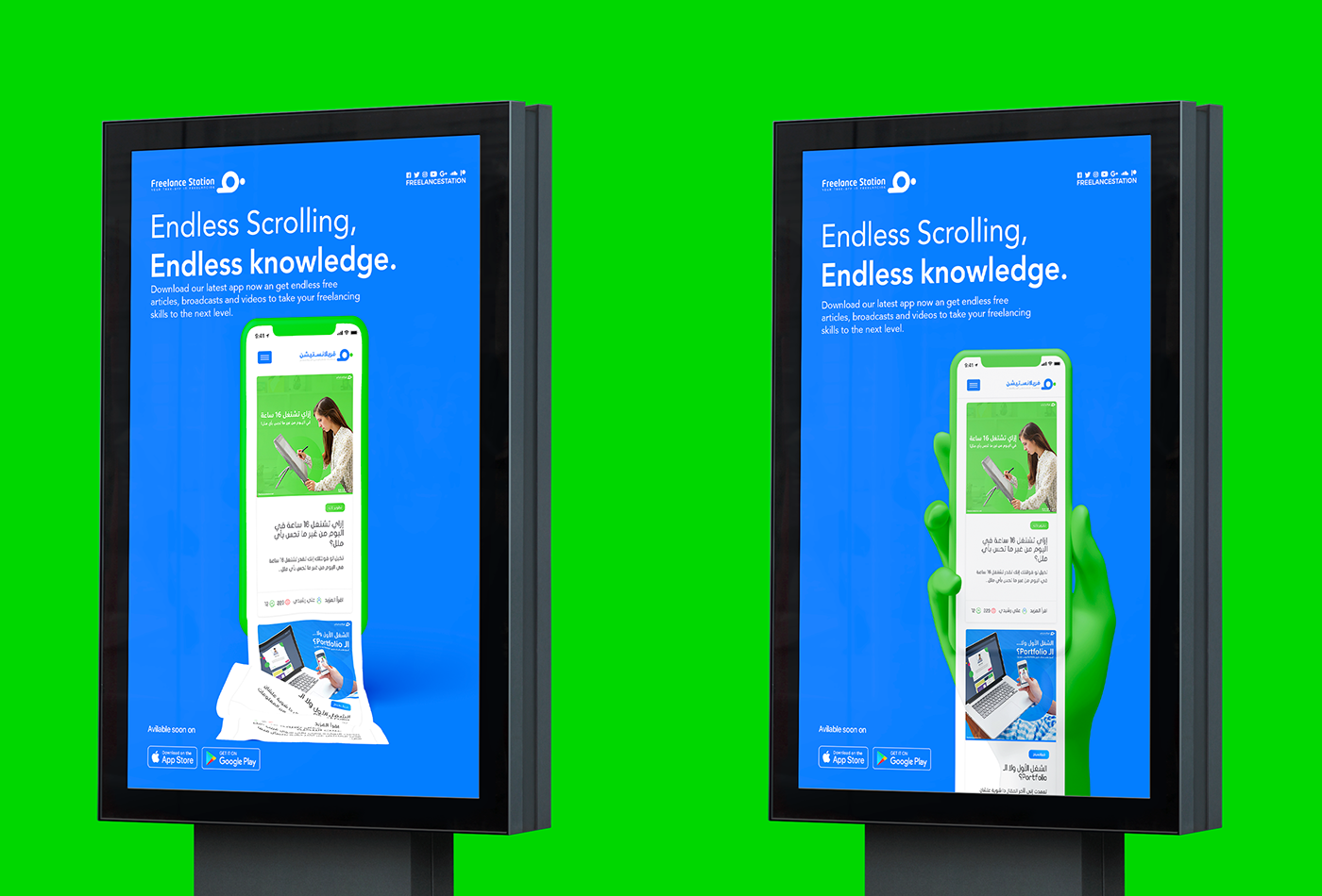
Other Elements
some more elements to add some more adventure!


Want to start your own project? We're Available!
Ataki Studio
Ataki Studio
Don't forget to check out the blog
Freelancestation.net
Freelancestation.net


