


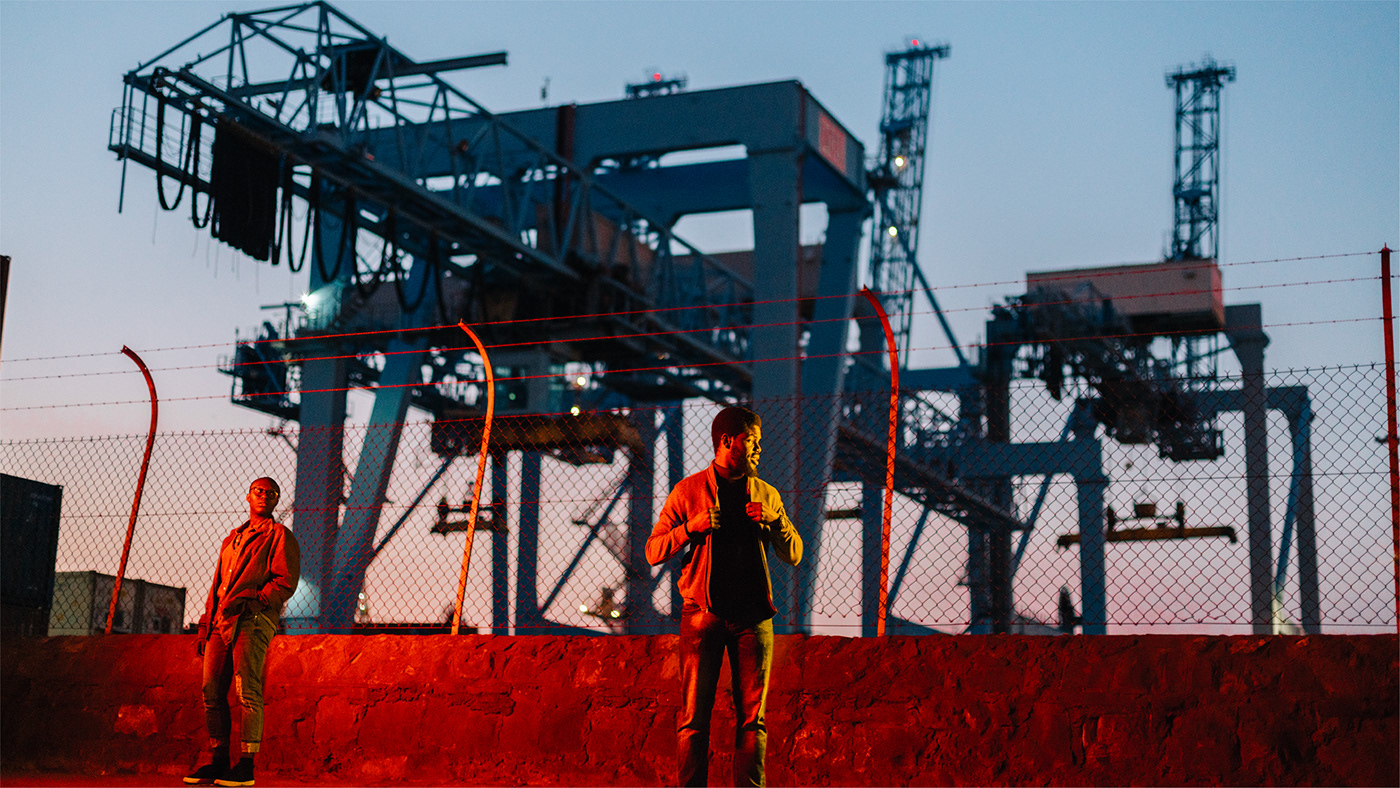
The Good, the Bad and the Brave
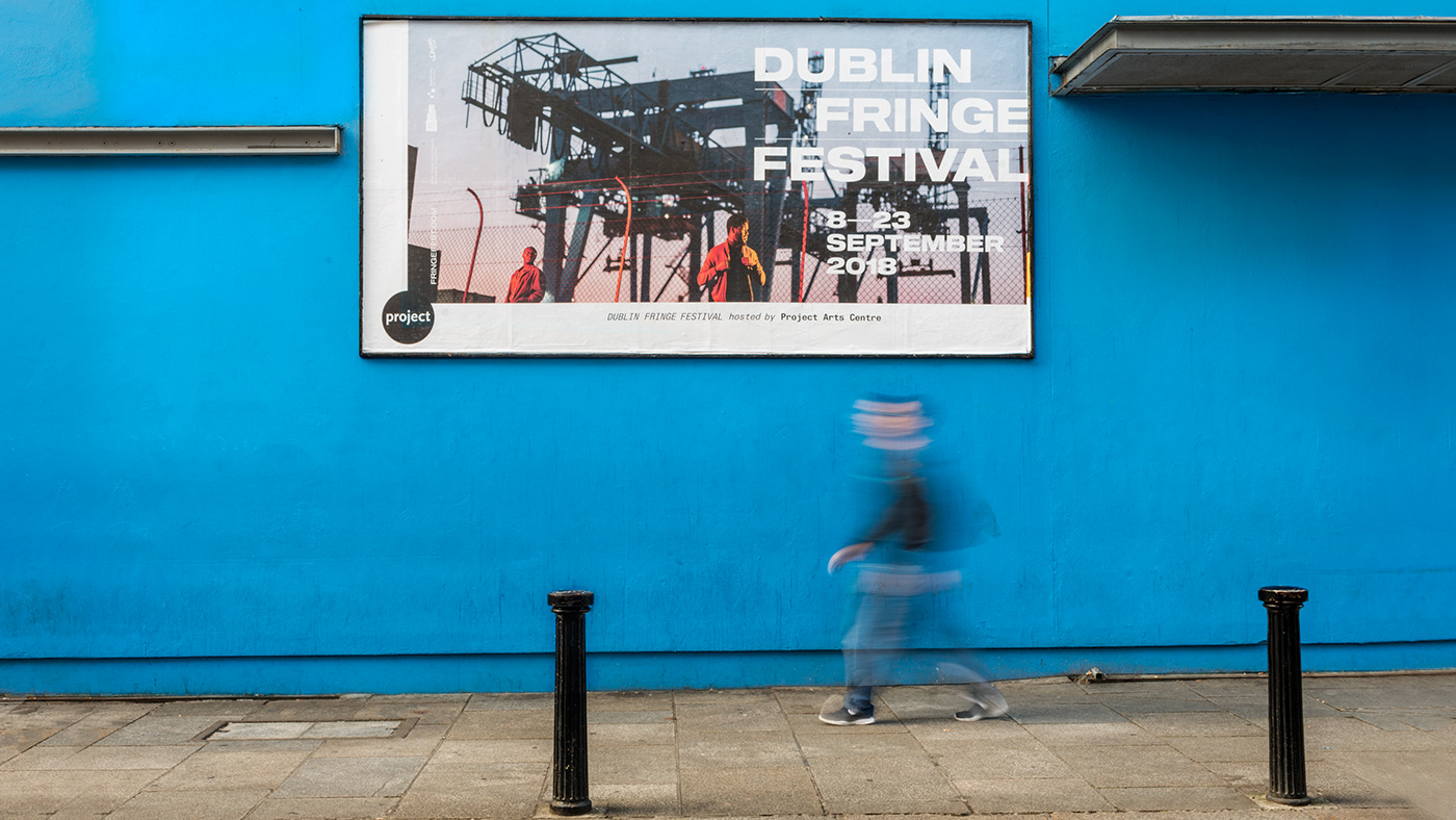
Dublin Fringe Festival is a name synonymous with bold ideas, brave performing arts and adventurous audiences. Drawing more than 30,000 spectators over the course of 16 days and nights, each September, the festival is a spectacle of firsts where the city becomes the stage and all who participate can escape the ordinary and expect the unexpected.
Making Words Work
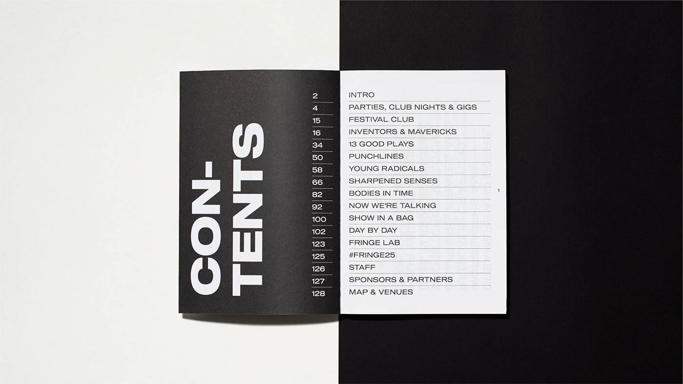
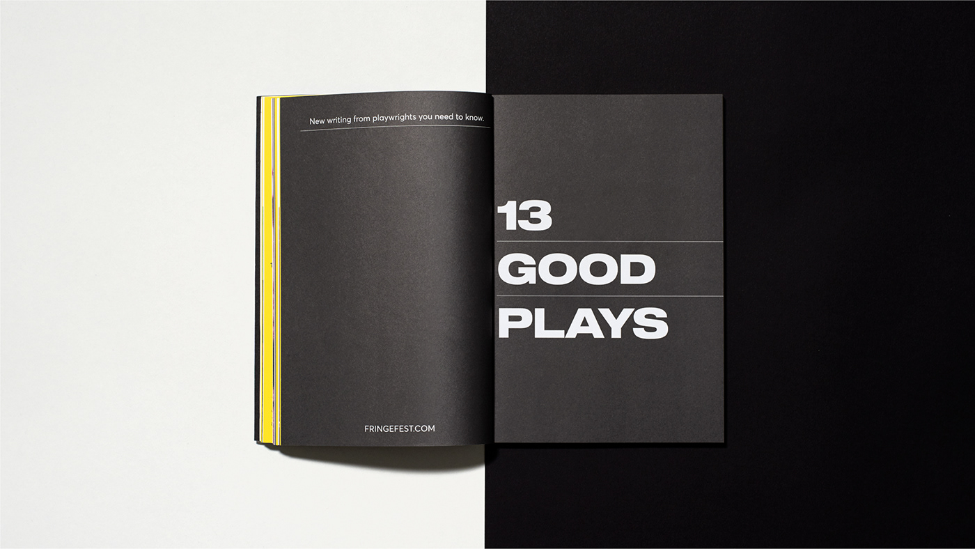
In our redesign of the brochure, we made it much more user-friendly by prioritising the name of the show/work and differentiating it from the artist’s name. We jazzed up the content with editorial pages to create impact and simultaneously provide relief from the brochure listings.
Feelin’ Good
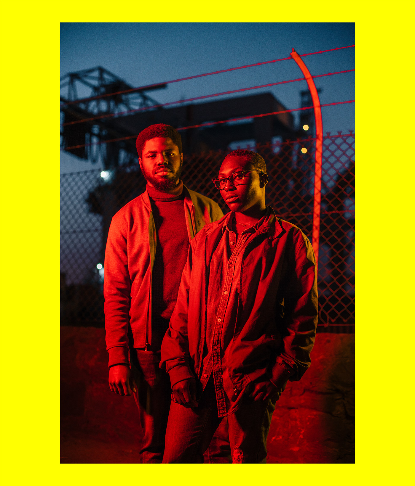
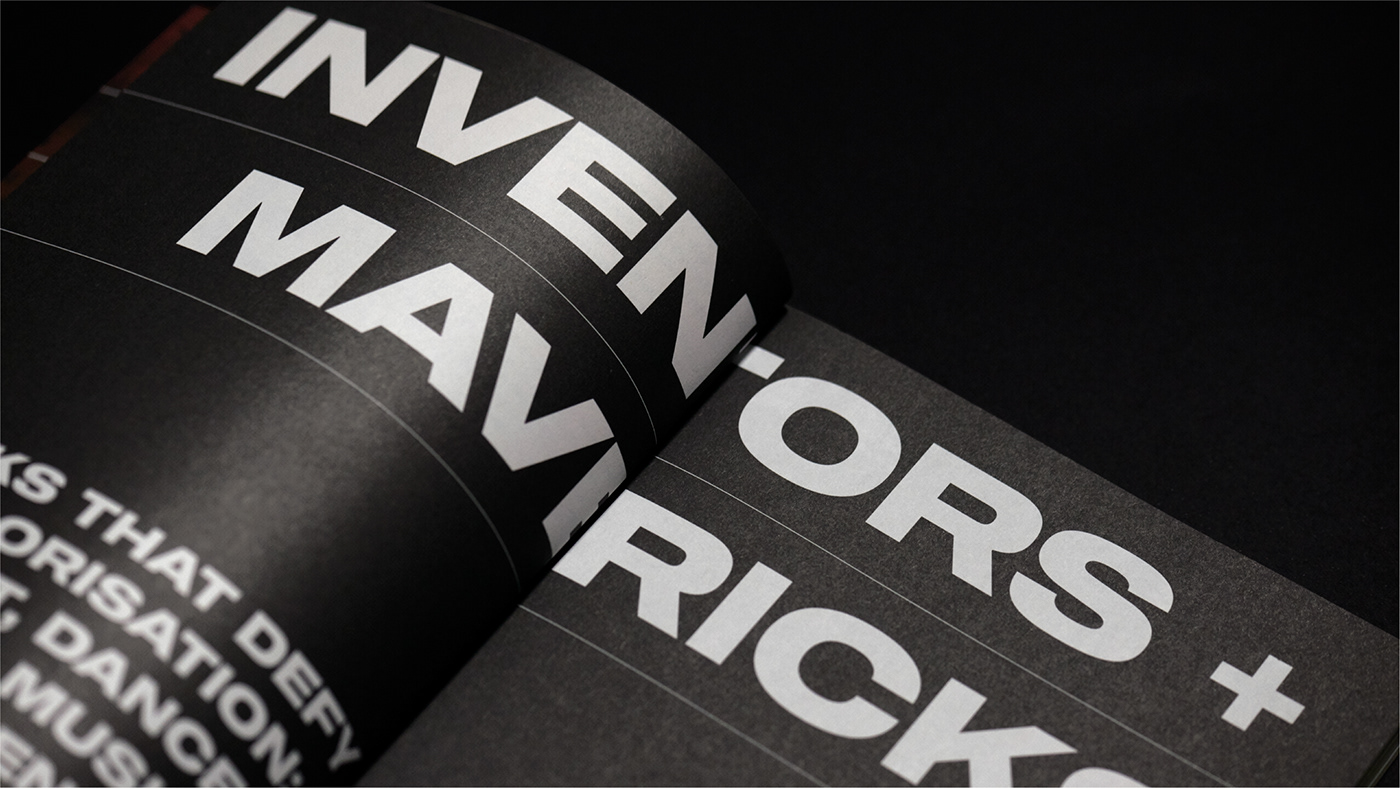
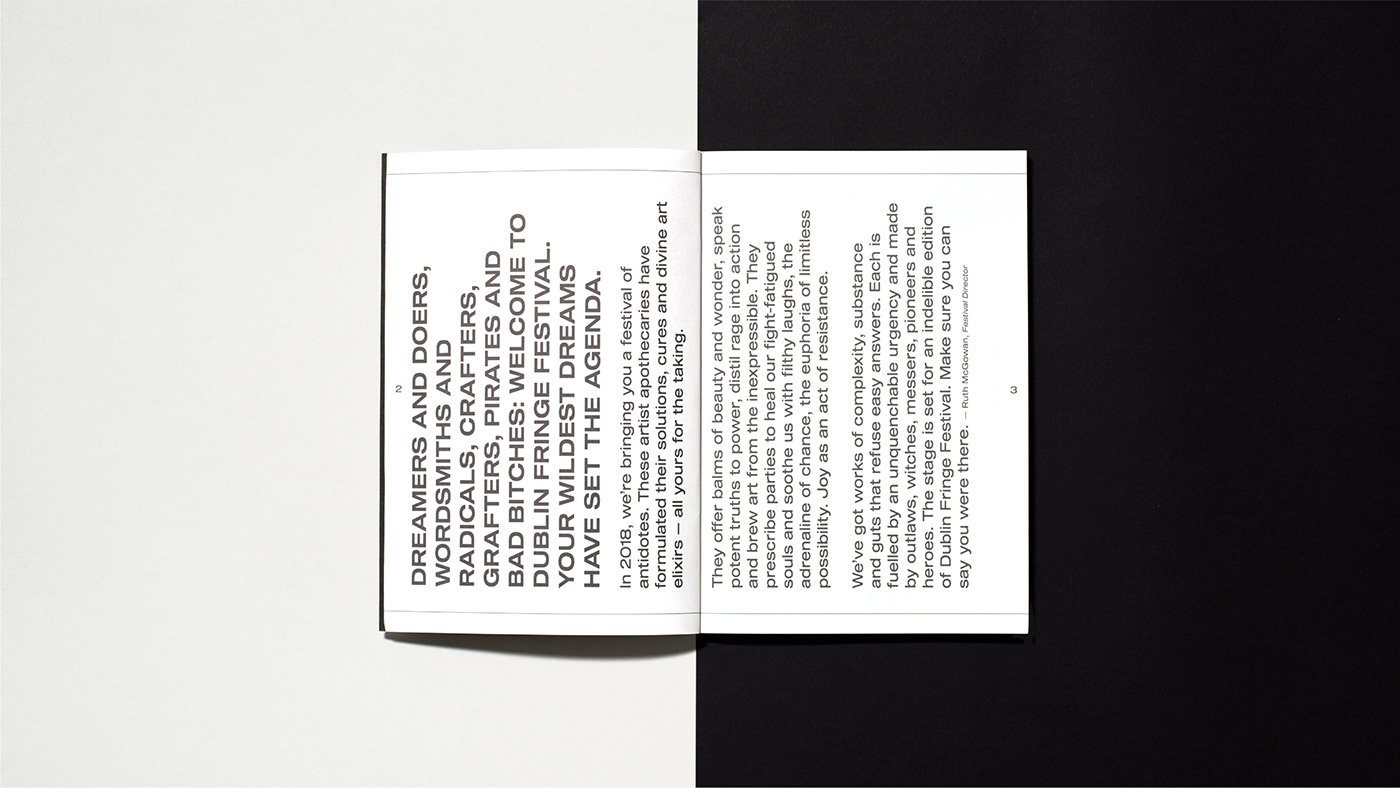
The revamped and refined brochure structure and the use of imagery, icons, bold type and disruptive page orientations throughout, mirrored the festival’s fresh approach and helped the reader to easily navigate its event listings. The unadorned cover and the distinct colouring highlighted the artists, while the rigid, oversized type set the pages alight.


Agency: bigO - Photographer: Myles Shelly - Composer: Dunk Murphy